
 Web Front-end
CSS Tutorial
Create a simple bubble dialog box with pure CSS (detailed explanation with pictures and text)
Web Front-end
CSS Tutorial
Create a simple bubble dialog box with pure CSS (detailed explanation with pictures and text)
Create a simple bubble dialog box with pure CSS (detailed explanation with pictures and text)

This article will introduce you step by step how to use pure CSS to create a simple bubble dialog box. It has certain reference value. Friends in need can refer to it. I hope it will be helpful to everyone.
You can directly insert the bubble box image, but the image needs to be loaded every time, which can be achieved with CSS!
First of all, we need to understand how the bubble box is implemented. Once you know the principles, you can be infinitely flexible! ! ! !
Let’s start with a basic bubble diagram!
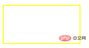
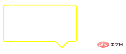
The first step is to have a frame! It's very simple, just a div! Then set relative positioning to its div.
HTML:
<div class="div"></div>
CSS:
.div{
    width: 200px;
    height: 100px;
    border: 2px solid #ff0;
    position: relative;
}As shown in the picture, this is a box, the basic shape is there!
Then, the most critical thing is how to realize the triangle part~
We must understand before that, where does the triangle come from?
Here, let me give an example to analyze it! ! ! !
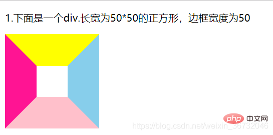
Let’s take a look at the picture below. step by step! ! !
HTML:
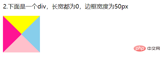
<p>1.下面是一个div.长宽为50*50的正方形,边框宽度为50</p>
<div class="div1"></div>
CSS:
		.div1{
			width: 50px;
			height: 50px;
			border: 50px solid;
			border-color: yellow skyblue pink deeppink;
}Rendering: We can see that when the border is 50px, it is already trapezoidal, right?
Next, set the width and height of the square to 0, leaving only a 50px border. Let’s take a look at the rendering. Do four triangles appear? Yes, the frame doesn’t wrap anything anymore. Only the border itself remains.
We take the upper border and set the color of the remaining three sides to transparent!
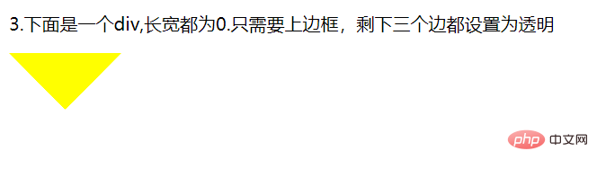
Do you know where the triangle comes from?
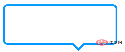
Let’s go back to the bubble box. We only need to position the triangle under the rectangular box, and the bubble box will basically be formed! !
CSS: Insert this style before the div! Use ::before and it’s ok!!! Position it absolutely! Set the top border color to: #ff0, the left and right borders to a transparent color, and the bottom border to a transparent color
		.div::before{
			content: '';
			width: 0;
			height: 0;
			border: 20px solid;
			position: absolute;
			bottom: -40px;
			left: 140px;
			border-color:  #ff0 transparent transparent;
}Result picture:
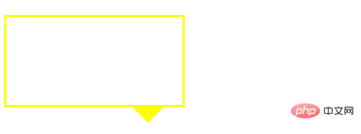
Okay, probably It looks like, hey! ! ! Isn’t it just a little bit worse? oh! It turns out that the triangle should be hollow, not a solid triangle! ! Then, wouldn't it be enough to insert a similar triangle after the div element with a white background color and cover it with the original yellow triangle? OK, let’s take a look! ! !
CSS:
		.div::after{
			content: '';
			width: 0;
			height: 0;
			border: 20px solid;
			position: absolute;
			bottom: -36px;
			left: 140px;
			border-color:  #fff transparent transparent;
}Rendering:
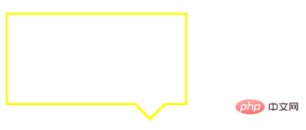
After completion, if it is a bit abrupt, add a rounded corner to the bubble box. ! ! !
css:
.div{
			width: 200px;
			height: 100px;
			border: 2px  solid #ff0;
			border-radius: 7px;  /*圆角弧度为7px*/
			position: relative;
		}
You can also set a bubble box with a filled color yourself! ! ! It’s very simple, no coding required! !
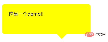
Okay, you’re done! A basic bubble box is complete! ! ! !
For more programming-related knowledge, please visit: Programming Teaching! !
The above is the detailed content of Create a simple bubble dialog box with pure CSS (detailed explanation with pictures and text). For more information, please follow other related articles on the PHP Chinese website!

Hot AI Tools

Undresser.AI Undress
AI-powered app for creating realistic nude photos

AI Clothes Remover
Online AI tool for removing clothes from photos.

Undress AI Tool
Undress images for free

Clothoff.io
AI clothes remover

Video Face Swap
Swap faces in any video effortlessly with our completely free AI face swap tool!

Hot Article
Hot Tools

Notepad++7.3.1
Easy-to-use and free code editor

SublimeText3 Chinese version
Chinese version, very easy to use

Zend Studio 13.0.1
Powerful PHP integrated development environment

Dreamweaver CS6
Visual web development tools

SublimeText3 Mac version
God-level code editing software (SublimeText3)
Hot Topics
 1386
1386
 52
52

 How to use bootstrap in vue
Apr 07, 2025 pm 11:33 PM
How to use bootstrap in vue
Apr 07, 2025 pm 11:33 PM
Using Bootstrap in Vue.js is divided into five steps: Install Bootstrap. Import Bootstrap in main.js. Use the Bootstrap component directly in the template. Optional: Custom style. Optional: Use plug-ins.
 The Roles of HTML, CSS, and JavaScript: Core Responsibilities
Apr 08, 2025 pm 07:05 PM
The Roles of HTML, CSS, and JavaScript: Core Responsibilities
Apr 08, 2025 pm 07:05 PM
HTML defines the web structure, CSS is responsible for style and layout, and JavaScript gives dynamic interaction. The three perform their duties in web development and jointly build a colorful website.
 How to write split lines on bootstrap
Apr 07, 2025 pm 03:12 PM
How to write split lines on bootstrap
Apr 07, 2025 pm 03:12 PM
There are two ways to create a Bootstrap split line: using the tag, which creates a horizontal split line. Use the CSS border property to create custom style split lines.
 Understanding HTML, CSS, and JavaScript: A Beginner's Guide
Apr 12, 2025 am 12:02 AM
Understanding HTML, CSS, and JavaScript: A Beginner's Guide
Apr 12, 2025 am 12:02 AM
WebdevelopmentreliesonHTML,CSS,andJavaScript:1)HTMLstructurescontent,2)CSSstylesit,and3)JavaScriptaddsinteractivity,formingthebasisofmodernwebexperiences.
 How to set up the framework for bootstrap
Apr 07, 2025 pm 03:27 PM
How to set up the framework for bootstrap
Apr 07, 2025 pm 03:27 PM
To set up the Bootstrap framework, you need to follow these steps: 1. Reference the Bootstrap file via CDN; 2. Download and host the file on your own server; 3. Include the Bootstrap file in HTML; 4. Compile Sass/Less as needed; 5. Import a custom file (optional). Once setup is complete, you can use Bootstrap's grid systems, components, and styles to create responsive websites and applications.
 How to resize bootstrap
Apr 07, 2025 pm 03:18 PM
How to resize bootstrap
Apr 07, 2025 pm 03:18 PM
To adjust the size of elements in Bootstrap, you can use the dimension class, which includes: adjusting width: .col-, .w-, .mw-adjust height: .h-, .min-h-, .max-h-
 How to insert pictures on bootstrap
Apr 07, 2025 pm 03:30 PM
How to insert pictures on bootstrap
Apr 07, 2025 pm 03:30 PM
There are several ways to insert images in Bootstrap: insert images directly, using the HTML img tag. With the Bootstrap image component, you can provide responsive images and more styles. Set the image size, use the img-fluid class to make the image adaptable. Set the border, using the img-bordered class. Set the rounded corners and use the img-rounded class. Set the shadow, use the shadow class. Resize and position the image, using CSS style. Using the background image, use the background-image CSS property.
 How to use bootstrap button
Apr 07, 2025 pm 03:09 PM
How to use bootstrap button
Apr 07, 2025 pm 03:09 PM
How to use the Bootstrap button? Introduce Bootstrap CSS to create button elements and add Bootstrap button class to add button text
