
 Web Front-end
Bootstrap Tutorial
In-depth analysis of multi-selection and fuzzy query drop-down boxes in bootstrap-select
Web Front-end
Bootstrap Tutorial
In-depth analysis of multi-selection and fuzzy query drop-down boxes in bootstrap-select
In-depth analysis of multi-selection and fuzzy query drop-down boxes in bootstrap-select

This article will take you to learn more about the multi-selection and fuzzy query drop-down boxes in bootstrap-select. It has certain reference value. Friends in need can refer to it. I hope it will be helpful to everyone.

Introducing the problem
The previous blogger encountered a problem in actual development, that is, it needs to support both multiple selection and simultaneous The drop-down control for fuzzy query is the well-known and powerful drop-down box plug-in bootstrap-select2. The blogger also referred to it at the time, but found that its multi-select effect was relatively poor, similar to this,

Such a multi-select control must be long enough. If the selection exceeds a certain limit, the style will collapse. You know~ I accidentally discovered the bootstrap-select plug-in later. , I instantly realized that it was very high-end! It supports both single selection and multiple selection. The most amazing thing is that it even comes with a fuzzy query function! Let me show you the cool effects first:
It’s a pity not to use such a control. Later, the blogger found a lot of documents and blog references. , but I found that many of them did not clearly explain the specific usage. They just gave a simple example, which did not have much reference value. The blogger made a clear usage of bootstrap-select by studying the relevant documents on the official website and combining it with his own development experience. The summary is for your reference. [Related recommendations: "bootstrap Tutorial"]
Official plug-in address: http://silviomoreto.github.io/bootstrap-select
Github address: https://github.com/silviomoreto/bootstrap-select
Application examples (refer to the official document Basic examples)
1.Single selection
- Simple single selection There is no "√" by default when selected.
<select class="selectpicker">
  <option>Mustard</option>
  <option>Ketchup</option>
  <option>Relish</option>
</select>
Effect display
- Group radio selection Pay attention to adding the optgroup tag
   <select class="selectpicker">
     <optgroup label="Picnic">
    <option>Mustard</option>
    <option>Ketchup</option>
    <option>Relish</option>
     </optgroup>
    <optgroup label="Camping">
    <option>Tent</option>
    <option>Flashlight</option>
    <option>Toilet Paper</option>
    </optgroup>
</select>Effect display
## 2. Multi-select box
Comparison Added amultiple tag to the radio button
<select class="selectpicker" multiple>
  <option>Mustard</option>
  <option>Ketchup</option>
  <option>Relish</option>
</select>
Add an attribute with
data-live-search="true"<div class="code" style="position:relative; padding:0px; margin:0px;"><pre class='brush:php;toolbar:false;'><select class="selectpicker" data-live-search="true">
<option>Hot Dog</option>
<option>Fries</option>
<option>Soda</option>
<option>Burger</option>
<option>Shake</option>
<option>Smile</option>
</select></pre><div class="contentsignin">Copy after login</div></div>Effect display
Add attributes
data-max-options="2"Or use maxOptionsText to limit during initialization<div class="code" style="position:relative; padding:0px; margin:0px;"><pre class='brush:php;toolbar:false;'><select class="selectpicker" multiple data-max-options="2">
<option>Mustard</option>
<option>Ketchup</option>
<option>Relish</option>
</select></pre><div class="contentsignin">Copy after login</div></div> Or set maxOptionsText when initializing selectpicker
$('.selectpicker').selectpicker({
                'selectedText':'cat',
                'maxOptionsText':2;
})Effect display
Controlled by the attribute
title.
<select class="selectpicker" multiple title="请选择一个">
  <option>Mustard</option>
  <option>Ketchup</option>
  <option>Relish</option>
</select>
Copy after loginEffect display
<select class="selectpicker">
  <option title="Combo 1">Hot Dog, Fries and a Soda</option>
  <option title="Combo 2">Burger, Shake and a Smile</option>
  <option title="Combo 3">Sugar, Spice and all things nice</option>
</select>
Copy after loginEffect display
Through attributes
data-selected-text-format to control the display of the selected value
The following 4 values are available:
values: Comma-separated list of selected values (system default);
</blockquote><blockquote><p>2.<code>count: 如果选择了一个项,则显示选项值。如果选择多于一个,则显示所选项的数量,如选择2个,则下拉框显示2个已被选中;
3.
count > x: 当count的值小于x时,展示逗号分隔的选定值列表;当count>x时,显示x个被选中;
4.
static:无论选中什么,都只展示默认的选中文本。 下面给几个简单示例
<select class="selectpicker" multiple data-selected-text-format="count">
  <option>Mustard</option>
  <option>Ketchup</option>
  <option>Relish</option>
  <option>Onions</option>
</select>
效果展示
<select class="selectpicker" multiple data-selected-text-format="count>3">
  <option>Mustard</option>
  <option>Ketchup</option>
  <option>Relish</option>
  <option>Onions</option>
</select>
效果展示
7.样式选择
- 按钮样式
通过
data-style来设置按钮的样式
<select class="selectpicker" data-style="btn-primary">
  ...
</select>

<select class="selectpicker" data-style="btn-info">
  ...
</select>

<select class="selectpicker" data-style="btn-success">
  ...
</select>

<select class="selectpicker" data-style="btn-warning">
  ...
</select>

<select class="selectpicker" data-style="btn-danger">
  ...
</select>
效果展示
- 单选框样式
这里要注意一下,单选框默认是没有多选框的选中之后的"√"图标的,如果想要加上这个图标的话,需要在样式中加入
show-tick即可。
<select class="selectpicker show-tick">
  <option>Mustard</option>
  <option>Ketchup</option>
  <option>Relish</option>
</select>
效果展示
- 菜单的箭头
Bootstrap的菜单箭头也可以被添加进来,需要加入样式
show-menu-arrow,个人感觉差别不大
<select class="selectpicker show-menu-arrow">
  <option>Mustard</option>
  <option>Ketchup</option>
  <option>Relish</option>
</select>
效果展示
- style样式自定义 bootstrap-select的样式不是死的,可以自定义style样式,类似最基本的css样式添加。
.special {
  font-weight: bold !important;
  color: #fff !important;
  background: #bc0000 !important;
  text-transform: uppercase;
}

<select class="selectpicker">
  <option>Mustard</option>
  <option class="special">Ketchup</option>
  <option style="background: #5cb85c; color: #fff;">Relish</option>
</select>效果展示
- 宽度(Width)
1.引用bootstrap的样式
<div class="row">
  <div class="col-xs-3">
    <div class="form-group">
      <select class="selectpicker form-control">
        <option>Mustard</option>
        <option>Ketchup</option>
        <option>Relish</option>
      </select>
    </div>
  </div>
</div>2.使用data-width属性,来定义宽度,可选的值有以下4个auto:select的宽度由option中内容宽度最宽的哪个决定;fit:select的宽度由实际选中的option的宽度决定;100px:select的宽度定义为100px;50%:select的宽度设置为父容器宽度的50%。
<select class="selectpicker" data-width="auto">
   <option>cow</option>
    <option>bullaaaaaaaaaaaa</option>
    <option>ASD</option>
    <option>Bla</option>
    <option>Ble</option>
</select>
<select class="selectpicker" data-width="fit">
  <option>cow</option>
    <option>bullaaaaaaaaaaaa</option>
    <option>ASD</option>
    <option>Bla</option>
    <option>Ble</option>
</select>
<select class="selectpicker" data-width="100px">
  <option>cow</option>
    <option>bull</option>
    <option>ASD</option>
    <option selected>Bla</option>
    <option>Ble</option>
</select>
<select class="selectpicker" data-width="50%">
    <option>cow</option>
    <option>bull</option>
    <option>ASD</option>
    <option selected>Bla</option>
    <option>Ble</option>
</select>效果展示:从左至右依次为“auto”,“fit","100px","50%"。
8.自定义option
1.添加图标
用data-icon给option添加小图标,实现比较炫酷的效果
 <select class="selectpicker">
  <option data-icon="glyphicon-heart">Ketchup</option>
  <option data-icon="glyphicon glyphicon-th-large">Mustard</option>
  <option data-icon="glyphicon glyphicon-home">Relish</option>
</select>
效果展示
如果想要获取更多样式可参考bootstrap官网的图标库,给个网址www.runoob.com/bootstrap/b…
2.插入HTML
用data-content可以在option中插入html元素,实现想要的效果。
<select class="selectpicker"> <option data-content="<span class='label label-success'>Relish</span>">Relish</option> </select>
效果展示
3.插入二级标题
用data-subtext实现二级标题,实现提示或者其他效果,如果要在select中也展示二级标题,要在初始化selectpicker时要设置showSubtext为true。
<select class="selectpicker" data-size="5">
    <option data-subtext="Heinz">Ketchup</option>
    <option data-subtext="ble">Mustard</option>
    <option data-subtext="com">Relish</option>
</select>效果展示
$('.selectpicker').selectpicker({
                'selectedText':'cat',
                'showSubtext':true
             })

<select class="selectpicker" data-size="5">
    <option data-subtext="Heinz">Ketchup</option>
    <option data-subtext="ble">Mustard</option>
    <option data-subtext="com">Relish</option>
</select>效果展示
9.自定义下拉菜单
1.菜单显示项大小
通过data-size属性来限制菜单显示的条数,比如说option有8条,我们只展示5条,其余的通过滚动条显示。
<select class="selectpicker" data-size="5">
    <option>apple</option>
    <option>banana</option>
    <option>group</option>
    <option>orange</option>
    <option>cherry</option>
    <option>mango</option>
    <option>pineapple</option>
    <option>lychee</option>
</select>效果展示(只展示前5个,后面的可以拖动滚动条查看)
2.全选和全不选
通过设置data-actions-box="true"来添加全选和全不选的按钮
<select class="selectpicker" multiple data-actions-box="true">
  <option>Mustard</option>
  <option>Ketchup</option>
  <option>Relish</option>
</select>
效果展示
当然这个按钮的文本也是可以自定制的 只需要在初始化时设置即可
       $('.selectpicker').selectpicker({
                'selectedText':'cat',
                 'noneSelectedText':'请选择',
                 'deselectAllText':'全不选',
                 'selectAllText': '全选',
})效果展示
3.添加数据分割线
设置data-divider="true"添加数据分割线。
<select class="selectpicker" data-size="5">
  <option>Mustrad</option>
  <option >Ketchup</option>
  <option >Relish</option>
  <option data-divider="true"></option>
   <option>Mustrad</option>
  <option >Ketchup</option>
  <option >Relish</option>
</select>
效果展示
4.添加菜单头
用data-header为下拉菜单设置菜单头
<select class="selectpicker" data-header="Select a condiment">
  <option>Mustard</option>
  <option>Ketchup</option>
  <option>Relish</option>
</select>
效果展示
5.设置菜单的上浮或者下浮
通过设置dropupAuto来设置菜单的上下浮动,dropupAuto默认为true,自动确定是否应显示的菜单上面或下面的选择框,如果设置为false,系统会加入一个dropup样式的上拉框。
 $('.selectpicker').selectpicker({
                'selectedText':'cat',
                 'dropupAuto':false
             })

<select class="selectpicker dropup">
  <option>Mustard</option>
  <option>Ketchup</option>
  <option>Relish</option>
</select>效果展示
10.不可用
在对应的控件上加入disabled即可实现
1.设置select不可用
这里select按钮失效,不能点击
<select class="selectpicker" disabled>
  <option>Mustard</option>
  <option>Ketchup</option>
  <option>Relish</option>
</select>
效果展示
2.设置option不可用
这里option设置属性为disabled的将无法选中
<select class="selectpicker">
  <option>Mustard</option>
  <option disabled>Ketchup</option>
  <option>Relish</option>
</select>
效果展示
3.设置optiongroup不可用 这里是一个optiongroup将无法选中
<select class="selectpicker test">
  <optgroup label="Picnic" disabled>
    <option>Mustard</option>
    <option>Ketchup</option>
    <option>Relish</option>
  </optgroup>
  <optgroup label="Camping">
    <option>Tent</option>
    <option>Flashlight</option>
    <option>Toilet Paper</option>
  </optgroup>
</select>效果展示
总结
好的,这里我们基本上把官方的应用示例解读完毕,当然如果有疑问可以自己亲自去验证或者咨询博主,想实现自己想要的效果就要多加摸索和实践,只要明白其中的规则就能触类旁通了。第一篇关于bootstrap-select的官方示例文档的解读,如果想了解更多bootstrap-select的用法,可以关注我后面的博客哦。
更多编程相关知识,请访问:编程入门!!
The above is the detailed content of In-depth analysis of multi-selection and fuzzy query drop-down boxes in bootstrap-select. For more information, please follow other related articles on the PHP Chinese website!

Hot AI Tools

Undresser.AI Undress
AI-powered app for creating realistic nude photos

AI Clothes Remover
Online AI tool for removing clothes from photos.

Undress AI Tool
Undress images for free

Clothoff.io
AI clothes remover

AI Hentai Generator
Generate AI Hentai for free.

Hot Article
Hot Tools

Notepad++7.3.1
Easy-to-use and free code editor

SublimeText3 Chinese version
Chinese version, very easy to use

Zend Studio 13.0.1
Powerful PHP integrated development environment

Dreamweaver CS6
Visual web development tools

SublimeText3 Mac version
God-level code editing software (SublimeText3)
Hot Topics


 How to introduce bootstrap into Eclipse
Apr 05, 2024 am 02:30 AM
How to introduce bootstrap into Eclipse
Apr 05, 2024 am 02:30 AM
Introduce Bootstrap in Eclipse in five steps: Download the Bootstrap file and unzip it. Import the Bootstrap folder into the project. Add Bootstrap dependency. Load Bootstrap CSS and JS in HTML files. Start using Bootstrap to enhance your user interface.
 How to introduce idea into bootstrap
Apr 05, 2024 am 02:33 AM
How to introduce idea into bootstrap
Apr 05, 2024 am 02:33 AM
Steps to introduce Bootstrap in IntelliJ IDEA: Create a new project and select "Web Application". Add "Bootstrap" Maven dependency. Create an HTML file and add Bootstrap references. Replace with the actual path to the Bootstrap CSS file. Run the HTML file to use Bootstrap styles. Tip: Use a CDN to import Bootstrap or customize HTML file templates.
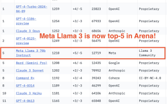 750,000 rounds of one-on-one battle between large models, GPT-4 won the championship, and Llama 3 ranked fifth
Apr 23, 2024 pm 03:28 PM
750,000 rounds of one-on-one battle between large models, GPT-4 won the championship, and Llama 3 ranked fifth
Apr 23, 2024 pm 03:28 PM
Regarding Llama3, new test results have been released - the large model evaluation community LMSYS released a large model ranking list. Llama3 ranked fifth, and tied for first place with GPT-4 in the English category. The picture is different from other benchmarks. This list is based on one-on-one battles between models, and the evaluators from all over the network make their own propositions and scores. In the end, Llama3 ranked fifth on the list, followed by three different versions of GPT-4 and Claude3 Super Cup Opus. In the English single list, Llama3 overtook Claude and tied with GPT-4. Regarding this result, Meta’s chief scientist LeCun was very happy and forwarded the tweet and
 How to read the bootstrap mediation effect test results in stata
Apr 05, 2024 am 01:48 AM
How to read the bootstrap mediation effect test results in stata
Apr 05, 2024 am 01:48 AM
Interpretation steps of Bootstrap mediation effect test in Stata: Check the sign of the coefficient: Determine the positive or negative direction of the mediation effect. Test p value: less than 0.05 indicates that the mediating effect is significant. Check the confidence interval: not containing zero indicates that the mediation effect is significant. Comparing the median p-value: less than 0.05 further supports the significance of the mediation effect.
 How to deal with checkboxes and radiobuttons in PHP forms
Aug 11, 2023 am 08:39 AM
How to deal with checkboxes and radiobuttons in PHP forms
Aug 11, 2023 am 08:39 AM
How to handle checkboxes and radio buttons in PHP forms In web development, forms are one of the main ways of data interaction between applications and users. In forms, sometimes we need to use checkboxes and radiobuttons to select options. This article will explain how to handle checkboxes and radio buttons in PHP. 1. Checkbox processing In HTML, we can use <inputtype="checkbox&qu
 How to read the results of bootstrap mediation test
Apr 05, 2024 am 03:30 AM
How to read the results of bootstrap mediation test
Apr 05, 2024 am 03:30 AM
The Bootstrap mediation test evaluates the mediation effect by resampling the data multiple times: Indirect effect confidence interval: indicates the estimated range of the mediation effect. If the interval does not contain zero, the effect is significant. p-value: Evaluates the probability that the confidence interval does not contain zero, with values less than 0.05 indicating significant. Sample size: The number of data samples used for analysis. Bootstrap subsampling times: the number of repeated samplings (500-2000 times). If the confidence interval does not contain zero and the p-value is less than 0.05, the mediation effect is significant, indicating that the mediating variable explains the relationship between the independent and dependent variables.
 How to use bootstrap to test mediation effects
Apr 05, 2024 am 03:57 AM
How to use bootstrap to test mediation effects
Apr 05, 2024 am 03:57 AM
The Bootstrap test uses resampling technology to evaluate the reliability of the statistical test and is used to prove the significance of the mediation effect: first, calculate the confidence interval of the direct effect, indirect effect and mediation effect; secondly, calculate the significance of the mediation type according to the Baron and Kenny or Sobel method. significance; and finally estimate the confidence interval for the natural indirect effect.
 What is the difference between bootstrap and springboot
Apr 05, 2024 am 04:00 AM
What is the difference between bootstrap and springboot
Apr 05, 2024 am 04:00 AM
The main difference between Bootstrap and Spring Boot is: Bootstrap is a lightweight CSS framework for website styling, while Spring Boot is a powerful, out-of-the-box backend framework for Java web application development. Bootstrap is based on CSS and HTML, while Spring Boot is based on Java and the Spring framework. Bootstrap focuses on creating the look and feel of a website, while Spring Boot focuses on back-end functionality. Spring Boot can be integrated with Bootstrap to create fully functional, beautiful
