css Float is a method to make an element break away from ordinary standard flow control. The element will move left or right according to the value of float until its outer boundary hits the inner boundary of the parent element or another float. As far as the outer boundary of the element, the surrounding elements will also be rearranged. Floating is a very useful layout method that can change the order of objects in the page.

The operating environment of this tutorial: Windows 7 system, CSS3 version, Dell G3 computer.
CSS floating is a method of making elements break away from ordinary standard flow control. It will move the element to the left or right, and the elements around it will also be rearranged. Float is often used for images, but it is also very useful in layout.
Floating is a very useful layout method that can change the order in which objects on the page flow forward and backward. The advantage of this is that it makes the layout of the content simple and has good scalability.
Floating is a very powerful layout function of CSS layout, and it is also the key issue in understanding CSS layout. In CSS, any element including div can be displayed in a floating manner.
Floating allows elements set with the floating attribute to break away from the control of the standard ordinary flow and move to a specified position in its parent element.
Use of floating:
Basic syntax format:
选择器{float:属性值;}left Elements float to the left
right The element floats to the right
none The element does not float
Characteristics of floating elements:
1. Floating elements break away from the standard document flow and get rid of the restrictions of block-level elements and inline elements
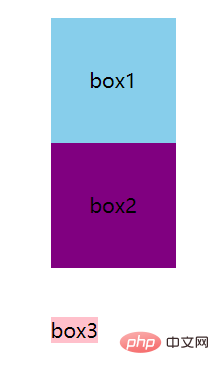
These are three different What the div box looks like without floating:

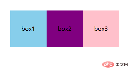
This is what two div boxes and a span element look like when floating is set at the same time:

2. Floating elements have the effect of sticking to each other. When the width is not enough, automatic line wrapping will occur.
These are three different div boxes without setting What it looks like when floating:

This is what three different div boxes look like when floating:

3. Although the floating elements are separated from the standard document flow, they are not separated from the text flow, and appear surrounded by words.

4. The elements after floating will There is a shrinking effect. When a block-level element does not set a width, when the block-level element floats, it will lose its height.
5. When the parent element does not set a height, the height of multiple child elements and Supports the height of the parent element; when float is set, the highest height of the child element supports the height of the parent element.
Disadvantages of floating:
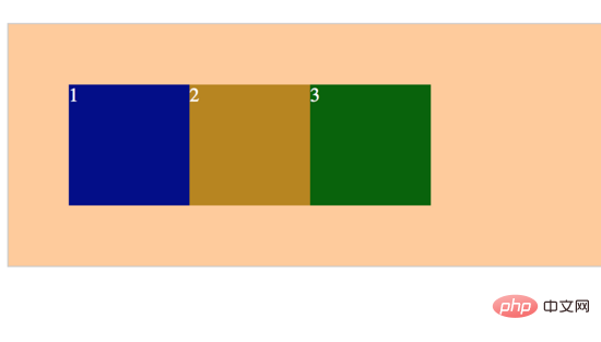
##The consequences of floating: (1) Since the floating element is out of the document flow, the height of the parent element cannot be expanded, which affects elements at the same level as the parent element (2) Non-floating elements at the same level as the floating element will Follow it, because the floating element breaks away from the document flow and does not occupy its original position(3) If the floating element is not the first floating element, the elements before it also need to be floated, otherwise it will easily affect the page Structure displayWe need to know: a floating box can move left and right until it encounters another floating box or a containing box on its outer edge. The floating box does not belong to the ordinary flow in the document flow. When the element is floated, it will not affect the layout of block-level elements, but will only affect the layout of inline elements. At this time, the normal flow in the document flow will show that the floating box does not have the same layout mode. When the height of the containing box is smaller than the floating box, "height collapse" will occur.

Clear floating:
Method 1: Add new elements, apply clear: both;
HTML:<div class="box">
<div class="div1">1</div>
<div class="div2">2</div>
<div class="div3">3</div>
<div class="clear"></div>
</div>.clear {
clear: both;
height: 0;
line-height: 0;
font-size: 0
} 
方法二:父级div定义overflow:auto;
HTML:
<div class="box">
    <div class="div1">1</div>
    <div class="div2">2</div>
    <div class="div3">3</div>
</div>CSS:
.box {
      border: 1px solid #ccc;
      background: #fc9;
      color: #fff;
      margin: 50px auto;
      padding: 50px;
      overflow: auto;
      zoom: 1; /*zoom: 1; 是在处理兼容性问题 */
}结果:也是实现了。
方法三:在父级样式添加伪元素:after或者:before(推荐)
HTML:
<div class="box">
    <div class="div1">1</div>
    <div class="div2">2</div>
    <div class="div3">3</div>
</div>CSS:
.box {
      border: 1px solid #ccc;
      background: #fc9;
      color: #fff;
      margin: 50px auto;
      padding: 50px;
    }
.box:after{
      content: '';
      display: block;
      clear: both;
}结果:当然不用说啦

学习视频分享:css视频教程
The above is the detailed content of what is css float. For more information, please follow other related articles on the PHP Chinese website!