

What are the methods to implement three-column layout in css?

Css method to implement three-column layout: 1. float floating layout; 2. absolute positioning layout; 3. flexbox elastic layout, which has compatibility issues on IE and can only support IE9 and above; 4. table table layout , which is not conducive to search engines crawling information; 5. Grid layout has poor compatibility.
The operating environment of this tutorial: Windows 7 system, CSS3&&HTML5 version, Dell G3 computer.
Three-column layout, as the name suggests, is fixed on both sides and adaptive in the middle. Three-column layout is very common in actual development. For example, the homepage of Taobao is a typical three-column layout: the product navigation on the left and the navigation on the right have fixed widths, and the main content in the middle adapts to the width of the browser.
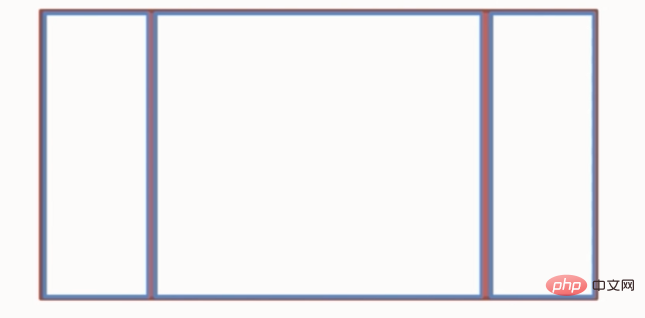
We might as well assume such a layout: the height is known, the width of the left column and the right column are each 300px, and the middle is adaptive. How many methods can be achieved? And what are the advantages and disadvantages of each?
1. Floating layout
<!DOCTYPE html>
<html>
<head>
    <meta charset="utf-8">
    <title>Layout</title>
    <style media="screen">
        html * {
            padding: 0;
            margin: 0;
        }
        .layout article div {
            min-height: 150px;
        }
    </style>
</head>
<body>
    <!--浮动布局  -->
    <section class="layout float">
        <style media="screen">
            .layout.float .left {
                float: left;
                width: 300px;
                background: red;
            }
            .layout.float .center {
                background: yellow;
            }
            .layout.float .right {
                float: right;
                width: 300px;
                background: blue;
            }
        </style>
        <h1>三栏布局</h1>
        <article class="left-right-center">
            <div class="left"></div>
            <div class="right"></div> // 右栏部分要写在中间内容之前
            <div class="center">
                <h2>浮动解决方案</h2>
                1.这是三栏布局的浮动解决方案; 2.这是三栏布局的浮动解决方案; 3.这是三栏布局的浮动解决方案; 4.这是三栏布局的浮动解决方案; 5.这是三栏布局的浮动解决方案; 6.这是三栏布局的浮动解决方案;
            </div>
        </article>
    </section>
</body>
</html>In this layout method, the DOM structure must write the floating part first, and then the middle block, otherwise the right The floating block will drop to the next line.
The advantage of floating layout is that it is relatively simple and has better compatibility. However, floating layout has limitations. Floating elements are out of the document flow and need to be cleared. If this is not handled well, it will cause many problems, such as the height of the parent container collapsing.
2. Absolute positioning layout
<!--绝对布局  -->
 <section class="layout absolute">
     <style>
         .layout.absolute .left-center-right>div{
             position: absolute;//三块都是绝对定位
         }
         .layout.absolute .left {
             left:0;
             width: 300px;
             background: red;
         }
         .layout.absolute .center {
             right: 300px;
             left: 300px;//离左右各三百
             background: yellow;
         }
         .layout.absolute .right {
             right: 0;
             width: 300px;
             background: blue;
         }
     </style>
     <h1>三栏布局</h1>
     <article class="left-center-right">
         <div class="left"></div>
         <div class="center">
             <h2>绝对定位解决方案</h2>
             1.这是三栏布局的浮动解决方案; 2.这是三栏布局的浮动解决方案; 3.这是三栏布局的浮动解决方案; 4.这是三栏布局的浮动解决方案; 5.这是三栏布局的浮动解决方案; 6.这是三栏布局的浮动解决方案;
         </div>
         <div class="right"></div>
     </article>
</section>The advantage of absolute positioning layout is that it is fast, easy to set up, and not prone to problems. The disadvantage is that the container is separated from the document flow, and the descendant elements are also separated from the document flow. When the height is unknown, there will be problems, which results in the effectiveness and usability of this method being relatively poor.
3. Flexbox layout
<!--flexbox布局-->
<section class="layout flexbox">
    <style>
        .layout.flexbox .left-center-right{
            display: flex;
        }
        .layout.flexbox .left {
            width: 300px;
            background: red;
        }
        .layout.flexbox .center {
            background: yellow;
            flex: 1;
        }
        .layout.flexbox .right {
            width: 300px;
            background: blue;
        }
    </style>
    <h1>三栏布局</h1>
    <article class="left-center-right">
        <div class="left"></div>
        <div class="center">
            <h2>flexbox解决方案</h2>
            1.这是三栏布局的浮动解决方案; 2.这是三栏布局的浮动解决方案; 3.这是三栏布局的浮动解决方案; 4.这是三栏布局的浮动解决方案; 5.这是三栏布局的浮动解决方案; 6.这是三栏布局的浮动解决方案;
        </div>
        <div class="right"></div>
    </article>
</section>Flexbox layout is a new one in css3. It is designed to solve the shortcomings of the above two methods and is relatively perfect. one. Currently, the layout on mobile terminals also uses flexbox. The disadvantage of flexbox is that IE10 starts to support it, but IE10 is in -ms form.
4. Table layout
<!--表格布局-->
    <section class="layout table">
        <style>
            .layout.table .left-center-right {
                display: table;
                height: 150px;
                width: 100%;
            }
            .layout.table .left-center-right>div {
                display: table-cell;
            }
            .layout.table .left {
                width: 300px;
                background: red;
            }
            .layout.table .center {
                background: yellow;
            }
            .layout.table .right {
                width: 300px;
                background: blue;
            }
        </style>
        <h1>三栏布局</h1>
        <article class="left-center-right">
            <div class="left"></div>
            <div class="center">
                <h2>表格布局解决方案</h2>
                1.这是三栏布局的浮动解决方案; 2.这是三栏布局的浮动解决方案; 3.这是三栏布局的浮动解决方案; 4.这是三栏布局的浮动解决方案; 5.这是三栏布局的浮动解决方案; 6.这是三栏布局的浮动解决方案;
            </div>
            <div class="right"></div>
        </article>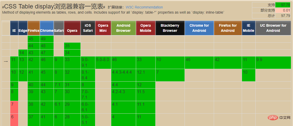
</section>The compatibility of table layout is very good (see the picture below). When flex layout is incompatible, you can try table layout. When the content overflows, it will automatically expand the parent element.
The table layout also has flaws: ① The column margins cannot be set; ② It is not friendly to SEO; ③ When the height of one of the cells exceeds the height, the cells on both sides will also become taller. However, Sometimes this is not the effect we want.
5. Grid Layout
<!--网格布局-->
<section class="layout grid">
    <style>
        .layout.grid .left-center-right {
            display: grid;
            width: 100%;
            grid-template-columns: 300px auto 300px;
            grid-template-rows: 150px;//行高
        }
        .layout.grid .left {
            background: red;
        }
        .layout.grid .center {
            background: yellow;
        }
        .layout.grid .right {
            background: blue;
        }
    </style>
    <h1>三栏布局</h1>
    <article class="left-center-right">
        <div class="left"></div>
        <div class="center">
            <h2>网格布局解决方案</h2>
            1.这是三栏布局的浮动解决方案; 2.这是三栏布局的浮动解决方案; 3.这是三栏布局的浮动解决方案; 4.这是三栏布局的浮动解决方案; 5.这是三栏布局的浮动解决方案; 6.这是三栏布局的浮动解决方案;
        </div>
        <div class="right"></div>
    </article>
</section>CSS Grid is the most powerful and simplest tool for creating grid layout. Just like tables, grid layouts allow web designers to align elements in columns or rows, but unlike tables, grid layouts have no content structure, making it impossible for various layouts to be the same as tables. For example, child elements in a grid layout can all position themselves so that they overlap and position similar elements.
But the compatibility of grid layout is not good. Supported on IE10, and only some attributes are supported.
6. Summary
1. Float layout is a layout that is commonly used nowadays. Many portal websites currently use this layout method. You only need to pay attention to it when using it. Clear float.
2. Position layout only directly sets the position of elements based on positioning attributes. I personally feel that it is not suitable for page layout.
3. Table layout is easy to use and there is no problem with compatibility. It is not conducive to search engines to crawl information
4. The flex layout is relatively powerful, but there are still compatibility issues on IE, and it can only be supported up to IE9 and above
5. The grid layout is very powerful, but compatible Sex sucks.
Learning video sharing: css video tutorial
The above is the detailed content of What are the methods to implement three-column layout in css?. For more information, please follow other related articles on the PHP Chinese website!

Hot AI Tools

Undresser.AI Undress
AI-powered app for creating realistic nude photos

AI Clothes Remover
Online AI tool for removing clothes from photos.

Undress AI Tool
Undress images for free

Clothoff.io
AI clothes remover

Video Face Swap
Swap faces in any video effortlessly with our completely free AI face swap tool!

Hot Article
Hot Tools

Notepad++7.3.1
Easy-to-use and free code editor

SublimeText3 Chinese version
Chinese version, very easy to use

Zend Studio 13.0.1
Powerful PHP integrated development environment

Dreamweaver CS6
Visual web development tools

SublimeText3 Mac version
God-level code editing software (SublimeText3)
Hot Topics
 1387
1387
 52
52

 How to use bootstrap in vue
Apr 07, 2025 pm 11:33 PM
How to use bootstrap in vue
Apr 07, 2025 pm 11:33 PM
Using Bootstrap in Vue.js is divided into five steps: Install Bootstrap. Import Bootstrap in main.js. Use the Bootstrap component directly in the template. Optional: Custom style. Optional: Use plug-ins.
 The Roles of HTML, CSS, and JavaScript: Core Responsibilities
Apr 08, 2025 pm 07:05 PM
The Roles of HTML, CSS, and JavaScript: Core Responsibilities
Apr 08, 2025 pm 07:05 PM
HTML defines the web structure, CSS is responsible for style and layout, and JavaScript gives dynamic interaction. The three perform their duties in web development and jointly build a colorful website.
 How to write split lines on bootstrap
Apr 07, 2025 pm 03:12 PM
How to write split lines on bootstrap
Apr 07, 2025 pm 03:12 PM
There are two ways to create a Bootstrap split line: using the tag, which creates a horizontal split line. Use the CSS border property to create custom style split lines.
 Understanding HTML, CSS, and JavaScript: A Beginner's Guide
Apr 12, 2025 am 12:02 AM
Understanding HTML, CSS, and JavaScript: A Beginner's Guide
Apr 12, 2025 am 12:02 AM
WebdevelopmentreliesonHTML,CSS,andJavaScript:1)HTMLstructurescontent,2)CSSstylesit,and3)JavaScriptaddsinteractivity,formingthebasisofmodernwebexperiences.
 How to resize bootstrap
Apr 07, 2025 pm 03:18 PM
How to resize bootstrap
Apr 07, 2025 pm 03:18 PM
To adjust the size of elements in Bootstrap, you can use the dimension class, which includes: adjusting width: .col-, .w-, .mw-adjust height: .h-, .min-h-, .max-h-
 How to use bootstrap button
Apr 07, 2025 pm 03:09 PM
How to use bootstrap button
Apr 07, 2025 pm 03:09 PM
How to use the Bootstrap button? Introduce Bootstrap CSS to create button elements and add Bootstrap button class to add button text
 How to set up the framework for bootstrap
Apr 07, 2025 pm 03:27 PM
How to set up the framework for bootstrap
Apr 07, 2025 pm 03:27 PM
To set up the Bootstrap framework, you need to follow these steps: 1. Reference the Bootstrap file via CDN; 2. Download and host the file on your own server; 3. Include the Bootstrap file in HTML; 4. Compile Sass/Less as needed; 5. Import a custom file (optional). Once setup is complete, you can use Bootstrap's grid systems, components, and styles to create responsive websites and applications.
 How to insert pictures on bootstrap
Apr 07, 2025 pm 03:30 PM
How to insert pictures on bootstrap
Apr 07, 2025 pm 03:30 PM
There are several ways to insert images in Bootstrap: insert images directly, using the HTML img tag. With the Bootstrap image component, you can provide responsive images and more styles. Set the image size, use the img-fluid class to make the image adaptable. Set the border, using the img-bordered class. Set the rounded corners and use the img-rounded class. Set the shadow, use the shadow class. Resize and position the image, using CSS style. Using the background image, use the background-image CSS property.
