

How to implement responsive layout in css

How to implement responsive layout in css: 1. Use flex layout, which has the advantages of simple code and convenient layout; 2. Use absolute layout, combined with media to achieve responsive layout; 3. Use grid layout, which has the advantages It is easy to write; 4. Use float layout, which has the advantage of better compatibility.
The operating environment of this tutorial: Windows 7 system, CSS3&&HTML5 version, Dell G3 computer.
A brief introduction to the four ways of responsive layout
Total html code
<body>
<div class="box">
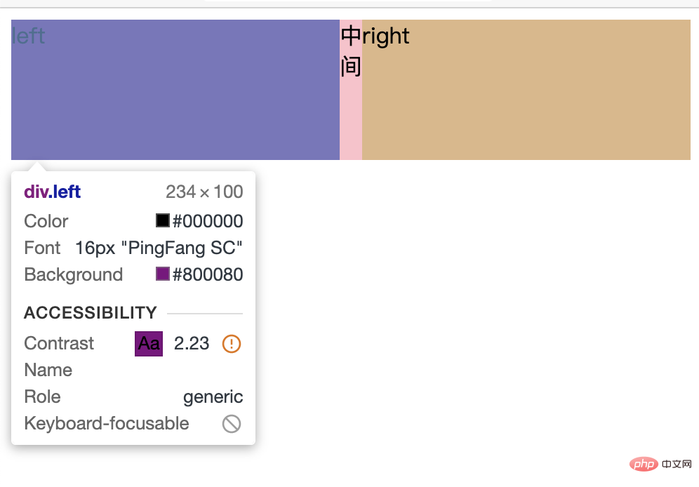
<div class="left">left</div>
<div class="center">中间</div>
<div class="right">right</div>
</div>
</body>flex Layout
.box{
    width: 100%
    height: 100px;
    display: flex;
}
.left{
    width: 300px;
    background-color: purple;
}
.center{
    flex: 1;
    background-color: pink;
}
.right{
    width: 300px;
    background-color: burlywood;
}Advantages
- Simple code and convenient layout
Disadvantages
- If there is content in the middle, it will not be smaller when reduced to the minimum
- And the width of the left and right sides will become smaller
Absolute layout
.box{
    position: relative;
    width: 100%;
    height: 100px;
}
.left{
    position: absolute;
    left: 0px;
    width: 300px;
    background-color: pink;
}
.right{
    position: absolute;
    right: 0px;
    width: 300px;
    background-color: pink;
}
.center{
    position: absolute;
    left: 300px;
    right: 300px;
    background-color: burlywood;
}
@media (max-width: 600px){
    .left,.right{
       /* 平分屏幕 */
        width: 50%;
    }
}Advantages
- Responsive layout can be achieved by using media in combination
Disadvantages
- The code writing is complicated and the layout is cumbersome
- If you do not use media to divide the screen equally, and the width is less than 600, the right side will cover the left side
grid layout
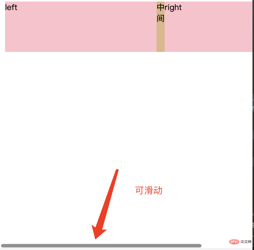
.box{
    display: grid;
    grid-template-columns: 300px 1fr 300px;
    grid-template-rows: 100px;
}
.left,.right{
    background-color: pink;
}
.center{
    background-color: burlywood;
}Advantages
- Easy to write
Disadvantages
- When there is content in the middle, it cannot continue to shrink
- The width will be fixed. When the width of the web page is smaller than the fixed width, the bottom can be slid

float layout
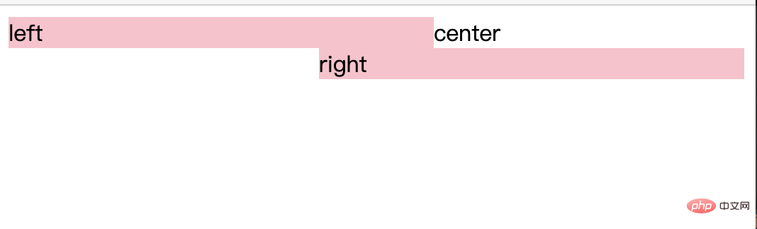
The floating flow needs to change the right and center positions
<div class="box">
    <div class="left">left</div>
    <div class="right">right</div>
    <div class="center">center</div>
</div>Advantages
- Relatively simple, good compatibility
Disadvantages
- Two blocks floating in the same row need to be in order Write them together (i.e. the p's of left and right are written in order
- After the compression becomes smaller, a line break is generated
- The middle content will not disappear
Solution
.box{
    height: 200px;
}
.left{
    float: left;
    width: 300px;
    background-color: pink;
}
.right{
    float: right;
    width: 300px;
    background-color: pink;
}
.center{
    margin:0 300px;
    background-color: burlywood;
}The third problem
- Flex layout can expand the height of the parent element based on any internal height
- grid layout can also expand the height of the parent element according to any internal height
Learning video sharing:css video tutorial
The above is the detailed content of How to implement responsive layout in css. For more information, please follow other related articles on the PHP Chinese website!

Hot AI Tools

Undresser.AI Undress
AI-powered app for creating realistic nude photos

AI Clothes Remover
Online AI tool for removing clothes from photos.

Undress AI Tool
Undress images for free

Clothoff.io
AI clothes remover

Video Face Swap
Swap faces in any video effortlessly with our completely free AI face swap tool!

Hot Article
Hot Tools

Notepad++7.3.1
Easy-to-use and free code editor

SublimeText3 Chinese version
Chinese version, very easy to use

Zend Studio 13.0.1
Powerful PHP integrated development environment

Dreamweaver CS6
Visual web development tools

SublimeText3 Mac version
God-level code editing software (SublimeText3)
Hot Topics


 How to use bootstrap in vue
Apr 07, 2025 pm 11:33 PM
How to use bootstrap in vue
Apr 07, 2025 pm 11:33 PM
Using Bootstrap in Vue.js is divided into five steps: Install Bootstrap. Import Bootstrap in main.js. Use the Bootstrap component directly in the template. Optional: Custom style. Optional: Use plug-ins.
 The Roles of HTML, CSS, and JavaScript: Core Responsibilities
Apr 08, 2025 pm 07:05 PM
The Roles of HTML, CSS, and JavaScript: Core Responsibilities
Apr 08, 2025 pm 07:05 PM
HTML defines the web structure, CSS is responsible for style and layout, and JavaScript gives dynamic interaction. The three perform their duties in web development and jointly build a colorful website.
 Understanding HTML, CSS, and JavaScript: A Beginner's Guide
Apr 12, 2025 am 12:02 AM
Understanding HTML, CSS, and JavaScript: A Beginner's Guide
Apr 12, 2025 am 12:02 AM
WebdevelopmentreliesonHTML,CSS,andJavaScript:1)HTMLstructurescontent,2)CSSstylesit,and3)JavaScriptaddsinteractivity,formingthebasisofmodernwebexperiences.
 How to set up the framework for bootstrap
Apr 07, 2025 pm 03:27 PM
How to set up the framework for bootstrap
Apr 07, 2025 pm 03:27 PM
To set up the Bootstrap framework, you need to follow these steps: 1. Reference the Bootstrap file via CDN; 2. Download and host the file on your own server; 3. Include the Bootstrap file in HTML; 4. Compile Sass/Less as needed; 5. Import a custom file (optional). Once setup is complete, you can use Bootstrap's grid systems, components, and styles to create responsive websites and applications.
 How to write split lines on bootstrap
Apr 07, 2025 pm 03:12 PM
How to write split lines on bootstrap
Apr 07, 2025 pm 03:12 PM
There are two ways to create a Bootstrap split line: using the tag, which creates a horizontal split line. Use the CSS border property to create custom style split lines.
 How to insert pictures on bootstrap
Apr 07, 2025 pm 03:30 PM
How to insert pictures on bootstrap
Apr 07, 2025 pm 03:30 PM
There are several ways to insert images in Bootstrap: insert images directly, using the HTML img tag. With the Bootstrap image component, you can provide responsive images and more styles. Set the image size, use the img-fluid class to make the image adaptable. Set the border, using the img-bordered class. Set the rounded corners and use the img-rounded class. Set the shadow, use the shadow class. Resize and position the image, using CSS style. Using the background image, use the background-image CSS property.
 How to use bootstrap button
Apr 07, 2025 pm 03:09 PM
How to use bootstrap button
Apr 07, 2025 pm 03:09 PM
How to use the Bootstrap button? Introduce Bootstrap CSS to create button elements and add Bootstrap button class to add button text
 How to resize bootstrap
Apr 07, 2025 pm 03:18 PM
How to resize bootstrap
Apr 07, 2025 pm 03:18 PM
To adjust the size of elements in Bootstrap, you can use the dimension class, which includes: adjusting width: .col-, .w-, .mw-adjust height: .h-, .min-h-, .max-h-
