
In CSS, you can use the float attribute to set float, the syntax is "selector {float:left|right|none}"; the element will move left or right according to the value of the float attribute until its The surrounding elements will also be rearranged until the outer border touches the inner border of the parent element or the outer border of another floated element.
The operating environment of this tutorial: Windows 7 system, CSS3&&HTML5 version, Dell G3 computer.
In CSS, you can use the float attribute to set float.
The float attribute defines in which direction the element floats. Historically this property has always been applied to images, causing the text to wrap around the image, but in CSS, any element can be floated. A floated element creates a block-level box, regardless of what type of element it is.
Basic syntax format:
选择器{float:属性值;}left elements float to the left
right elements float to the right
none The element is not floated
css floating is a method to make the element out of ordinary standard flow control, which will cause the element to move left or right around it The elements will also be rearranged.
Floating is a very useful layout method that can change the order in which objects on the page flow forward and backward. The advantage of this is that it makes the layout of the content simple and has good scalability.
Floating is a very powerful layout function of CSS layout, and it is also the key issue in understanding CSS layout. In CSS, any element including div can be displayed in a floating manner.
Floating allows the element with the floating attribute set to escape from the control of the standard ordinary flow and move to a specified position in its parent element.
Floating is the most commonly used attribute for layout in CSS.
Now there are two divs, set the width and height respectively. We know that their effects are as follows:
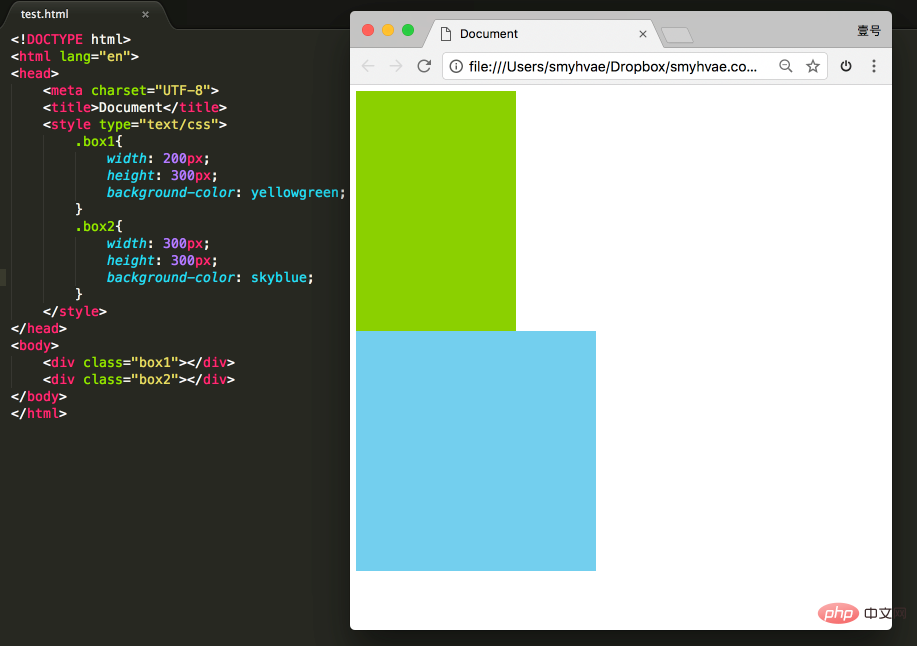
At this time, if you add a floating attribute to these two divs, such as float: left;, the effect As follows:
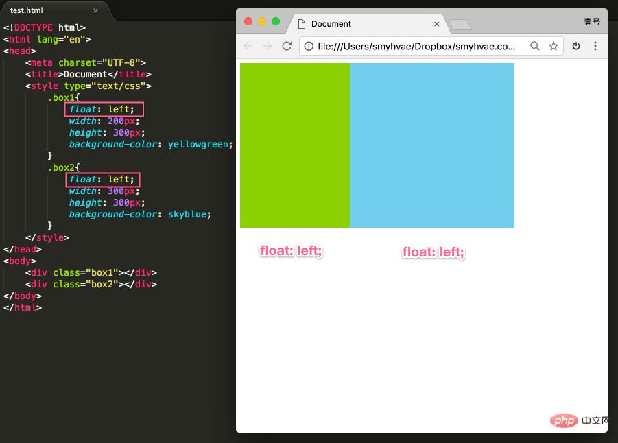
This achieves the floating effect. At this time, the two elements are side by side, and both elements can set the width and height (this cannot be achieved in the standard flow in the previous paragraph).
If you want to learn floating well, you must know three properties. Let’s talk about it next.
Off standard means out of standard flow. Let's look at a few examples.
Proof 1:
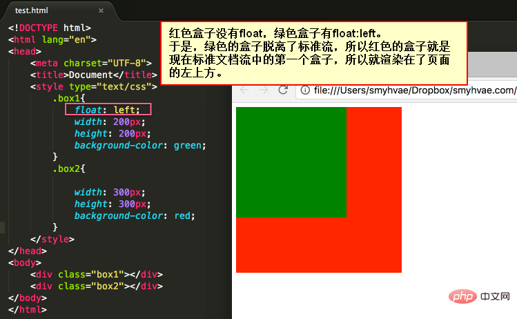
In the picture above, by default, the two div tags are arranged up and down. Now due to the float attribute, the first <div> tag in the above picture appears to be floating, so this tag is arranged on another level. The second <div> is also arranged according to the standard flow on its own level.
Proof 2:
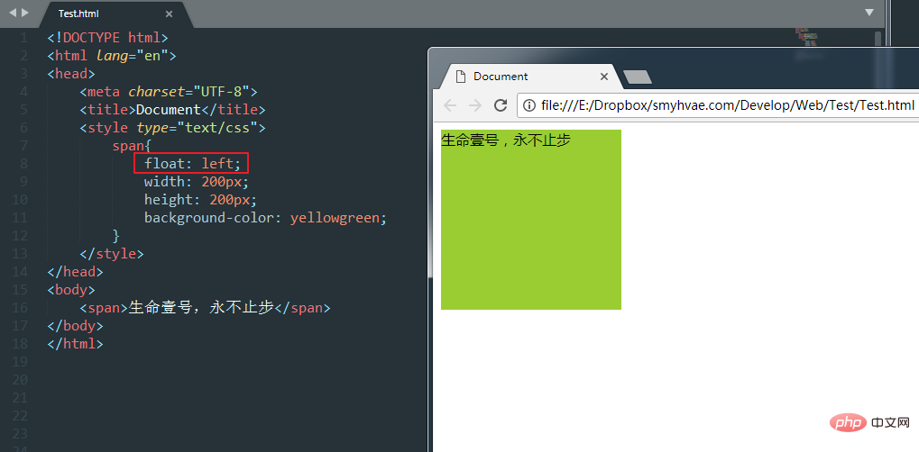
In the above figure, the span tag cannot be set in width and height in the standard flow (because it is an inline element). However, once it is set to float, the width and height can be set even without converting it to a block-level element.
So it can prove one thing: Once an element is floated, it will be able to be side by side, and the width and height can be set. No matter it turns out to be a div or a span. All tags, after floating, no longer distinguish between inline and block levels.
Let’s look at an example to understand.
After setting the float: left; attribute for all three divs, we then set the width and height. When changing the size of the browser window, you can see the snapping effect of the div:
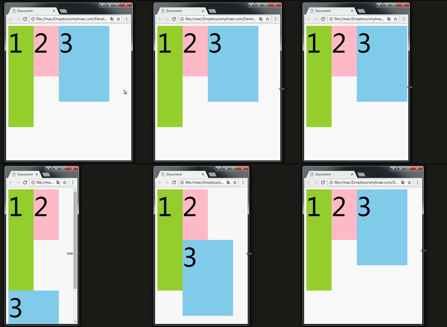
The above picture shows that if there is enough space for No. 3, it will be close to No. 2 . If there is not enough space, it will lean on big brother No. 1.
If there is not enough space to lean against Brother No. 1, No. 3 will stick to the left wall by himself.
But when No. 3 sticks to the wall by himself, please note:
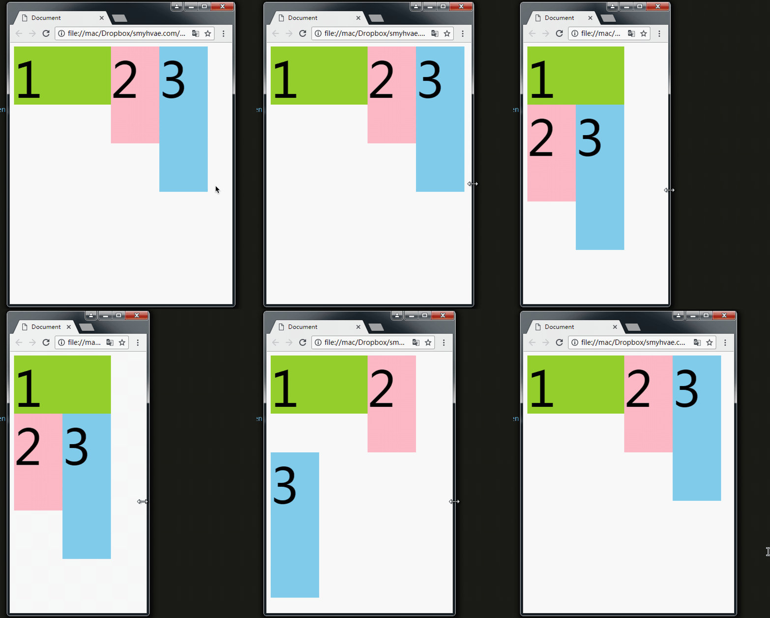
The picture above shows that when No. 3 sticks to the left wall, he will not go to 1 It's crowded inside.
Similarly, float also has an attribute value of right, which is symmetrical to the attribute value of left.
You will understand it if you look at a picture. We let div float and p not float.
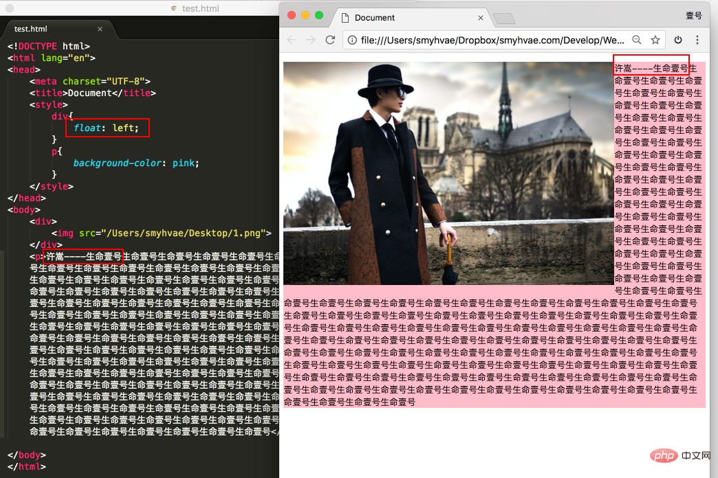
In the above picture, we found that: div blocks p, but does not block the text in p, forming a "word circumference" effect.
Summary: Text in the standard stream will not be obscured by floating boxes. (Words are like water)
Regarding floating, we have to emphasize one point. To avoid confusion, we must follow a principle in the early stage: It is never a thing that floats alone. Floating is all Floating together, floating, everyone floating.
Shrink: A floating element, if width is not set, will automatically shrink to the width of the content (this is very similar to inline elements).
For example:
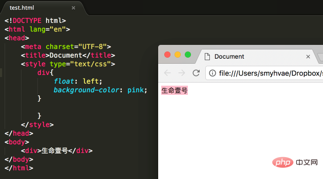
In the above picture, the div itself is a block-level element. If width is not set, it will occupy the entire row alone; however, setting After the div is floated, it will shrink
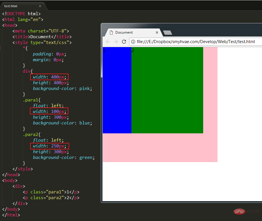
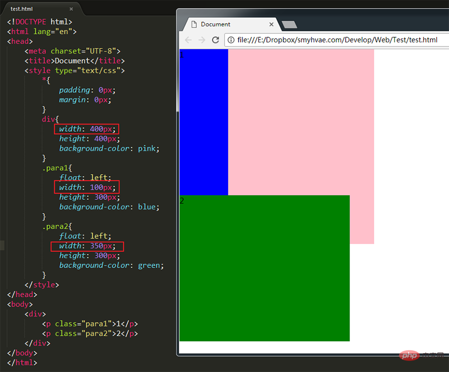
As shown in the picture above, set para1 and para2 to float, They are the children of div. At this time, the width of para1 para2 is smaller than the width of div. The effect is shown in the picture above. But if the width of para1 para2 is set to be greater than the width of div, we will find that para2 falls:
(Learning video sharing: css video tutorial )
The above is the detailed content of How to set float in css. For more information, please follow other related articles on the PHP Chinese website!