html set image transparency
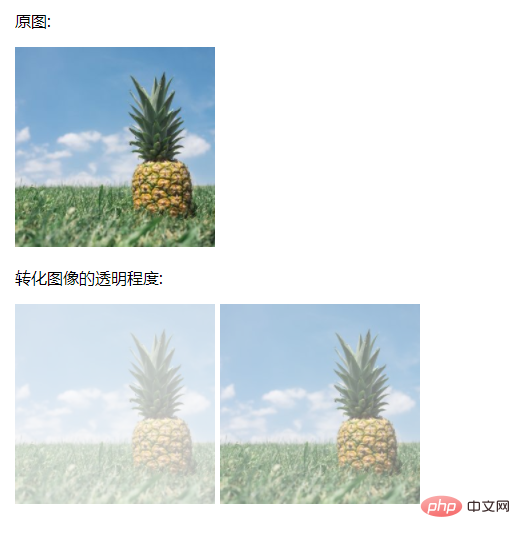
In HTML, you can use the filter attribute to set the image transparency effect. You only need to add the "filter:opacity(%);" style to the image element; the value of the opacity() function is between 0% and 100 %, a value of 0% means it is completely transparent, and a value of 100% means there is no change in the image.

The operating environment of this tutorial: Windows 7 system, CSS3&&HTML5 version, Dell G3 computer.
htmlSet image transparency
<!DOCTYPE html>
<html>
<head>
<style>
#img1 {
    -webkit-filter: opacity(30%); /* Chrome, Safari, Opera */
    filter: opacity(30%);
}
#img2 {
    -webkit-filter: opacity(60%); /* Chrome, Safari, Opera */
    filter: opacity(60%);
}
</style>
</head>
<body>
<p>原图:</p>
<img src="/static/imghw/default1.png"  data-src="pineapple.jpg"  class="lazy"   alt="Pineapple"    style="max-width:90%" >
<p>转化图像的透明程度:</p>
<img src="/static/imghw/default1.png"  data-src="pineapple.jpg"  class="lazy"  id="img1"  alt="Pineapple"    style="max-width:90%">
<img src="/static/imghw/default1.png"  data-src="pineapple.jpg"  class="lazy"  id="img2"  alt="Pineapple"    style="max-width:90%">
</body>
</html>Rendering:

Description:
The filter attribute defines the visual effect (such as blur and saturation) of the element (usually ).
Values or functions that can be used in the filter attribute:
| Filter | Description |
|---|---|
| none | Default value, no effect. |
| blur(px) | Set Gaussian blur to the image. The "radius" value sets the standard deviation of the Gaussian function, or how many pixels are blended together on the screen, so the larger the value, the blurr it is; If no value is set, the default is 0; this parameter can Set css length value, but does not accept percentage value. |
| brightness(%) | Applies a linear multiplication to the image, making it appear brighter or darker. If the value is 0%, the image will be completely black. If the value is 100%, there will be no change in the image. Other values correspond to linear multiplier effects. Values above 100% are okay and the image will be brighter than before. If no value is set, the default is 1. |
| contrast(%) | Adjust the contrast of the image. If the value is 0%, the image will be completely black. The value is 100% and the image is unchanged. Values can exceed 100%, meaning a lower comparison will be used. If no value is set, the default is 1. |
| drop-shadow(h-shadow v-shadow blur spread color) | Sets a shadow effect to the image. Shadows are composited underneath the image and can be blurred, offset versions of the matte that can be painted in a specific color. The function accepts values of type 注意: Webkit, 以及一些其他浏览器 不支持第四个长度,如果加了也不会渲染。 |
| grayscale(%) | 将图像转换为灰度图像。值定义转换的比例。值为100%则完全转为灰度图像,值为0%图像无变化。值在0%到100%之间,则是效果的线性乘子。若未设置,值默认是0; |
| hue-rotate(deg) | 给图像应用色相旋转。"angle"一值设定图像会被调整的色环角度值。值为0deg,则图像无变化。若值未设置,默认值是0deg。该值虽然没有最大值,超过360deg的值相当于又绕一圈。 |
| invert(%) | 反转输入图像。值定义转换的比例。100%的价值是完全反转。值为0%则图像无变化。值在0%和100%之间,则是效果的线性乘子。 若值未设置,值默认是0。 |
| opacity(%) | 转化图像的透明程度。值定义转换的比例。值为0%则是完全透明,值为100%则图像无变化。值在0%和100%之间,则是效果的线性乘子,也相当于图像样本乘以数量。 若值未设置,值默认是1。该函数与已有的opacity属性很相似,不同之处在于通过filter,一些浏览器为了提升性能会提供硬件加速。 |
| saturate(%) | 转换图像饱和度。值定义转换的比例。值为0%则是完全不饱和,值为100%则图像无变化。其他值,则是效果的线性乘子。超过100%的值是允许的,则有更高的饱和度。 若值未设置,值默认是1。 |
| sepia(%) | 将图像转换为深褐色。值定义转换的比例。值为100%则完全是深褐色的,值为0%图像无变化。值在0%到100%之间,则是效果的线性乘子。若未设置,值默认是0; |
| url() | URL函数接受一个XML文件,该文件设置了 一个SVG滤镜,且可以包含一个锚点来指定一个具体的滤镜元素。 例如: filter: url(svg-url#element-id) Copy after login The above is the detailed content of html set image transparency. For more information, please follow other related articles on the PHP Chinese website! Statement of this Website
The content of this article is voluntarily contributed by netizens, and the copyright belongs to the original author. This site does not assume corresponding legal responsibility. If you find any content suspected of plagiarism or infringement, please contact admin@php.cn

Hot AI Tools
Undresser.AI UndressAI-powered app for creating realistic nude photos 
AI Clothes RemoverOnline AI tool for removing clothes from photos. 
Undress AI ToolUndress images for free 
Clothoff.ioAI clothes remover 
AI Hentai GeneratorGenerate AI Hentai for free. 
Hot Article
Assassin's Creed Shadows: Seashell Riddle Solution
3 weeks ago
By DDD
What's New in Windows 11 KB5054979 & How to Fix Update Issues
2 weeks ago
By DDD
Where to find the Crane Control Keycard in Atomfall
3 weeks ago
By DDD
Saving in R.E.P.O. Explained (And Save Files)
1 months ago
By 尊渡假赌尊渡假赌尊渡假赌

Hot Tools
Notepad++7.3.1Easy-to-use and free code editor 
SublimeText3 Chinese versionChinese version, very easy to use 
Zend Studio 13.0.1Powerful PHP integrated development environment 
Dreamweaver CS6Visual web development tools 
SublimeText3 Mac versionGod-level code editing software (SublimeText3) 
Hot Topics
CakePHP Tutorial
 1386
1386
 52
52
 How to use bootstrap in vue
Apr 07, 2025 pm 11:33 PM
Using Bootstrap in Vue.js is divided into five steps: Install Bootstrap. Import Bootstrap in main.js. Use the Bootstrap component directly in the template. Optional: Custom style. Optional: Use plug-ins.  The Roles of HTML, CSS, and JavaScript: Core Responsibilities
Apr 08, 2025 pm 07:05 PM
HTML defines the web structure, CSS is responsible for style and layout, and JavaScript gives dynamic interaction. The three perform their duties in web development and jointly build a colorful website.  How to write split lines on bootstrap
Apr 07, 2025 pm 03:12 PM
There are two ways to create a Bootstrap split line: using the tag, which creates a horizontal split line. Use the CSS border property to create custom style split lines.  Understanding HTML, CSS, and JavaScript: A Beginner's Guide
Apr 12, 2025 am 12:02 AM
WebdevelopmentreliesonHTML,CSS,andJavaScript:1)HTMLstructurescontent,2)CSSstylesit,and3)JavaScriptaddsinteractivity,formingthebasisofmodernwebexperiences.  How to resize bootstrap
Apr 07, 2025 pm 03:18 PM
To adjust the size of elements in Bootstrap, you can use the dimension class, which includes: adjusting width: .col-, .w-, .mw-adjust height: .h-, .min-h-, .max-h-  How to set up the framework for bootstrap
Apr 07, 2025 pm 03:27 PM
To set up the Bootstrap framework, you need to follow these steps: 1. Reference the Bootstrap file via CDN; 2. Download and host the file on your own server; 3. Include the Bootstrap file in HTML; 4. Compile Sass/Less as needed; 5. Import a custom file (optional). Once setup is complete, you can use Bootstrap's grid systems, components, and styles to create responsive websites and applications.  How to insert pictures on bootstrap
Apr 07, 2025 pm 03:30 PM
There are several ways to insert images in Bootstrap: insert images directly, using the HTML img tag. With the Bootstrap image component, you can provide responsive images and more styles. Set the image size, use the img-fluid class to make the image adaptable. Set the border, using the img-bordered class. Set the rounded corners and use the img-rounded class. Set the shadow, use the shadow class. Resize and position the image, using CSS style. Using the background image, use the background-image CSS property.  How to use bootstrap button
Apr 07, 2025 pm 03:09 PM
How to use the Bootstrap button? Introduce Bootstrap CSS to create button elements and add Bootstrap button class to add button text 
|


