

Pure CSS3 to achieve 3D text effect (source code analysis)

This article will take you through the implementation principle of 3D text effects. It does not consider the reusability and portability of the code. It has certain reference value. Friends in need can refer to it. I hope it will be helpful to everyone.

1. Simple effect 1

In order to simplify the operation , we use the same document structure as the previous article "Recommended Pure CSS3 Text Effects". The following effects are quite different, so they will not be listed again.
<div contenteditable="true" class="text effect01">前端开发whqet</div>
In css, let’s start with the global settings, which are still the same as the previous article. However, in order to avoid visual fatigue, we modified the background color and text color.
body{
  background-color: #666;
}
@import url(http://fonts.googleapis.com/css?family=Dosis:500,800);
.text {
    font-family:"微软雅黑", "Dosis", sans-serif;
    font-size: 80px;
    text-align: center;
    font-weight: bold;
    line-height:200px;
    text-transform:uppercase;
    position: relative;
}Then there is the core code of simple effect one
/*简单单纯的效果一*/
.effect01{
    background-color: #7ABCFF;
    color:#FFD300;
    text-shadow:
        0px 0px 0 #b89800,
        1px -1px 0 #b39400,
        2px -2px 0 #ad8f00,
        3px -3px 0 #a88b00,
        4px -4px 0 #a38700,
        5px -5px 0 #9e8300,
        6px -6px 0 #997f00,
        7px -7px 0 #947a00,
        8px -8px 0 #8f7600,
        9px -9px 0 #8a7200,
        10px -10px 0 #856e00,
        11px -11px 0 #806a00,
        12px -12px 0 #7a6500,
        13px -13px 12px rgba(0, 0, 0, 0.55),
        13px -13px 1px rgba(0, 0, 0, 0.5);
}From which we can see that there are three elements to use text-shadow to achieve a three-dimensional effect:
- Set multiple shadows to achieve a sense of depth, the horizontal and vertical offset changes of
- shadows to achieve a sense of direction, and the color gradient of
- shadows to achieve a sense of staggeredness.
Although this implementation method is simple, it is not very portable and has poor reusability. Just imagine, how to modify the three-dimensional characters in different directions? How to implement three-dimensional characters in different colors? What should I do if it’s tedious to achieve different effects word for word? So what if animation is needed?
Next, by gradually improving the "simple" effect one, we will answer these questions one by one.
2. The second effect of saying no to "simple", sass implements 3d text mixin

The children's shoes said, Brother, what about the change? It seems to be no different from the previous one? Please be patient and you will understand after looking at the code.
I wrote a text 3D mixin using sass. Using this mixin, we can easily control the depth, direction and staggeredness of the three-dimensional characters.
/*  对“单纯”说不的效果二,  sass实现的华丽转身  */

/**
* 利用text-shadow实现3d文字效果
*
* $color     立体字的初始颜色
* $dx        立体字水平偏移位置,dx>0,向右偏,建议取值[-2,2]
* $dy        立体字垂直偏移位置,dy>0,向下偏,建议取值[-2,2],dx和dy配合控制立体字的方向
* $steps     立体字的层叠数量
* $darken    立体字的颜色变暗数值,建议取值[0,1],需要结合层叠数量,避免过多的黑色出现
* @copyright 前端开发whqet,http://blog.csdn.net/whqet
*/
@mixin text3d($color: #ffd300, $dx: 1, $dy: -1,$steps:10, $darken:.1) {
  color:$color;
  $color:darken($color,30%);

  $output: '';
  $x:0px;
  $y:0px;
  @for $n from 1 to $steps{
    $output: $output + '#{$x} #{$y} 0 #{$color},';
    $x:$x+$dx;
    $y:$y+$dy;
    $color:darken($color, $darken * ($n+10));
  }
  $output: $output+'#{$x} #{$y} 12px rgba(0,0,0,0.3),#{$x} #{$y} 1px rgba(0,0,0,0.5);';

  text-shadow:unquote($output);
}

.effect02{
    @include text3d(#00d3ff,1,-1,15,.05);
}What does it look like? Let’s study it carefully. Using this mixin implemented in sass, we can easily realize three-dimensional characters and animate them. Please see the third effect.
3. The third effect of "hyperactivity", animation makes the shadow move

With the second effect Mixin, effect three will come naturally.
/*  “多动”效果三, 加上动画 */
.effect03{
  animation:animateShadow 2s linear infinite;
}
@keyframes animateShadow{
  0% {@include text3d(#00d3ff,1,1,15,.05); }
  25% {@include text3d(#00d3ff,-1,-1,15,.05); }
  50% {@include text3d(#00d3ff,1,1,15,.05); }
  75% {@include text3d(#00d3ff,-1.5,1.5,15,.05); }
}4. The fourth effect of showing "personality", lettering.js realizes word-by-word control

lettering. js is a powerful jquery plug-in that can split strings, similar to the code below.
<div contenteditable="true" class="text effect04">前端开发whqet</div>
<!-- 拆分成这样 -->
<div contenteditable="true" class="text effect04">
	<span class="char1">前</span>
	<span class="char2">端</span>
	<span class="char3">开</span>
	<span class="char4">发</span>
	<span class="char5">w</span>
	<span class="char6">h</span>
	<span class="char7">q</span>
	<span class="char8">e</span>
	<span class="char9">t</span>
</div>
We need to import jquery.js and lettering.js into the page, and then we can use it.
<!-- 引入jquery,cdn方式 -->
<script src="//cdnjs.cloudflare.com/ajax/libs/jquery/2.1.1/jquery.min.js"></script>
<!-- 引入lettering,cdn方式 -->
<script src="//cdnjs.cloudflare.com/ajax/libs/lettering.js/0.6.1/jquery.lettering.min.js"></script>
<!-- 使用lettering -->
<script>
	//JS is only used to keep the HTML markup clean
	$(".effect04").lettering();
</script>Then, use sass to achieve personalized control, adjust-hue generates continuous hue colors, and the @for loop implements traversal.
/*   彰显“个性”的效果四,lettering.js实现逐字控制 */
.effect04{
  letter-spacing:.1em;
}
$base:#FFD300;
@for $i from 1 through 9 {
  .effect04 .char#{$i} {
    @include text3d(adjust-hue($base, $i *15deg),-1,1,10,.05)
  }
}5. "Personality" upgrade effect five, rainbow character animation

/*   “个性”升级的效果五,彩虹字 */
@for $i from 1 through 10 {
  .effect05 .char#{$i} {
    animation: rainbow 2s linear infinite;
    animation-delay: 0.1s * $i;
  }
}
$base2:#7E00FF;
@keyframes rainbow {
  @for $i from 0 through 10 {
    #{$i* 10%}  {@include text3d(adjust-hue($base2, $i *36deg), 1, 1, 10,.1); }
  }
}6. text-shadow IE9-’s solution
Of course, unfortunately, text-shadow did not receive relatively complete support until IE10, so what should IE9- do, especially It is in China where XP is a fanatical hobby. Fortunately, IE's built-in filter can achieve the same effect, so there is this text-shadow polyfill. Here we use sass to patch text-shadow.
In this case, for browsers below ie9, our text3d mixin should be modified like this
/**
* 利用text-shadow实现3d文字效果
*
* $color     立体字的初始颜色
* $dx        立体字水平偏移位置,dx>0,向右偏,建议取值[-2,2]
* $dy        立体字垂直偏移位置,dy>0,向下偏,建议取值[-2,2],dx和dy配合控制立体字的方向
* $steps     立体字的层叠数量
* $darken    立体字的颜色变暗数值,建议取值[0,1],需要结合层叠数量,避免过多的黑色出现
* @copyright 前端开发whqet,http://blog.csdn.net/whqet
*/
@mixin text3d($color: #ffd300, $dx: 1, $dy: -1,$steps:10, $darken:.1) {
  color:$color;
  $color:darken($color,30%);

  $output: '';
  $x:0px;
  $y:0px;
  @for $n from 1 to $steps{
    $output: $output + '#{$x} #{$y} 0 #{$color},';
    $x:$x+$dx;
    $y:$y+$dy;
    $color:darken($color, $darken * ($n+10));
  }
  $output: $output+'#{$x} #{$y} 12px rgba(0,0,0,0.3),#{$x} #{$y} 1px rgba(0,0,0,0.5);';

  //for the mordern browser
  //text-shadow:unquote($output);

  //just for ie9-,这里做了修改
  @include jquery-text-shadow(unquote($output));
}Enjoy it.
The effect of the case is still in the codepen:
Online research: http://codepen.io/whqet/pen/eGuqf
For more programming-related knowledge, please visit: Programming Video! !
The above is the detailed content of Pure CSS3 to achieve 3D text effect (source code analysis). For more information, please follow other related articles on the PHP Chinese website!

Hot AI Tools

Undresser.AI Undress
AI-powered app for creating realistic nude photos

AI Clothes Remover
Online AI tool for removing clothes from photos.

Undress AI Tool
Undress images for free

Clothoff.io
AI clothes remover

Video Face Swap
Swap faces in any video effortlessly with our completely free AI face swap tool!

Hot Article
Hot Tools

Notepad++7.3.1
Easy-to-use and free code editor

SublimeText3 Chinese version
Chinese version, very easy to use

Zend Studio 13.0.1
Powerful PHP integrated development environment

Dreamweaver CS6
Visual web development tools

SublimeText3 Mac version
God-level code editing software (SublimeText3)
Hot Topics
 1387
1387
 52
52

 How to achieve wave effect with pure CSS3? (code example)
Jun 28, 2022 pm 01:39 PM
How to achieve wave effect with pure CSS3? (code example)
Jun 28, 2022 pm 01:39 PM
How to achieve wave effect with pure CSS3? This article will introduce to you how to use SVG and CSS animation to create wave effects. I hope it will be helpful to you!
 Why is Gaussian Splatting so popular in autonomous driving that NeRF is starting to be abandoned?
Jan 17, 2024 pm 02:57 PM
Why is Gaussian Splatting so popular in autonomous driving that NeRF is starting to be abandoned?
Jan 17, 2024 pm 02:57 PM
Written above & the author’s personal understanding Three-dimensional Gaussiansplatting (3DGS) is a transformative technology that has emerged in the fields of explicit radiation fields and computer graphics in recent years. This innovative method is characterized by the use of millions of 3D Gaussians, which is very different from the neural radiation field (NeRF) method, which mainly uses an implicit coordinate-based model to map spatial coordinates to pixel values. With its explicit scene representation and differentiable rendering algorithms, 3DGS not only guarantees real-time rendering capabilities, but also introduces an unprecedented level of control and scene editing. This positions 3DGS as a potential game-changer for next-generation 3D reconstruction and representation. To this end, we provide a systematic overview of the latest developments and concerns in the field of 3DGS for the first time.
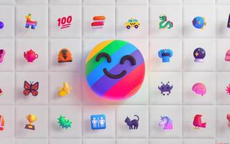 Learn about 3D Fluent emojis in Microsoft Teams
Apr 24, 2023 pm 10:28 PM
Learn about 3D Fluent emojis in Microsoft Teams
Apr 24, 2023 pm 10:28 PM
You must remember, especially if you are a Teams user, that Microsoft added a new batch of 3DFluent emojis to its work-focused video conferencing app. After Microsoft announced 3D emojis for Teams and Windows last year, the process has actually seen more than 1,800 existing emojis updated for the platform. This big idea and the launch of the 3DFluent emoji update for Teams was first promoted via an official blog post. Latest Teams update brings FluentEmojis to the app Microsoft says the updated 1,800 emojis will be available to us every day
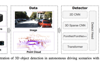 Choose camera or lidar? A recent review on achieving robust 3D object detection
Jan 26, 2024 am 11:18 AM
Choose camera or lidar? A recent review on achieving robust 3D object detection
Jan 26, 2024 am 11:18 AM
0.Written in front&& Personal understanding that autonomous driving systems rely on advanced perception, decision-making and control technologies, by using various sensors (such as cameras, lidar, radar, etc.) to perceive the surrounding environment, and using algorithms and models for real-time analysis and decision-making. This enables vehicles to recognize road signs, detect and track other vehicles, predict pedestrian behavior, etc., thereby safely operating and adapting to complex traffic environments. This technology is currently attracting widespread attention and is considered an important development area in the future of transportation. one. But what makes autonomous driving difficult is figuring out how to make the car understand what's going on around it. This requires that the three-dimensional object detection algorithm in the autonomous driving system can accurately perceive and describe objects in the surrounding environment, including their locations,
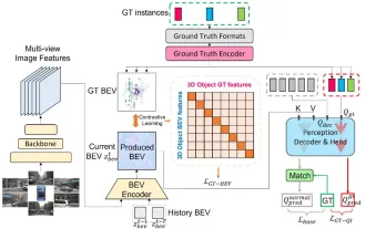 CLIP-BEVFormer: Explicitly supervise the BEVFormer structure to improve long-tail detection performance
Mar 26, 2024 pm 12:41 PM
CLIP-BEVFormer: Explicitly supervise the BEVFormer structure to improve long-tail detection performance
Mar 26, 2024 pm 12:41 PM
Written above & the author’s personal understanding: At present, in the entire autonomous driving system, the perception module plays a vital role. The autonomous vehicle driving on the road can only obtain accurate perception results through the perception module. The downstream regulation and control module in the autonomous driving system makes timely and correct judgments and behavioral decisions. Currently, cars with autonomous driving functions are usually equipped with a variety of data information sensors including surround-view camera sensors, lidar sensors, and millimeter-wave radar sensors to collect information in different modalities to achieve accurate perception tasks. The BEV perception algorithm based on pure vision is favored by the industry because of its low hardware cost and easy deployment, and its output results can be easily applied to various downstream tasks.
 Paint 3D in Windows 11: Download, Installation, and Usage Guide
Apr 26, 2023 am 11:28 AM
Paint 3D in Windows 11: Download, Installation, and Usage Guide
Apr 26, 2023 am 11:28 AM
When the gossip started spreading that the new Windows 11 was in development, every Microsoft user was curious about how the new operating system would look like and what it would bring. After speculation, Windows 11 is here. The operating system comes with new design and functional changes. In addition to some additions, it comes with feature deprecations and removals. One of the features that doesn't exist in Windows 11 is Paint3D. While it still offers classic Paint, which is good for drawers, doodlers, and doodlers, it abandons Paint3D, which offers extra features ideal for 3D creators. If you are looking for some extra features, we recommend Autodesk Maya as the best 3D design software. like
 Get a virtual 3D wife in 30 seconds with a single card! Text to 3D generates a high-precision digital human with clear pore details, seamlessly connecting with Maya, Unity and other production tools
May 23, 2023 pm 02:34 PM
Get a virtual 3D wife in 30 seconds with a single card! Text to 3D generates a high-precision digital human with clear pore details, seamlessly connecting with Maya, Unity and other production tools
May 23, 2023 pm 02:34 PM
ChatGPT has injected a dose of chicken blood into the AI industry, and everything that was once unthinkable has become basic practice today. Text-to-3D, which continues to advance, is regarded as the next hotspot in the AIGC field after Diffusion (images) and GPT (text), and has received unprecedented attention. No, a product called ChatAvatar has been put into low-key public beta, quickly garnering over 700,000 views and attention, and was featured on Spacesoftheweek. △ChatAvatar will also support Imageto3D technology that generates 3D stylized characters from AI-generated single-perspective/multi-perspective original paintings. The 3D model generated by the current beta version has received widespread attention.
 Use CSS skillfully to realize various strange-shaped buttons (with code)
Jul 19, 2022 am 11:28 AM
Use CSS skillfully to realize various strange-shaped buttons (with code)
Jul 19, 2022 am 11:28 AM
This article will show you how to use CSS to easily realize various weird-shaped buttons that appear frequently. I hope it will be helpful to you!
