 Web Front-end
 CSS Tutorial
 A brief discussion on the idea of cleverly using CSS to create wave effects
A brief discussion on the idea of cleverly using CSS to create wave effects
This article will give you an idea of how to skillfully use CSS to create a wave effect. It has certain reference value. Friends in need can refer to it. I hope it will be helpful to everyone.

This article will introduce another wave effect achieved using CSS. The idea is very interesting.
Start with the area of a curved triangle using definite integrals
Before entering the topic, let’s take a look at this. In advanced mathematics, we can use definite integrals to find the area of a triangle. The area of a subfunction curved edge graph.
We can divide the area under the curve into n thin and tall rectangles. When n approaches infinity, the area of all rectangles is equal to the area of the curved edge figure.
Two simple schematic diagrams, the pictures are taken from Why can definite integrals be used to find the area? :

When n infinitely approaches infinity, the area of all rectangles is equal to the area of the curved edge figure:

Using this idea, we can also simulate a curved edge, that is, a wavy line, in CSS through multiple divs.
Step 1. Cut the graphic into multiple parts
First, we can define a parent container with 12 child divs under the parent container:
<div class="g-container">
  <div class="g-item"></div>
  <div class="g-item"></div>
  <div class="g-item"></div>
  <div class="g-item"></div>
  <div class="g-item"></div>
  <div class="g-item"></div>
  <div class="g-item"></div>
  <div class="g-item"></div>
  <div class="g-item"></div>
  <div class="g-item"></div>
  <div class="g-item"></div>
  <div class="g-item"></div>
</div>
Through flex layout, simply lay out and get such a graphic, with each sub-element having the same height:
.g-container {
    width: 200px;
    height: 200px;
    border: 2px solid #fff;
    display: flex;
    align-items: flex-end;
}

.g-item {
    flex-grow: 1;
    height: 60px;
    background-color: #fff;
}The effect is as follows:

Step 2. Let each child element run the height transformation animation with different negative delays
Next, with a simple transformation, we need to make this image move by changing the height of each child element Implementation:
.g-item {
    flex-grow: 1;
    height: 60px;
    background-color: #000;
    animation: heightChange 1s infinite ease-in-out alternate;
}

@keyframes heightChange {
    from {
        height: 60px;
    }
    to {
        height: 90px;
    }
}The effect is as follows:

Next, you only need to set a negative delay of different times for the animation sequence of each child element. , you can get a preliminary wave effect. In order to reduce the workload here, we use SASS to implement:
$count: 12;
$speed: 1s;

.g-item {
    --f: #{$speed / -12};
    flex-grow: 1;
    height: 60px;
    background-color: #000;
    animation: heightChange $speed infinite ease-in-out alternate;
}

@for $i from 0 to $count {
    .g-item:nth-child(#{$i + 1}) {
        animation-delay: calc(var(--f) * #{$i});
    }
}

@keyframes heightChange {
    from {
        height: 60px;
    }
    to {
        height: 90px;
    }
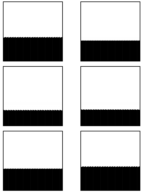
}In this way, we get a preliminary wave effect:

Step 3. Eliminate aliasing
As you can see, there are certain aliases in the above wave animation. What we have to do next is to eliminate these as much as possible. Sawtooth.
Method 1: Increase the number of divs
According to the idea of using definite integrals to find the area of curved edge graphics at the beginning, we only need to increase the number of sub-divs as much as possible, that is However, when the number of divs is infinite, the jagged edges will disappear.
We can try to replace the above 12 sub-divs with 120. It is too laborious to write 120 divs one by one. Here we use the Pug template engine:
div.g-container
 -for(var i=0; i<120; i++)
div.g-itemFor the CSS code, you only need to change the animation delay time. The negative delay of the 120 sub-divs is controlled within 1s:
// 12 -- 120
$count: 120;
$speed: 1s;

.g-item {
    // 注意,只有这里发生了变化
    --f: #{$speed / -120};
    flex-grow: 1;
    height: 60px;
    background-color: #000;
    animation: heightChange $speed infinite ease-in-out alternate;
}

@for $i from 0 to $count {
    .g-item:nth-child(#{$i + 1}) {
        animation-delay: calc(var(--f) * #{$i});
    }
}In this way, we can get a smoother curve:

Method 2: Use transform: skew() to simulate radians
Of course, in actual situations, using so many divs is too much It's a waste, so is there any other way to eliminate aliasing as much as possible when the number of divs is relatively small?
Here, we can try to add different transform: skewY() to the child elements during the motion transformation process to simulate radians.
Let’s transform the code again. We will reduce the number of divs and add an animation effect of transform: skewY() to each sub-div:
div.g-container
 -for(var i=0; i<24; i++)
div.g-itemComplete The CSS code is as follows:
$count: 24;
$speed: 1s;

.g-item {
    // 注意,只有这里发生了变化
    --f: #{$speed / -24};
    flex-grow: 1;
    height: 60px;
    background-color: #000;
    animation:
        heightChange $speed infinite ease-in-out alternate,
        skewChange $speed infinite ease-in-out alternate;
}

@for $i from 0 to $count {
    .g-item:nth-child(#{$i + 1}) {
        animation-delay:
            calc(var(--f) * #{$i}),
            calc(var(--f) * #{$i} - #{$speed / 2});
    }
}

@keyframes heightChange {
    from {
        height: var(--h);
    }
    to {
        height: calc(var(--h) + 30px);
    }
}

@keyframes skewChange {
    from {
        transform: skewY(20deg);
    }
    to {
        transform: skewY(-20deg);
    }
}In order to facilitate understanding, first look at the transformation of the child div with skewY() added when the height transformation animation is consistent:

You can see that each transformation has obvious protruding aliasing. Superimposing the delayed height transformation can effectively eliminate most of the aliasing effect:

At this point, we have another method of anti-aliasing with a moderate number of divs! For the complete code of all the above effects, you can click here:
CodePen -- PureCSS Wave Effects
Mixed use
Finally, we can adjust several variable parameters to combine several different The wave effects are combined together to get some combination effects, which is also very good.
Something like this:

CodePen -- PureCSS Wave Effects 2
Based on this, I think we The LOGO of Sea Group, the parent company of the company (Shopee), looks like this:

Use the solution in this article to implement a dynamic LOGO animation for it:

CodePen Demo -- PureCSS Wave - Sea Group Logo
Disadvantages
This solution The shortcomings are still very obvious:
- First of all, it is useless div, which requires more divs to achieve the effect, and the more divs, the better the effect will be. Of course, if it is increased to a certain level, lag will not be possible. The avoided
- jaggies cannot be completely eliminated. This is the most fatal or affects the place where it can really be useful.
Of course, the purpose of this article is more to explore. Thinking, discuss the advantages and disadvantages of this method, the entire process of realizing animation, and the use of animation negative delay time, all have some reference and learning significance. CSS is still very interesting~
Original address: https://segmentfault.com/a/1190000040017751
Author: chokcoco
More programming For related knowledge, please visit: programming video! !
The above is the detailed content of A brief discussion on the idea of cleverly using CSS to create wave effects. For more information, please follow other related articles on the PHP Chinese website!

Hot AI Tools

Undresser.AI Undress
AI-powered app for creating realistic nude photos

AI Clothes Remover
Online AI tool for removing clothes from photos.

Undress AI Tool
Undress images for free

Clothoff.io
AI clothes remover

AI Hentai Generator
Generate AI Hentai for free.

Hot Article

Hot Tools

Notepad++7.3.1
Easy-to-use and free code editor

SublimeText3 Chinese version
Chinese version, very easy to use

Zend Studio 13.0.1
Powerful PHP integrated development environment

Dreamweaver CS6
Visual web development tools

SublimeText3 Mac version
God-level code editing software (SublimeText3)

Hot Topics
 What does placeholder mean in vue
May 07, 2024 am 09:57 AM
In Vue.js, the placeholder attribute specifies the placeholder text of the input element, which is displayed when the user has not entered content, provides input tips or examples, and improves form accessibility. Its usage is to set the placeholder attribute on the input element and customize the appearance using CSS. Best practices include being relevant to the input, being short and clear, avoiding default text, and considering accessibility.
 What does span mean in js
May 06, 2024 am 11:42 AM
The span tag can add styles, attributes, or behaviors to text. It is used to: add styles, such as color and font size. Set attributes such as id, class, etc. Associated behaviors such as clicks, hovers, etc. Mark text for further processing or citation.
 What does rem mean in js
May 06, 2024 am 11:30 AM
REM in CSS is a relative unit relative to the font size of the root element (html). It has the following characteristics: relative to the root element font size, not affected by the parent element. When the root element's font size changes, elements using REM will adjust accordingly. Can be used with any CSS property. Advantages of using REM include: Responsiveness: Keep text readable on different devices and screen sizes. Consistency: Make sure font sizes are consistent throughout your website. Scalability: Easily change the global font size by adjusting the root element font size.
 How to introduce images into vue
May 02, 2024 pm 10:48 PM
There are five ways to introduce images in Vue: through URL, require function, static file, v-bind directive and CSS background image. Dynamic images can be handled in Vue's computed properties or listeners, and bundled tools can be used to optimize image loading. Make sure the path is correct otherwise a loading error will appear.
 What is node in js
May 07, 2024 pm 09:06 PM
Nodes are entities in the JavaScript DOM that represent HTML elements. They represent a specific element in the page and can be used to access and manipulate that element. Common node types include element nodes, text nodes, comment nodes, and document nodes. Through DOM methods such as getElementById(), you can access nodes and operate on them, including modifying properties, adding/removing child nodes, inserting/replacing nodes, and cloning nodes. Node traversal helps navigate within the DOM structure. Nodes are useful for dynamically creating page content, event handling, animation, and data binding.
 What language is the browser plug-in written in?
May 08, 2024 pm 09:36 PM
Browser plug-ins are usually written in the following languages: Front-end languages: JavaScript, HTML, CSS Back-end languages: C++, Rust, WebAssembly Other languages: Python, Java
 How to set unknown attributes in vscode vscode method to set unknown attributes
May 09, 2024 pm 02:43 PM
1. First, open the settings icon in the lower left corner and click the settings option. 2. Then, find the CSS column in the jumped window. 3. Finally, change the drop-down option in the unknownproperties menu to the error button.
 What do ref and id in vue do?
May 02, 2024 pm 08:42 PM
In Vue.js, ref is used in JavaScript to reference a DOM element (accessible to subcomponents and the DOM element itself), while id is used to set the HTML id attribute (can be used for CSS styling, HTML markup, and JavaScript lookup).


