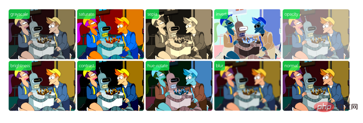
Let's take a look at the magical uses of CSS filters
This article will take you through the magical uses of CSS filter. It has certain reference value. Friends in need can refer to it. I hope it will be helpful to everyone.

Background
Basic concept
CSS filter Properties apply graphical effects such as blur or color shift to elements forming filters, which are often used to adjust the rendering of images, backgrounds, and borders. Its value can be the filter function <filter-function></filter-function> or the svg filter added using url.
filter: <filter-function> [<filter-function>]* | none
filter: url(file.svg#filter-element-id)
<filter-function> can be used for filter and backdrop-filter attributes. Its data type is specified by one of the following filter functions. Each function requires one parameter. If the parameter is invalid, the filter will not take effect. The following is an explanation of the meaning of the filter function:
- ##blur()
: Blur the image - brightness()
: Make the image brighter Brighter or dimmer - contrast()
: Increase or decrease the contrast of the image - drop-shadow()
: Apply a drop shadow behind the image - grayscale()
: Convert the image to grayscale - hue-rotate()
: Change the overall hue of the image - invert()
: Invert the image color - opacity()
: Change the image transparency - saturate()
: Supersaturate or desaturate the input image - sepia()
: Convert the image to sepia
Usage example /* 使用SVG filter */
filter: url("filters.svg#filter-id");
/* 使用filter函数 */
filter: blur(5px);
filter: brightness(0.4);
filter: contrast(200%);
filter: drop-shadow(16px 16px 20px blue);
filter: grayscale(50%);
filter: hue-rotate(90deg);
filter: invert(75%);
filter: opacity(25%);
filter: saturate(30%);
filter: sepia(60%);
/* 多个filter */
filter: contrast(175%) brightness(3%);
/* 不使用filter */
filter: none;
/* 全局变量 */
filter: inherit;
filter: initial;
filter: unset;Copy after login
/* 使用SVG filter */
filter: url("filters.svg#filter-id");
/* 使用filter函数 */
filter: blur(5px);
filter: brightness(0.4);
filter: contrast(200%);
filter: drop-shadow(16px 16px 20px blue);
filter: grayscale(50%);
filter: hue-rotate(90deg);
filter: invert(75%);
filter: opacity(25%);
filter: saturate(30%);
filter: sepia(60%);
/* 多个filter */
filter: contrast(175%) brightness(3%);
/* 不使用filter */
filter: none;
/* 全局变量 */
filter: inherit;
filter: initial;
filter: unset;
More intelligent shadow effects
When adding a shadow to an element, we generally use the
box-shadow attribute, through box-shadow(x offset, y offset, blur size, shadow size, color value, inset)# The syntax form of ## makes it easy to add shadow effects to elements, but box-shadow also has a disadvantage, that is, when adding a shadow effect to a transparent image, it cannot penetrate the element and can only be added to the transparent image element. on the box model. At this time, the drop-shadow method of the filter attribute can solve this problem very well. The shadow added by it can penetrate the element instead of adding it to the box model border of the element. superior. drop-shadow
box-shadow. If the browser supports hardware acceleration, The shadow effect added using filter will be more realistic. drop-shadow
box-shadow except that it does not support setting inset):
filter: drop-shadow(x偏移, y偏移, 模糊大小, 色值);
For example: filter: drop-shadow(1px 1px 15px rgba(0, 0, 0, .5));
box-shadow
andfilter: drop-shadow to add shadows to transparent elements:
<img  class="box-shadow lazy"  src="/static/imghw/default1.png"  data-src="futurama.png"    / alt="Let's take a look at the magical uses of CSS filters" >
<img  class="drop-shadow lazy"  src="/static/imghw/default1.png"  data-src="futurama.png"    / alt="Let's take a look at the magical uses of CSS filters" >
.box-shadow {
  box-shadow: 1px 1px 15px rgba(0, 0, 0, .5);
}
.drop-shadow {
  filter: drop-shadow(1px 1px 15px rgba(0, 0, 0, .5));
} Elements and webpages are grayed out
When major disasters or other mourning days occur, state-owned enterprise and government websites often have all webpages grayed out needs. Or many web pages have a style effect that turns the mouse hover
into a color when hovering over a gray element. At this time, you can use thegrayscale method of the filter attribute. It can adjust the grayscale of the element by setting filter: grayscale(100%) to the page element. Page elements can be grayed out. In the following example, there are h1 and img tags under the body tag, as shown below before adding the filter style.
<body>
  <h1 id="FUTURAMA">FUTURAMA</h1>
  <img  class="img lazy"  src="/static/imghw/default1.png"  data-src="./images/futurama.png"      style="max-width:90%"  / alt="Let's take a look at the magical uses of CSS filters" >
</body>
Now we add a  .gray
.gray
body element,
You can achieve the effect of graying out the entire web page. .gray {
filter: grayscale(100%);
}In order to be compatible with other low-version browsers such as  IE8
IE8
svg filter.
.gray {
-webkit-filter: grayscale(1);
-webkit-filter: grayscale(100%);
-moz-filter: grayscale(100%);
-ms-filter: grayscale(100%);
-o-filter: grayscale(100%);
filter: url("data:image/svg+xml;utf8,<svg xmlns=\'http://www.w3.org/2000/svg\'><filter id=\'grayscale\'><feColorMatrix type=\'matrix\' values=\'0.3333 0.3333 0.3333 0 0 0.3333 0.3333 0.3333 0 0 0.3333 0.3333 0.3333 0 0 0 0 0 1 0\'/></filter></svg>#grayscale");
filter: progid:DXImageTransform.Microsoft.BasicImage(grayscale=1);
filter: grayscale(100%);
}When dealing with urgent needs for graying out web pages, this function often needs to be removed after a period of time online. We can also add the following similar methods when going online for the first time to control the automatic online and offline time of the graying out effect. In this way, it can be removed automatically when the scheduled time is reached, eliminating the need to go through the construction process twice. (function setGray() {
var endTime = Date.parse("Apr 06 2077 00:00:01");
var timestamp = Date.parse(new Date());
if (timestamp <= endTime) {
document.querySelector('html').classList.add('gray');
}
})();元素强调、高亮
brightness 方法实现元素高亮的效果,可以应用到菜单栏、图片列表 hover 效果,来强调鼠标当前悬浮或选中的内容。下面是对一组按钮菜单栏添加 brightness 和 saturate 两个方法,通过改变亮度和饱和度来高亮元素。


.container {
  margin: 40px;
}
.button {
  padding: 0.5em 0.5em;
  background: #E0E0E0;
  border-radius: 3px;
}
.button.dark {
  background: #333;
}
.button:hover:not(.disabled) {
  cursor: pointer;
  border-radius: 3px;
  filter: brightness(110%) saturate(140%);
}
.button.disabled {
  filter: grayscale(100%);
}毛玻璃效果
毛玻璃(Frosted glass)效果,顾名思义就是类似半透明毛玻璃的效果,在 iOS 系统、Windows 10 等系统 UI 中有广泛应用,使用毛玻璃效果可以增强视觉体验。在 《CSS揭秘》 等著作中也有系统讲解,下面是我对分别使用 filter: blur 和 backdrop-filter: blur两种方法实现这种效果的总结。
有两个含有相同类名 glass 的 p 元素,它们分别被添加两个类 glass-by-filter 和 glass-by-backdrop-filter 来区分两种方法。
<div class="glass glass-by-filter"></div>
<div class="glass glass-by-backdrop-filter"></div>
通用样式,设置毛玻璃元素的大小、圆角等基本样式:
.glass {
  height: 300px;
  width: 300px;
  border: 1px groove #EFEFEF;
  border-radius: 12px;
  background: rgba(242, 242, 242, 0.5);
  box-shadow: 0 0.3px 0.7px rgba(0, 0, 0, 0.126),
    0 0.9px 1.7px rgba(0, 0, 0, 0.179), 0 1.8px 3.5px rgba(0, 0, 0, 0.224),
    0 3.7px 7.3px rgba(0, 0, 0, 0.277), 0 10px 20px rgba(0, 0, 0, 0.4);
}filter: blur 方法,给元素添加了一个 ::before 伪类设置 blur 方法并将其置于底层实现毛玻璃效果。
.glass-by-filter {
  z-index: 1;
  box-sizing: border-box;
  position: relative;
}
.glass-by-filter::before {
  content: "";
  position: absolute;
  top: 0; right: 0; bottom: 0; left: 0;
  z-index: -1;
  background: inherit;
  filter: blur(10px);
}backdrop-filter: blur 直接在元素上添加 blur 方法实现毛玻璃效果。
.glass-by-backdrop-filter {
  backdrop-filter: blur(10px);
}实现效果如下图所示(左:filter、右:backdrop-filter):

阅读扩展:毛玻璃边框效果:https://css-tricks.com/blurred-borders-in-css
艺术照!甚至可以实现简易版 insatagram
复古、版画、油画、漫画、液化、老照片、性冷淡、莫兰迪、赛博朋克、旺达幻视风格通通都可以实现!
通过结合使用 filter 的所有方法,可以搭配出任意自己想要的效果。以下是一个简单的 filter 方法调节器,可以调整每个方法的值,同时实时展示图片的滤镜效果。如下图所示。

页面主要代码如下,控制区 #imageEditor 是一个 form 表单,表单每一行分别控制一种filter方法的值,展示区 #imageContainer 内部包含一个 img 元素,产生的 filter 滤镜作用在该元素上。
<form id="imageEditor">
  <p>
    <label for="gs">Grayscale</label>
    <input id="gs" name="gs" type="range" min="0" max="100" value="0">
  </p>
  <p>
    <label for="blur">Blur</label>
    <input id="blur" name="blur" type="range" min="0" max="10" value="0">
  </p>
  <p>
    <label for="br">Exposure</label>
    <input id="br" name="br" type="range" min="0" max="200" value="100">
  </p>
  <p>
    <label for="ct">Contrast</label>
    <input id="ct" name="ct" type="range" min="0" max="200" value="100">
  </p>
  <p>
    <label for="huer">Hue Rotate</label>
    <input id="huer" name="huer" type="range" min="0" max="360" value="0">
  </p>
  <p>
    <label for="opacity">Opacity</label>
    <input id="opacity" name="opacity" type="range" min="0" max="100" value="100">
  </p>
  <p>
    <label for="invert">Invert</label>
    <input id="invert" name="invert" type="range" min="0" max="100" value="0">
  </p>
  <p>
    <label for="saturate">Saturate</label>
    <input id="saturate" name="saturate" type="range" min="0" max="500" value="100">
  </p>
  <p>
    <label for="sepia">Sepia</label>
    <input id="sepia" name="sepia" type="range" min="0" max="100" value="0">
  </p>
  <input type="reset" form="imageEditor" id="reset" value="Reset" />
</form>
<div id="imageContainer" class="center">
  <img  src="/static/imghw/default1.png"  data-src="futurama.png"  class="lazy"   alt="Let's take a look at the magical uses of CSS filters" >
</div>function editImage() {
var gs = $("#gs").val(); // grayscale
var blur = $("#blur").val(); // blur
var br = $("#br").val(); // brightness
var ct = $("#ct").val(); // contrast
var huer = $("#huer").val(); // hue-rotate
var opacity = $("#opacity").val(); // opacity
var invert = $("#invert").val(); // invert
var saturate = $("#saturate").val(); // saturate
var sepia = $("#sepia").val(); // sepia
$("#imageContainer img").css(
"filter", 'grayscale(' + gs+
'%) blur(' + blur +
'px) brightness(' + br +
'%) contrast(' + ct +
'%) hue-rotate(' + huer +
'deg) opacity(' + opacity +
'%) invert(' + invert +
'%) saturate(' + saturate +
'%) sepia(' + sepia + '%)'
);
$("#imageContainer img").css(
"-webkit-filter", 'grayscale(' + gs+
'%) blur(' + blur +
'px) brightness(' + br +
'%) contrast(' + ct +
'%) hue-rotate(' + huer +
'deg) opacity(' + opacity +
'%) invert(' + invert +
'%) saturate(' + saturate +
'%) sepia(' + sepia + '%)'
);
}
// 当input值发生变化时即时应用滤镜
$("input[type=range]").change(editImage).mousemove(editImage);现在只是实现了滤镜的实时预览,后续待实现功能包括支持复杂的 svg 滤镜模版、导出下载等,完成这些步骤,以后照片添加滤镜再也不用下载其他 APP了。实例完整版代码:https://codepen.io/dragonir/pen/abJmqxM
节省空间,提高网页加载速度
实践证明,同一图片减小亮度和对比度及色相饱和度之后的体积与原图相比,可以减小很大一部分体积空间 2M 左右的图片经过弱化后保存,就可以压缩到 1M 左右。在网页中我们可以使用经过 弱化 的图片,然后通过 CSS filter 将其还原。这样就可以达到压缩资源体积,提升网页加载速度、提高用户体验的目的。
具体操作可阅读以下教程:
对比度交换技术:使用
CSS filter提高图像性能https://css-tricks.com/contrast-swap-technique-improved-image-performance-css-filters
兼容性
从 caniuse 查询结果可以看出,css filter 属性在现代浏览器中的支持性已经很好了,除了 IE 浏览器之外,其他浏览器中大多可以正常使用,必要时可添加浏览器内核前缀。但是官网也有以下3个issue 提示,相信后续随着浏览器的升级,这些问题也会被逐步修复:
- In Safari browser, if the child element has animation effect, the filter will not be applied.
- Currently no browser supports the
spread-radiusmethod of thedrop-shadowfilter. - In the
Edgebrowser, if an element or sub-element is set to anegative value z-index, the filter cannot be applied.
Summary
This article simply lists several common page effects using CSS filter, in fact# Each built-in method of ##filter can have infinite possible extension applications, such as invert Inverting color can also be applied to hover effects and adjusting web pagessepia The brown value can achieve eye protection effects, etc. As long as you use your imagination and creativity, filter can be well applied in practice.
- Gloss glass effect https://codepen.io/KazuyoshiGoto/pen/nhstF
- Broken glass effect https://codepen.io/bajjy/pen/vwrKk
- Hover effect achieved using filter https://codepen.io/nxworld/details/ZYNOBZ
- Invert button https://codepen.io/monkey-company/pen/zZZvRp
- Old photos https://codepen.io/dudleystorey/pen/pKoqa
- Advanced version filter editor :https://codepen.io/stoumann/pen/MWeNmyb
Retro Morandi Color Cold Oil Painting Effect# created using the above filter editor. ## Filter pictures. (Wow, this is too wow, CSS Jue Jueziyyds)
Introduction to ProgrammingAuthor: dragonir
For more programming-related knowledge, please visit:
The above is the detailed content of Let's take a look at the magical uses of CSS filters. For more information, please follow other related articles on the PHP Chinese website!

Hot AI Tools

Undresser.AI Undress
AI-powered app for creating realistic nude photos

AI Clothes Remover
Online AI tool for removing clothes from photos.

Undress AI Tool
Undress images for free

Clothoff.io
AI clothes remover

AI Hentai Generator
Generate AI Hentai for free.

Hot Article

Hot Tools

Notepad++7.3.1
Easy-to-use and free code editor

SublimeText3 Chinese version
Chinese version, very easy to use

Zend Studio 13.0.1
Powerful PHP integrated development environment

Dreamweaver CS6
Visual web development tools

SublimeText3 Mac version
God-level code editing software (SublimeText3)

Hot Topics
 1378
1378
 52
52
 An article about memory control in Node
Apr 26, 2023 pm 05:37 PM
The Node service built based on non-blocking and event-driven has the advantage of low memory consumption and is very suitable for handling massive network requests. Under the premise of massive requests, issues related to "memory control" need to be considered. 1. V8’s garbage collection mechanism and memory limitations Js is controlled by the garbage collection machine
 PHP and Vue: a perfect pairing of front-end development tools
Mar 16, 2024 pm 12:09 PM
PHP and Vue: a perfect pairing of front-end development tools. In today's era of rapid development of the Internet, front-end development has become increasingly important. As users have higher and higher requirements for the experience of websites and applications, front-end developers need to use more efficient and flexible tools to create responsive and interactive interfaces. As two important technologies in the field of front-end development, PHP and Vue.js can be regarded as perfect tools when paired together. This article will explore the combination of PHP and Vue, as well as detailed code examples to help readers better understand and apply these two
 Questions frequently asked by front-end interviewers
Mar 19, 2024 pm 02:24 PM
In front-end development interviews, common questions cover a wide range of topics, including HTML/CSS basics, JavaScript basics, frameworks and libraries, project experience, algorithms and data structures, performance optimization, cross-domain requests, front-end engineering, design patterns, and new technologies and trends. . Interviewer questions are designed to assess the candidate's technical skills, project experience, and understanding of industry trends. Therefore, candidates should be fully prepared in these areas to demonstrate their abilities and expertise.
 How to use Go language for front-end development?
Jun 10, 2023 pm 05:00 PM
With the development of Internet technology, front-end development has become increasingly important. Especially the popularity of mobile devices requires front-end development technology that is efficient, stable, safe and easy to maintain. As a rapidly developing programming language, Go language has been used by more and more developers. So, is it feasible to use Go language for front-end development? Next, this article will explain in detail how to use Go language for front-end development. Let’s first take a look at why Go language is used for front-end development. Many people think that Go language is a
 C# development experience sharing: front-end and back-end collaborative development skills
Nov 23, 2023 am 10:13 AM
As a C# developer, our development work usually includes front-end and back-end development. As technology develops and the complexity of projects increases, the collaborative development of front-end and back-end has become more and more important and complex. This article will share some front-end and back-end collaborative development techniques to help C# developers complete development work more efficiently. After determining the interface specifications, collaborative development of the front-end and back-end is inseparable from the interaction of API interfaces. To ensure the smooth progress of front-end and back-end collaborative development, the most important thing is to define good interface specifications. Interface specification involves the name of the interface
 Is Django front-end or back-end? check it out!
Jan 19, 2024 am 08:37 AM
Django is a web application framework written in Python that emphasizes rapid development and clean methods. Although Django is a web framework, to answer the question whether Django is a front-end or a back-end, you need to have a deep understanding of the concepts of front-end and back-end. The front end refers to the interface that users directly interact with, and the back end refers to server-side programs. They interact with data through the HTTP protocol. When the front-end and back-end are separated, the front-end and back-end programs can be developed independently to implement business logic and interactive effects respectively, and data exchange.
 Can golang be used as front-end?
Jun 06, 2023 am 09:19 AM
Golang can be used as a front-end. Golang is a very versatile programming language that can be used to develop different types of applications, including front-end applications. By using Golang to write the front-end, you can get rid of a series of problems caused by languages such as JavaScript. For example, problems such as poor type safety, low performance, and difficult to maintain code.
![How to solve the '[Vue warn]: Failed to resolve filter' error](https://img.php.cn/upload/article/000/887/227/169243040583797.jpg?x-oss-process=image/resize,m_fill,h_207,w_330) How to solve the '[Vue warn]: Failed to resolve filter' error
Aug 19, 2023 pm 03:33 PM
How to solve the '[Vue warn]: Failed to resolve filter' error
Aug 19, 2023 pm 03:33 PM
Methods to solve the "[Vuewarn]:Failedtoresolvefilter" error During the development process using Vue, we sometimes encounter an error message: "[Vuewarn]:Failedtoresolvefilter". This error message usually occurs when we use an undefined filter in the template. This article explains how to resolve this error and gives corresponding code examples. When we are in Vue


