

How to set background radial gradient in html

In HTML, you can use the radial-gradient function to set a radial gradient. You only need to add "background:radial-gradient (starting position, shape, size, color, color, color) to the background attribute of the element. "That's it.

The operating environment of this tutorial: Windows 7 system, CSS3&&HTML5 version, Dell G3 computer.
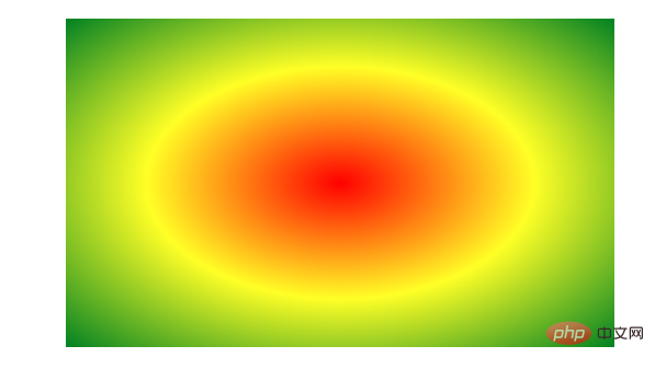
Radial gradient: the transition from one point to the surrounding colors.
The radial gradient is as shown in the figure:
# Syntax: (must add browser prefix)
background: radial-gradient(center, shape, size, start-color, ..., last-color);
center: the starting point of the gradient Position, which can be a percentage. The default is the center of the graphic.
shape: The shape of the gradient, ellipse represents an ellipse, and circle represents a circle. The default is ellipse. If the element shape is a square element, ellipse and circle will be displayed the same.
size: Regarding the size of the radial gradient:
closest-side closest side
farthest-side farthest side
closest-corner closest corner
farthest-corner Farthest corner
The implementation code is as follows:
p{
            width:500px;
            height:300px;
            margin:40px auto;
            background:-webkit-radial-gradient(center,closest-corner,red,yellow,green);
}Extended information:
Linear gradient: from one direction to Color change from one direction to another
Standard mode syntax (without adding browser prefix):
background:linear-gradient(direction,color-stop1,color-stop2)
Note: The default value of direction is to bottom, that is, from top to bottom
stop: The distribution position of the color, the default is uniform distribution (even distribution)
Syntax of compatibility mode (add browser prefix):
background:-webkit-linear-gradient(direction,color-stop1,color-stop2)
Description: The direction value cannot be added to, this value indicates that the color starts to gradient from this direction, contrary to the above
stop: the distribution position of the color, the default is uniform distribution (average distribution)
Gradient direction: the previous implementation of up and down or left and right Gradient, next we will introduce the diagonal gradient
1. to left \ to right \ to top (gradient up and down or left and right)
2. to left top \ to right bottom (diagonal Line gradient)
3. Changes in gradient line angle
For example: Standard mode: 40deg 40 degrees
Compatible mode: 90 - 40deg
Linear gradient : Color distribution (color area size):
linear-gradient (direction, color 1 20%, color 2 30%, color 3)
to 20%, this position is still color 1 After 20%, start the gradient to color 2
The code is as follows:
div{
            width:500px;
            height:300px;
            margin:100px auto;
            background-image: -webkit-linear-gradient(left, red, yellow);
}Recommended learning:html video tutorial
The above is the detailed content of How to set background radial gradient in html. For more information, please follow other related articles on the PHP Chinese website!

Hot AI Tools

Undresser.AI Undress
AI-powered app for creating realistic nude photos

AI Clothes Remover
Online AI tool for removing clothes from photos.

Undress AI Tool
Undress images for free

Clothoff.io
AI clothes remover

Video Face Swap
Swap faces in any video effortlessly with our completely free AI face swap tool!

Hot Article
Hot Tools

Notepad++7.3.1
Easy-to-use and free code editor

SublimeText3 Chinese version
Chinese version, very easy to use

Zend Studio 13.0.1
Powerful PHP integrated development environment

Dreamweaver CS6
Visual web development tools

SublimeText3 Mac version
God-level code editing software (SublimeText3)
Hot Topics
 1389
1389
 52
52

 Table Border in HTML
Sep 04, 2024 pm 04:49 PM
Table Border in HTML
Sep 04, 2024 pm 04:49 PM
Guide to Table Border in HTML. Here we discuss multiple ways for defining table-border with examples of the Table Border in HTML.
 HTML margin-left
Sep 04, 2024 pm 04:48 PM
HTML margin-left
Sep 04, 2024 pm 04:48 PM
Guide to HTML margin-left. Here we discuss a brief overview on HTML margin-left and its Examples along with its Code Implementation.
 Nested Table in HTML
Sep 04, 2024 pm 04:49 PM
Nested Table in HTML
Sep 04, 2024 pm 04:49 PM
This is a guide to Nested Table in HTML. Here we discuss how to create a table within the table along with the respective examples.
 HTML Table Layout
Sep 04, 2024 pm 04:54 PM
HTML Table Layout
Sep 04, 2024 pm 04:54 PM
Guide to HTML Table Layout. Here we discuss the Values of HTML Table Layout along with the examples and outputs n detail.
 HTML Input Placeholder
Sep 04, 2024 pm 04:54 PM
HTML Input Placeholder
Sep 04, 2024 pm 04:54 PM
Guide to HTML Input Placeholder. Here we discuss the Examples of HTML Input Placeholder along with the codes and outputs.
 Moving Text in HTML
Sep 04, 2024 pm 04:45 PM
Moving Text in HTML
Sep 04, 2024 pm 04:45 PM
Guide to Moving Text in HTML. Here we discuss an introduction, how marquee tag work with syntax and examples to implement.
 HTML Ordered List
Sep 04, 2024 pm 04:43 PM
HTML Ordered List
Sep 04, 2024 pm 04:43 PM
Guide to the HTML Ordered List. Here we also discuss introduction of HTML Ordered list and types along with their example respectively
 HTML onclick Button
Sep 04, 2024 pm 04:49 PM
HTML onclick Button
Sep 04, 2024 pm 04:49 PM
Guide to HTML onclick Button. Here we discuss their introduction, working, examples and onclick Event in various events respectively.
