Before implementing, let’s get familiar with the css box model
Then create an ordinary application
<p></p>
.triangle {
    width: 100px;
    height: 100px;
    border-top: 10px solid #000;
    border-right: 10px solid #ff0000;
    border-left: 10px solid #00ff00;
    border-bottom: 10px solid #0000ff;
}Effect: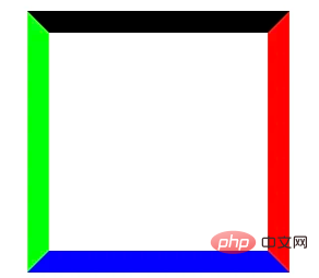
At this time, you need to pay attention to the intersection of the four borders, which will be used later. Then remove the width and height of the content. In order to facilitate observation, set the four borders larger. The effect is as follows:
.triangle {
    width: 0;
    height: 0;
    border-top: 100px solid #000;
    border-right: 100px solid #ff0000;
    border-left: 100px solid #00ff00;
    border-bottom: 100px solid #0000ff;
}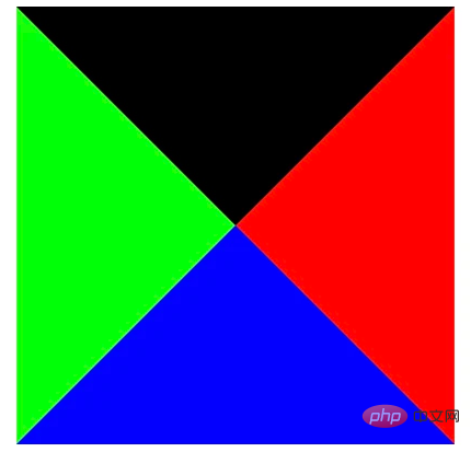
Now do you feel that the triangle is a bit rudimentary? Yes, there are four directions. If you want to set the color of the other directions to be transparent, try a downward triangle first:
.triangle {
    width: 0;
    height: 0;
    border-top: 100px solid #000;
    border-right: 100px solid transparent;
    border-left: 100px solid transparent;
    border-bottom: 100px solid transparent;
}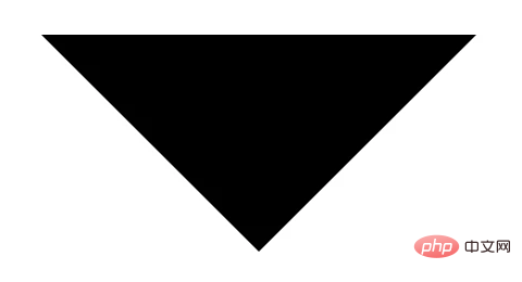
It seems This is the method. Of course, the bottom border is not used at the moment, and it will also increase the total height, so it can be removed directly. Can we understand it this way, leaving the color wherever the bottom is?
The next question is the width and height of this triangle. If you look carefully, the width of this triangle is exactly the sum of the left and right borders, which is 200px, and its height is of course the width of the top border, which is 100px. . [Recommended study: "css video tutorial"]
By analogy, if the design draft is an upward triangle with a length of 50px and a height of 60px, then it should be written like this:
.triangle {
    width: 0;
    height: 0;
    border-top: 60px solid #000;
    border-right: 25px solid transparent;
    border-left: 25px solid transparent;
}
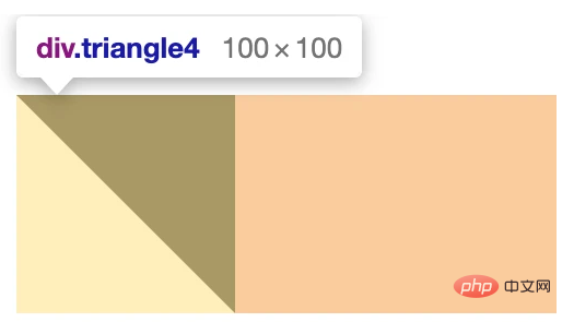
You can also realize a right triangle:
.triangle {
    width: 0;
    height: 0;
    border-top: 100px solid #000;
    border-left: 100px solid transparent;
}
.triangle {
    width: 0;
    height: 0;
    border-top: 60px solid #000;
    border-right: 50px solid transparent;
}
Summary:
Ordinary triangle: Whichever direction the base is, set the color value in that direction. The opposite side is directly removed, and then its left and right (up and down) The sum of the widths of the two sides is the length of the base of the triangle, and its own width is the height of the triangle.Right-angled triangle: You only need two borders. You can fill it into a square row first, and then leave the bottom edge with a color value. Leave the side where the supplementary triangle is.


