
In HTML, floating means that the element can move to the left or right until its outer margin touches the inner margin of its parent or the outer margin of the previous element. You only need to set the "float:left|right|none|inherit" style is enough.
The operating environment of this tutorial: Windows 7 system, CSS3&&HTML5 version, Dell G3 computer.
1. What is float?
Floating allows the element to move left or right until its margins touch the padding of its parent or the margins of the previous element (here refers to the previous element regardless of whether it has If float is not set, it will be next to the previous element)
2. Float (float) syntax:
float: left or right or none or inherit
left: let The element floats to the left
right: Let the element float to the right
none: Let the element not float
inherit: Let the element inherit the floating attribute from the parent
3. Floating characteristics
1.Support all css styles
2.Content expands width and height
3.If multiple elements are set to float, they will be arranged in one row Arrangement
4. Break away from the document flow
5. Raise the level by half a level
In other words: after an element is set with a floating attribute, the next element will ignore this element exists, but the text content in the next element will still make way for this element so that its own text content surrounds the floated element.
Note: No matter what attribute the element is, if float is set attribute, the element becomes an element with the inline-block attribute
4. Specific manifestations of floating
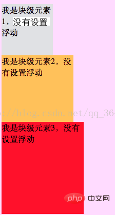
1. If the three elements are block elements, before floating is not set
html style:
<div class="class1">我是块级元素1,没有设置浮动</div>
<div class="class2">我是块级元素2,没有设置浮动</div>
<div class="class3">我是块级元素3,没有设置浮动</div>
css style is:
.class1{width:100px;height:100px;background:palegreen;}
.class2{width:120px;height:130px;background:gold;}
.class3{width:160px;height:180px;background:red;}The result displayed by the browser is:
If you give the An element is set to float to the left:
<div class="class1">我是块级元素1,设置向左浮动</div>
<div class="class2">我是块级元素2,没有设置浮动</div>
<div class="class3">我是块级元素3,没有设置浮动</div>
css style is:
.class1{width:100px; height:100px;background:palegreen;float:left;}
.class2{width:120px; height:130px;background:gold;}
.class3{width:160px; height:180px;background:red;}The result displayed by the browser is:
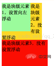
Conclusion:
1) Elements that are not floated will fill the space left by the floating elements
2) Floating elements will overlap with non-floating elements, and floating elements will be at the top of the layer
3) When floating, the element will break away from the document flow, and subsequent elements will ignore this element, but will still make room for this floating element, and the text content in the element will wrap around it
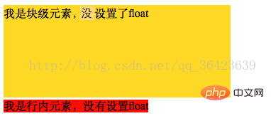
2. If there is a block-level element and an inline element (or an inline block-level element)
<divclass="a">我是块级元素,没有设置float</div>
<span class="b">我是行内元素,没有设置float</span>
css style is:
.a{width:320px;height:230px;background:gold;}
.b{background:red;}The result displayed by the browser is:
If the first element is set to float to the left:
<div class="a">我是块级元素,且设置了float</div>
<span class="b">我是行内元素,没有设置float</span>
css style is:
.a{width:320px; height:230px; background:gold;float:left;}
.b{background:red;}The result displayed by the browser is:

Conclusion;
The following element will follow the previous element, and the following element will decide whether it needs to wrap according to the characteristics of its own element
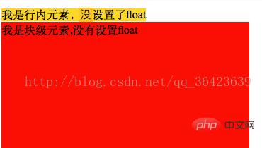
3. If the previous element is an inline element and the following one is a block-level element
<span class="c">我是行内元素,没有设置float</span>
<div class="d">我是块级元素,没有设置float</div>
css style is:
.c{width:320px;height:230px;background:gold;}
.d{width:350px;height:280px;background:red;}The result displayed by the browser is:
If the first element is set to float
<span class="c">我是行内元素,并且设置float</span>
<div class="d">我是块级元素,没有设置float</div>
css style is:
.c{width:320px; height:230px; background:gold;float:left;}
.d{width:350px; height:280px;background:red;}The result displayed by the browser is:
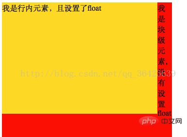
Summary:
1) The inline element is set to float, and the element becomes an introverted block-level label, and the width and height can be set
2) Detached Document flow, the original space is occupied by elements that are not floated at the back
4. If both are inline tags
<span class="e">我是行内元素,没有设置float</span>
<span class="f">我是行内元素,没有设置float</span>
css style:
.e{width:320px;height:230px;background:gold;}
.f{width:350px;height:280px;background:red;}Browser display The result is:

If float is set for the first one:
<span class="e">我是行内元素,且设置了float</span>
<span class="f">我是行内元素,没有设置float</span>
css style:
.e{width:320px; height:230px; background:gold;float:left;}
.f{width:350px; height:280px;background:red;}The result displayed by the browser For:

Summary:
The following elements will follow the previous elements, and the following elements will decide whether they are needed based on the characteristics of their own elements. Line break
1) The floating element will not overflow the parent’s containing block in its floating direction
That is to say, the element floats left, and its The left outer margin will not exceed the left inner margin of the parent. If the element is floated to the right, its right outer margin will not exceed the right inner margin of the parent.
2) The position of the floating element is affected by the same-level floating in the same direction. Effect of Elements
也就是说同一父级中有多个浮动元素,后一个元素的位置会受到前一个浮动元素位置的影响,他们不会相互遮挡,后一个浮动元素会紧挨着前一个浮动元素的左外边距进行定位,如果当前空间不足,则会换行,否则会放置在前一个浮动元素的下面
<div id="wrap2">

   <div class="class1"></div>

   <div class="class2"></div>

   <div class="class3"></div>

   <div class="class4"></div>

</div>
css样式
#wrap2{width:550px;height:600px;border:3pxsolid red;}
.class1{width:200px;height:400px;background: blue;float:left;}
.class2{width:200px;height:200px;background: yellow;float:left;}
.class3{width:200px;height:200px;background: fuchsia;float:left;}
.class4{width:200px;height:200px;background: chartreuse;float:left;}3)浮动元素不会与不同方向的浮动元素相重叠
4)如果父级中的浮动元素的高度大于父级的高度,则该浮动元素会溢出该父级元素
<p id="wrap3">
   <p class="class5"></p>
   <p class="class6"></p>
   <p class="class7"></p>
   <p class="class8"></p>
</p>
css样式
#wrap3{width:350px;height:600px;border:3pxsolid red;}
.class5{width:200px;height:200px;background: blue;float:left;}
.class6{width:200px;height:200px;background: yellow;float:right;}
.class7{width:200px;height:200px;background: fuchsia;float:left;}
.class8{width:200px;height:200px;background: chartreuse;float:right;}推荐学习:html视频教程
The above is the detailed content of What is float in html. For more information, please follow other related articles on the PHP Chinese website!