CSS container queries you may not know! !

In front-end development, it is often necessary to design according to different screen sizes to achieve PC and mobile responsiveness. We generally use CSS media queries to detect the viewport width or height and then change the design based on that pattern. This is how web layouts have been designed for the past 10 years.
CSS Container Query, a feature that has long been requested by web developers, will soon appear in CSS. In the latest Chrome Canary, we can use chrome ://flags/#enable-container-queries Enables the Container Queries function. In this article, I’ll cover what it is, how it will change your workflow as a designer, and more.
Current responsive design status
Currently, we implement responsiveness, which generally requires three styles of UI design, namely mobile, tablet and desktop.
In the picture above, the UI is designed in three versions, so developers can implement it very well, which is very nice (this is only for fear of lazy UI) PC version, this is a pain in the ass).
Now let's take a look at using media queries to see how to implement it.

The picture above is the same component, which has three variants, namely default, Card and Featured. In CSS, developers need to create three variations of this component, where each composition is unique.
.c-media {
  /* the default styles */
  display: flex;
  flex-wrap: wrap;
  gap: 1rem;
}

@media (min-with: 400px) {
  .c-media--card {
    display: block;
  }

  .c-media--card img {
    margin-bottom: 1rem;
  }
}

@media (min-with: 1300px) {
  .c-media--featured {
    position: relative;
    /* other styles */
  }

  .c-media--featured .c-media__content {
    position: absolute;
    left: 0;
    top: 0;
    width: 100%;
    height: 100%;
  }
}The above variations depend on media queries or viewport width. This means, we cannot control them based on their parent width. Now you may be thinking, what’s the problem here? Oh or, that's a great question.
The problem is that developers only use variants of components when the viewport width is larger than a certain value. For example, if I use the featured aka PC style in tablet, it doesn't work, why? Because its media query width is greater than 1300px.

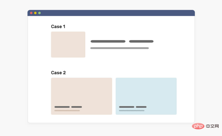
Not only that, we also face a problem when the content is lower than expected. Sometimes, the UP owner may only add one article, but the design is to include three of them. In this case, either we will have an empty space or the project will expand to fill the available space. Consider the following image:

# In the first case (Case 1), the article is too wide, causing the cover to become deformed. The same problem occurs in the second case (Case 2). If you use container queries, we can solve these problems by querying the parent component to decide how to display a specific component. Consider the following diagram, which shows how we can use container queries to fix this problem.
 In this case, what if we turn our thoughts to the parent component of the component? In other words, if we query the parent component and determine the component based on the width or height of the parent component What should it look like? Let's take a look at the concept of
.
What is a container queryFirst, let me define the container. It contains an element of another element, generally we call it
wrapper. In the latest Chrome Canary, we can enable the Container Queries function through chrome://flags/#enable-container-queries.
When a component is placed in an item, it is included in the item. This means that we can query the width of the parent element and modify it accordingly. Consider the following image
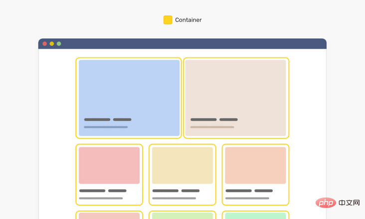 #Note that each card has a yellow outline that represents the parent component of each component. Using CSS container queries, we can modify a component based on its parent component's width.
<div class="o-grid">
  <div class="o-grid__item">
    <article class="c-media"></article>
  </div>
  <!-- + more items -->
</div>The component is an item with class
.c-media, and its parent is the .o-grid__item element. In CSS, we can do the following: <div class="code" style="position:relative; padding:0px; margin:0px;"><pre class='brush:php;toolbar:false;'>.o-grid__item {
contain: layout inline-size style;
}
.c-media {
/* Default style */
}
@container (min-width: 320px) {
.c-media {
/* The styles */
}
}
@container (min-width: 450px) {
.c-media {
/* The styles */
}
}</pre><div class="contentsignin">Copy after login</div></div>First, we tell the browser that every element with an item of class
is a container. Then, you tell the browser that if the parent element's width is equal to or greater than 500px, it should display differently. The same is true for the 700px query. This is how CSS container queries work. Additionally, we can define them wherever we want, which means we can query on the top-level container if needed. Now that you have understood the basic idea of CSS container query, take a look at the picture below to deepen the image.
On the left, this is a viewport being resized. On the right, a component that changes based on the parent component's width. This is the function and use of container queries.
Design with container queries in mind
As a UI, you need to adapt to this revolutionary CSS feature because it will change the way we design for the web. We not only design for the screen size, but also consider how the component should adapt when the width of the container changes.
Nowadays, design systems are becoming more and more popular. The design team will build a set of rules and components so that other members can build the page based on them. With the arrival of CSS container queries, we will also design how a component should adjust based on the width of its parent component.
Consider the following design:
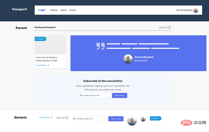
Please note that we have a title, article sections, quotes, and a newsletter. Each of them should fit within the width of the parent view.
I can divide these components into the following parts
- Viewport (media query)
- Parent (container query)
- General: No Affected components such as buttons, labels, paragraphs.
For the sample UI, here is how we divide the components.

When we think with this mindset when designing a UI, we can start thinking about different variations of components that depend on their parent width.
In the image below, notice how each variation of the post component starts with a specific width.
As a designer, it might be a little strange to think about parent width at first, but this is the way forward. We provide front-end developers with details and versions of each component that they can use.
Not only that, we may also have a variant of the component that should only be displayed in a specific context. For example, the event list page. In this case, it is important to know where to use this variant.
The question is, how to tell the designer where these components should be used.
Communicate with developers
Good communication is an important factor in project success. As a designer, we should provide guidance on where component variations should be used. It can be a complete page design or a simple diagram showing how to use each component.

Note how I mapped each variant to a specific context rather than a viewport. To further demonstrate this, let’s look at how our components behave differently when used with CSS Grid.
In a CSS grid, we can tell the browser that we want columns to expand if the number of columns is lower than expected by using the auto-fit keyword (you can read more about this here). This feature is very powerful as it helps us present different variations on the same background.

It is very useful to have a component react to the width of its parent. As you just saw, we're revisiting the desktop-sized page and have different sections, each with a different number of columns.
Avoid complexity when designing responsive components
It’s important to remember that the internal parts of a component are just like a Lego game. We can sort them based on current changes, but everything has a limit. Sometimes, a front-end developer is better off working on an entirely new component rather than using container queries to create variations.
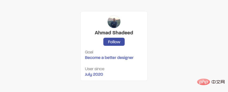
Consider the following.

It has the following content:
- Avatar
- Name
- Button
- Key/Value Pairs
If the internal parts remain the same, or at least don't contain new parts, we can change the component and have multiple variations as shown below.

CSS Container Query Use Cases
Let’s explore some use cases that can be implemented using CSS Container Query.
Chat list
I see this pattern on Facebook messenger. Chat list changes based on viewport width. We can achieve this using CSS container queries.

When there is enough space, the list will expand and display the name of each user. The parent element of the chat list can be a dynamically resized element (for example: using CSS viewport units, or CSS comparison functions).
// HTML
<div class="content">
  <aside>
    <ul>
      <li>
        <img src="/static/imghw/default1.png"  data-src="shadeed.jpg"  class="lazy"   alt="Ahmad Shadeed" />
        <span class="name">Ahmad Shadeed</span>
      </li>
    </ul>
  </aside>
  <main>
    <h2 id="Main-nbsp-content">Main content</h2>
  </main>
</div>// CSS
.content {
display: grid;
grid-template-columns: 0.4fr 1fr;
}
aside {
contain: layout inline-size style;
}
@container (min-width: 180px) {
.name {
display: block;
}
}aside 宽度是0.4f,所以它是动态宽度。另外,我添加了contain属性。然后,如果容器宽度大于180px,将显示用户名。
另一个类似的用例是侧导航。我们可以切换导航项标签的位置,从在新行或旁边的图标。
当容器很小时,导航项标签是如何从一个新行切换的,当有足够的空间时,导航项标签是如何靠近导航图标的。
示例地址:https://codepen.io/shadeed/pen/Popmryw?editors=0100
英文原文地址:https://ishadee.com/article/contner-queries-for-designers/
作者:AAhmad Shadeed
更多编程相关知识,请访问:编程视频!!
The above is the detailed content of CSS container queries you may not know! !. For more information, please follow other related articles on the PHP Chinese website!

Hot AI Tools

Undresser.AI Undress
AI-powered app for creating realistic nude photos

AI Clothes Remover
Online AI tool for removing clothes from photos.

Undress AI Tool
Undress images for free

Clothoff.io
AI clothes remover

Video Face Swap
Swap faces in any video effortlessly with our completely free AI face swap tool!

Hot Article

Hot Tools

Notepad++7.3.1
Easy-to-use and free code editor

SublimeText3 Chinese version
Chinese version, very easy to use

Zend Studio 13.0.1
Powerful PHP integrated development environment

Dreamweaver CS6
Visual web development tools

SublimeText3 Mac version
God-level code editing software (SublimeText3)

Hot Topics
 1386
1386
 52
52
 How to use bootstrap in vue
Apr 07, 2025 pm 11:33 PM
Using Bootstrap in Vue.js is divided into five steps: Install Bootstrap. Import Bootstrap in main.js. Use the Bootstrap component directly in the template. Optional: Custom style. Optional: Use plug-ins.
 The Roles of HTML, CSS, and JavaScript: Core Responsibilities
Apr 08, 2025 pm 07:05 PM
HTML defines the web structure, CSS is responsible for style and layout, and JavaScript gives dynamic interaction. The three perform their duties in web development and jointly build a colorful website.
 How to write split lines on bootstrap
Apr 07, 2025 pm 03:12 PM
There are two ways to create a Bootstrap split line: using the tag, which creates a horizontal split line. Use the CSS border property to create custom style split lines.
 Understanding HTML, CSS, and JavaScript: A Beginner's Guide
Apr 12, 2025 am 12:02 AM
WebdevelopmentreliesonHTML,CSS,andJavaScript:1)HTMLstructurescontent,2)CSSstylesit,and3)JavaScriptaddsinteractivity,formingthebasisofmodernwebexperiences.
 How to set up the framework for bootstrap
Apr 07, 2025 pm 03:27 PM
To set up the Bootstrap framework, you need to follow these steps: 1. Reference the Bootstrap file via CDN; 2. Download and host the file on your own server; 3. Include the Bootstrap file in HTML; 4. Compile Sass/Less as needed; 5. Import a custom file (optional). Once setup is complete, you can use Bootstrap's grid systems, components, and styles to create responsive websites and applications.
 How to insert pictures on bootstrap
Apr 07, 2025 pm 03:30 PM
There are several ways to insert images in Bootstrap: insert images directly, using the HTML img tag. With the Bootstrap image component, you can provide responsive images and more styles. Set the image size, use the img-fluid class to make the image adaptable. Set the border, using the img-bordered class. Set the rounded corners and use the img-rounded class. Set the shadow, use the shadow class. Resize and position the image, using CSS style. Using the background image, use the background-image CSS property.
 How to resize bootstrap
Apr 07, 2025 pm 03:18 PM
To adjust the size of elements in Bootstrap, you can use the dimension class, which includes: adjusting width: .col-, .w-, .mw-adjust height: .h-, .min-h-, .max-h-
 How to use bootstrap button
Apr 07, 2025 pm 03:09 PM
How to use the Bootstrap button? Introduce Bootstrap CSS to create button elements and add Bootstrap button class to add button text


