
 Web Front-end
Bootstrap Tutorial
A brief discussion on the solution to the problem of chart display when switching tabs in Bootstrap Tab
Web Front-end
Bootstrap Tutorial
A brief discussion on the solution to the problem of chart display when switching tabs in Bootstrap Tab
A brief discussion on the solution to the problem of chart display when switching tabs in Bootstrap Tab

This article will introduce to you how to solve the problem of tab switching chart display during Bootstrap development. It has certain reference value. Friends in need can refer to it. I hope it will be helpful to everyone.

When making responsive pages, it is often necessary to consider the interface compatibility of devices of more sizes. Generally, pixels cannot be hard-coded so that the interface elements can be adjusted according to the size of the device. Different dynamic adjustments are made, but sometimes we still encounter some problems. For example, the first page of the Tab tab is displayed normally, but the displayed content is not dynamically adjusted when switching other pages. This essay introduces how to solve the problem of chart display when switching the Tab tab page. , and the chart control can realize dynamic changes and resizing of the window. [Related recommendations: "bootstrap Tutorial"]
1. Conventional chart processing
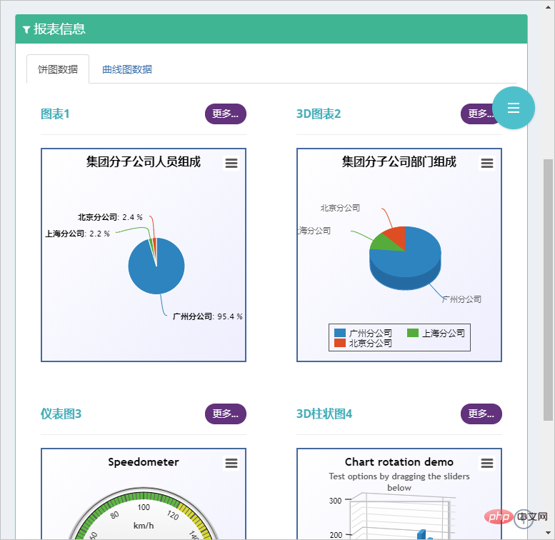
For example, there are two Tab tabs in the following interface, as follows As shown, the first tab page displays normally.
Part of the interface code is as follows
<div class="portlet-body">
    <div class="tab-char" id="lineContainer1" style="height:300px;max-width:500px;"></div>
</div>If we view the size of the simulated device based on IPhone, we will find that the picture has not been effectively processed Zoom is displayed in the correct way, that is, when switching tabs, the size of the chart on the second tab page cannot be scaled correctly.
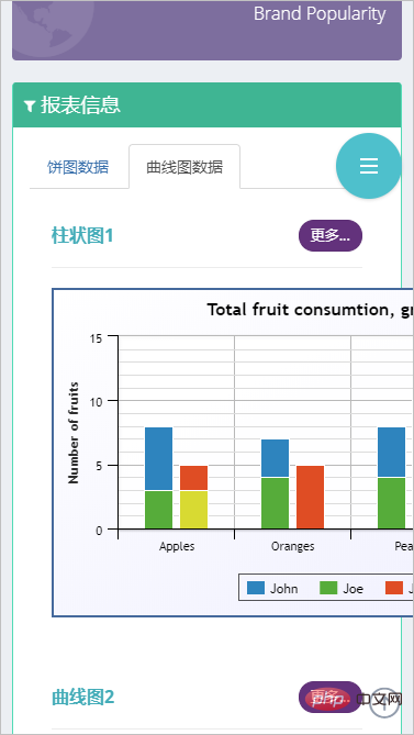
Then if we want to achieve the correct effect when the tab is switched, then we need to track the tab switching event for processing.
I searched for solutions on the Internet, and one of the essays on "Solving the Problem of Not Displaying the Echarts When Switching the Bootstrap Tab Page (Tab) Plug-in" introduces a very good idea.
However, I made some mergers and transformations, and actually achieved several key points he mentioned, but it was more simplified:
1. Bootstrap implements responsive layout
2. Highcharts realizes self-adaptation
3. Tab switching and zooming are displayed normally
I am using the HighChart chart control here, but the principle is Similarly, we need to perform a traversal process on the chart collection, but the traversal process can use the more convenient JQuery document search method.
2. Solve the problem of chart display when switching Tab tabs
For example, my chart declaration and the code for dynamically obtaining chart data are as follows:
//初始化对象
$(function () {
var chart1 = new Highcharts.Chart({
chart: {
renderTo: "container1",
plotBackgroundColor: null,
plotBorderWidth: null,
plotShadow: false,
},
title: {
text: '集团分子公司人员组成'
},
tooltip: {
pointFormat: '{series.name}: <b>{point.y}</b>'
},
plotOptions: {
pie: {
allowPointSelect: true,
cursor: 'pointer',
dataLabels: {
enabled: true,
format: '<b>{point.name}</b>: {point.percentage:.1f} %',
style: {
color: (Highcharts.theme && Highcharts.theme.contrastTextColor) || 'black'
}
},
//showInLegend: true
}
},
series: [{
type: 'pie',
name: '人员数量',
data: []
}]
});
//通过Ajax获取图表1数据
$.ajaxSettings.async = false;
var data1 = [];
$.getJSON("/User/GetCompanyUserCountJson", function (dict) {
for (var key in dict) {
if (dict.hasOwnProperty(key)) {
data1.push([key, dict[key]]);
}
};
chart1.series[0].setData(data1);
});This part is just a reference. It is not these codes that really work.
What really works is that we use Boosttrap's Tab change event to process it, as shown below.
//TAB页面变化的时候,调整图表宽度
$('.grid_tab').on('shown.bs.tab', function () {
var target = $(this).attr('href');
var controls = $(target).find('.tab-char');
for(var i=0;i<controls.length; i++)
{
$(controls[i]).highcharts().reflow();
}
});
//窗口大小变化的时候,调整图表宽度
$(window).resize(function () {
var controls = $(document).find('div.tab-char');
for (var i = 0; i < controls.length; i++) {
$(controls[i]).highcharts().reflow();
}
});The JS above uses JQuery to dynamically traverse the corresponding highcharts object, and then calls its .reflow() function to update it.
Referring to the HTML code of the Tab tab page of the chart below, we noticed the two p layers of class="tab-pane" and class="tab-char". These are the two p layers we use JQuery to dynamically search for charts. control and handle the key.
<div class="tab-pane fade active in" id="tab_2_1">
                <div class="row">
                    <div class="col-md-6 col-sm-6">
                        <div class="portlet light ">
                            <div class="portlet-title">
                                <div class="caption">
                                    <i class="icon-bar-chart font-green-sharp hide"></i>
                                    <span class="caption-subject font-green-sharp bold uppercase">图表1</span>
                                </div>
                                <div class="actions">
                                    <div class="btn-group btn-group-devided" data-toggle="buttons">
                                        <label class="btn btn-transparent purple btn-circle btn-sm active">
                                        <input type="radio" name="options" class="toggle" id="option1">更多...</label>
                                    </div>
                                </div>
                            </div>
                            <div class="portlet-body">
                                <div class="tab-char" id="container1" style="height: 300px;max-width:500px"></div>
                            </div>
                        </div>
                    </div>
                    <div class="col-md-6 col-sm-6">
                        <div class="portlet light ">
                            <div class="portlet-title">
                                <div class="caption">
                                    <i class="icon-bar-chart font-green-sharp hide"></i>
                                    <span class="caption-subject font-green-sharp bold uppercase">3D图表2</span>
                                </div>
                                <div class="actions">
                                    <div class="btn-group btn-group-devided" data-toggle="buttons">
                                        <label class="btn btn-transparent purple btn-circle btn-sm active">
                                            <input type="radio" name="options" class="toggle" id="option1">更多...
                                        </label>
                                    </div>
                                </div>
                            </div>
                            <div class="portlet-body">
                                <div class="tab-char" id="container2" style="height: 300px;max-width:500px"></div>
                            </div>
                        </div>
</div>If we are unable to determine whether it is running correctly when processing jS, we can track the function and obtain the corresponding object. The following is the result obtained by tracking in Chrome, and can Track every step of the way.
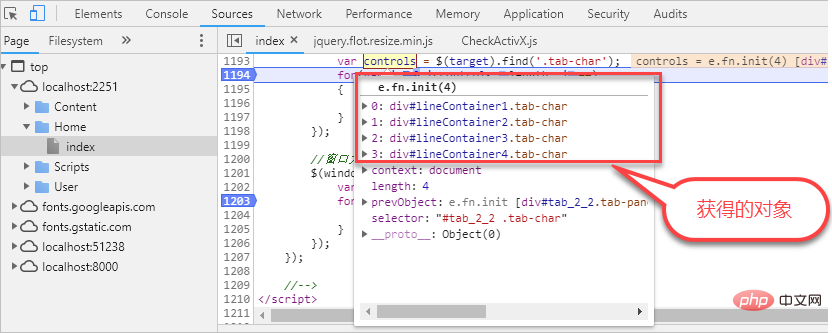
#Or you can look at the objects we capture when the window changes.
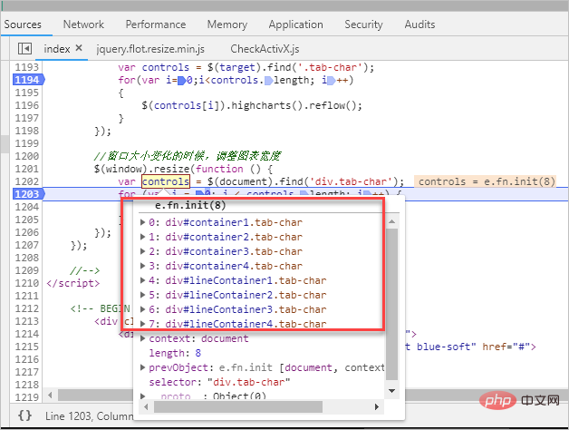
After obtaining the object, we convert it to the corresponding control, and then call its interface to update.
$(controls[i]).highcharts().reflow();
The above is our implementation idea and tracking processing method. Finally, the above picture illustrates the solution to the problem.
For more programming-related knowledge, please visit: Introduction to Programming! !
The above is the detailed content of A brief discussion on the solution to the problem of chart display when switching tabs in Bootstrap Tab. For more information, please follow other related articles on the PHP Chinese website!

Hot AI Tools

Undresser.AI Undress
AI-powered app for creating realistic nude photos

AI Clothes Remover
Online AI tool for removing clothes from photos.

Undress AI Tool
Undress images for free

Clothoff.io
AI clothes remover

AI Hentai Generator
Generate AI Hentai for free.

Hot Article
Hot Tools

Notepad++7.3.1
Easy-to-use and free code editor

SublimeText3 Chinese version
Chinese version, very easy to use

Zend Studio 13.0.1
Powerful PHP integrated development environment

Dreamweaver CS6
Visual web development tools

SublimeText3 Mac version
God-level code editing software (SublimeText3)
Hot Topics
 1384
1384
 52
52

 How to get the bootstrap search bar
Apr 07, 2025 pm 03:33 PM
How to get the bootstrap search bar
Apr 07, 2025 pm 03:33 PM
How to use Bootstrap to get the value of the search bar: Determines the ID or name of the search bar. Use JavaScript to get DOM elements. Gets the value of the element. Perform the required actions.
 How to use bootstrap in vue
Apr 07, 2025 pm 11:33 PM
How to use bootstrap in vue
Apr 07, 2025 pm 11:33 PM
Using Bootstrap in Vue.js is divided into five steps: Install Bootstrap. Import Bootstrap in main.js. Use the Bootstrap component directly in the template. Optional: Custom style. Optional: Use plug-ins.
 How to write split lines on bootstrap
Apr 07, 2025 pm 03:12 PM
How to write split lines on bootstrap
Apr 07, 2025 pm 03:12 PM
There are two ways to create a Bootstrap split line: using the tag, which creates a horizontal split line. Use the CSS border property to create custom style split lines.
 How to do vertical centering of bootstrap
Apr 07, 2025 pm 03:21 PM
How to do vertical centering of bootstrap
Apr 07, 2025 pm 03:21 PM
Use Bootstrap to implement vertical centering: flexbox method: Use the d-flex, justify-content-center, and align-items-center classes to place elements in the flexbox container. align-items-center class method: For browsers that do not support flexbox, use the align-items-center class, provided that the parent element has a defined height.
 How to resize bootstrap
Apr 07, 2025 pm 03:18 PM
How to resize bootstrap
Apr 07, 2025 pm 03:18 PM
To adjust the size of elements in Bootstrap, you can use the dimension class, which includes: adjusting width: .col-, .w-, .mw-adjust height: .h-, .min-h-, .max-h-
 How to set up the framework for bootstrap
Apr 07, 2025 pm 03:27 PM
How to set up the framework for bootstrap
Apr 07, 2025 pm 03:27 PM
To set up the Bootstrap framework, you need to follow these steps: 1. Reference the Bootstrap file via CDN; 2. Download and host the file on your own server; 3. Include the Bootstrap file in HTML; 4. Compile Sass/Less as needed; 5. Import a custom file (optional). Once setup is complete, you can use Bootstrap's grid systems, components, and styles to create responsive websites and applications.
 How to insert pictures on bootstrap
Apr 07, 2025 pm 03:30 PM
How to insert pictures on bootstrap
Apr 07, 2025 pm 03:30 PM
There are several ways to insert images in Bootstrap: insert images directly, using the HTML img tag. With the Bootstrap image component, you can provide responsive images and more styles. Set the image size, use the img-fluid class to make the image adaptable. Set the border, using the img-bordered class. Set the rounded corners and use the img-rounded class. Set the shadow, use the shadow class. Resize and position the image, using CSS style. Using the background image, use the background-image CSS property.
 What to do if the Bootstrap Table uses AJAX to get data garbled
Apr 07, 2025 am 11:54 AM
What to do if the Bootstrap Table uses AJAX to get data garbled
Apr 07, 2025 am 11:54 AM
Solutions to the garbled code of Bootstrap Table when using AJAX to obtain data from the server: 1. Set the correct character encoding of the server-side code (such as UTF-8). 2. Set the request header in the AJAX request and specify the accepted character encoding (Accept-Charset). 3. Use the "unescape" converter of the Bootstrap Table to decode the escaped HTML entity into original characters.
