What is the difference between the css perspective attribute and the perspective() function? This article will briefly compare the perspective attribute and the perspective() function to understand the similarities and differences between them.

Perspective propertyperspective Used to activate three-dimensional space on an element so that its children can be positioned in this space.
It allows you to add a sense of depth to your scene by making elements higher on the z-axis (closer to the viewer) appear larger, while elements farther away appear smaller.

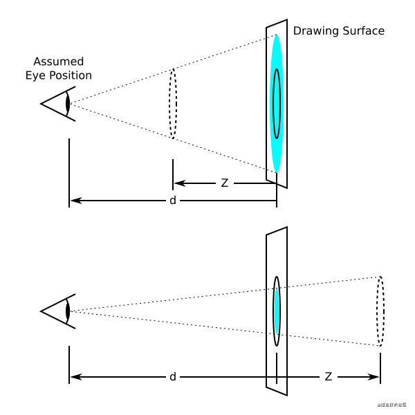
#The blue circle in this image represents an element in three-dimensional space. The letter d represents the perspective value, which is the assumed distance between the observer's eyes and the screen. The letter Z represents the position of the element on the z-axis. The farther an element is on the z-axis, the smaller it appears relative to the viewer, and the closer it is, the larger it appears. This is the effect of perspective in three-dimensional space.
Without specifying perspective, elements transformed using the 3D transformation function will appear flat and 2D.
Perspective propertiesperspective Used in conjunction with CSS transforms. It requires a length value or the keyword none. Use this property with any value other than none to establish a stacking context. It also creates a containing block (somewhat similar to position:relative), just like the transform property does.
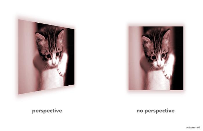
The following image shows the results of transforming (rotating) an element in three-dimensional space with and without specifying perspective.

#Use the rotateY() function to rotate the image 50 degrees on the y-axis. The image on the left shows the result of applying rotation while specifying perspective, and the image on the right shows the same transformation without perspective. In the image on the right, the transformation appears to be planar and two-dimensional because no three-dimensional space is triggered.
By default, the vanishing point of 3D space is at the center. (It can be changed using the perspective-origin property perspective-origin.)
Official syntax
perspective: none | <length>
Values
No perspective is applied, so three-dimensional space is not triggered .
Specifies the assumed distance between the observer and the z=0 plane. It is used to calculate the perspective matrix that applies the perspective transformation to the element and its contents. If set to zero, no perspective is applied. Negative values are not allowed. See the
Example
The following sets the perspective of an element, and the child elements of the element are transformed in the three-dimensional space triggered by the perspective attribute:
.container {
    perspective: 1800px;
}

.container .child {
    float: left;
    margin: 50px;
    transform: translateZ(-50px) rotateY(45deg);
}Online Demo
The perspective effect of elements can best be demonstrated on 3D shapes (such as cubes).
In this demonstration, there are three identical cubes, all with the same transformation. They each have a different set of perspectives. Try changing the perspective value to see how the depth of the scene changes.
The higher the perspective value, the weaker the effect, the lower the perspective value, the stronger the effect.
Because Nuggets does not support the introduction of iframe preview, the preview effect can be seen in codepen css perspective demo
When you have an element that you want to transform in 3D space, you can activate that space using the perspective property of its parent elementperspective , or use the perspective function perspective() that converts the element itself. So what is the difference between these two methods?
Perspective propertiesperspective and perspective functionsperspective() are both used to make elements that are farther away appear larger by making elements that are higher on the z-axis (closer to the viewer) appear larger. Smaller to give the element depth. The lower the value, the closer the z-pane is to the viewer, and the more impressive the effect; the higher the value, the farther the element is from the screen, and the more subtle the effect.
When you apply perspective to an element using the perspective function perspective() (see the Transform attribute entry transform for details on how this works), you Three-dimensional space is activated only on this element. The perspective() notation is convenient when applying three-dimensional transformations to individual elements. But when you have multiple transformed elements in a container, if each element has a perspective set using the perspective function perspective(), the elements will not line up as expected. This is because each of them has its own three-dimensional space and therefore its own vanishing point. To avoid this and allow elements to align, they should share the same space. By using the perspective property perspective on the parent container, a three-dimensional space is created that is shared by all of its child elements, which are transformed using a 3D transform.
The image below shows the results of triggering a three-dimensional space on the container, in which the container's children are rotated (left), and using the perspective function perspective() on each item The result of triggering a three-dimensional space (right):
The main reference translation of this article is from:
But because the original text is a bit too wordy, the chapters and table of contents have been adjusted.
Original address: https://juejin.cn/post/6978259550881677349
For more programming-related knowledge, please visit: Programming Video! !
The above is the detailed content of A brief discussion on the similarities and differences between the css perspective attribute and the perspective() function. For more information, please follow other related articles on the PHP Chinese website!