 Web Front-end
 CSS Tutorial
 An in-depth analysis of the css text-emphasis property and its usage!
An in-depth analysis of the css text-emphasis property and its usage!
This article will take you to understand the css text-emphasis attribute, and introduce the use of the text-emphasis attribute through several examples.
Generally speaking, the pages we create are not for literary users, so it is unlikely that they will come into contact with the "emphasis mark" symbol. If you are familiar with word, you should know that there is a text setting in word, which is to set the "emphasis mark".
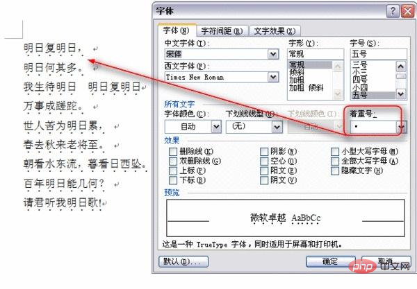
# I don’t have Word on my computer, so I searched for one on Baidu. Anyway, this is probably the effect.
So the CSS property we are going to talk about in this article is the "emphasis mark" property. We can set the text "emphasis mark" style through the text-emphasis property. This is the abbreviation of the two properties text-emphasis-color and text-emphasis-style. That is to say, we can pass text-emphasis at the same time Set the "emphasis mark" character style and color, such as:
p {
    -webkit-text-emphasis: dot red;
    text-emphasis: dot red;
}Then you can see this effect.

As for whether this effect is seen in word, I don’t know. Anyway, in web pages, the emphasis marks we see are not only Character style and color can be modified, as well as size and position.
text-emphasis-stylehas several attribute values, and can enter any character;text- emphasis-colorcan use the color values used in regular web,rgba(),rgb(), etc.;
And if you want to adjust the position, then you need an additional attribute text-emphasis-position, although this attribute looks very similar to style and color , but is not one of the abbreviations text-emphasis. So for text-emphasis-position under normal circumstances, the positions we can control are the two directions of upper and lower, that is:
text-emphasis-position: over;text-emphasis-position: under;
If you want to know more, you can read the detailed introduction in MDN, which will not be described here. Then according to the above, we modify the CSS part, like this:
p {
    -webkit-text-emphasis: '——' rgba(255, 0, 0, .5);
    text-emphasis: '——' rgba(255, 0, 0, .5);
    -webkit-text-emphasis-position: under;
    text-emphasis-position: under;
}Then the result is:

Doesn’t it look very What about the effect of underlining text like text-decoration: underline;? Then let's add another attribute of this to see the effect.
p {
    -webkit-text-emphasis: '——' rgba(255, 0, 0, .5);
    text-emphasis: '——' rgba(255, 0, 0, .5);
    -webkit-text-emphasis-position: under;
    text-emphasis-position: under;
    text-decoration: underline;
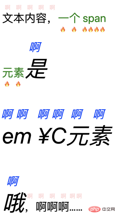
}
These two are different attributes, and there must be differences. I won’t go into details. The main differences can also be seen through the documentation. What needs to be mentioned here is that if the text-decoration attribute value is set by the parent to the underline style, then the child is set to overline, two line styles It will exist even if the text-decoration-style value is changed.
And text-emphasis When we change the attribute value, the result will be different. At the same time, if we do not set a color value, the color of the "emphasis mark" will inherit the text color of the element itself. Because the color value can be set, we can also use transparent to directly set the element to be transparent.
The text size of the "emphasis mark" is almost half of the normal text.
Recall the points mentioned earlier:- You can enter any characters; If the color is not set, it will inherit the
- color of the element itself
value can also be set to transparent;The size of the "emphasis mark" is about half of the normal text;

- Only one character will be displayed, regardless of whether the character is a full-width or half-width character, or even an emoji special character;
- is only a visible text character "emphasis mark" is displayed on the top;
<p>文本内容,<span>一个 span 元素</span><em>是 em ¥C元素哦</em>,啊啊啊……</p>

So this is the end of this article? No, there is one more thing I want to say. As you can see from the rendering above, the "emphasis mark" is below or above the text, so for a normal text, the line height (line-height) is probably familiar to everyone. So what will be the effect after adding line-height to the part with the "emphasis mark"? After
line-height: 20px; is added to p, no changes are seen; and if 20px is replaced with 60px, there has been a change, the height has been expanded a little; then make it bigger, expand it, and the "emphasis mark" follows the text to separate the upper and lower lines of content.

On a whim, when the value of line-height is relatively small, no effect is seen. Under normal circumstances, there is no text-emphasis, the smaller line-height will cause multiple lines of content to overlap, like this:
But now it has text-emphasis will not overlap. It seems to directly affect the minimum value of line-height. It must be ensured that the height value between multiple lines is within a certain The value seems to be about 1em, so that it can fit an "emphasis mark" that is half the normal font-size of the text, and must be kept at a certain distance from the text content. .
Back to the topic "What is the use of the unpopular text-emphasis?" Yes, what's the use? Apart from the normal indication that a certain part of the text content is highlighted, it doesn't seem to have any use. Unless we reuse the "emphasis number" feature to play, especially the line-height will be stretched to ensure that at least 1em or so of space exists between multiple lines. So if we use a transparent color "emphasis mark", does it mean that this part of the text will never be superimposed?
Then combined with emoji or a chaotic combination of up and down, will it create a different sky?
Looking back, a good "emphasis mark" should be left to do its own thing and be used to mark the text for emphasis. It's better not to play with it.
For more programming-related knowledge, please visit: Introduction to Programming! !
The above is the detailed content of An in-depth analysis of the css text-emphasis property and its usage!. For more information, please follow other related articles on the PHP Chinese website!

Hot AI Tools

Undresser.AI Undress
AI-powered app for creating realistic nude photos

AI Clothes Remover
Online AI tool for removing clothes from photos.

Undress AI Tool
Undress images for free

Clothoff.io
AI clothes remover

AI Hentai Generator
Generate AI Hentai for free.

Hot Article

Hot Tools

Notepad++7.3.1
Easy-to-use and free code editor

SublimeText3 Chinese version
Chinese version, very easy to use

Zend Studio 13.0.1
Powerful PHP integrated development environment

Dreamweaver CS6
Visual web development tools

SublimeText3 Mac version
God-level code editing software (SublimeText3)

Hot Topics
 1385
1385
 52
52
 How to use bootstrap in vue
Apr 07, 2025 pm 11:33 PM
Using Bootstrap in Vue.js is divided into five steps: Install Bootstrap. Import Bootstrap in main.js. Use the Bootstrap component directly in the template. Optional: Custom style. Optional: Use plug-ins.
 The Roles of HTML, CSS, and JavaScript: Core Responsibilities
Apr 08, 2025 pm 07:05 PM
HTML defines the web structure, CSS is responsible for style and layout, and JavaScript gives dynamic interaction. The three perform their duties in web development and jointly build a colorful website.
 How to write split lines on bootstrap
Apr 07, 2025 pm 03:12 PM
There are two ways to create a Bootstrap split line: using the tag, which creates a horizontal split line. Use the CSS border property to create custom style split lines.
 Understanding HTML, CSS, and JavaScript: A Beginner's Guide
Apr 12, 2025 am 12:02 AM
WebdevelopmentreliesonHTML,CSS,andJavaScript:1)HTMLstructurescontent,2)CSSstylesit,and3)JavaScriptaddsinteractivity,formingthebasisofmodernwebexperiences.
 How to resize bootstrap
Apr 07, 2025 pm 03:18 PM
To adjust the size of elements in Bootstrap, you can use the dimension class, which includes: adjusting width: .col-, .w-, .mw-adjust height: .h-, .min-h-, .max-h-
 How to set up the framework for bootstrap
Apr 07, 2025 pm 03:27 PM
To set up the Bootstrap framework, you need to follow these steps: 1. Reference the Bootstrap file via CDN; 2. Download and host the file on your own server; 3. Include the Bootstrap file in HTML; 4. Compile Sass/Less as needed; 5. Import a custom file (optional). Once setup is complete, you can use Bootstrap's grid systems, components, and styles to create responsive websites and applications.
 How to insert pictures on bootstrap
Apr 07, 2025 pm 03:30 PM
There are several ways to insert images in Bootstrap: insert images directly, using the HTML img tag. With the Bootstrap image component, you can provide responsive images and more styles. Set the image size, use the img-fluid class to make the image adaptable. Set the border, using the img-bordered class. Set the rounded corners and use the img-rounded class. Set the shadow, use the shadow class. Resize and position the image, using CSS style. Using the background image, use the background-image CSS property.
 How to use bootstrap button
Apr 07, 2025 pm 03:09 PM
How to use the Bootstrap button? Introduce Bootstrap CSS to create button elements and add Bootstrap button class to add button text


