How to use rem in css3
rem is a relative size value, relative to the unit of html element font size, and the syntax format is "element: number rem". rem changes the font size of the browser, which will break the layout of our web page.

The operating environment of this tutorial: Windows 7 system, CSS3&&HTML5 version, Dell G3 computer.
css3 has added a new relative unit rem. Using rem is the same as em as a relative font size unit. It is a relative unit, relative to the unit of the root element font size. To put it more bluntly, it is relative to the font size of the html element. The unit.
Advantages: When calculating the size of sub-elements, you only need to calculate it based on the font size of the html element. It is no longer like when using em, you have to go back and forth to find the font size of the parent element for frequent calculations, and you cannot do without a calculator at all.
rem is the unit
With the emergence of CSS3, he also introduced some new units, including what we call rem today. Rem is described on the W3C official website like this - "font size of the root element". Let's take a closer look at rem.
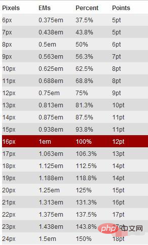
rem is relative to the root element , which means that we only need to determine a reference value in the root element and set the font size in the root element. This can be completely based on your own needs. , you can also refer to the picture below:

Let’s look at a simple example:
html {font-size: 62.5%;/*10 ÷ 16 × 100% = 62.5%*/}
body {font-size: 1.4rem;/*1.4 × 10px = 14px */}
h1 { font-size: 2.4rem;/*2.4 × 10px = 24px*/}I defined a in the root element The basic font size is 62.5% (that is, 10px. Setting this value is mainly to facilitate calculation. If it is not set, it will be based on "16px"). From the above calculation results, we can use "rem" as conveniently as "px", and at the same time solve the difference between "px" and "em".
Use of rem
First we need to add this tag:
<meta name="viewport" content="initial-scale=1,maximum-scale=1, minimum-scale=1">
The specific meaning is as follows:
initial-scale - the initial scaling ratio minimum-scale - The minimum ratio that the user is allowed to zoom to maximum-scale - The maximum ratio that the user is allowed to zoom to
Then set the font-size of the html:
// resize 窗口大小发生改变的时候才会触发的,第一次加载时不会触发
var resizeEvt = 'orientationchange' in window ? 'orientationchange' : 'resize',
    // 手机屏幕是否反转orientationchange
    window.addEventListener(resizeEvt, setFontSize, false); // IE 谷歌
document.addEventListener('DOMContentLoaded', setFontSize, false); //火狐
function setFontSize() {
    var cWidth = window.innerWidth || document.documentElement.clientWidth || document.body.clientWidth;
    var basicNum = 200;
    var htmlFontSize = basicNum * (cWidth / 设计稿宽度);
    document.documentElement.style.fontSize = htmlFontSize + 'px';
}The width of the general design draft is 750, in During the development process, we used iPhone 6/7/8 as the benchmark, so the font-size of the HTML should be 200*(375/750)=100px; so if there is a box with a width of 200px in the design draft. We need to set his width to (200/100)rem; so this is why I recommend setting basicNum to 200, because it is simple to calculate.
var htmlFontSize=basicNum*(cWidth/设计稿宽度);
It can be seen that the wider the screen size, the larger the font-size of the root html. Since other elements are
based on it, they can be adaptive.
Browser compatibility
rem is a new measurement unit introduced by CSS3. Everyone will definitely feel frustrated and worried about browser support. In fact, there is no need to be afraid. You may be surprised that there are quite a few supported browsers, such as: Mozilla Firefox 3.6, Apple Safari 5, Google Chrome, IE9 and Opera11.
However, when using units to set fonts, you cannot completely ignore IE. If you want to use this REM, but also want to be compatible with the effect under IE, you can consider using "px" and "rem" together. Use "px" to achieve the effect under IE6-8, and then use "Rem" to achieve the effect of the browser.
Recommended learning: css video tutorial
The above is the detailed content of How to use rem in css3. For more information, please follow other related articles on the PHP Chinese website!

Hot AI Tools

Undresser.AI Undress
AI-powered app for creating realistic nude photos

AI Clothes Remover
Online AI tool for removing clothes from photos.

Undress AI Tool
Undress images for free

Clothoff.io
AI clothes remover

AI Hentai Generator
Generate AI Hentai for free.

Hot Article

Hot Tools

Notepad++7.3.1
Easy-to-use and free code editor

SublimeText3 Chinese version
Chinese version, very easy to use

Zend Studio 13.0.1
Powerful PHP integrated development environment

Dreamweaver CS6
Visual web development tools

SublimeText3 Mac version
God-level code editing software (SublimeText3)

Hot Topics
 1376
1376
 52
52
 Working With GraphQL Caching
Mar 19, 2025 am 09:36 AM
If you’ve recently started working with GraphQL, or reviewed its pros and cons, you’ve no doubt heard things like “GraphQL doesn’t support caching” or
 Making Your First Custom Svelte Transition
Mar 15, 2025 am 11:08 AM
The Svelte transition API provides a way to animate components when they enter or leave the document, including custom Svelte transitions.
 Show, Don't Tell
Mar 16, 2025 am 11:49 AM
How much time do you spend designing the content presentation for your websites? When you write a new blog post or create a new page, are you thinking about
 Building an Ethereum app using Redwood.js and Fauna
Mar 28, 2025 am 09:18 AM
With the recent climb of Bitcoin’s price over 20k $USD, and to it recently breaking 30k, I thought it’s worth taking a deep dive back into creating Ethereum
 What the Heck Are npm Commands?
Mar 15, 2025 am 11:36 AM
npm commands run various tasks for you, either as a one-off or a continuously running process for things like starting a server or compiling code.
 How do you use CSS to create text effects, such as text shadows and gradients?
Mar 14, 2025 am 11:10 AM
The article discusses using CSS for text effects like shadows and gradients, optimizing them for performance, and enhancing user experience. It also lists resources for beginners.(159 characters)
 Creating Your Own Bragdoc With Eleventy
Mar 18, 2025 am 11:23 AM
No matter what stage you’re at as a developer, the tasks we complete—whether big or small—make a huge impact in our personal and professional growth.
 Let's use (X, X, X, X) for talking about specificity
Mar 24, 2025 am 10:37 AM
I was just chatting with Eric Meyer the other day and I remembered an Eric Meyer story from my formative years. I wrote a blog post about CSS specificity, and


