3 ways to implement rounded triangles with pure CSS (skill sharing)
This article will introduce you to 3 methods of drawing rounded triangles using CSS. It has certain reference value. Friends in need can refer to it. I hope it will be helpful to everyone.

Previously in this article - "6 Techniques for Drawing Triangles with CSS (Sharing)", introduced 6 ways to use CSS to achieve Triangular way.
But a very important scene is missed. How to use pure CSS to implement a triangle with rounded corners? , like this:

This article will introduce several ways to implement triangles with rounded corners.
Method 1. Fully Compatible SVG Method
If you want to generate a triangle with rounded corners, the least amount of code, the best way Generated using SVG.
Use SVG's polygon tag <polygon></polygon> to generate a trigonal shape, and use SVG's stroke-linejoin="round" to generate rounded corners at the connection.
The amount of code is very small, the core code is as follows:
<svg>
  <polygon></polygon>
</svg>
.triangle {
    fill: #0f0;
    stroke: #0f0;
    stroke-width: 10;
}The actual graphics are as follows:
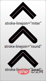
Here, we actually use SVG polygons stroke-linejoin: round The rounded corners generated by the round attribute, what is stroke-linejoin
-
miter is the default value, which means using a square brush to form sharp corners at the connection -
round means connecting with rounded corners to achieve a smooth effect -
bevel The connection will form a miter

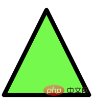
We actually generate a rounded triangle through a polygon with a border and the border connection type is stroke-linejoin: round
.triangle {
    fill: #0f0;
    stroke: #000;
    stroke-width: 10;
}
Control the fillet size through stroke-width
So how to control the size of the fillet? It is also very simple. By controlling the size of stroke-width
Of course, to keep the size of the triangle consistent, while increasing/reducing the stroke-width, you need to reduce/increase the width/height of the graphic.

For the complete DEMO, you can click here: CodePen Demo -- Using SVG to implement a triangle with rounded cornershttps: //codepen.io/Chokcoco/pen/eYWZvKo
Method 2. Graphic splicing
However, as mentioned above,use pure CSS Implement a triangle with rounded corners
, but the first method above actually uses SVG. So is there a way to just use CSS? Of course, divergent thinking, the interesting part of CSS is here, using a graphic, there can be many ingenious solutions! Let’s take a look, a rounded triangle can actually be split into several parts:

Drawing a rhombus with rounded corners
Then, our next goal becomes to draw a rhombus with rounded corners. There are many methods. This article gives one of the methods:1. First, transform a square into Form a rhombus, use transform
<div></div>
div {
    width:  10em;
    height: 10em;
    transform: rotate(-60deg) skewX(-30deg) scale(1, 0.866);
}
 2. Transform one of the angles Rounded corners:
 div {
width: 10em;
height: 10em;
transform: rotate(-60deg) skewX(-30deg) scale(1, 0.866);
+ border-top-right-radius: 30%;
} At this point, we have successfully obtained a rhombus with rounded corners!
 Splicing 3 rhombuses with rounded corners
The next step is very simple. We only need to use the other two pseudo-elements of the element to generate 2 more rhombuses with rounded corners. A rounded rhombus can be spliced together with a total of 3 graphics rotation and displacement! The complete code is as follows:###<div></div>
div{
    position: relative;
    background-color: orange;
}
div:before,
div:after {
    content: '';
    position: absolute;
    background-color: inherit;
}
div,
div:before,
div:after {
    width:  10em;
    height: 10em;
    border-top-right-radius: 30%;
}
div {
    transform: rotate(-60deg) skewX(-30deg) scale(1,.866);
}
div:before {
    transform: rotate(-135deg) skewX(-45deg) scale(1.414, .707) translate(0,-50%);
}
div:after {
    transform: rotate(135deg) skewY(-45deg) scale(.707, 1.414) translate(50%);
}就可以得到一个圆角三角形了!效果如下:

完整的代码你可以戳这里:CodePen Demo -- A triangle with rounded
https://codepen.io/Chokcoco/pen/vYmLVZr
法三. 图形拼接实现渐变色圆角三角形
完了吗?没有!
上述方案,虽然不算太复杂,但是有一点还不算太完美的。就是无法支持渐变色的圆角三角形。像是这样:
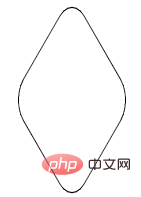
如果需要实现渐变色圆角三角形,还是有点复杂的。但真就还有人鼓捣出来了,下述方法参考至 -- How to make 3-corner-rounded triangle in CSS。
同样也是利用了多块进行拼接,但是这次我们的基础图形,会非常的复杂。
首先,我们需要实现这样一个容器外框,和上述的方法比较类似,可以理解为是一个圆角菱形(画出 border 方便理解):

<div></div>
div {
    width: 200px;
    height: 200px;
    transform: rotate(30deg) skewY(30deg) scaleX(0.866);
    border: 1px solid #000;
    border-radius: 20%;
}接着,我们同样使用两个伪元素,实现两个稍显怪异的图形进行拼接,算是对 transform 的各种用法的合集:
div::before,
div::after {
    content: "";
    position: absolute;
    width: 200px;
    height: 200px;
}
div::before {
    border-radius: 20% 20% 20% 55%;
    transform: scaleX(1.155) skewY(-30deg) rotate(-30deg) translateY(-42.3%) skewX(30deg) scaleY(0.866) translateX(-24%);
    background: red;
}
div::after {
    border-radius: 20% 20% 55% 20%;
    background: blue;
    transform: scaleX(1.155) skewY(-30deg) rotate(-30deg) translateY(-42.3%) skewX(-30deg) scaleY(0.866) translateX(24%);
}为了方便理解,制作了一个简单的变换动画:
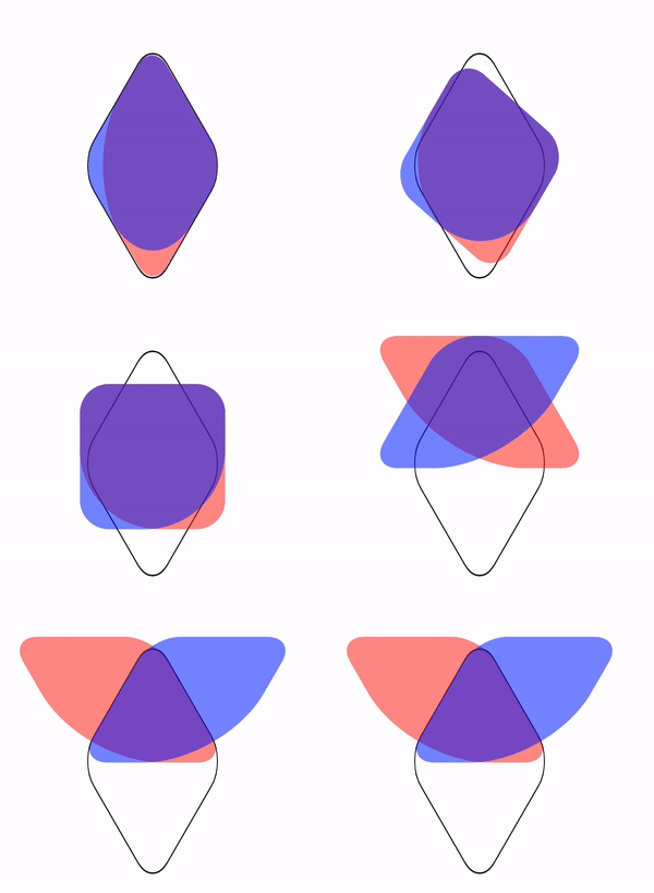
本质就是实现了这样一个图形:

最后,给父元素添加一个 overflow: hidden 并且去掉父元素的 border 即可得到一个圆角三角形:

由于这两个元素重叠空间的特殊结构,此时,给两个伪元素添加同一个渐变色,会完美的叠加在一起:
div::before,
div::after, {
    background: linear-gradient(#0f0, #03a9f4);
}最终得到一个渐变圆角三角形:

上述各个图形的完整代码,你可以戳这里:CodePen Demo -- A triangle with rounded and gradient background
https://codepen.io/Chokcoco/pen/LYyGRpV
最后
本文介绍了几种在 CSS 中实现带圆角三角形的方式,虽然部分有些繁琐,但是也体现了 CSS ”有趣且折磨人“ 的一面,具体应用的时候,还是要思考一下,对是否使用上述方式进行取舍,有的时候,切图也许是更好的方案。
好了,本文到此结束,希望对你有帮助 :)
原文地址:https://segmentfault.com/a/1190000040344317
作者:chokcoco
更多编程相关知识,请访问:编程视频!!
The above is the detailed content of 3 ways to implement rounded triangles with pure CSS (skill sharing). For more information, please follow other related articles on the PHP Chinese website!

Hot AI Tools

Undresser.AI Undress
AI-powered app for creating realistic nude photos

AI Clothes Remover
Online AI tool for removing clothes from photos.

Undress AI Tool
Undress images for free

Clothoff.io
AI clothes remover

Video Face Swap
Swap faces in any video effortlessly with our completely free AI face swap tool!

Hot Article

Hot Tools

Notepad++7.3.1
Easy-to-use and free code editor

SublimeText3 Chinese version
Chinese version, very easy to use

Zend Studio 13.0.1
Powerful PHP integrated development environment

Dreamweaver CS6
Visual web development tools

SublimeText3 Mac version
God-level code editing software (SublimeText3)

Hot Topics
 1386
1386
 52
52
 How to use bootstrap in vue
Apr 07, 2025 pm 11:33 PM
Using Bootstrap in Vue.js is divided into five steps: Install Bootstrap. Import Bootstrap in main.js. Use the Bootstrap component directly in the template. Optional: Custom style. Optional: Use plug-ins.
 The Roles of HTML, CSS, and JavaScript: Core Responsibilities
Apr 08, 2025 pm 07:05 PM
HTML defines the web structure, CSS is responsible for style and layout, and JavaScript gives dynamic interaction. The three perform their duties in web development and jointly build a colorful website.
 How to write split lines on bootstrap
Apr 07, 2025 pm 03:12 PM
There are two ways to create a Bootstrap split line: using the tag, which creates a horizontal split line. Use the CSS border property to create custom style split lines.
 Understanding HTML, CSS, and JavaScript: A Beginner's Guide
Apr 12, 2025 am 12:02 AM
WebdevelopmentreliesonHTML,CSS,andJavaScript:1)HTMLstructurescontent,2)CSSstylesit,and3)JavaScriptaddsinteractivity,formingthebasisofmodernwebexperiences.
 How to set up the framework for bootstrap
Apr 07, 2025 pm 03:27 PM
To set up the Bootstrap framework, you need to follow these steps: 1. Reference the Bootstrap file via CDN; 2. Download and host the file on your own server; 3. Include the Bootstrap file in HTML; 4. Compile Sass/Less as needed; 5. Import a custom file (optional). Once setup is complete, you can use Bootstrap's grid systems, components, and styles to create responsive websites and applications.
 How to resize bootstrap
Apr 07, 2025 pm 03:18 PM
To adjust the size of elements in Bootstrap, you can use the dimension class, which includes: adjusting width: .col-, .w-, .mw-adjust height: .h-, .min-h-, .max-h-
 How to use bootstrap button
Apr 07, 2025 pm 03:09 PM
How to use the Bootstrap button? Introduce Bootstrap CSS to create button elements and add Bootstrap button class to add button text
 How to insert pictures on bootstrap
Apr 07, 2025 pm 03:30 PM
There are several ways to insert images in Bootstrap: insert images directly, using the HTML img tag. With the Bootstrap image component, you can provide responsive images and more styles. Set the image size, use the img-fluid class to make the image adaptable. Set the border, using the img-bordered class. Set the rounded corners and use the img-rounded class. Set the shadow, use the shadow class. Resize and position the image, using CSS style. Using the background image, use the background-image CSS property.


