How to achieve shadow effect in css3
In CSS, you can use the box-shadow attribute to achieve the shadow effect. You only need to set the "box-shadow: horizontal shadow position, vertical shadow position, blur distance, shadow size, color inset;" style to the element. This property adds one or more shadows to the box, a comma-separated list of shadows.

The operating environment of this tutorial: Windows 7 system, CSS3&&HTML5 version, Dell G3 computer.
I have rarely used it before and have not understood this aspect carefully, so I just implemented some simple requirements for shadows and animations. So while this project needs to be combined with practice, let’s summarize this aspect.
Shadow effect in css3:
box-shadow in css3 Please see the properties of box-shadow (the introduction is taken from w3c content)
box-shadow: h-shadow v-shadow blur spread color inset;
box-shadow to Add one or more shadows to the box. This property is a comma-separated list of shadows, each specified by 2-4 length values, an optional color value, and the optional inset keyword. The value for omitted length is 0.
Value Description
h-shadow Required. The position of the horizontal shadow. Negative values are allowed. (Positive values are on the right, negative values are on the left)
v-shadow Required. The position of the vertical shadow. Negative values are allowed. (Positive values are at the bottom, negative values are at the top)
blur Optional. Fuzzy distance. (Area covered by shadow)
spread Optional. The size of the shadow. (size of shadow)
color Optional. The color of the shadow. See CSS color values. (Color of shadow)
inset Optional. Change the outer shadow (outset) to an inner shadow. (The default is the setting of outer, inner shadow and outer shadow)
The next step is to implement different shadow effects one by one:
<!DOCTYPE html>
<html>
<head>
    <meta charset="UTF-8">
    <title>box-shadow</title>
    <style>
        .demo{
            width:200px;
            height:200px;
            border: 1px solid #999;
            margin: 50px auto;
            box-shadow: 10px 10px 5px #9521de;
        }
    </style>
</head>
<body>
<div></div>
</body>
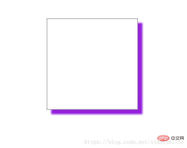
</html>box-shadow: 10px 10px 5px #9521de; (horizontal and The vertical direction is a positive value)
Rendering:
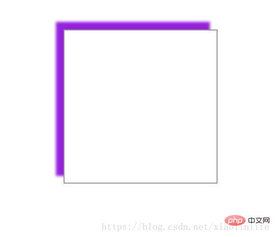
box-shadow: -10px -10px 5px #9521de; (The horizontal and vertical directions are In the case of negative values)
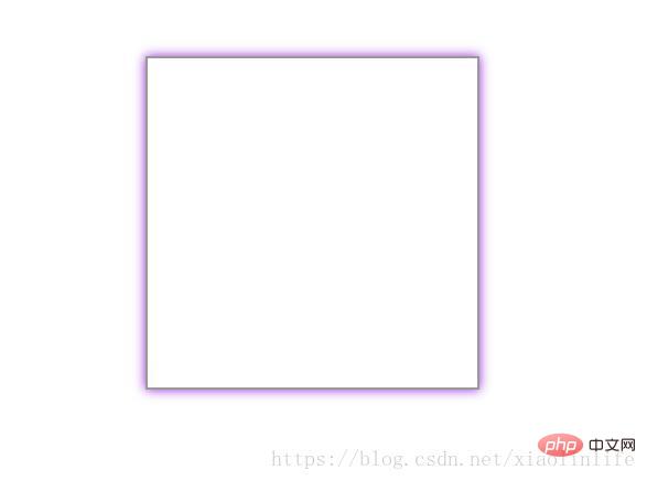
box-shadow: 0px 0px 10px #9521de; (When the horizontal and vertical directions are 0, there will be shadows all around. In this case Also commonly used)
box-shadow: 0px 0px 10px 10px #9521de; (When the horizontal and vertical directions are 0, there will be shadows all around. The three values are the blur distance (the coverage area of the shadow) and the fourth value is the size of the shadow (this is rarely used))
f27fd8cdd93fc3a3a5309aa413725c5-3.jpg" alt="Write a picture description here "/>
**box-shadow: 0px 0px 10px #9521de inset;** When the horizontal and vertical directions are 0, there will be shadows all around. The third value is the blur distance (shadow The coverage area) is set to the inner shadow)
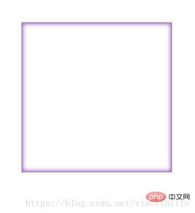
**box-shadow: 5px 5px 10px #9521de inset;** When the horizontal and vertical directions are positive values, in Upper left, the third value is the blur distance (the area covered by the shadow) set so that the inner shadow is exactly opposite to the outer shadow)
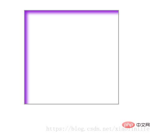
**box-shadow: -5px - 5px 10px #9521de inset;** When the horizontal and vertical directions are negative values, in the lower right, the third value is the blur distance (the coverage area of the shadow) set to the inner shadow exactly opposite to the outer shadow)
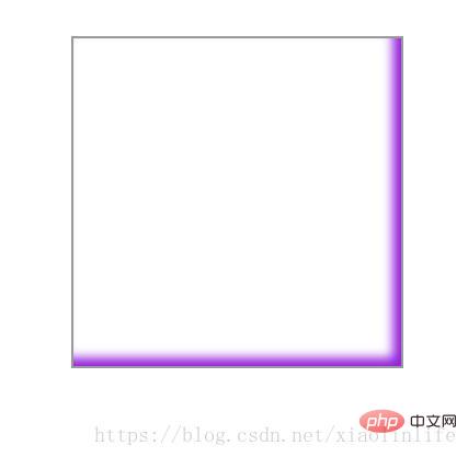
The above is just a simple experiment on the effect and position of the shadow. In fact, judging from the effect used in the project, it is still **box-shadow: 0px 0px 10px #9521de;**and* *box-shadow: 10px 10px 5px #9521de;**In fact, it is mainly through familiarity with various effects to freely combine them, and familiarity with the meaning of each value.
The spread attribute is rarely used, this is for expansion Shadow radius.
For example: box-shadow: -5px -5px 10px 10px #9521de inset;
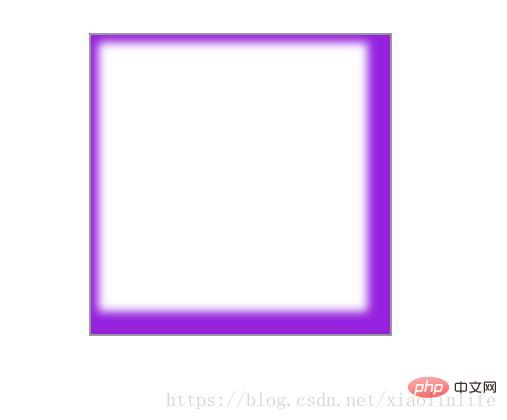
You can also set the shadow individually for each side Effect:
box-shadow:5px 5px 5px #000,5px -5px 5px #000,-5px 5px 5px #000,-5px -5px 5px #000;
In a word: use as you learn.
Recommended learning: css video tutorial
The above is the detailed content of How to achieve shadow effect in css3. For more information, please follow other related articles on the PHP Chinese website!

Hot AI Tools

Undresser.AI Undress
AI-powered app for creating realistic nude photos

AI Clothes Remover
Online AI tool for removing clothes from photos.

Undress AI Tool
Undress images for free

Clothoff.io
AI clothes remover

AI Hentai Generator
Generate AI Hentai for free.

Hot Article

Hot Tools

Notepad++7.3.1
Easy-to-use and free code editor

SublimeText3 Chinese version
Chinese version, very easy to use

Zend Studio 13.0.1
Powerful PHP integrated development environment

Dreamweaver CS6
Visual web development tools

SublimeText3 Mac version
God-level code editing software (SublimeText3)

Hot Topics
 How to register for Bitstamp exchange pro? Is it safe? Is it formal?
Aug 13, 2024 pm 06:36 PM
How to register BitstampPro? Visit the BitstampPro website. Fill in your personal information and email address. Create a password and accept the terms. Verify email address. Is BitstampPro safe? Authentication required. Enforce the use of two-factor authentication. Most assets are stored in cold storage. Use HTTPS to encrypt communication. Conduct regular security audits. Is BitstampPro legitimate? Registered in Luxembourg. Regulated by the Luxembourg Financial Supervisory Committee. Comply with anti-money laundering and know-your-customer regulations.
 How to implement the custom table function of clicking to add data in dcat admin?
Apr 01, 2025 am 07:09 AM
How to implement the table function of custom click to add data in dcatadmin (laravel-admin) When using dcat...
 The latest ranking list of virtual currency trading platform APP (inventory of top 10 virtual currency trading platforms)
Mar 04, 2025 pm 03:51 PM
This article lists the top ten leading cryptocurrency exchanges in the world, including OKX, Binance, Gate.io, Huobi, Kraken, Coinbase, KuCoin, Crypto.com, Bitfinex and Bitstamp. With their strong technical strength, rich product lines, strict compliance operations and innovative ecological construction, these exchanges have taken the lead in the global cryptocurrency market. The article will introduce their special functions, technical architecture, security measures, compliance qualifications and ecosystem construction respectively, providing reference for investors to choose a suitable trading platform.
 Share the top ten official website addresses of the world's formal virtual currency trading software in 2025
Feb 15, 2025 pm 04:42 PM
With the development of the cryptocurrency market, formal virtual currency trading software has become the focus of investors' attention. In the fierce competition, some trading platforms stand out and provide safe and reliable services. According to industry research and comprehensive rankings, this article will list the top ten best virtual currency trading software in the world in 2025 and provide its official website address. These platforms have been strictly reviewed and are designed to provide users with excellent trading experience and investment guarantees.
 What exactly is Bitstamp exchange like? Is Bitstamp exchange safe?
Aug 16, 2024 pm 06:02 PM
The Bitstamp exchange is known for its security and reliability, boasting the following features: Cold Storage and Multi-Signature: Most funds are stored offline, requiring multiple authorizations to approve transactions. Compliance and Regulation: Regulated by the Luxembourg Financial Regulatory Commission and compliant with anti-money laundering and KYC regulations. Network security measures: including DDoS protection, SSL encryption and regular security audits. Insurance and Fund Protection: Theft or loss is insured by Lloyd's of London and has a backup fund to protect user funds. Customer support and response: 24/7 customer support, right on the matter
 Dynamic web page elements XPath and Class names change frequently. How to stably crawl the target a tag?
Apr 01, 2025 pm 04:12 PM
Dynamic web element crawling problem: dealing with XPath and Class name changes, many crawler developers will encounter a difficult problem when crawling dynamic web pages: the goal...
 What software is used to make bean bags?
Nov 27, 2024 am 11:39 AM
"Doubao" is a powerful AI assistant with complex software architecture and technical support behind it. The core of the architecture is a large language model (LLM) and image generation model, and also includes modules such as natural language processing, multi-modal generation, user interface, data storage and cloud computing platform. These modules adopt a microservices architecture and are developed using programming languages such as Python, Java, C, etc. The architecture is still evolving, and more advanced AI technology may be introduced in the future to improve the performance and functionality of “Bean Bao”.
 How to share the same page on the PC and mobile side and handle cache issues?
Apr 01, 2025 pm 01:57 PM
How to share the same page on the PC and mobile side and handle cache issues? In the nginx php mysql environment built using the Baota background, how to make the PC side and...


