 Web Front-end
 CSS Tutorial
 How to achieve fully compatible frosted glass effect using CSS? (detailed code explanation)
How to achieve fully compatible frosted glass effect using CSS? (detailed code explanation)
This article will take you to understand the CSS backdrop-filter attribute, see the compatibility of this attribute, and introduce how to achieve a fully compatible frosted glass effect.

Through this article, you can learn the
most basic use of CSS
backdrop-filterto achieve frosting The effect of glass (frosted glass)Firefox browser that is not compatible with
backdrop-filterso far, how to use some technical operations to cleverly achieve the frosted glass effect , so that this effect can really be applied in business
What isbackdrop-filter
backdrop- The filter CSS property allows you to add graphical effects (such as blur or color shift) to the area behind an element. Because it applies to all elements behind the element, in order to see the effect, the element or its background must be made at least partially transparent.
backdrop-filter is very similar to filter. The values that can be taken are the same, but one is applied to the entire element and the other is only applied to the back of the element. Area.
backdrop-filter vs. filter
We use backdrop-filter vs. filter At the same time, a frosted glass effect is implemented for comparison. The pseudo code is as follows:
1 2 3 4 5 |
|
1 2 3 4 5 6 7 8 9 10 11 12 13 14 15 |
|
CodePen Demo -- Comparison between filter and backup-filter
Address: https://codepen.io/Chokcoco/pen/WNjebrr
Before backdrop-filter, I wanted to achieve the above-mentioned filter effect of only adding elements to the background It's still very difficult, and, fine for static images, if the background is a dynamic background that can be scrolled, CSS is usually powerless.
backdrop-filter was born to add filters to the content behind the element without affecting the element itself. It can be used to achieve frosted glass effect (frosted glass) very conveniently!
backdrop-filter Compatibility
backdrop-filter In fact, it has been around for a long time. However, firefox has not yet None are compatible with it!

For some PC-side businesses that have given up on IE, firefox still needs to be compatible. If you want to use backdrop-filter to achieve the frosted glass effect To implement the application, the Firefox compatibility issue must be resolved.
Achieve frosted glass effect in firefox
OK, the focus of this article is how to use backdrop-filter in firefox as much as possible Restore the effect of frosted glass.
First of all, let’s take a look. If backdrop-filter is used normally, or the above example has the following effect, there is no frosted glass effect:

Use background-attachment: fixed compatible with static background images
If you want to use the frosted glass effect on Firefox. The background using frosted glass elements is just a static background image. In fact, there are many methods.
We only need to superimpose the same picture behind the element, use background-attachment: fixed to position the picture superimposed under the element to the same coordinates as the background, and then use filter: blur() Just blur it.
The pseudo code is as follows:
1 |
|
1 2 3 4 5 6 7 8 9 10 11 12 13 14 15 16 17 18 19 20 21 22 23 24 25 26 27 28 29 30 31 32 33 34 |
|
The effect is as follows:

This method is also used before there is no backdrop-filter , one of the most commonly used methods to achieve a simple frosted glass effect in various browsers.
CodePen Demo -- Use background-attachment: fixed | filter: bulr() to achieve frosted glass effect
Address: https://codepen.io/Chokcoco/pen/XWRrVma
Using background-attachment: fixed is compatible with the disadvantages of static background images
However, this method also has two disadvantages:
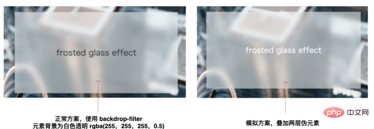
1. Pseudo elements are used to superimpose a layer of background. Due to the hierarchical relationship, the background of the parent element is at the bottom, so the background color of the element itself is not fully reflected. You can compare the actual renderings of the two methods:

The solution is to overlay a layer of background color through another pseudo-element. This background color should be originally assigned to the parent element itself.
The effect after superposition is as follows:

CodePen Demo -- 使用 background-attachment: fixed | filter: bulr() 实现毛玻璃效果优化
地址:https://codepen.io/Chokcoco/pen/abWbzKG
2、上述效果已经非常接近了,硬要挑刺的话,就是应用了模糊滤镜的伪元素的边缘有白边瑕疵,这一点其实是滤镜本身的问题,也非常好解决,我们只需要将伪元素的范围扩大一点即可:
1 2 3 4 5 6 7 8 9 10 11 12 |
|
定位的代码由 top: 0px; 改为 top: -100px,四个方位都是如此即可。如此一来,就能做到基本上是百分百的模拟。
使用 moz-element() 配合 filter: blur() 实现复杂背景毛玻璃效果
下面这种方法就非常巧妙了,正常而言,运用毛玻璃效果的背景元素,都不是一张图片那么简单!背后通常都是整个页面复杂的结构,多层 DOM 的嵌套。
那么通过叠加一张简单的图片,就无法奏效了,我们得想办法模拟整个 DOM 元素。
而恰好,在 Firefox 中,有这么一个属性 -- -moz-element()。
何为 -moz-element()?MDN-element) 的解释是,CSS 函数 element() 定义了一个从任意的 HTML 元素中生成的图像 <image> 值。该图像值是实时的,这意味着如果被指定的 HTML 元素被更改,应用了该属性的元素的背景也会相应更改。
它其实是个草案规范,但是一直以来,只有 Firefox 支持它 -- CAN I USE -- CSS element():
它有什么作用呢?
-moz-element() 如何使用
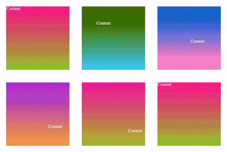
那么 -moz-element() 如何使用呢?简而言之,它能够复制一个元素内部渲染出来的 UI,并且能够实时同步变化。
假设我们有这样一个简单的结构,元素背景和内容都在运动:
1 2 3 |
|
1 2 3 4 5 6 7 8 9 10 11 12 13 14 15 16 17 18 19 20 21 22 23 24 25 26 27 28 29 |
|
它的效果大概是这样:

我们就假设这个结构就是我们页面某一块的内容,然后,我们就可以使用 background: -moz-element(#id) 这种方式,将这个元素内绘制的 UI 内容完全拷贝至另外一个元素,看看效果。
我们添加一个元素 <div class="g-element-copy"></div>,在这个元素内模拟 #bg 内的内容:
1 2 3 4 |
|
1 2 3 4 5 6 7 |
|
它可以完全复制另外一个元素内绘制出来的 UI,并且能追踪实时变化:

CodePen Demo -- -moz-element Demo(Firefox Only)
地址:https://codepen.io/Chokcoco/pen/jOmOPPL
在 firefox 中使用 element 复制 UI,用作毛玻璃元素背景
这样,有了上面的铺垫,下面的内容就比较好理解了。
和上述的 background-attachment: fixed 方案对比,我们还是通过伪元素叠加一层背景,只不过背景内的内容由单纯一张图片,变成了由 -moz-element() 复制的整段 UI 内容。
其次,上面的方案我们使用 background-attachment: fixed 使背景图和伪元素内叠加的图片的位置对齐,在这里,我们需要借助 Javascript 进行简单的运算,确定背景内容元素的相关位置,计算对齐量。
来看这样一个 DEMO:
1 2 3 4 5 6 7 8 9 10 11 12 13 |
|
其中,.g-glossy 是在正常情况下 backdrop-filter 兼容时,我们的毛玻璃元素,而 .g-glossy-firefox 则是不兼容 backdrop-filter 时,我们需要模拟整个 DOM 背景 UI时候的元素,可以通过 CSS 特性检测 CSS @support 进行控制:
核心 CSS 代码:
1 2 3 4 5 6 7 8 9 10 11 12 13 14 15 16 17 18 19 20 21 22 23 24 25 26 |
|
简单解读一下:
对于兼容
backdrop-filter的,.g-glossy内的代码将直接生效,并且.g-glossy-firefox不会展示对于 Firefox 浏览器,因为
backdrop-filter必然不兼容,所以.g-glossy内的backdrop-filter: blur(10px)不会生效,而@supports (background: -moz-element(#bg))内的样式会生效,此时.g-glossy-firefox将会利用background: -moz-element(#bg) no-repeat;模拟 id 为bg的元素
当然,这里我们需要借助一定的 JavaScript 代码,计算我们的模拟页面 UI 的元素 .g-glossy-firefox 相对它模拟的 #bg 元素,也就是页面布局的一个定位偏差:
1 2 3 4 5 6 7 8 9 10 11 |
|
OK,至此,我们就能完美的在 Firefox 上也实现毛玻璃的效果了:
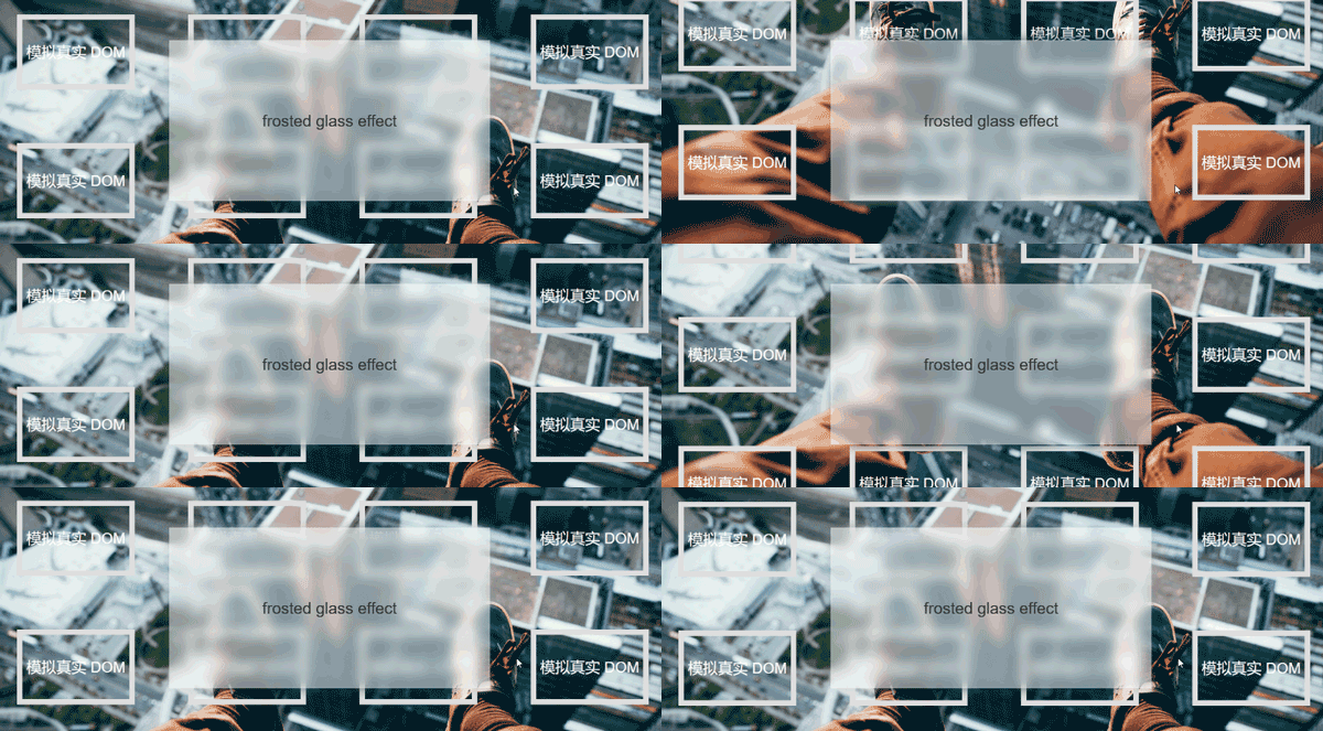
它相对于上面的第一种方案而言,最大的不同之处在于,它可以模拟各式各样的背景元素,背景元素可以不仅仅只是一张图片!它可以是各种复杂的结构!
这种方案是我的 CSS 群中,风海流 同学提供的一种思路,非常的巧妙,并且,他自己也对这种方案进行了完整的阐述,你可以戳这里看看:在网页中实现标题栏「毛玻璃」效果,本文也是经过他的同意,重新整理发出。
上述效果的完整代码,你可以戳这里:
CodePen Demo -- 兼容 Firefox 的复杂背景毛玻璃(磨砂玻璃)效果
https://codepen.io/Chokcoco/pen/ExWqaQG
总结一下
简单对上述内容进行一个总结:
- 你可以使用
backdrop-filter对兼容它的浏览器非常简单的实现毛玻璃(磨砂玻璃)效果 - 对于不兼容
backdrop-filter的浏览器,如果它只是简单背景,可以使用background-attachment: fixed配合filter: blur()进行模拟 - 对于 firefox 浏览器,你还可以使用
moz-element()配合filter: blur()实现复杂背景毛玻璃效果 - 对于不兼容的上述 3 种效果的其他浏览器,设置了毛玻璃效果的元素,可以通过设置类似
background: rgba(255, 255, 255, 0.5)的样式,使之回退到半透明效果,也算一种非常合理的降级效果,不会引起 Bug
原文地址:https://segmentfault.com/a/1190000040263452
作者:ChokCoco
更多编程相关知识,请访问:编程视频!!
The above is the detailed content of How to achieve fully compatible frosted glass effect using CSS? (detailed code explanation). For more information, please follow other related articles on the PHP Chinese website!

Hot AI Tools

Undresser.AI Undress
AI-powered app for creating realistic nude photos

AI Clothes Remover
Online AI tool for removing clothes from photos.

Undress AI Tool
Undress images for free

Clothoff.io
AI clothes remover

Video Face Swap
Swap faces in any video effortlessly with our completely free AI face swap tool!

Hot Article

Hot Tools

Notepad++7.3.1
Easy-to-use and free code editor

SublimeText3 Chinese version
Chinese version, very easy to use

Zend Studio 13.0.1
Powerful PHP integrated development environment

Dreamweaver CS6
Visual web development tools

SublimeText3 Mac version
God-level code editing software (SublimeText3)

Hot Topics
 1386
1386
 52
52
 How to use bootstrap in vue
Apr 07, 2025 pm 11:33 PM
Using Bootstrap in Vue.js is divided into five steps: Install Bootstrap. Import Bootstrap in main.js. Use the Bootstrap component directly in the template. Optional: Custom style. Optional: Use plug-ins.
 The Roles of HTML, CSS, and JavaScript: Core Responsibilities
Apr 08, 2025 pm 07:05 PM
HTML defines the web structure, CSS is responsible for style and layout, and JavaScript gives dynamic interaction. The three perform their duties in web development and jointly build a colorful website.
 How to write split lines on bootstrap
Apr 07, 2025 pm 03:12 PM
There are two ways to create a Bootstrap split line: using the tag, which creates a horizontal split line. Use the CSS border property to create custom style split lines.
 Understanding HTML, CSS, and JavaScript: A Beginner's Guide
Apr 12, 2025 am 12:02 AM
WebdevelopmentreliesonHTML,CSS,andJavaScript:1)HTMLstructurescontent,2)CSSstylesit,and3)JavaScriptaddsinteractivity,formingthebasisofmodernwebexperiences.
 How to insert pictures on bootstrap
Apr 07, 2025 pm 03:30 PM
There are several ways to insert images in Bootstrap: insert images directly, using the HTML img tag. With the Bootstrap image component, you can provide responsive images and more styles. Set the image size, use the img-fluid class to make the image adaptable. Set the border, using the img-bordered class. Set the rounded corners and use the img-rounded class. Set the shadow, use the shadow class. Resize and position the image, using CSS style. Using the background image, use the background-image CSS property.
 How to resize bootstrap
Apr 07, 2025 pm 03:18 PM
To adjust the size of elements in Bootstrap, you can use the dimension class, which includes: adjusting width: .col-, .w-, .mw-adjust height: .h-, .min-h-, .max-h-
 How to set up the framework for bootstrap
Apr 07, 2025 pm 03:27 PM
To set up the Bootstrap framework, you need to follow these steps: 1. Reference the Bootstrap file via CDN; 2. Download and host the file on your own server; 3. Include the Bootstrap file in HTML; 4. Compile Sass/Less as needed; 5. Import a custom file (optional). Once setup is complete, you can use Bootstrap's grid systems, components, and styles to create responsive websites and applications.
 How to use bootstrap button
Apr 07, 2025 pm 03:09 PM
How to use the Bootstrap button? Introduce Bootstrap CSS to create button elements and add Bootstrap button class to add button text


