In the previous article "CSS: How to Set a Gradient Effect for the Page Background (Detailed Code Explanation)", I introduced you how to use CSS to set the background color gradient. The following article will introduce to you how to use css3 to add shadow effects to text. Let’s see how to do it together.

Using css3 to add shadow effects to text code example
<!DOCTYPE html>
<html>
<head>
<meta charset="utf-8">
<title>文字阴影</title>
<style>
h1
{text-shadow: 7px 10px 6px #FF0145;}
p
{text-shadow: 5px 5px 5px #FF0000;}
p1
{text-shadow: 5px 5px 5px #FF4780;}
</style>
</head>
<body>

<h1>php中文网</h1>
<p>php中文网</p>
<p1>文字阴影</p1>


</body>
</html>Code running effect diagram

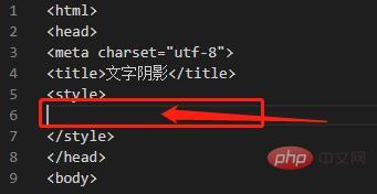
When the text does not have a shadow effect, use <style> to enter the code as follows:

Basic writing code example
<style>
p{text-shadow: 5px 5px 5px #FF0000;}
</style>

<p>php中文网</p>Code running effect diagram

text The syntax of -shadow

Horizontal offset: refers to how much the text shadow is offset relative to the text itself. Zero means no offset and coincides with the text position; positive number means offset to the right; negative number means offset to the left.
Vertical offset: Similar to horizontal offset, except that the direction is vertical, that is, up and down offset.
Feather Radius: The smaller the feather radius, the sharper the shadow; the larger the feather radius, the hazier the shadow.
Shadow Color: Specify the color of the shadow, which can be any color. Generally use darker colors to create shadow effects and lighter colors to create glow effects.
Recommended learning: CSS video tutorial
The above is the detailed content of Teach you step by step how to use css3 to add shadow effects to text (detailed code explanation). For more information, please follow other related articles on the PHP Chinese website!