Fix CSS irregular borders in one move
Everyone may be used to using box-shadow to set the box shadow, but as the name suggests, the shadow projection of box shadow is generally a square. If we encounter other situations, how should we achieve the shadow effect?

I have done many special layouts before, such as the techniques for implementing coupons with CSS and the tooltips that support gradients with CSS in these two articles, as follows

But there has always been a pain point: the inability to add borders to these graphics

Today I bring a little trick: use drop-shadow can fix all irregular borders with one line of code
1. Projection
You need to use drop-shadow here, here is a brief introduction
The syntax is actually very simple
filter: drop-shadow(offset-x offset-y blur-radius color)
is not a separate attribute, but a method under the filter filter
Here offset-x, offset-y are the offsets, blur-radius is the blur radius, and color is the projection color . The actual function is to simulate the projection of the real world (the transparent part will not be projected). The difference is as follows
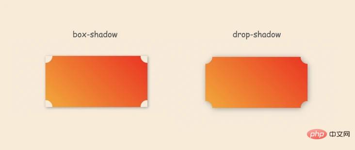
Unfortunately, although it is similar to box-shadow, it is missing Expansion radius. Just imagine, if the expansion radius is supported, would it be easy to create irregular borders (it should not be supported, because the real-world projection does not have an expansion radius)?
So, how does drop-shadow generate a border?
2. Multiple projections
box-shadow can easily realize multiple shadows
box-shadow: 0 0 3px #333, 1px 1px 5px #666, ...
can be superimposed infinitely.
However, drop-shadow will not work. For example,
filter: drop-shadow(0 0 3px #333, 1px 1px 5px #666, ...)
you can see that the browser directly considers it illegal

But it can To put it another way, although drop-shadow does not support it, filter supports a variety of filters, so it can be implemented like this
filter: drop-shadow(0 0 3px #333) drop-shadow(0 0 3px #333) drop-shadow(0 0 3px #333)...
This will take effect
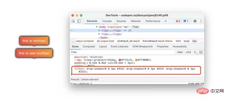
Is it a bit like a border? If you only set a blur of 0.5px and overlay it a few times, the blurred part will become clearer. This is a bit like a softer stroke. After a few more strokes, it will become clearer, so you can get this effect
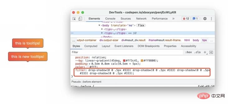
This is closer. After practice, fine-tuning may be needed. Here is a relatively perfect solution (here comes the key point~)
.wrap{
  filter: drop-shadow(0px 0px 0.5px #333) drop-shadow(0px 0px 0px #333) drop-shadow(0px 0px 0px #333) drop-shadow(0px 0px 0px #333) drop-shadow(0px 0px 0px #333)
}
The border achieved in this way is clear enough and can basically be used daily
There are many colors in this code, which can be optimized. The projected color follows the current text color by default, so it can be simplified to
.wrap{
  filter: drop-shadow(0 0 0.5px)drop-shadow(0 0 0)drop-shadow(0 0 0)drop-shadow(0 0 0)drop-shadow(0 0 0);
  color: #333;
}3. Usage and limitations
The usage is simple, just add this line of CSS to the outermost layer of the container. For example, in the previous coupon example, the resulting border effect is like this
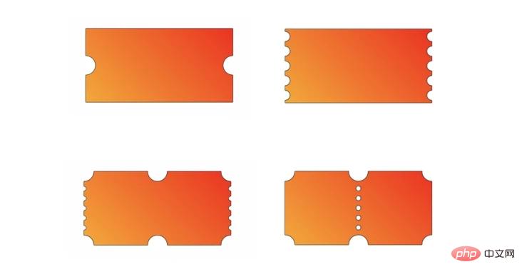
There is also something like this

The border is pretty good, and the shadow is almost invisible
But here It should be noted that the graphics cropped by mask need to be nested with a parent layer in the outer layer, otherwise the projection will be directly cropped by mask
<div class="wrap">
  <div class="coupon">
   <!--优惠券-->
  </div>
</div>
In addition, this solution is suitable for relatively small borders. If the larger The border may be smoother, and more filters need to be superimposed, and the effect is not very good. As follows
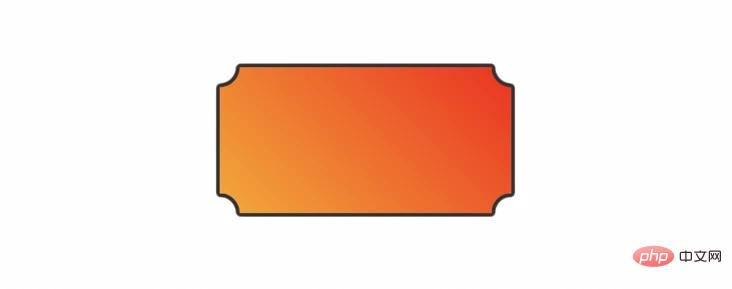
you need to make your own choices (generally not There are too thick borders)
4. Summary and explanation
This article introduces a general solution to achieve irregular borders, the cost is very low, and the effect is also very good. Here is a summary:
drop-shadow will only generate projections for opaque parts, consistent with the real physical world
drop-shadow does not support multiple projections, and filter supports multiple filters , can indirectly realize multiple projections
The implementation principle of the border is the multiple superposition of projections
Some graphics generated by mask cropping need to be wrapped One layer of container, then generate border
Suitable for relatively small borders, too large borders are not ideal
Filter is actually a relatively performance-intensive attribute and is not suitable for use in a large range
Maybe most students will still choose "cut picture.png" in the end, but this can be regarded as a solution, and one more solution is always right. Finally, if you think it’s good and helpful to you, please like, collect and repost it❤❤❤
Recommended learning: css video tutorial
The above is the detailed content of Fix CSS irregular borders in one move. For more information, please follow other related articles on the PHP Chinese website!

Hot AI Tools

Undresser.AI Undress
AI-powered app for creating realistic nude photos

AI Clothes Remover
Online AI tool for removing clothes from photos.

Undress AI Tool
Undress images for free

Clothoff.io
AI clothes remover

AI Hentai Generator
Generate AI Hentai for free.

Hot Article

Hot Tools

Notepad++7.3.1
Easy-to-use and free code editor

SublimeText3 Chinese version
Chinese version, very easy to use

Zend Studio 13.0.1
Powerful PHP integrated development environment

Dreamweaver CS6
Visual web development tools

SublimeText3 Mac version
God-level code editing software (SublimeText3)

Hot Topics
 How to display hidden lines in xml
Apr 02, 2025 pm 11:45 PM
There are two common ways to hide rows in XML: Use the display property in CSS to set to none Use XSLT to skip hidden rows via conditional copying
 How to display the content of the interface with xml
Apr 02, 2025 pm 11:48 PM
XML is widely used to build and manage user interfaces. It defines and displays the interface content through the following steps: Define interface elements: XML uses tags to define interface elements and their properties. Building a hierarchy: XML organizes interface elements according to hierarchical relationships to form a tree structure. Using Stylesheets: Developers use stylesheet languages such as CSS or XSL to specify the visual appearance and behavior of elements. Rendering process: A browser or application uses an XML parser and stylesheet to parse an XML file and render interface elements to make it visible on the screen.
 How to play picture sequences smoothly with CSS animation?
Apr 04, 2025 pm 05:57 PM
How to achieve the playback of pictures like videos? Many times, we need to implement similar video player functions, but the playback content is a sequence of images. direct...
 How do you make sure that some operations are performed only once when using the useEffect hook in React's App.tsx?
Apr 04, 2025 pm 06:33 PM
In React projects, we often encounter problems with the use of lifecycle functions, especially when it comes to page refresh, how to ensure that certain operations only...
 The width of emsp spaces in HTML is inconsistent. How to reliably implement text indentation?
Apr 04, 2025 pm 11:57 PM
Regarding the problem of inconsistent width of emsp spaces in HTML and Chinese characters in many web tutorials, it is mentioned that occupying the width of a Chinese character, but the actual situation is not...
 How to use Vue 3 to implement up scrolling loading function similar to WeChat chat records?
Apr 04, 2025 pm 03:51 PM
How to achieve upward scrolling loading similar to WeChat chat records? When developing applications similar to WeChat chat records, a common question is how to...
 How to use CSS to achieve smooth playback effect of image sequences?
Apr 04, 2025 pm 04:57 PM
How to realize the function of playing pictures like videos? Many times, we need to achieve similar video playback effects in the application, but the playback content is not...
 How to implement a tight transition animation in React using react-transition-group?
Apr 04, 2025 pm 11:27 PM
Using react-transition-group in React to achieve confusion about closely following transition animations. In React projects, many developers will choose to use react-transition-group library to...


