

How Vue encapsulates Echarts charts

Before we start, we first follow the normal component registration process, create a new component named radar-chart in the project components directory, and then introduce the component to a Demo page for use.
New radar-chart component content:
// radar-chart.vue (子组件)
<template>
<p style="width: 100%; height: 100%;"></p>
</template>
<script>
export default {
name: 'radar-chart'
};
</script>
<style scoped>
</style>Demo page code:
// demo.vue (父组件)
<template>
<p style="border: 1px solid black; width: 400px; height: 300px; margin: 5px;">
<radar-chart></radar-chart>
</p>
</template>
<script>
import radarChart from '@/components/proj-components/echarts/radar-chart';
export default {
name: 'radar-chart-demo',
components: {
radarChart,
},
};
</script>
<style scoped>
</style>Demo page rendering 1:

Initialize the chart
After the preparation work is completed, what we have to do is to introduce ECharts and initialize an ECharts instance in the component. Here you can first copy the instance from the official website and data.
(1) Introduce ECharts in radar-chart.vue:
// radar-chart.vue (子组件)
import echarts from 'echarts';
(2) Create chart configuration data in methods. For data format, please refer to Echarts official website:
// radar-chart.vue (子组件)

    methods: {
        // 初始化图表配置
        initOption() {
            let vm = this;
            vm.option = {
                title: {
                    text: '基础雷达图'
                },
                tooltip: {},
                legend: {
                    data: ['预算分配(Allocated Budget)', '实际开销(Actual Spending)']
                },
                radar: {
                    // shape: 'circle',
                    name: {
                        textStyle: {
                            color: '#fff',
                            backgroundColor: '#999',
                            borderRadius: 3,
                            padding: [3, 5]
                        }
                    },
                    indicator: [{ name: '销售(sales)', max: 6500}, { name: '管理(Administration)', max: 16000}, { name: '信息技术(Information Techology)', max: 30000}, { name: '客服(Customer Support)', max: 38000}, { name: '研发(Development)', max: 52000}, { name: '市场(Marketing)', max: 25000}]
                },
                series: [{
                    name: '预算 vs 开销(Budget vs spending)',
                    type: 'radar',
                    // areaStyle: {normal: {}},
                    data: [{value: [4300, 10000, 28000, 35000, 50000, 19000], name: '预算分配(Allocated Budget)'}, {value: [5000, 14000, 28000, 31000, 42000, 21000], name: '实际开销(Actual Spending)'}]
                }]
            };
        },
},(3 ) Initialize the chart: In the component hook mounted method:
// radar-chart.vue (子组件)
    mounted() {
        this.initOption();
        this.$nextTick(() => { // 这里的 $nextTick() 方法是为了在下次 DOM 更新循环结束之后执行延迟回调。也就是延迟渲染图表避免一些渲染问题
            this.ready();
        });
},In methods:
// radar-chart.vue (子组件)
   ready() {
      let vm = this;
      let dom = document.getElementById('radar-chart');

      vm.myChart = echarts.init(dom);
      vm.myChart && vm.myChart.setOption(vm.option);
},Demo page rendering 2:

There are three steps here, including introducing ECharts, initializing the chart configuration, and initializing the chart. Finally, you can see on the Demo page that the radar chart of ECharts has been initially displayed in the project.
Extract chart configuration properties (emphasis)
We have successfully created a radar chart above, but it is obvious that the data in radar-chart.vue is written Dead and cannot be called repeatedly. Next, let’s start with packaging.
The idea of encapsulation is as follows:
1. demo.vue passes a set of personalized data to radar-chart.vue
2. radar-chart.vue passes props option receives data
3. Refine the received data and overwrite the configuration data option
4. Initialize the chart
Specific implementation: Pass data to the sub-component in data Define variables and assign values in mounted
// demo.vue (父组件)
<template>
<p style="border: 1px solid black; width: 900px; height: 600px; margin: 5px;">
<radar-chart :indicator="indicator" :legendData="radarData"></radar-chart>
</p>
</template>
<script>
import radarChart from '@/components/proj-components/echarts/radar-chart';
export default {
name: 'radar-chart-demo',
components: {
radarChart,
},
mounted() {
this.indicator = [
{ name: '销售', max: 6500 },
{ name: '管理', max: 16000 },
{ name: '信息技术', max: 30000 },
{ name: '客服', max: 38000 },
];
this.radarData = [
{
value: [4000, 15000, 26000, 21000],
name: '实际开销(Actual Spending)',
}
];
},
data() {
return {
indicator: [], // 雷达指示器数据
legendData: [], // 雷达图例数据
};
},
};
</script>
<style scoped>
</style>Receive data from the parent component in props
// radar-chart.vue (子组件)

    props: {
        // 指示器数据,必传项
        // 格式举例 [{ name: 'a', max: 1},{ name: 'a', max: 1},{ name: 'a', max: 1}]
        indicator: {
            type: Array,
            default: () => []
        },
        // 图例数据,必填项。
        // 格式举例 [{ value: [5000, 14000, 28000], name: 'name' },{ value: [5000, 14000, 28000], name: 'name' }]
        legendData: {
            type: Array,
            default: () => []
        },
},Update chart data option in ready() If you update the indicator and data attributes here value, there is no need to initialize these two values in initOption()
// radar-chart.vue (子组件)

    ready() {
       let vm = this;
       let dom = document.getElementById('radar-chart');

       vm.myChart = echarts.init(dom);

       // 得到指示器数据
       vm.option.radar.indicator = vm.indicator;
       // 得到图例数据
       vm.option.series[0].data = vm.legendData;

       vm.myChart && vm.myChart.setOption(vm.option);
},Demo page rendering picture 3:

// radar-chart.vue (子组件)
<template>
<p :id="chartId" style="height: 100%; width: 100%;"></p>
</template>
<script>
let chartIdSeed = 1;
export default {
data() {
return {
chartId: 1,
};
},
mounted() {
let vm = this;
vm.chartId = 'radar-chart_' + chartIdSeed++;
},
methods: {
let vm = this;
let dom = document.getElementById(vm.chartId);
}
};
</script>// radar-chart.vue (子组件)
<script>
export default {
data() {
return {
// 默认配置项。以下配置项可以在父组件 :chartConfig 进行配置,会覆盖这里的默认配置
defaultConfig: {
tooltipShow: true
},
finallyConfig: {}, // 最后配置项
};
},
mounted() {
// 在这里合并默认配置与父组件传进来的配置
vm.finallyConfig = Object.assign({}, vm.defaultConfig, vm.$attrs.chartConfig);
},
methods: {
initOption() {
vm.option = {
tooltip: {
show: vm.finallyConfig.tooltipShow, // 在这里使用最终配置
},
}
},
}
};
</script>// radar-chart.vue (子组件)
watch: {
legendData() {
this.$nextTick(() => {
this.ready();
});
}
},// radar-chart.vue (子组件)
export default {
data() {
return {
chartResizeTimer: null, // 定时器,用于resize事件函数节流
};
},
methods: {
ready() {
// 添加窗口resize事件
window.addEventListener('resize', vm.handleChartResize);
// 触发父组件的 @chartClick 事件
vm.myChart.on('click', function(param) {
vm.$emit('chartClick', param);
});
},
// 处理窗口resize事件
handleChartResize() {
let vm = this;
clearTimeout(vm.chartResizeTimer);
vm.chartResizeTimer = setTimeout(function() {
vm.myChart && vm.myChart.resize();
}, 200);
},
},
beforeDestroy() {
// 释放该图例资源,较少页面卡顿情况
if (this.myChart) this.myChart.clear();
// 移除窗口resize事件
window.removeEventListener('resize', this.handleChartResize);
}
};vue.js Tutorial》】
The above is the detailed content of How Vue encapsulates Echarts charts. For more information, please follow other related articles on the PHP Chinese website!

Hot AI Tools

Undresser.AI Undress
AI-powered app for creating realistic nude photos

AI Clothes Remover
Online AI tool for removing clothes from photos.

Undress AI Tool
Undress images for free

Clothoff.io
AI clothes remover

Video Face Swap
Swap faces in any video effortlessly with our completely free AI face swap tool!

Hot Article
Hot Tools

Notepad++7.3.1
Easy-to-use and free code editor

SublimeText3 Chinese version
Chinese version, very easy to use

Zend Studio 13.0.1
Powerful PHP integrated development environment

Dreamweaver CS6
Visual web development tools

SublimeText3 Mac version
God-level code editing software (SublimeText3)
Hot Topics
 1386
1386
 52
52

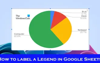 How to add labels to legend in Google Sheet
Feb 19, 2024 am 11:03 AM
How to add labels to legend in Google Sheet
Feb 19, 2024 am 11:03 AM
This article will demonstrate how to add labels to legends in Google Sheet that focus on a single thing, providing a name or identity. A legend explains a system or group of things, giving you relevant contextual information. How to Add Labels to a Legend in GoogleSheet Sometimes, when working with charts, we want to make them easier to understand. This can be achieved by adding appropriate labels and legends. Next, we’ll show you how to add labels to legends in Google Sheets to make your data clearer. Create the chart Edit the text of the legend label Let's get started. 1] Create a chart To label the legend, first, we have to create a chart: First, enter in the columns or rows of GoogleSheets
 ECharts and Java interface: How to quickly implement statistical charts such as line charts, bar charts, pie charts, etc.
Dec 17, 2023 pm 10:37 PM
ECharts and Java interface: How to quickly implement statistical charts such as line charts, bar charts, pie charts, etc.
Dec 17, 2023 pm 10:37 PM
ECharts and Java interface: How to quickly implement statistical charts such as line charts, bar charts, and pie charts. Specific code examples are required. With the advent of the Internet era, data analysis has become more and more important. Statistical charts are a very intuitive and powerful display method. Charts can display data more clearly, allowing people to better understand the connotation and patterns of the data. In Java development, we can use ECharts and Java interfaces to quickly display various statistical charts. ECharts is a software developed by Baidu
 How to use php interface and ECharts to generate visual statistical charts
Dec 18, 2023 am 11:39 AM
How to use php interface and ECharts to generate visual statistical charts
Dec 18, 2023 am 11:39 AM
In today's context where data visualization is becoming more and more important, many developers hope to use various tools to quickly generate various charts and reports so that they can better display data and help decision-makers make quick judgments. In this context, using the Php interface and ECharts library can help many developers quickly generate visual statistical charts. This article will introduce in detail how to use the Php interface and ECharts library to generate visual statistical charts. In the specific implementation, we will use MySQL
 Steps to draw dashboard using ECharts and Python interface
Dec 18, 2023 am 08:40 AM
Steps to draw dashboard using ECharts and Python interface
Dec 18, 2023 am 08:40 AM
The steps to draw a dashboard using ECharts and Python interface require specific code examples. Summary: ECharts is an excellent data visualization tool that can easily perform data processing and graphics drawing through the Python interface. This article will introduce the specific steps to draw a dashboard using ECharts and Python interface, and provide sample code. Keywords: ECharts, Python interface, dashboard, data visualization Introduction Dashboard is a commonly used form of data visualization, which uses
 How to use map heat map to display city heat in ECharts
Dec 18, 2023 pm 04:00 PM
How to use map heat map to display city heat in ECharts
Dec 18, 2023 pm 04:00 PM
How to use a map heat map to display city heat in ECharts ECharts is a powerful visual chart library that provides various chart types for developers to use, including map heat maps. Map heat maps can be used to show the popularity of cities or regions, helping us quickly understand the popularity or density of different places. This article will introduce how to use the map heat map in ECharts to display city heat, and provide code examples for reference. First, we need a map file containing geographic information, EC
 How to use calendar charts to display time data in ECharts
Dec 18, 2023 am 08:52 AM
How to use calendar charts to display time data in ECharts
Dec 18, 2023 am 08:52 AM
How to use calendar charts to display time data in ECharts ECharts (Baidu’s open source JavaScript chart library) is a powerful and easy-to-use data visualization tool. It offers a variety of chart types, including line charts, bar charts, pie charts, and more. The calendar chart is a very distinctive and practical chart type in ECharts, which can be used to display time-related data. This article will introduce how to use calendar charts in ECharts and provide specific code examples. First, you need to use
 Does ECharts depend on jQuery? In-depth analysis
Feb 27, 2024 am 08:39 AM
Does ECharts depend on jQuery? In-depth analysis
Feb 27, 2024 am 08:39 AM
Does ECharts need to rely on jQuery? Detailed interpretation requires specific code examples. ECharts is an excellent data visualization library that provides a rich range of chart types and interactive functions and is widely used in web development. When using ECharts, many people will have a question: Does ECharts need to rely on jQuery? This article will explain this in detail and give specific code examples. First, to be clear, ECharts itself does not rely on jQuery;
 How to insert a chart in word
Mar 20, 2024 pm 03:41 PM
How to insert a chart in word
Mar 20, 2024 pm 03:41 PM
Sometimes in order to display the data more intuitively, we need to use charts to display it. But when it comes to charts, many people think that they can only be operated on Excel. In fact, this is not the case. Word can also directly insert charts. How to do it? Just take a look and you'll find out. 1. First we open a word document. 2. Next we find the "Chart" tool button in the "Insert" menu and click it. 3. Click the "Chart" button and select a suitable chart. Here we can select a chart type at will and click "OK". 4. After selecting the chart, the system will automatically open the excel chart, and inside The data has been entered, we just need to change the data. If you have already prepared the form here,
