We have almost learned the knowledge about the css background. Next, let’s take a look at the knowledge of the grid system. Friends in need can refer to it.
Let’s look at a little chestnut first.
 <style>
      article {
          display: grid;
          width: 300px;
          height: 300px;
          grid-template-rows: repeat(3,1fr);
          grid-template-columns: repeat(3,1fr);
      }
      div{
          background: rgb(208, 159, 255);
          background-clip: content-box;
          border: solid 1px rgb(208, 159, 255);
          padding: 10px;
      }
    </style>
  </head>
  <body>
    <article>
      <div>1</div>
      <div>2</div>
      <div>3</div>
      <div>4</div>
      <div>5</div>
      <div>6</div>
      <div>7</div>
      <div>8</div>
      <div>9</div>
    </article>
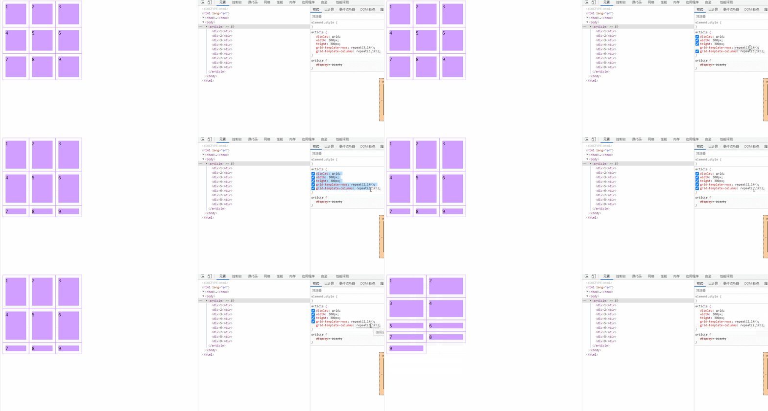
</body>The result of this small example is
 As you can see, by changing the value of the attribute, we changed the originally very beautiful layout into a not particularly beautiful one. A layout. So what attributes did we change? By observing, you can see that the attribute values of
 grid-template-rows and grid-template-columns have been changed.
Let’s take a look at these two attributes.
The grid-template-columns property is based on the dimensions of the grid column to define the name of the grid line and the size of the grid track. The values are a space-separated list, where each value specifies the dimensions of the corresponding column.
The syntax format is
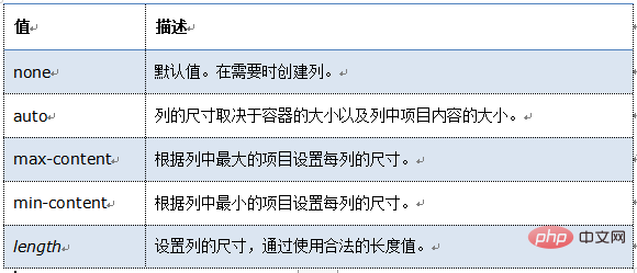
grid-template-columns: none|auto|max-content|min-content|length|initial|inherit;
This is a detailed introduction to this attribute value.
none: This keyword represents an ambiguous mesh. All rows and their sizes will be implicitly specified by the grid-auto-rows attribute.
max-content: is a keyword used to indicate that the maximum content of the grid item occupies the grid track.
min-content: is a keyword used to indicate that the grid track is occupied by the maximum and minimum content of the grid item.
auto: If the grid track is the largest, this property is equivalent to
After looking at the grid-template-columns property, let’s look at another property, grid-template-rows.
grid-template-rows Specifies the number (and height) of rows in a grid layout. The values are a space-separated list, where each value specifies the height of the corresponding row.
Let’s take a look at the syntax format of this attribute.
grid-template-rows: none|auto|max-content|min-content|length|initial|inherit;
I found that the value of this attribute is exactly the same as the value of the previous attribute, so we don’t have to remember so much. Let’s take a look at the concise version

Recommended learning: css video tutorial
The above is the detailed content of How to define grid line size in css. For more information, please follow other related articles on the PHP Chinese website!