Quickly create advanced blurry background images with CSS
Do you want your web page to look high-end? Want to increase the number of reading visits to your web page? Do you want your users to be attracted to your page at first glance? Then don’t miss this article! After all, anyone can learn how to create a high-end blurry background image simply and quickly!
Without further ado, let’s start with the main text!
As the title says, what we are going to introduce today is to create a blurred background image through CSS, which is suitable for your personal blog page and website background.
I will directly add the code below:
<!DOCTYPE html>
<html>
<head>
    <meta charset=utf-8 />
    <title></title>
<style>
    body, html {
        height: 100%;
        margin: 0;
        font-family: Arial, Helvetica, sans-serif;
    }
    * {
        box-sizing: border-box;
    }
    .bg-image {
        /* 所使用的图像 */
        background-image: url("001.jpg");

        /* 添加模糊效果 */
        filter: blur(8px);
        -webkit-filter: blur(8px);

        /* 完整的高度 */
        height: 100%;

        /* 中心和缩放图像*/
        background-position: center;
        background-repeat: no-repeat;
        background-size: cover;
    }
    /* 将文本放置在页面/图像的中间 */
    .bg-text {
        background-color: rgb(0,0,0);
        background-color: rgba(0,0,0, 0.4);
        color: white;
        font-weight: bold;
        border: 3px solid #f1f1f1;
        position: absolute;
        top: 50%;
        left: 50%;
        transform: translate(-50%, -50%);
        z-index: 2;
        width: 80%;
        padding: 20px;
        text-align: center;
    }
</style>

</head>
<body>
<div class="bg-image"></div>
<div class="bg-text">
    <h2 id="欢迎来到">欢迎来到</h2>
    <h1 id="虚拟现实">虚拟现实</h1>
    <p>一切都是虚拟的,但感觉还是真实</p>
</div>
</body>
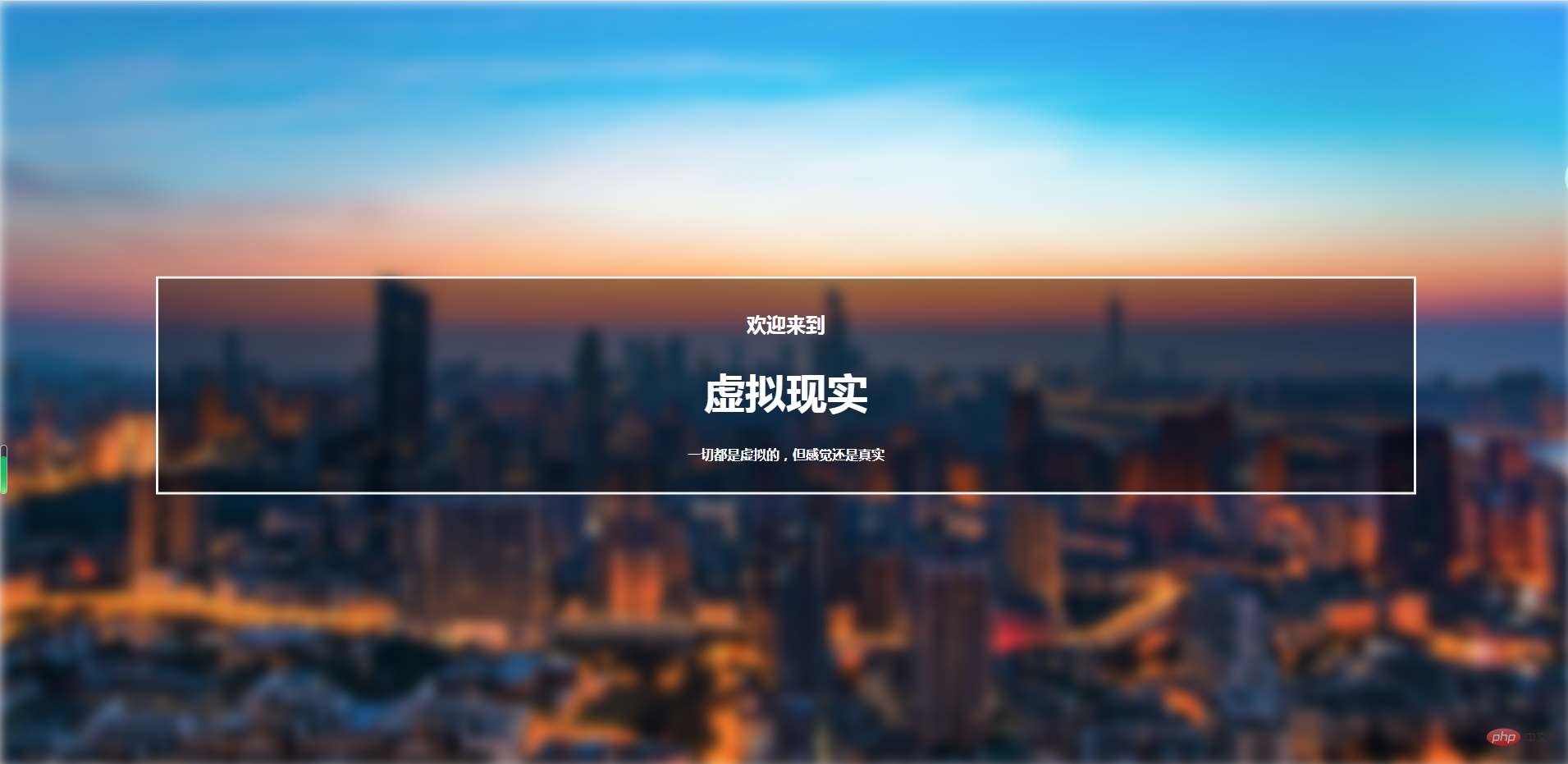
</html>The effect is as shown below:

( The background image comes from the Internet, sorry for the infringement)
How about it! Isn’t the effect great!
So in the above code, I will introduce you to several key css attributes:
filter The attribute defines the visibility of the element (usually ) Effects (e.g. blur and saturation).
Note: The non-standard "filter" attribute supported by older versions of Internet Explorer (4.0 to 8.0) has been deprecated. IE8 and lower browsers usually use the opacity attribute.
transformThe property applies a 2D or 3D transformation to the element. This property allows us to rotate, scale, move or tilt the element.
borderShorthand property sets all border properties in one declaration.
border-width:规定边框的宽度。
border-style:规定边框的样式。
border-color:规定边框的颜色。
inherit:规定应该从父元素继承 border 属性的设置。
backgroundShorthand property sets all background properties in one declaration.
background-color:规定要使用的背景颜色。
background-position:规定背景图像的位置。
background-size:规定背景图片的尺寸。
background-repeat:规定如何重复背景图像。
background-origin:规定背景图片的定位区域。
background-clip:规定背景的绘制区域。
background-attachment:规定背景图像是否固定或者随着页面的其余部分滚动。
background-image:规定要使用的背景图像。
inherit:规定应该从父元素继承 background 属性的设置。
PHP Chinese website platform has a lot of video teaching resources. Welcome everyone to learn "css Video Tutorial"!
The above is the detailed content of Quickly create advanced blurry background images with CSS. For more information, please follow other related articles on the PHP Chinese website!

Hot AI Tools

Undresser.AI Undress
AI-powered app for creating realistic nude photos

AI Clothes Remover
Online AI tool for removing clothes from photos.

Undress AI Tool
Undress images for free

Clothoff.io
AI clothes remover

Video Face Swap
Swap faces in any video effortlessly with our completely free AI face swap tool!

Hot Article

Hot Tools

Notepad++7.3.1
Easy-to-use and free code editor

SublimeText3 Chinese version
Chinese version, very easy to use

Zend Studio 13.0.1
Powerful PHP integrated development environment

Dreamweaver CS6
Visual web development tools

SublimeText3 Mac version
God-level code editing software (SublimeText3)

Hot Topics
 1387
1387
 52
52
 How to use bootstrap in vue
Apr 07, 2025 pm 11:33 PM
Using Bootstrap in Vue.js is divided into five steps: Install Bootstrap. Import Bootstrap in main.js. Use the Bootstrap component directly in the template. Optional: Custom style. Optional: Use plug-ins.
 The Roles of HTML, CSS, and JavaScript: Core Responsibilities
Apr 08, 2025 pm 07:05 PM
HTML defines the web structure, CSS is responsible for style and layout, and JavaScript gives dynamic interaction. The three perform their duties in web development and jointly build a colorful website.
 How to write split lines on bootstrap
Apr 07, 2025 pm 03:12 PM
There are two ways to create a Bootstrap split line: using the tag, which creates a horizontal split line. Use the CSS border property to create custom style split lines.
 Understanding HTML, CSS, and JavaScript: A Beginner's Guide
Apr 12, 2025 am 12:02 AM
WebdevelopmentreliesonHTML,CSS,andJavaScript:1)HTMLstructurescontent,2)CSSstylesit,and3)JavaScriptaddsinteractivity,formingthebasisofmodernwebexperiences.
 How to resize bootstrap
Apr 07, 2025 pm 03:18 PM
To adjust the size of elements in Bootstrap, you can use the dimension class, which includes: adjusting width: .col-, .w-, .mw-adjust height: .h-, .min-h-, .max-h-
 How to use bootstrap button
Apr 07, 2025 pm 03:09 PM
How to use the Bootstrap button? Introduce Bootstrap CSS to create button elements and add Bootstrap button class to add button text
 How to set up the framework for bootstrap
Apr 07, 2025 pm 03:27 PM
To set up the Bootstrap framework, you need to follow these steps: 1. Reference the Bootstrap file via CDN; 2. Download and host the file on your own server; 3. Include the Bootstrap file in HTML; 4. Compile Sass/Less as needed; 5. Import a custom file (optional). Once setup is complete, you can use Bootstrap's grid systems, components, and styles to create responsive websites and applications.
 How to insert pictures on bootstrap
Apr 07, 2025 pm 03:30 PM
There are several ways to insert images in Bootstrap: insert images directly, using the HTML img tag. With the Bootstrap image component, you can provide responsive images and more styles. Set the image size, use the img-fluid class to make the image adaptable. Set the border, using the img-bordered class. Set the rounded corners and use the img-rounded class. Set the shadow, use the shadow class. Resize and position the image, using CSS style. Using the background image, use the background-image CSS property.


