How to dynamically draw a smiley face using HTML5+CSS3
In the previous article, we introduced the method of using HTML5 CSS3 to dynamically draw an elephant. If you are interested, you can click on the link to read → "HTML5 CSS3 to dynamically draw an elephant". This time we continue to talk about using HTML5 CSS3 to achieve animation effects and introduce how to dynamically draw a smiley face.
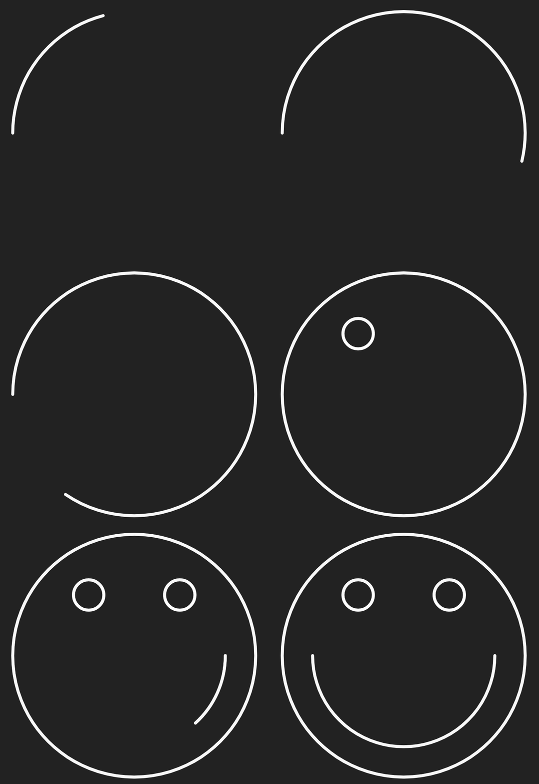
The main content of today’s article is: use HTML5 svg to draw a line smiley face, and then use CSS3 to add animation effects to it so that it can be drawn slowly. Just saying that you may not understand what the effect is, let’s take a look at the rendering directly:

Let’s study how to achieve this effect:
First set the background color of the entire page, the size of the svg canvas, and the color of the lines.
body {
  background: #222;
  display: flex;
  height: 100vh;
  justify-content: center;
  align-items: center;
  margin: 0;
}

svg {
  display: block;
  height: 90vmin;
  width: 90vmin;
}

.stroke {
  stroke-width: 1;
  stroke: #fff;
  fill: none;
}Then use svg to draw a line smiley face
Define the svg tag and nest an independent svg fragment in the current document
<svg viewBox="-50 -50 100 100">

</svg>
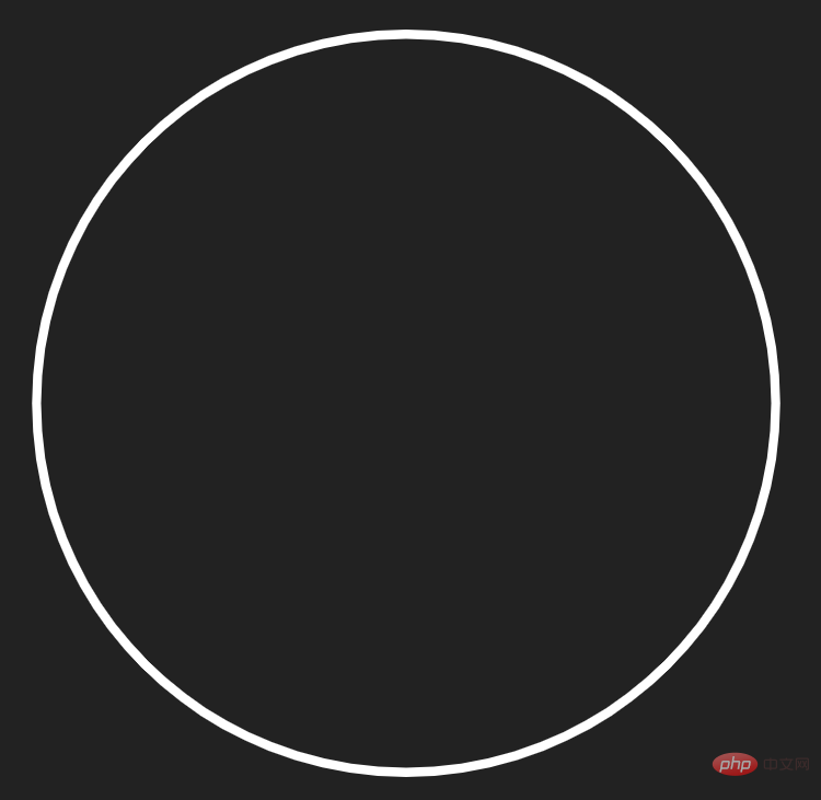
Define a path tag and draw a circle
<svg viewBox="-50 -50 100 100">
  <path class="stroke" d="M-40 0 a 40 40 0 0 1 80 0 a 40 40 0 0 1 -80 0"></path>
</svg>

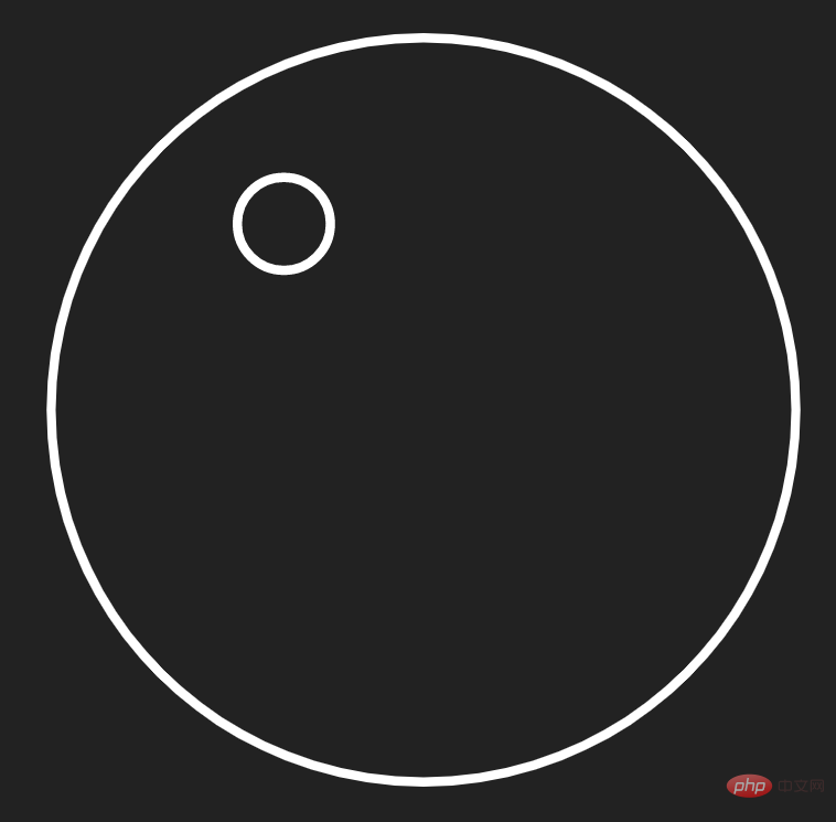
Use the path tag to draw the eye on the left
<svg viewBox="-50 -50 100 100">
  <path class="stroke" d="M-40 0 a 40 40 0 0 1 80 0 a 40 40 0 0 1 -80 0"></path>
  <path class="stroke" d="M-20 -20 a 5 5 0 0 1 10 0 a 5 5 0 0 1 -10 0"></path>
</svg>

Draw out the right eye as well
<svg viewBox="-50 -50 100 100">
  <path class="stroke" d="M-40 0 a 40 40 0 0 1 80 0 a 40 40 0 0 1 -80 0"></path>
  <path class="stroke" d="M-20 -20 a 5 5 0 0 1 10 0 a 5 5 0 0 1 -10 0"></path>
  <path class="stroke" d="M10 -20 a 5 5 0 0 1 10 0 a 5 5 0 0 1 -10 0"></path>
</svg>

- ##Draw the mouth
<svg viewBox="-50 -50 100 100">
  <path class="stroke" d="M-40 0 a 40 40 0 0 1 80 0 a 40 40 0 0 1 -80 0"></path>
  <path class="stroke" d="M-20 -20 a 5 5 0 0 1 10 0 a 5 5 0 0 1 -10 0"></path>
  <path class="stroke" d="M10 -20 a 5 5 0 0 1 10 0 a 5 5 0 0 1 -10 0"></path>
  <path class="stroke" d="M30 0 a 30 30 0 1 1 -60 0"></path>
</svg>

.stroke {
  stroke-linecap: round;
}
Finally realize the animation effect:
Bind an animation to the .stroke element, and then set the stroke-dasharray and stroke-dashoffset properties so that the smiley face pattern will be hidden first.stroke {
animation: stroke-anim 2s linear forwards;
stroke-dasharray: 300;
stroke-dashoffset: 300;
}@keyframes stroke-anim {
to {
stroke-dashoffset: 0;
}
}.stroke:nth-child(2) {
animation-delay: 2s;
}
.stroke:nth-child(3) {
animation-delay: 3s;
}
.stroke:nth-child(4) {
animation-delay: 4s;
}
@keyframes stroke-anim {
  to {
	stroke-dashoffset: 0;
  }
}
<!DOCTYPE html>
<html>
<head>
<meta charset="utf-8">
<style>
body {
background: #222;
display: flex;
height: 100vh;
justify-content: center;
align-items: center;
margin: 0;
}
svg {
display: block;
height: 90vmin;
width: 90vmin;
}
.stroke {
stroke-width: 1;
stroke: #fff;
fill: none;
stroke-linecap: round;
animation: stroke-anim 2s linear forwards;
stroke-dasharray: 300;
stroke-dashoffset: 300;
}
.stroke:nth-child(2) {
  animation-delay: 2s;
}
.stroke:nth-child(3) {
  animation-delay: 3s;
}

.stroke:nth-child(4) {
  animation-delay: 4s;
}

@keyframes stroke-anim {
  to {
	stroke-dashoffset: 0;
  }
}
</style>
</head>
<body>
<svg viewBox="-50 -50 100 100">
<path class="stroke" d="M-40 0 a 40 40 0 0 1 80 0 a 40 40 0 0 1 -80 0"></path>
<path class="stroke" d="M-20 -20 a 5 5 0 0 1 10 0 a 5 5 0 0 1 -10 0"></path>
<path class="stroke" d="M10 -20 a 5 5 0 0 1 10 0 a 5 5 0 0 1 -10 0"></path>
<path class="stroke" d="M30 0 a 30 30 0 1 1 -60 0"></path>
</svg>
</body>
</html>You can copy the above code directly and run the demonstration locally.
Here are some key tags and attributes:
- ##
- Path
The path element is a general element used to define shapes. All basic shapes can be created using the path element. The SVGelement is used to draw advanced shapes composed of lines, arcs, curves, etc., with or without fill. The element is probably the most advanced and versatile SVG shape of all elements. It's also probably the hardest element to master.
- animation
- Properties and
@keyframes
Rulesanimation property is a shorthand property. There are six animation properties that can be used to set:/* 定义动画*/ @keyframes 动画名称{ /* 样式规则*/ } /* 将它应用于元素 */ .element { animation-name: 动画名称(在@keyframes中已经声明好的); /* 或使用动画简写属性*/ animation: 动画名称 1s ... }Copy after login - property defines when the animation starts.
The value of this property is measured in seconds or milliseconds; negative values are allowed, -2s causes the animation to start immediately, but skips 2 seconds to enter the animation.:nth-child() - Selector
n can be a number, a keyword, or a formula.:nth-child(n) The selector matches the nth child element in the parent element , there are no restrictions on element types.
animation-name:规定需要绑定到选择器的 keyframe 名称。。
animation-duration:规定完成动画所花费的时间,以秒或毫秒计。
animation-timing-function:规定动画的速度曲线。
animation-delay:规定在动画开始之前的延迟。
animation-iteration-count:规定动画应该播放的次数。
animation-direction:规定是否应该轮流反向播放动画。
- animation-delay
PHP Chinese website platform has a lot of video teaching resources. Welcome everyone to learn "css video tutorial" and "HTML video tutorial"!
The above is the detailed content of How to dynamically draw a smiley face using HTML5+CSS3. For more information, please follow other related articles on the PHP Chinese website!

Hot AI Tools

Undresser.AI Undress
AI-powered app for creating realistic nude photos

AI Clothes Remover
Online AI tool for removing clothes from photos.

Undress AI Tool
Undress images for free

Clothoff.io
AI clothes remover

Video Face Swap
Swap faces in any video effortlessly with our completely free AI face swap tool!

Hot Article

Hot Tools

Notepad++7.3.1
Easy-to-use and free code editor

SublimeText3 Chinese version
Chinese version, very easy to use

Zend Studio 13.0.1
Powerful PHP integrated development environment

Dreamweaver CS6
Visual web development tools

SublimeText3 Mac version
God-level code editing software (SublimeText3)

Hot Topics
 1386
1386
 52
52
 Table Border in HTML
Sep 04, 2024 pm 04:49 PM
Guide to Table Border in HTML. Here we discuss multiple ways for defining table-border with examples of the Table Border in HTML.
 HTML margin-left
Sep 04, 2024 pm 04:48 PM
Guide to HTML margin-left. Here we discuss a brief overview on HTML margin-left and its Examples along with its Code Implementation.
 Nested Table in HTML
Sep 04, 2024 pm 04:49 PM
This is a guide to Nested Table in HTML. Here we discuss how to create a table within the table along with the respective examples.
 HTML Table Layout
Sep 04, 2024 pm 04:54 PM
Guide to HTML Table Layout. Here we discuss the Values of HTML Table Layout along with the examples and outputs n detail.
 HTML Input Placeholder
Sep 04, 2024 pm 04:54 PM
Guide to HTML Input Placeholder. Here we discuss the Examples of HTML Input Placeholder along with the codes and outputs.
 HTML Ordered List
Sep 04, 2024 pm 04:43 PM
Guide to the HTML Ordered List. Here we also discuss introduction of HTML Ordered list and types along with their example respectively
 Moving Text in HTML
Sep 04, 2024 pm 04:45 PM
Guide to Moving Text in HTML. Here we discuss an introduction, how marquee tag work with syntax and examples to implement.
 HTML onclick Button
Sep 04, 2024 pm 04:49 PM
Guide to HTML onclick Button. Here we discuss their introduction, working, examples and onclick Event in various events respectively.


