Let's talk about breakpoints and containers in Bootstrap5
This article will take you through the breakpoints and containers in Bootstrap5. I hope it will be helpful to you!

1. Bootstrap5 breakpoints
1.1 Mobile first
Speaking of mobile first, we must first mention responsive design. Responsive interface is to design a page that can adapt to different devices. Responsive design uses media query and other technologies to achieve style adaptation under different devices/windows. It also That is to say, it will display different page layouts to users according to the different devices you use. [Related recommendation: "bootstrap tutorial"]
This is implemented by having a media query technology based on HTML5, which can obtain the screen width, and then use css to use different values under different widths Just css effect.
Mobile first is to first develop an interface suitable for mobile clients, and then adapt the corresponding style according to the situation of the PC. On the contrary, the design idea is to give priority to PC. Which one to choose? The method should be considered based on your habits and which users account for a large proportion. Mobile first is now generally advocated.
1.2 Bootstrap breakpoints
The so-called breakpoint refers to the critical point. This table and its content must be remembered. In addition, especially the class infix, it is often used. This will be demonstrated in detail in the layout of the next section. You only need to read it a few times. It doesn't matter if you can't remember it. You can check it out when the time comes.
| Breakpoint type | Class infix | Resolution | ||||
|---|---|---|---|---|---|---|
| Small, tablet or old laptop) | sm | ≥576px | ||||
| Medium (medium, narrow screen computer) | md |
≥768px | ||||
lg | ≥992px||||||
| xl |
|
|||||
| xxl |
|
|
≥576px | Medium
≥768px | Large
≥992px | X- Large
≥1200px | XX-Large
≥1400px |
||
|---|---|---|---|---|---|---|
.container | 100%540px | 720px | 960px | 1140px | 1320px | |
.container-sm | 100%540px | 720px | 960px | 1140px | 1320px | |
.container-md | 100%100% | 720px | 960px | 1140px | 1320px | |
.container- lg | 100%100% | 100% | 960px | 1140px | 1320px | |
.container-xl | 100%100% | 100% | 100% | 1140px | 1320px | |
.container-xxl | 100%100% | 100% | 100% | 100% | 1320px | |
.container-fluid | 100%100% | 100% | 100% | 100% | 100% |
2.3 Container parsing changes with browser width
2.3.1 Simple examples
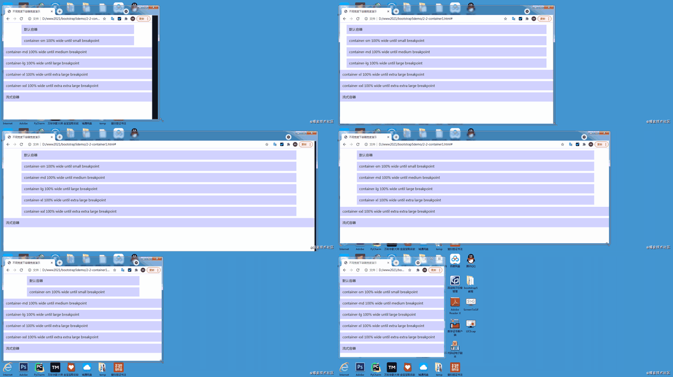
Some friends may not understand the table in 2.2. I will give you a few examples:Take container-md as an example. When the screen When the width is less than 768px, the container width accounts for 100% of the screen width. When the screen width is greater than 768px and less than 992px, the container width is always 720px; and when the screen width is greater than 992px and less than 1200px, the container width is always 960px, and so on, the same is true for other breakpoint containers and the default container.2.3.2 Several characteristics of Bootstrap containers (excluding flow containers)
- The width of the container jumps and is not smooth. The width of the interval between each two breakpoints is the same
- The container is borderless before the breakpoint and has margins after the breakpoint. For a 768px screen, the container width is 720px.
- The default container (container) and the small container (container-sm) are currently equivalent, but it is not ruled out that there will be changes in the next step.
2.4 Demo code for container changes with browser width
The following is the demo code under different browser widths, as well as GIF If you don’t understand the rendering, you can download the code and study it yourself. The style part is written by me to set the background color of the container and the interval of each container to facilitate distinction and viewing. It has nothing to do with the container itself.2.4.1 Demonstration animation

<!doctype html>
<html>
  <head>
    <meta charset="utf-8">
    <meta name="viewport" content="width=device-width, initial-scale=1">
    <meta name="keywords" content="">
    <meta name="description" content="">
    <link href="bootstrap5/bootstrap.min.css" rel="stylesheet">

    <title>不同宽度下容器宽度演示</title>
    <style>
      div{background-color: rgba(0, 0, 255, 0.178);padding: 10px;margin: 10px;}
    </style>
  </head>
  <body>
    <div>    默认容器  </div>
    <div>container-sm 100% wide until small breakpoint</div>
    <div>container-md 100% wide until medium breakpoint</div>
    <div>container-lg 100% wide until large breakpoint</div>
    <div>container-xl 100% wide until extra large breakpoint</div>
    <div>container-xxl 100% wide until extra extra large breakpoint</div>
    <div> 流式容器 </div>

     <script src="bootstrap5/bootstrap.bundle.min.js" ></script>
  </body>
</html>
The above is the detailed content of Let's talk about breakpoints and containers in Bootstrap5. For more information, please follow other related articles on the PHP Chinese website!

Hot AI Tools

Undresser.AI Undress
AI-powered app for creating realistic nude photos

AI Clothes Remover
Online AI tool for removing clothes from photos.

Undress AI Tool
Undress images for free

Clothoff.io
AI clothes remover

AI Hentai Generator
Generate AI Hentai for free.

Hot Article

Hot Tools

Notepad++7.3.1
Easy-to-use and free code editor

SublimeText3 Chinese version
Chinese version, very easy to use

Zend Studio 13.0.1
Powerful PHP integrated development environment

Dreamweaver CS6
Visual web development tools

SublimeText3 Mac version
God-level code editing software (SublimeText3)

Hot Topics
 1371
1371
 52
52
 How to use Docker for container failure recovery and automatic restart
Nov 07, 2023 pm 04:28 PM
As a lightweight virtualization platform based on container technology, Docker has been widely used in various scenarios. In a production environment, high availability and automatic failure recovery of containers are crucial. This article will introduce how to use Docker for container failure recovery and automatic restart, including specific code examples. 1. Configuration of automatic container restart In Docker, the automatic restart function of the container can be enabled by using the --restart option when running the container. Common options are: no: do not automatically restart. silent
 Fix breakpoint errors on Windows 11: 10 effective methods
Apr 24, 2023 am 10:19 AM
Since Windows 11 is still relatively new and is still expected to feature a lot of improvements, users are bound to deal with a bug or two. One such error is the Breaking Point Reached error message on Windows 11. This error can be due to a number of factors, some of which are known, while others are difficult to determine. Thankfully, these solutions are usually not far-fetched and in some cases only require a system update. Regardless of the cause and complexity, we've collected ways to fix errors in this complete guide. You just need to follow the instructions and you'll be fine. What does the error message "Breakpoint reached" mean? Breakpoint reached is a common error message that Windows 11 users may encounter. This error message usually occurs in
 AtomHub, an open source container mirroring center jointly created by Huawei, Inspur and other units, announced that it is officially open for public testing and can stably download domestic services.
Jan 02, 2024 pm 03:54 PM
According to Huawei’s official news, the Open Atomic Developer Conference, with the theme of “Everything for Developers”, was held in Wuxi for two days, from December 16 to 17. The conference was led by the Open Atomic Open Source Foundation, Huawei, and Inspur. , DaoCloud, Xieyun, Qingyun, Hurricane Engine, as well as the OpenSDV Open Source Alliance, openEuler community, OpenCloudOS community and other member units jointly initiated the construction of the AtomHub Trusted Mirror Center, which is officially open for public testing. AtomHub adheres to the concepts of co-construction, co-governance, and sharing, and aims to provide open source organizations and developers with a neutral, open and co-constructed trusted open source container mirror center. In view of the instability and uncontrollability of image warehouses such as DockerHub, and some
 How to install Redhat Podman on Windows 10 or 11 via CMD
Oct 02, 2023 pm 09:33 PM
Install RedHatPodman on Windows 11 or 10 Follow the steps below to install RedHatPodman on your Windows machine using Command Prompt or Powershell: Step 1: Check System Requirements First, you have to make sure that your Windows system is running with the latest updates so that it can meet the requirements to run Podman requirements. You should be using Windows 11 or Windows 10 version 1709 (Build 16299) or higher and you have to enable Windows Subsystem for Linux 2 (WSL2) and VM features, well if they are not activated yet then you can use The two-step command executes this
 What are the common types in C++ STL containers?
Jun 02, 2024 pm 02:11 PM
The most common container types in C++STL are Vector, List, Deque, Set, Map, Stack and Queue. These containers provide solutions for different data storage needs, such as dynamic arrays, doubly linked lists, and key- and value-based associative containers. In practice, we can use STL containers to organize and access data efficiently, such as storing student grades.
 How to sort C++ STL containers?
Jun 02, 2024 pm 08:22 PM
How to sort STL containers in C++: Use the sort() function to sort containers in place, such as std::vector. Using the ordered containers std::set and std::map, elements are automatically sorted on insertion. For a custom sort order, you can use a custom comparator class, such as sorting a vector of strings alphabetically.
 JavaScript debugging skills and method experience sharing in front-end development
Nov 02, 2023 pm 05:54 PM
Experience sharing on JavaScript debugging skills and methods in front-end development Introduction: In front-end development, JavaScript is one of the most common and important programming languages. It is widely used to develop web pages, applications, and mobile terminals. However, due to the dynamic and loose nature of JavaScript, developers often encounter a variety of bugs and issues. In this article, I will share some JavaScript debugging tips and methods that I have learned in front-end development,
 Three ways to use Python as a backend for small programs
Apr 12, 2023 pm 09:10 PM
Hello, I am Brother Zheng. WeChat's mini program is a very good experience, simple and quick to use. I have been learning to use mini programs these days. I have summarized three ways to use Python as the backend of mini programs for your reference. Method 1. WeChat cloud hosting [1]. Advantages: No need to purchase a server, no domain name registration required, billing based on usage, DevOps automation, security authentication, suitable for people with no operation and maintenance experience. Disadvantages: The cost is definitely slightly higher than the cost of building a self-built server. Just like the same model, automatic transmission cars are more expensive than manual transmission cars. The so-called cloud hosting is a Docker container. You only need to get a warehouse, which can be any of github, gitlab, and gitee.


