CSS FAQ: How to draw polygons (triangles ~ hexagons)
How to draw polygons using pure CSS? This article will introduce to you how to draw triangles starting from pure CSS, and introduce the methods of drawing quadrilaterals, pentagons, and hexagons. Higher implementation methods can also be drawn by analogy. I hope it will be helpful to everyone!

Today I am going to study a CSS question that is often tested in interviews, using CSS to draw polygons. This time we take triangles, quadrilaterals, pentagons, and hexagons as examples. First, we need to understand some necessary knowledge before starting.
1. Basic knowledge reserve
This time we will use pure CSS knowledge to draw some shapes. In order to draw these shapes, first learn the required CSS Basic knowledge point-css box model. [Related recommendation: "css video tutorial"]
As can be seen from the above picture, the standard box model is composed of content , padding, border, and margin. Let’s take a look at the specific situation using code.
<!--HTML部分,此部分代码若是不变,后面将复用不在赘述-->
<div id="main"></div>
/*css部分*/
#main {
  width: 100px;
  height: 100px;
  border: 200px solid red;
}The renderings are as follows:

2. Actual combat
It’s all talk but no practice, now it’s up to you to use it These basic CSS properties are used to draw common triangles, quadrilaterals, pentagons...
2.1 Quadrilateral
If you cannot directly use the background-color property to draw a quadrilateral, we can use the above picture to It can be seen that if the width and height of the content are all set to 0, and the width and height of the border are set, then we can get a quadrilateral consisting only of the border. Quadrilaterals are divided into squares, parallelograms, rectangles, etc. Here is Let's use borders to implement the three graphics above.
2.1.1 Square
First let us implement the simplest square.
#main {
  width: 0px;
  height: 0px;
  border-bottom: 200px solid red;
  border-left: 200px solid black;
  border-right: 200px solid blue;
  border-top: 200px solid pink;
}The effect is shown in the figure below:

2.1.2 Rectangle
In 2.1.1 we have already achieved this by using border To implement a square, let’s implement a rectangle next. Based on the mathematical knowledge we have learned, we only need to adjust the length and width of the square so that the length ≠ the width. Let’s implement it next.
#main {
  width: 0px;
  height: 0px;
  border-bottom: 200px solid red;
  border-left: 100px solid red;
  border-right: 100px solid red;
  border-top: 200px solid red;
}The effect is shown in the figure below:

2.1.3 Parallelogram
PS: The realization of parallelogram requires the use of two triangles To implement, it is recommended to skip it here. Please go to Reading 2.2 to see the implementation of the triangle, and then go back to see the parallelogram method here.
It is assumed that you have finished reading the content of 2.2. Next, realize the parallelogram.
<div id="wrapper">
	<div class="public"></div>
	<div class="public move"></div>
</div>
*{
   margin: 0;
}
#wrapper {
	  position: relative;
}
.public {
   width: 0px;
   height: 0px;
  border-bottom: 200px solid red;
  border-left: 200px solid transparent;
  border-right: 200px solid transparent;
  border-top: 200px solid transparent;
  position: absolute;
}
.move {
  transform: rotate(180deg);
  top: 200px;
  left: 200px;
}The effect is as shown below:

2.2 Triangle
So far, the simplest quadrilateral has been completed, so at this time it is Don’t you already have feelings? Let's go on. Since borders can realize quadrilaterals, triangles should be no problem. Of course, there are many types of triangles. According to the angles, they can be divided into acute triangles, right triangles, and obtuse triangles. Let's implement them separately. one time.
2.2.1 Acute triangle
First of all, let’s take a look at the situation occupied by the left, right, top, and bottom of the border when the width and height of the content are both 0. .
#main {
  width: 0px;
  height: 0px;
  border-bottom: 200px solid red;
  border-left: 200px solid black;
  border-right: 200px solid blue;
  border-top: 200px solid pink;
}The rendering is as follows:

It can be seen from the picture that left, right, top and bottom all occupy a triangle, then when we When we need a certain triangle, we only need to hide the other three triangles. We can use the transparent attribute value to hide the border, so let's implement it.
#main {
  width: 0px;
  height: 0px;
  border-bottom: 200px solid red;
  border-left: 200px solid transparent;
  border-right: 200px solid transparent;
  border-top: 200px solid transparent;
}The effect is shown in the picture:

2.2.2 Right triangle
At this point we can draw an acute triangle, right angle We can get the triangle based on the picture above. Just display the two border sides. Try the code.
#main {
  width: 0px;
  height: 0px;
  border-bottom: 200px solid red;
  border-left: 200px solid red;
  border-right: 200px solid transparent;
  border-top: 200px solid transparent;
}The effect is as shown in the picture:

2.2.3 Obtuse triangle
The above picture confirms the feasibility of the previous idea. So let's think about how to implement an obtuse triangle? It's not possible to follow the previous thinking, so we need to change our thinking.
我们可以用两个直角三角形,将小的直角三角形覆盖在大的上面,让我们试一下吧!!
<div id="main1"></div>
<div id="main2"></div>
#main1 {
  width: 0px;
  height: 0px;
  border-bottom: 200px solid red;
  border-left: 200px solid transparent;
}
#main2 {
  width: 0px;
  height: 0px;
  border-bottom: 200px solid black;
  border-left: 150px solid transparent;
  position: absolute;
  /*这里8px是浏览器中的margin自带的间距,之前没有处理*/
  top: 8px;
  left: 58px;
}效果图如下所示:

这次通过绝对定位来控制小的直角三角形,那么我们可以通过控制黑色三角形的颜色来显示钝角三角形。
2.3 五边形
三角形都已经学会了,那么很多图形都可以通过三角形拼凑得来,就以五边形为例,这里将以多个三角形来画出五边形。
<div id="wrapper">
    <div class="main1 tool"></div>
    <div class="main2 tool"></div>
    <div class="main3 tool"></div>
    <div class="main4 tool"></div>
    <div class="main5 tool"></div>
</div>*{
margin: 0;
}
#wrapper {
position: relative;
top: 300px;
margin-left: 300px;
}
.main2 {
transform: rotate(72deg);
}
.main3 {
transform: rotate(144deg);
}
.main4 {
transform: rotate(216deg);
}
.main5 {
transform: rotate(288deg);
}
.tool{
width: 0px;
height: 0px;
border-right: 58px solid transparent;
border-left: 58px solid transparent;
border-bottom: 160px solid red;
position: absolute;
top: 0;
left: 0;
}效果如下图所示:

实现五边形的主要难点在于border的三个边的取值,以及旋转的角度。
2.4 六边形
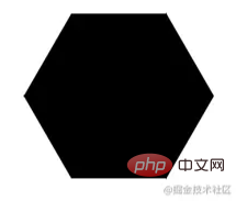
到目前为止三角行、四、五边形的三种形式都实现了一遍,他们均是通过border来实现的,那么让我们来想一下怎么画出一个六边形,有条件的可以在纸上画画,我们可以把一个五边形分成6个等边三角形,让我们通过上面所学知识来实现一下六边形吧!
<div id="wrapper">
  <div class="main1 tool"></div>
  <div class="main2 tool"></div>
  <div class="main3 tool"></div>
  <div class="main4 tool"></div>
  <div class="main5 tool"></div>
  <div class="main6 tool"></div>
</div>
*{
  margin: 0;
}
#wrapper {
  position: relative;
  top: 300px;
  margin-left: 300px;
}
.main2 {
  transform: rotate(60deg);
}
.main3 {
  transform: rotate(120deg);
}
.main4 {
  transform: rotate(180deg);
}
.main5 {
  transform: rotate(240deg);
}
.main6 {
  transform: rotate(300deg);
}
.tool{
  width: 0px;
  height: 0px;
  border-right: calc(60px / 1.732) solid transparent;
  border-left: calc(60px / 1.732) solid transparent;
  border-bottom: 60px solid red;
  transform-origin: top;
  position: absolute;
  top: 0;
  left: 0;
}
通过上面的方法实现五边形,这边难点主要是画出等边三角形。
上面的方法已经实现了,让我们想想其他的方法实现一下吧,这里我们将通过三个四边形实现五边形,让我们一下实验一下吧!!
<div id="wrapper">
  <div class="main1 tool"></div>
  <div class="main2 tool"></div>
  <div class="main3 tool"></div>
</div>
*{
    margin: 0;
}
#wrapper {
    position: relative;
    top: 300px;
    margin-left: 300px;
}
.main1 {
    width: calc(120px / 1.732);
    height: 120px;
    background-color: black;
}
.main2 {
    width: calc(120px / 1.732);
    height: 120px;
    transform: rotate(120deg);
    background-color: black;
}
.main3 {
    width: calc(120px / 1.732);
    height: 120px;
    transform: rotate(240deg);
    background-color: black;
}
.tool{
    position: absolute;
    top: 0;
    left: 0;
}
好了,目前已经讲述了三角形,四边形,五边形,六边形得到实现方式了,更高的实现方式就以此类推了。
原文地址:https://juejin.cn/post/7001772184498601991
作者:执鸢者
更多编程相关知识,请访问:编程入门!!
The above is the detailed content of CSS FAQ: How to draw polygons (triangles ~ hexagons). For more information, please follow other related articles on the PHP Chinese website!

Hot AI Tools

Undresser.AI Undress
AI-powered app for creating realistic nude photos

AI Clothes Remover
Online AI tool for removing clothes from photos.

Undress AI Tool
Undress images for free

Clothoff.io
AI clothes remover

Video Face Swap
Swap faces in any video effortlessly with our completely free AI face swap tool!

Hot Article

Hot Tools

Notepad++7.3.1
Easy-to-use and free code editor

SublimeText3 Chinese version
Chinese version, very easy to use

Zend Studio 13.0.1
Powerful PHP integrated development environment

Dreamweaver CS6
Visual web development tools

SublimeText3 Mac version
God-level code editing software (SublimeText3)

Hot Topics
 1389
1389
 52
52
 The Roles of HTML, CSS, and JavaScript: Core Responsibilities
Apr 08, 2025 pm 07:05 PM
HTML defines the web structure, CSS is responsible for style and layout, and JavaScript gives dynamic interaction. The three perform their duties in web development and jointly build a colorful website.
 How to use bootstrap in vue
Apr 07, 2025 pm 11:33 PM
Using Bootstrap in Vue.js is divided into five steps: Install Bootstrap. Import Bootstrap in main.js. Use the Bootstrap component directly in the template. Optional: Custom style. Optional: Use plug-ins.
 How to write split lines on bootstrap
Apr 07, 2025 pm 03:12 PM
There are two ways to create a Bootstrap split line: using the tag, which creates a horizontal split line. Use the CSS border property to create custom style split lines.
 Understanding HTML, CSS, and JavaScript: A Beginner's Guide
Apr 12, 2025 am 12:02 AM
WebdevelopmentreliesonHTML,CSS,andJavaScript:1)HTMLstructurescontent,2)CSSstylesit,and3)JavaScriptaddsinteractivity,formingthebasisofmodernwebexperiences.
 How to use bootstrap button
Apr 07, 2025 pm 03:09 PM
How to use the Bootstrap button? Introduce Bootstrap CSS to create button elements and add Bootstrap button class to add button text
 How to resize bootstrap
Apr 07, 2025 pm 03:18 PM
To adjust the size of elements in Bootstrap, you can use the dimension class, which includes: adjusting width: .col-, .w-, .mw-adjust height: .h-, .min-h-, .max-h-
 How to insert pictures on bootstrap
Apr 07, 2025 pm 03:30 PM
There are several ways to insert images in Bootstrap: insert images directly, using the HTML img tag. With the Bootstrap image component, you can provide responsive images and more styles. Set the image size, use the img-fluid class to make the image adaptable. Set the border, using the img-bordered class. Set the rounded corners and use the img-rounded class. Set the shadow, use the shadow class. Resize and position the image, using CSS style. Using the background image, use the background-image CSS property.
 How to set up the framework for bootstrap
Apr 07, 2025 pm 03:27 PM
To set up the Bootstrap framework, you need to follow these steps: 1. Reference the Bootstrap file via CDN; 2. Download and host the file on your own server; 3. Include the Bootstrap file in HTML; 4. Compile Sass/Less as needed; 5. Import a custom file (optional). Once setup is complete, you can use Bootstrap's grid systems, components, and styles to create responsive websites and applications.


