 WeChat Applet
 Mini Program Development
 Teach you step by step how to customize the bottom navigation bar of WeChat applet
Teach you step by step how to customize the bottom navigation bar of WeChat applet
How to customize the bottom navigation bar of WeChat applet? The following article will introduce to you the specific implementation method of customizing the bottom navigation bar. I hope it will be helpful to you!

WeChat supports custom navigation bar to achieve flexible bottom navigation bar. A simple description is given in the official document, but it is not too specific. Here I Through step-by-step specific code implementation, we will help you complete the specific implementation of customizing the bottom navigation bar. [Related learning recommendations: 小program development tutorial]
Introducing colorui
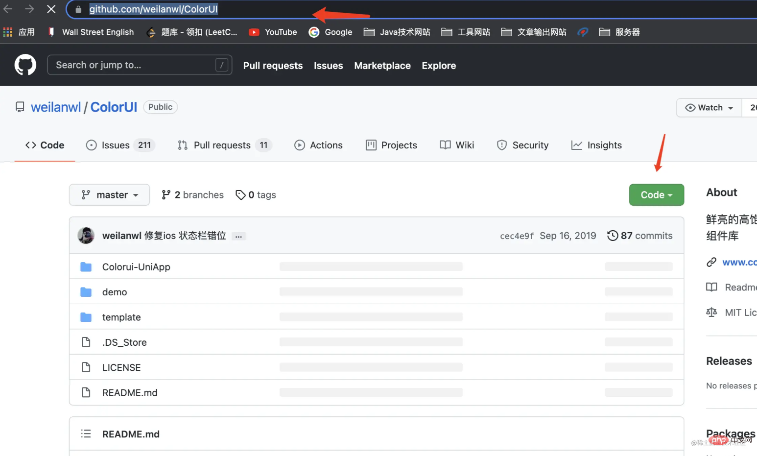
https://github.com/weilanwl/ColorUI
Visit this URL and download the colorui component library
After downloading, put the colorui folder in the demo folder into your applet In the project
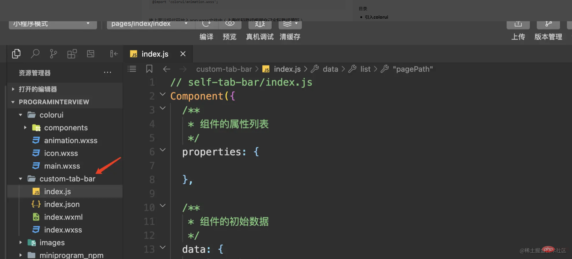

Settings are introduced
@import 'colorui/main.wxss';
@import 'colorui/icon.wxss';
@import 'colorui/animation.wxss';
Put the above code into the app.wxss file (Fill in the above code path according to your actual path)
colorui has been introduced successfully. I am using the style component of colorui here. In fact, the same is true for other uses, or you can write the bottom navigation bar yourself. Any style can be used
Create a custom bottom navigation bar component
We first create a custom component folder **custom-tab-bar, **Remember, the custom bottom navigation bar The folder name must be this and cannot be changed to anything else, otherwise the applet will not be recognized.

Then we create two pages (home,my) under Pages, which are used as two switching pages for the navigation bar


app.json file settings
If you do not use the default navigation bar settings of the mini program, you need to set the custom attribute of the tabBar in the app.json file. For true
The specific code is as follows:
"tabBar": {
    "custom": true,
    "list": [
      {
        "pagePath": "pages/home/home",
        "text": "首页",
        "iconPath": "images/icon/basics.png",
        "selectedIconPath": "images/icon/basics_cur.png"
      },
      {
        "pagePath": "pages/my/my",
        "text": "我的",
        "iconPath": "images/icon/component.png",
        "selectedIconPath": "images/icon/component_cur.png"
      }
    ]
},It should be noted here that the list also needs to be set. The pagePath in the list configures the specific tab page you need to configure. Here I only set it There are two tabs, so two are configured. After configuring several tabs, configure a few here. No one is missing. In addition to pagePath, other fields in the list can be increased or decreased according to your own needs.
Write the specific code logic of the navigation bar
The specific implementation of the navigation bar component
1. Initial data setting of the component
**// custome-tab-bar/index.js**
/**
   * 组件的初始数据
   */
  data: {
    selected: 0,
    list: [{
        "pagePath": "/pages/home/home",
        "text": "首页",
        "iconPath": "/images/icon/basics.png",
        "selectedIconPath": "/images/icon/basics_cur.png"
      },
      {
        "pagePath": "/pages/my/my",
        "text": "我的",
        "iconPath": "/images/icon/component.png",
        "selectedIconPath": "/images/icon/component_cur.png"
      }
    ]
}You can see here that the settings are roughly the same as those in app.json, but the real list data is actually obtained here instead of app.json. This is the key to implementing custom components, so everyone You may have questions, since app.json is not used, why do you need to set it in app.json? I checked here and found that this is the standard requirement of the mini program and we can only comply with it.
2. Component navigation bar page code implementation
<!--custom-tab-bar/index.wxml-->
<view class="cu-bar tabbar">
  <view wx:for="{{list}}" wx:key="index" class="action" data-index="{{index}}" data-path="{{item.pagePath}}" bindtap="switchTab">
    <view class="cuIcon-cu-image">
      <image ></image>
    </view>
    <view class="text-green">{{item.text}}</view>
  </view>
</view>Here is the colorui style used. We compare the index bit of each data in the list with the selected value to create the button style. Switching effect, realize tab page switching through switchTab switching event.
3. Component switching event code implementation
/**
   * 组件的方法列表
   */
  methods: {
    switchTab(e) {
      const data = e.currentTarget.dataset
      const url = data.path

      wx.switchTab({
        url
      })
      this.setData({
        selected: data.index
      })
    }
}Call the wx.switchTab method provided by WeChat to complete the url jump, and record the index value selected at the time.
The code for our component has been written here, and then the specific page must also set up the corresponding logic for button switching
4. Implementation of tab specific page code
// pages/my/my.js
/**
   * 生命周期函数--监听页面显示
   */
  onShow: function () {
    console.log("onShow")
    if (typeof this.getTabBar === 'function' && this.getTabBar()) {
      this.getTabBar().setData({
        selected: 1
      })
    }
},Set the value of selected through the page life cycle function of onShow. Because my page is the second tab, the index value is set to 1. The custom component WeChat has a new getTabBar interface, which can obtain the custom tabBar under the current page. Component instance, you can set the selected value in the component. The home page has the same settings, and the index value can be jumped according to the actual situation.
Final effect presentation
Through the implementation of the above code, the entire custom bottom navigation bar is realized. In fact, the overall implementation is relatively simple. Let's take a look at the effect
For more programming-related knowledge, please visit: Programming Video! !
The above is the detailed content of Teach you step by step how to customize the bottom navigation bar of WeChat applet. For more information, please follow other related articles on the PHP Chinese website!

Hot AI Tools

Undresser.AI Undress
AI-powered app for creating realistic nude photos

AI Clothes Remover
Online AI tool for removing clothes from photos.

Undress AI Tool
Undress images for free

Clothoff.io
AI clothes remover

AI Hentai Generator
Generate AI Hentai for free.

Hot Article

Hot Tools

Notepad++7.3.1
Easy-to-use and free code editor

SublimeText3 Chinese version
Chinese version, very easy to use

Zend Studio 13.0.1
Powerful PHP integrated development environment

Dreamweaver CS6
Visual web development tools

SublimeText3 Mac version
God-level code editing software (SublimeText3)

Hot Topics
 How to quickly set up a custom avatar in Netflix
Feb 19, 2024 pm 06:33 PM
An avatar on Netflix is a visual representation of your streaming identity. Users can go beyond the default avatar to express their personality. Continue reading this article to learn how to set a custom profile picture in the Netflix app. How to quickly set a custom avatar in Netflix In Netflix, there is no built-in feature to set a profile picture. However, you can do this by installing the Netflix extension on your browser. First, install a custom profile picture for the Netflix extension on your browser. You can buy it in the Chrome store. After installing the extension, open Netflix on your browser and log into your account. Navigate to your profile in the upper right corner and click
 Xianyu WeChat mini program officially launched
Feb 10, 2024 pm 10:39 PM
Xianyu's official WeChat mini program has quietly been launched. In the mini program, you can post private messages to communicate with buyers/sellers, view personal information and orders, search for items, etc. If you are curious about what the Xianyu WeChat mini program is called, take a look now. What is the name of the Xianyu WeChat applet? Answer: Xianyu, idle transactions, second-hand sales, valuations and recycling. 1. In the mini program, you can post idle messages, communicate with buyers/sellers via private messages, view personal information and orders, search for specified items, etc.; 2. On the mini program page, there are homepage, nearby, post idle, messages, and mine. 5 functions; 3. If you want to use it, you must activate WeChat payment before you can purchase it;
 How to customize shortcut key settings in Eclipse
Jan 28, 2024 am 10:01 AM
How to customize shortcut key settings in Eclipse? As a developer, mastering shortcut keys is one of the keys to improving efficiency when coding in Eclipse. As a powerful integrated development environment, Eclipse not only provides many default shortcut keys, but also allows users to customize them according to their own preferences. This article will introduce how to customize shortcut key settings in Eclipse and give specific code examples. Open Eclipse First, open Eclipse and enter
 The operation process of edius custom screen layout
Mar 27, 2024 pm 06:50 PM
1. The picture below is the default screen layout of edius. The default EDIUS window layout is a horizontal layout. Therefore, in a single-monitor environment, many windows overlap and the preview window is in single-window mode. 2. You can enable [Dual Window Mode] through the [View] menu bar to make the preview window display the playback window and recording window at the same time. 3. You can restore the default screen layout through [View menu bar>Window Layout>General]. In addition, you can also customize the layout that suits you and save it as a commonly used screen layout: drag the window to a layout that suits you, then click [View > Window Layout > Save Current Layout > New], and in the pop-up [Save Current Layout] Layout] enter the layout name in the small window and click OK
 WeChat applet implements image upload function
Nov 21, 2023 am 09:08 AM
WeChat applet implements picture upload function With the development of mobile Internet, WeChat applet has become an indispensable part of people's lives. WeChat mini programs not only provide a wealth of application scenarios, but also support developer-defined functions, including image upload functions. This article will introduce how to implement the image upload function in the WeChat applet and provide specific code examples. 1. Preparatory work Before starting to write code, we need to download and install the WeChat developer tools and register as a WeChat developer. At the same time, you also need to understand WeChat
 What is the name of Xianyu WeChat applet?
Feb 27, 2024 pm 01:11 PM
The official WeChat mini program of Xianyu has been quietly launched. It provides users with a convenient platform that allows you to easily publish and trade idle items. In the mini program, you can communicate with buyers or sellers via private messages, view personal information and orders, and search for the items you want. So what exactly is Xianyu called in the WeChat mini program? This tutorial guide will introduce it to you in detail. Users who want to know, please follow this article and continue reading! What is the name of the Xianyu WeChat applet? Answer: Xianyu, idle transactions, second-hand sales, valuations and recycling. 1. In the mini program, you can post idle messages, communicate with buyers/sellers via private messages, view personal information and orders, search for specified items, etc.; 2. On the mini program page, there are homepage, nearby, post idle, messages, and mine. 5 functions; 3.
 How to customize x-axis and y-axis in excel? (How to customize excel axis scale)
Mar 14, 2024 pm 02:10 PM
In an excel table, sometimes you may need to insert coordinate axes to see the changing trend of the data more intuitively. Some friends still don’t know how to insert coordinate axes in the table. Next, I will share with you how to customize the coordinate axis scale in Excel. Coordinate axis insertion method: 1. In the excel interface, select the data. 2. In the insertion interface, click to insert a column chart or bar chart. 3. In the expanded interface, select the graphic type. 4. In the right-click interface of the table, click Select Data. 5. In the expanded interface, you can customize it.
 Implement the drop-down menu effect in WeChat applet
Nov 21, 2023 pm 03:03 PM
To implement the drop-down menu effect in WeChat Mini Programs, specific code examples are required. With the popularity of mobile Internet, WeChat Mini Programs have become an important part of Internet development, and more and more people have begun to pay attention to and use WeChat Mini Programs. The development of WeChat mini programs is simpler and faster than traditional APP development, but it also requires mastering certain development skills. In the development of WeChat mini programs, drop-down menus are a common UI component, achieving a better user experience. This article will introduce in detail how to implement the drop-down menu effect in the WeChat applet and provide practical


