

How many types of css box models are there?

There are two types of css box models, namely: 1. W3c standard box model (standard box model), width and height refer to the width and height of the content area; 2. IE standard box model (Weird box model), width and height refer to the total width and height of the content area, borders, and padding.
The operating environment of this tutorial: Windows 7 system, CSS3&&HTML5 version, Dell G3 computer.
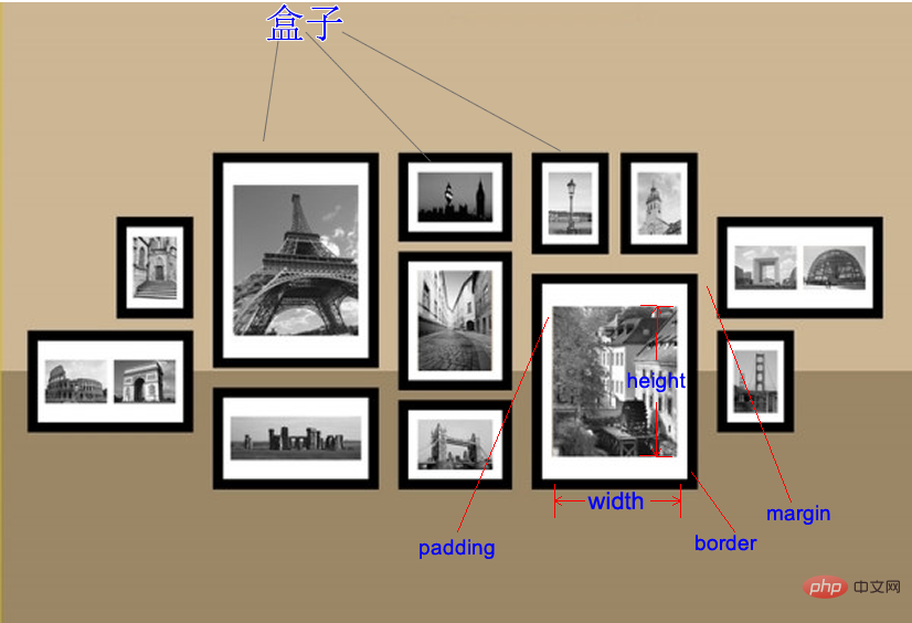
Box Model
The CSS box model is a thinking model used by CSS technology that is often used in web design. The Box Model can be used to lay out elements, including padding, borders, margins, and actual content.
Area in the box
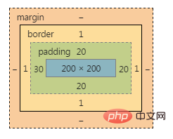
There are only 5 main attributes in a box: width, height, padding, border, and margin. As follows:
- width and height: The width and height of the content (not the width and height of the box).
- padding: padding.
- border: border.
- margin: Margin.
Schematic diagram of the box model:
Code demonstration:
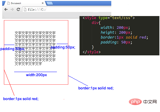
The box above , width:200px; height:200px; But the actual width and height occupied are 302*302. This is because padding and border need to be added.
Note: Width and real occupied width are not the same concept! Look at the example below.
Standard box model and IE box model
The box model is divided into two types:
The first is the W3c standard box model (standard box Model)
The second IE standard box model (weird box model)
In the knowledge we have learned so far, Based on the standard box model.
Standard box model:
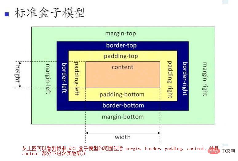
IE box model:
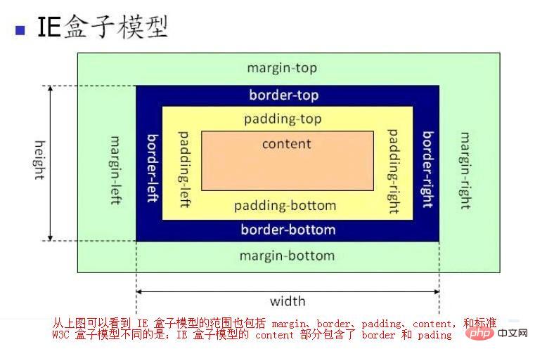
The above picture shows :
The CSS Box Model (Box Model) stipulates several ways for elements to be processed:
- width and height: The width and height of the content ( Not the width and height of the box).
- padding: padding.
- border: border.
- margin: Margin.
The difference between CSS box model and IE box model:
In standard box model,width and height refer to the width and height of the content area . Increasing padding, borders, and margins will not affect the size of the content area, but it will increase the overall size of the element's box.
In the IE box model, width and height refer to the content area border paddingThe width and height.
Note: Android also has the concepts of margin and padding, which have similar meanings. If you know a little bit about Android, it should be easier to understand. The difference is that there is no such thing as border in Android, and in Android, margin is not part of the control. I think this is more reasonable, haha.
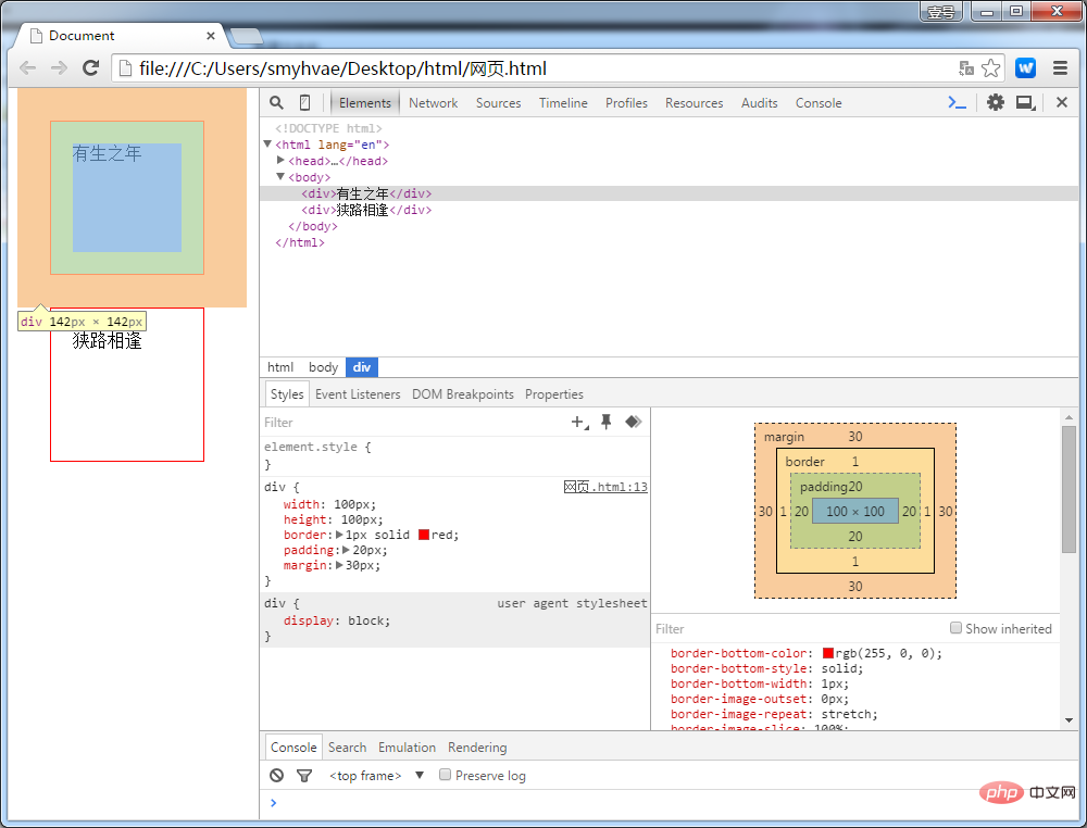
<body> tags also have margin
<body> tags need to be emphasized. Many people think that the <body> tag occupies the entire area of the entire page. This is actually wrong. The correct understanding is this: the largest box on the entire web page is <document>, which is the browser. And <body> is the son of <document>. The default margin size given by the browser to <body> is 8 pixels. At this time, <body> occupies a large area of the entire page, not the entire area. Let’s look at a piece of code.
<!doctype html>
<html>
 <head>
  <meta charset="UTF-8">
  <meta name="Generator" content="EditPlus®">
  <meta name="Author" content="">
  <meta name="Keywords" content="">
  <meta name="Description" content="">
  <title>Document</title>

<style type="text/css">

div{
width: 100px;
height: 100px;
border: 1px solid red;
padding: 20px;
margin: 30px;
}

</style>

 </head>

 <body>

<div>有生之年</div>
<div>狭路相逢</div>

 </body>

</html>In the above code, we set margins and other information on the div tag. Open Google Chrome and hold down F12. The display effect is as follows:
Understanding width and height
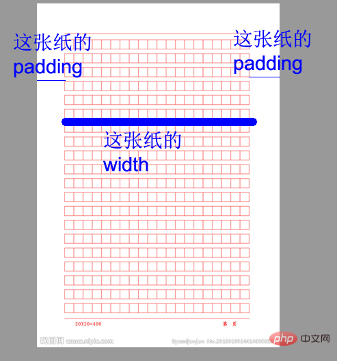
You must know that in the eyes of front-end development engineers, in the world Everything is different.
For example, when measuring the manuscript paper, the front-end development engineer will only measure the content width:
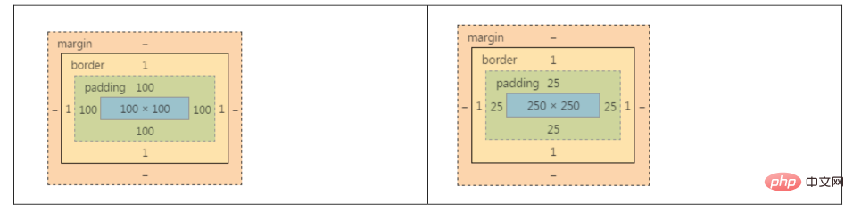
The actual width and height of the two boxes below are both 302 *302:
Box 1:
	.box1{
		width: 100px;
		height: 100px;
		padding: 100px;
		border: 1px solid red;
}盒子2:
	.box2{
		width: 250px;
		height: 250px;
		padding: 25px;
		border: 1px solid red;
}真实占有宽度 = 左border + 左padding + width + 右padding + 右border
上面这两个盒子的盒模型图如下:
如果想保持一个盒子的真实占有宽度不变,那么加width的时候就要减padding。加padding的时候就要减width。因为盒子变胖了是灾难性的,这会把别的盒子挤下去。
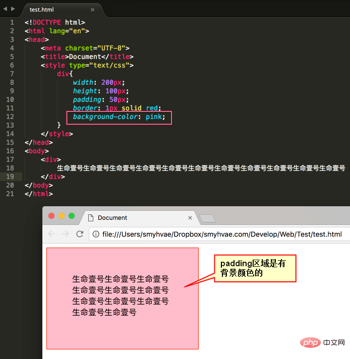
认识padding
padding区域也有颜色
padding就是内边距。padding的区域有背景颜色,css2.1前提下,并且背景颜色一定和内容区域的相同。也就是说,background-color将填充所有border以内的区域。
效果如下:
padding有四个方向
padding是4个方向的,所以我们能够分别描述4个方向的padding。
方法有两种,第一种写小属性;第二种写综合属性,用空格隔开。
小属性的写法:
	padding-top: 30px;
	padding-right: 20px;
	padding-bottom: 40px;
	padding-left: 100px;
综合属性的写法:(上、右、下、左)(顺时针方向,用空格隔开。margin的道理也是一样的)
padding:30px 20px 40px 100px;
如果写了四个值,则顺序为:上、右、下、左。
如果只写了三个值,则顺序为:上、右、下。??和右一样。
如果只写了两个值,比如说:
padding: 30px 40px;
则顺序等价于:30px 40px 30px 40px;
要懂得,用小属性层叠大属性。比如:
padding: 20px;
padding-left: 30px;
上面的padding对应盒子模型为:
下面的写法:
padding-left: 30px;
padding: 20px;
第一行的小属性无效,因为被第二行的大属性层叠掉了。
(学习视频分享:css视频教程)
The above is the detailed content of How many types of css box models are there?. For more information, please follow other related articles on the PHP Chinese website!

Hot AI Tools

Undresser.AI Undress
AI-powered app for creating realistic nude photos

AI Clothes Remover
Online AI tool for removing clothes from photos.

Undress AI Tool
Undress images for free

Clothoff.io
AI clothes remover

AI Hentai Generator
Generate AI Hentai for free.

Hot Article
Hot Tools

Notepad++7.3.1
Easy-to-use and free code editor

SublimeText3 Chinese version
Chinese version, very easy to use

Zend Studio 13.0.1
Powerful PHP integrated development environment

Dreamweaver CS6
Visual web development tools

SublimeText3 Mac version
God-level code editing software (SublimeText3)
Hot Topics
 1377
1377
 52
52

 How to use bootstrap button
Apr 07, 2025 pm 03:09 PM
How to use bootstrap button
Apr 07, 2025 pm 03:09 PM
How to use the Bootstrap button? Introduce Bootstrap CSS to create button elements and add Bootstrap button class to add button text
 How to resize bootstrap
Apr 07, 2025 pm 03:18 PM
How to resize bootstrap
Apr 07, 2025 pm 03:18 PM
To adjust the size of elements in Bootstrap, you can use the dimension class, which includes: adjusting width: .col-, .w-, .mw-adjust height: .h-, .min-h-, .max-h-
 How to write split lines on bootstrap
Apr 07, 2025 pm 03:12 PM
How to write split lines on bootstrap
Apr 07, 2025 pm 03:12 PM
There are two ways to create a Bootstrap split line: using the tag, which creates a horizontal split line. Use the CSS border property to create custom style split lines.
 How to set up the framework for bootstrap
Apr 07, 2025 pm 03:27 PM
How to set up the framework for bootstrap
Apr 07, 2025 pm 03:27 PM
To set up the Bootstrap framework, you need to follow these steps: 1. Reference the Bootstrap file via CDN; 2. Download and host the file on your own server; 3. Include the Bootstrap file in HTML; 4. Compile Sass/Less as needed; 5. Import a custom file (optional). Once setup is complete, you can use Bootstrap's grid systems, components, and styles to create responsive websites and applications.
 How to view the date of bootstrap
Apr 07, 2025 pm 03:03 PM
How to view the date of bootstrap
Apr 07, 2025 pm 03:03 PM
Answer: You can use the date picker component of Bootstrap to view dates in the page. Steps: Introduce the Bootstrap framework. Create a date selector input box in HTML. Bootstrap will automatically add styles to the selector. Use JavaScript to get the selected date.
 How to insert pictures on bootstrap
Apr 07, 2025 pm 03:30 PM
How to insert pictures on bootstrap
Apr 07, 2025 pm 03:30 PM
There are several ways to insert images in Bootstrap: insert images directly, using the HTML img tag. With the Bootstrap image component, you can provide responsive images and more styles. Set the image size, use the img-fluid class to make the image adaptable. Set the border, using the img-bordered class. Set the rounded corners and use the img-rounded class. Set the shadow, use the shadow class. Resize and position the image, using CSS style. Using the background image, use the background-image CSS property.
 How to verify bootstrap date
Apr 07, 2025 pm 03:06 PM
How to verify bootstrap date
Apr 07, 2025 pm 03:06 PM
To verify dates in Bootstrap, follow these steps: Introduce the required scripts and styles; initialize the date selector component; set the data-bv-date attribute to enable verification; configure verification rules (such as date formats, error messages, etc.); integrate the Bootstrap verification framework and automatically verify date input when form is submitted.
 How to use bootstrap in vue
Apr 07, 2025 pm 11:33 PM
How to use bootstrap in vue
Apr 07, 2025 pm 11:33 PM
Using Bootstrap in Vue.js is divided into five steps: Install Bootstrap. Import Bootstrap in main.js. Use the Bootstrap component directly in the template. Optional: Custom style. Optional: Use plug-ins.
