CSS+JS implements love like button (code example)
This article will introduce to you how to implement a "full of love" like button using CSS JS. I hope it will be helpful to you!

I was watching a rap show some time ago, and I was struck by the phrase 的爱ery from one of the rappers JBcob Words have brainwashed me.
So this time I bring you a 爱之满 like button, so that everyone can feel the feeling of being wrapped in love while liking it.

ToDoList
- Love Button
- Guide Like
- full of love
Just Do It
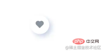
##❤️ Love Button
- There are many ways to make a heart. You can use the heart from the icon library, you can write a
- svg
, or you can use a picture. Here I will usepseudo-element to make a heart. . (Learning video sharing: css video tutorial)
<!-- fullLove.html -->
<div class="likeBtn" id="likeBtn">
    <span class="heart" id="heart"></span>
</div>/* fullLove.css */
.heart{
background-color: #8a93a0;
height: 13px;
width: 13px;
transform: rotate(-45deg) scale(1);
display: inline-block;
}
.heart::before {
content: '';
position: absolute;
top: -50%;
left: 0;
background-color: inherit;
border-radius: 50%;
height: 13px;
width: 13px;
}
.heart::after {
content: '';
position: absolute;
top: 0;
right: -50%;
background-color: inherit;
border-radius: 50%;
height: 13px;
width: 13px;
}- Add some shadows to the outer layer to come out
- imitation effect

Guide likes
- We need to make the buttons have some visual effects to guide the audience to like, That
- Continuous Vibration is undoubtedly a good choice.
// love.js
const likeBtn = document.getElementById('likeBtn');
const heart=document.getElementById('heart')
likeBtn.addEventListener('mousemove',() => {
  heart.classList.add('heratPop')
})
likeBtn.addEventListener('mouseout',() => {
  heart.classList.remove('heratPop')
})/* fullLove.css */
.heratPop{
animation: pulse 1s linear infinite;
}
@keyframes pulse {
0% {
transform: rotate(-45deg) scale(1);
}
10% {
transform: rotate(-45deg) scale(1.1);
}
20% {
transform: rotate(-45deg) scale(0.9);
}
30% {
transform: rotate(-45deg) scale(1.2);
}
40% {
transform: rotate(-45deg) scale(0.9);
}
50% {
transform: rotate(-45deg) scale(1.1);
}
60% {
transform: rotate(-45deg) scale(0.9);
}
70% {
transform: rotate(-45deg) scale(1);
}
}
爱之满
- #The next step is the most important thing
- 爱之满It’s full , how can we achieve this effect? The more love, the better. Then let’s find a way to make the
- love float around the button, and the love will be displaced and disappear within the specified time. To create an element, you can use
- document.createElement
, and to remove an element, you can useremove() ofDOM It's easy to download. You only need to - set different sizes and displacements for different hearts during the process. Core code (
- Please see the end of the article for the complete code):
// love.js
function addHearts(content) {
for(let i=0; i<10; i++) {
setTimeout(() => {
const fullHeart = document.createElement('div');
fullHeart.classList.add('hearts');
fullHeart.innerHTML = '<span class="heart"></span>';
fullHeart.style.left = Math.random() * 100 + '%';
fullHeart.style.top = Math.random() * 100 + '%';
fullHeart.style.transform = `translate(-50%, -50%) scale(${Math.random()+0.3}) `
fullHeart.style.animationDuration = Math.random() * 2 + 3 + 's';
fullHeart.firstChild.style.backgroundColor='#ed3056'
content.appendChild(fullHeart);
setTimeout(() => {
fullHeart.remove();
}, 3000);
}, i * 100)
}
}/* fullLove.css */
.hearts {
position: absolute;
color: #E7273F;
font-size: 15px;
top: 50%;
left: 50%;
transform: translate(-50%, -50%);
animation: fly 3s linear forwards;
}
@keyframes fly {
to {
transform: translate(-50%, -50px) scale(0);
}
}
Written at the end
- First of all, thank you all for seeing this and sharing this time It’s the effect of
- 爱之满
likes. I hope it can help students in need.
Programming Learning! !
The above is the detailed content of CSS+JS implements love like button (code example). For more information, please follow other related articles on the PHP Chinese website!

Hot AI Tools

Undresser.AI Undress
AI-powered app for creating realistic nude photos

AI Clothes Remover
Online AI tool for removing clothes from photos.

Undress AI Tool
Undress images for free

Clothoff.io
AI clothes remover

AI Hentai Generator
Generate AI Hentai for free.

Hot Article

Hot Tools

Notepad++7.3.1
Easy-to-use and free code editor

SublimeText3 Chinese version
Chinese version, very easy to use

Zend Studio 13.0.1
Powerful PHP integrated development environment

Dreamweaver CS6
Visual web development tools

SublimeText3 Mac version
God-level code editing software (SublimeText3)

Hot Topics
 1371
1371
 52
52
 How to use bootstrap button
Apr 07, 2025 pm 03:09 PM
How to use the Bootstrap button? Introduce Bootstrap CSS to create button elements and add Bootstrap button class to add button text
 How to resize bootstrap
Apr 07, 2025 pm 03:18 PM
To adjust the size of elements in Bootstrap, you can use the dimension class, which includes: adjusting width: .col-, .w-, .mw-adjust height: .h-, .min-h-, .max-h-
 How to insert pictures on bootstrap
Apr 07, 2025 pm 03:30 PM
There are several ways to insert images in Bootstrap: insert images directly, using the HTML img tag. With the Bootstrap image component, you can provide responsive images and more styles. Set the image size, use the img-fluid class to make the image adaptable. Set the border, using the img-bordered class. Set the rounded corners and use the img-rounded class. Set the shadow, use the shadow class. Resize and position the image, using CSS style. Using the background image, use the background-image CSS property.
 How to upload files on bootstrap
Apr 07, 2025 pm 01:09 PM
The file upload function can be implemented through Bootstrap. The steps are as follows: introduce Bootstrap CSS and JavaScript files; create file input fields; create file upload buttons; handle file uploads (using FormData to collect data and then send to the server); custom style (optional).
 How to remove the default style in Bootstrap list?
Apr 07, 2025 am 10:18 AM
The default style of the Bootstrap list can be removed with CSS override. Use more specific CSS rules and selectors, follow the "proximity principle" and "weight principle", overriding the Bootstrap default style. To avoid style conflicts, more targeted selectors can be used. If the override is unsuccessful, adjust the weight of the custom CSS. At the same time, pay attention to performance optimization, avoid overuse of !important, and write concise and efficient CSS code.
 How to change the size of a Bootstrap list?
Apr 07, 2025 am 10:45 AM
The size of a Bootstrap list depends on the size of the container that contains the list, not the list itself. Using Bootstrap's grid system or Flexbox can control the size of the container, thereby indirectly resizing the list items.
 How to verify bootstrap date
Apr 07, 2025 pm 03:06 PM
To verify dates in Bootstrap, follow these steps: Introduce the required scripts and styles; initialize the date selector component; set the data-bv-date attribute to enable verification; configure verification rules (such as date formats, error messages, etc.); integrate the Bootstrap verification framework and automatically verify date input when form is submitted.
 How to layout bootstrap
Apr 07, 2025 pm 02:24 PM
To use Bootstrap to layout a website, you need to use a grid system to divide the page into containers, rows, and columns. First add the container, then add the rows in it, add the columns within the row, and finally add the content in the column. Bootstrap's responsive layout function automatically adjusts the layout according to breakpoints (xs, sm, md, lg, xl). Different layouts under different screen sizes can be achieved by using responsive classes.


