 Web Front-end
 CSS Tutorial
 Share an interesting CSS3 pseudo-element::marker, which makes the list number more vivid
Share an interesting CSS3 pseudo-element::marker, which makes the list number more vivid
This article will introduce to you the interesting and interesting CSS3 pseudo-element ::marker. Using it can make our list numbers more interesting and vivid. If you are interested, come and take a look with me!

What is ::marker
CSS pseudo-element::marker is newly added starting from CSS Pseudo-Elements Level 3. A relatively new pseudo-element perfected in CSS Pseudo-Elements Level 4, it has been supported by browsers since Chrome 86. [Learning video sharing: css video tutorial]
Using it, we can add a pseudo element to the element to generate a bullet or number.
Normally, we have the following structure:
<ul>
  <li>Contagious</li>
  <li>Stages</li>
  <li>Pages</li>
  <li>Courageous</li>
  <li>Shaymus</li>
  <li>Faceless</li>
</ul>
No special style is added by default. Its style is roughly like this:
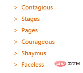
::marker we can transform the small dot in front of the serial number:
li {
  padding-left: 12px;
  cursor: pointer;
  color: #ff6000;
}
li::marker {
  content: '>';
}
::marker can only be a list item, for example, the li inside ul and the li inside ol are both list item.
list item, we can set any display: list-item The elements use the ::marker pseudo-element.
- all font properties -- So the font property is related
- color -- color value
- the content property -- content content, similar to ::before
The content of the pseudo element is used to fill in the serial number contenttext-combine-upright (en-US), unicode-bidi and direction properties -- related to the document writing direction
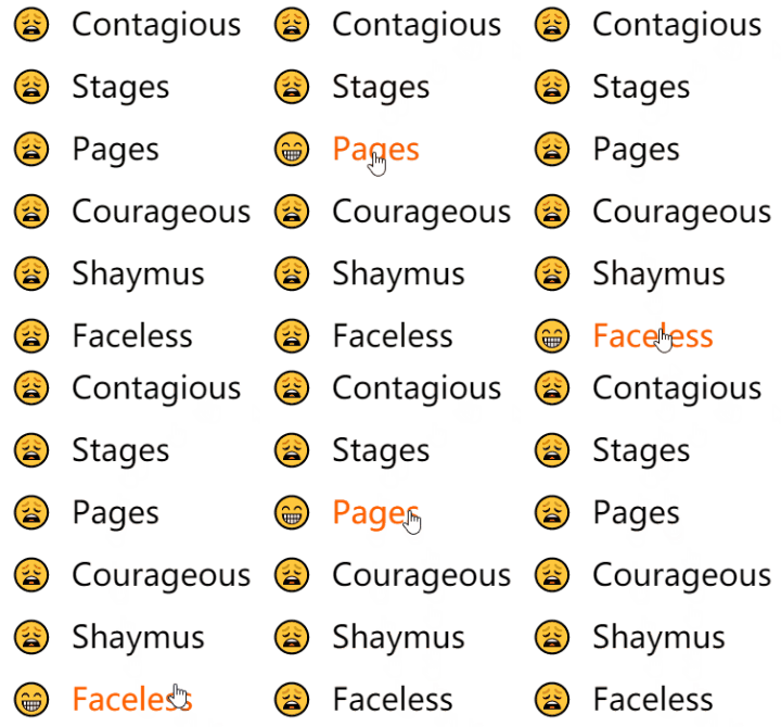

::marker. Note that is required when used on non-list-item elements. display: list-item:
<h1 id="Lorem-nbsp-ipsum-nbsp-dolor-nbsp-sit-nbsp-amet">Lorem ipsum dolor sit amet</h1>
<h1 id="Lorem-nbsp-ipsum-nbsp-dolor-nbsp-sit-nbsp-amet">Lorem ipsum dolor sit amet</h1>

CodePen Demo -- ::marker examplehttps://codepen.io/ Chokcoco/pen/eYvZmpW::marker can change dynamicallyInterestingly,
::marker can still change dynamically, take advantage of this , you can easily create some interesting hover effects.


https://codepen.io/Chokcoco/pen/eYvZmpW
Used together with counter
It can be observed that, The
::marker pseudo-element is very similar to the ::before and ::after pseudo-elements. They all have a content attribute. . In
, some simple string addition operations can actually be performed. Using this, we can cooperate with CSS counters counter-reset and counter-increment to implement the operation of adding a serial number to the ::marker element. If you don’t know much about
, you can go here: MDN -- counter-increment<h3 id="Lorem-nbsp-ipsum-nbsp-dolor-nbsp-sit-nbsp-amet">Lorem ipsum dolor sit amet.</h3> <p>Lorem ipsum dolor sit amet consectetur adipisicing elit.</p> <h3 id="Itaque-nbsp-sequi-nbsp-eaque-nbsp-earum-nbsp-laboriosam">Itaque sequi eaque earum laboriosam.</h3> <p>Ratione culpa reprehenderit beatae quaerat voluptatibus, debitis iusto?</p> <h3 id="Laudantium-nbsp-sapiente-nbsp-commodi-nbsp-quidem-nbsp-excepturi">Laudantium sapiente commodi quidem excepturi!</h3> <p>Lorem ipsum dolor sit amet consectetur adipisicing elit.</p>
We use
::marker and CSS counter counter-increment to implement an ordered list of automatic counting and h3 preceded by an emoji expression: The effect of <div class="code" style="position:relative; padding:0px; margin:0px;"><pre class='brush:php;toolbar:false;'>body {
counter-reset: h3;
}
h3 {
counter-increment: h3;
display: list-item;
}
h3::marker {
display: list-item;
content: "✔" counter(h3) " ";
color: lightsalmon;
font-weight: bold;
}</pre><div class="contentsignin">Copy after login</div></div> is as follows, which implements the effect of automatically adding a serial number to the ::marker<p> element: <code>
https://codepen.io/chriscoyier/pen/ExNWmee
Finally
This article introduces what ::marker is and some of its practical scenarios. It can be seen that although ::before, ::after can also achieve similar functions, but CSS still provides a more semantic tag ::marker, which also shows that everyone needs to control their own front-end code (HTML/CSS) Pay more attention to semantics.
Okay, this article ends here, I hope it will be helpful to you :)
For more programming-related knowledge, please visit: Programming Video! !
The above is the detailed content of Share an interesting CSS3 pseudo-element::marker, which makes the list number more vivid. For more information, please follow other related articles on the PHP Chinese website!

Hot AI Tools

Undresser.AI Undress
AI-powered app for creating realistic nude photos

AI Clothes Remover
Online AI tool for removing clothes from photos.

Undress AI Tool
Undress images for free

Clothoff.io
AI clothes remover

AI Hentai Generator
Generate AI Hentai for free.

Hot Article

Hot Tools

Notepad++7.3.1
Easy-to-use and free code editor

SublimeText3 Chinese version
Chinese version, very easy to use

Zend Studio 13.0.1
Powerful PHP integrated development environment

Dreamweaver CS6
Visual web development tools

SublimeText3 Mac version
God-level code editing software (SublimeText3)

Hot Topics
 How to achieve wave effect with pure CSS3? (code example)
Jun 28, 2022 pm 01:39 PM
How to achieve wave effect with pure CSS3? This article will introduce to you how to use SVG and CSS animation to create wave effects. I hope it will be helpful to you!
 Use CSS skillfully to realize various strange-shaped buttons (with code)
Jul 19, 2022 am 11:28 AM
This article will show you how to use CSS to easily realize various weird-shaped buttons that appear frequently. I hope it will be helpful to you!
 How to hide elements in css without taking up space
Jun 01, 2022 pm 07:15 PM
Two methods: 1. Using the display attribute, just add the "display:none;" style to the element. 2. Use the position and top attributes to set the absolute positioning of the element to hide the element. Just add the "position:absolute;top:-9999px;" style to the element.
 How to implement lace borders in css3
Sep 16, 2022 pm 07:11 PM
In CSS, you can use the border-image attribute to achieve a lace border. The border-image attribute can use images to create borders, that is, add a background image to the border. You only need to specify the background image as a lace style; the syntax "border-image: url (image path) offsets the image border width inward. Whether outset is repeated;".
 It turns out that text carousel and image carousel can also be realized using pure CSS!
Jun 10, 2022 pm 01:00 PM
How to create text carousel and image carousel? The first thing everyone thinks of is whether to use js. In fact, text carousel and image carousel can also be realized using pure CSS. Let’s take a look at the implementation method. I hope it will be helpful to everyone!
 How to enlarge the image by clicking the mouse in css3
Apr 25, 2022 pm 04:52 PM
Implementation method: 1. Use the ":active" selector to select the state of the mouse click on the picture; 2. Use the transform attribute and scale() function to achieve the picture magnification effect, the syntax "img:active {transform: scale(x-axis magnification, y Axis magnification);}".
 css3 what is adaptive layout
Jun 02, 2022 pm 12:05 PM
Adaptive layout, also known as "responsive layout", refers to a web page layout that can automatically recognize the screen width and make corresponding adjustments; such a web page can be compatible with multiple different terminals instead of making a specific version for each terminal. . Adaptive layout was born to solve the problem of mobile web browsing, and can provide a good user experience for users using different terminals.
 Does css3 animation effect have deformation?
Apr 28, 2022 pm 02:20 PM
The animation effect in css3 has deformation; you can use "animation: animation attribute @keyframes ..{..{transform: transformation attribute}}" to achieve deformation animation effect. The animation attribute is used to set the animation style, and the transform attribute is used to set the deformation style. .


