
 WeChat Applet
Mini Program Development
Teach you step by step how to develop a search input box component in a mini program
WeChat Applet
Mini Program Development
Teach you step by step how to develop a search input box component in a mini program
Teach you step by step how to develop a search input box component in a mini program

This article will share with you a practical application of small program development and introduce how to develop a search input box component. I hope it will be helpful to everyone!

Let’s talk about the development of components this time. Since a mini program may be composed of many pages, and different pages may have similar parts, we need to reasonably split the pages into different components, just like building blocks , and then complete the assembly of each page by combining different components. This is why there is the concept of component development. [Related learning recommendations: 小program development tutorial]
Practical Exercise
So without further ado, let’s start the actual combat directly. How to split a page into components is guided by the experience accumulated after developing a series of pages. Let's first make a few pages to get a feel for it.
For example, let’s make a small program homepage first. Most of the homepages of many of our common applications are a content list. In fact, it has a more professional name called “feed flow”.

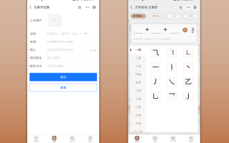
For example, in the picture above, they are the homepages of the mini programs of Weibo, Zhihu, Meituan and Boss Direct Recruitment. As you can see, they are basically composed of a search input box at the top and a content list in the main part that can be continuously scrolled up.
Home page development
Then according to this idea, we start to develop our own small program home page.
First, we open the app.json file, in which the first configured item in pages is the mini program homepage.
Next, we open the index.wxml file on the homepage and clear it, and then start writing our own homepage content.
Before clearing
After clearing
We can change the # indicated in the above picture ##Hot reload Turn on, so that you can see the modification effect in real time after modifying the content of the page, without having to manually click compile every time.
navigationBarTitleText field in app.json to empty characters. Just skewer.
Search box component
As we mentioned above, the homepage consists of a search input box at the top and a list in the main part, which naturally separates the homepage. It is divided intoSearch input box Content list two components, because both elements may be reused by other pages.
rounded corners input box. There is a search icon on the far left side of the input box, and there is a line of default prompt text inside the input box.
Built-in component input
Input box we will use the internal componentinput provided by the mini program, the document can be seeninput
view tag as a container at each element level to wrap the elements, so that the elements can be controlled later in the layout. It will all be easier.
pages/index/index.wxml, the page will look like the left side.
input of the mini program and set the default prompt text for it through the placeholder attribute.


index.wxss Cleared the original content and added our own style code.
Style Debugging
Here is a very practical development tip, as shown in the picture above, we can use the Debugger provided by the developer tools to view the page The actual rendered structure and style attributes, and we can directly modify the styles of page elements here and see the effects in real time. Even for color attributes, we can click on the current color to bring up the color selection panel and adjust the color of the element as shown above.

Then, when we adjust the page style to the best effect, directly select and copy the style code in the debugger, and then paste it into our index .wxss.

Icon introduction
Finally, we also need to display a search style icon on the leftmost side inside the input box, then First we need to find a search style picture from the Internet. It is recommended to use iconfont for icon filtering on this website

After we select the icon, we can modify the color and size of the icon as shown below, and then download.

Next, we put the downloaded pictures into the mini program project folder. There are many ways to open the mini program project folder. For example, you can right-click any file in the Explorer in the developer tools, and then select Show in the Explorer, or click the details panel in the upper right corner, and then click Local directoryOne item.

Then we create a new assets folder to store the static files of the mini program, such as pictures, public styles, etc.

We will put the search image we just downloaded into the images directory in assets, and change the image name to English Name (it is generally recommended to name files in English to avoid some program parsing errors)

Then we return to the developer tools and you can see the search you just copied The icon is ready. Then, we use the style code to display it in the input box

#First, we can use the method shown in the picture above and click the icon in the upper left corner of the debugger to Take a look at the current element structure of our page. The method is to first click the view icon in the upper left corner of the debugger, and then move the mouse to any position in the mini program preview on the left. You can see that the right panel will highlight the selected element according to the selected position on the left. The corresponding code area.
Through this method, we can intuitively understand the current code structure of our page, thereby deciding which container layer our newly added icon element should be placed in.
Position layout
After the above operation, we finally end up in the first row inside the search-bar layer container, which is the same as inputAnother built-in component image is added at the same level, and then the location of the image to be displayed is specified through the src attribute. Here, when you set the src attribute in the image tag, the developer tools will automatically prompt you for the path you can choose. Since the location of our image is outside the directory where the current file is located, we only need to enter .. at the beginning to go to the upper-level directory. Then the developer tool will prompt us that the upper-level directory is available. which files.

Finally, we used CSS syntax to write reasonable styles in index.wxss, and the search icon was displayed to the vertical center position on the left side of the input box . For specific syntax, please refer to Related Documents for learning
Real Machine Preview
So after the above development, our homepage has begun to take shape. Here we introduce another powerful function provided by developer tools-the real machine preview function.

As shown in the figure, click the Preview button at the top of the panel. The developer tools will compile the current mini program project into a previewable state, and then log in to the mini program. By scanning the QR code on the developer's WeChat, you can see the effect of the current mini program on the real device

Summary
Okay, finally let’s summarize what we talked about today. Today we first introduced the concept of component development and why component splitting is necessary, and introduced some development techniques used in the process of developing components through an example, including
- Using built-in components
- Style debugging method
- Image resource introduction
- Real machine preview
Of course, this article has not actually carried out component development, because we still develop elements directly in the page file, in the next article we will split the homepage according to Search input box component Content list component, so that Detailed introduction to the development methods of small program components.
For more programming related knowledge, please visit: Programming Video! !
The above is the detailed content of Teach you step by step how to develop a search input box component in a mini program. For more information, please follow other related articles on the PHP Chinese website!

Hot AI Tools

Undresser.AI Undress
AI-powered app for creating realistic nude photos

AI Clothes Remover
Online AI tool for removing clothes from photos.

Undress AI Tool
Undress images for free

Clothoff.io
AI clothes remover

Video Face Swap
Swap faces in any video effortlessly with our completely free AI face swap tool!

Hot Article
Hot Tools

Notepad++7.3.1
Easy-to-use and free code editor

SublimeText3 Chinese version
Chinese version, very easy to use

Zend Studio 13.0.1
Powerful PHP integrated development environment

Dreamweaver CS6
Visual web development tools

SublimeText3 Mac version
God-level code editing software (SublimeText3)
Hot Topics
 1386
1386
 52
52

 Develop WeChat applet using Python
Jun 17, 2023 pm 06:34 PM
Develop WeChat applet using Python
Jun 17, 2023 pm 06:34 PM
With the popularity of mobile Internet technology and smartphones, WeChat has become an indispensable application in people's lives. WeChat mini programs allow people to directly use mini programs to solve some simple needs without downloading and installing applications. This article will introduce how to use Python to develop WeChat applet. 1. Preparation Before using Python to develop WeChat applet, you need to install the relevant Python library. It is recommended to use the two libraries wxpy and itchat here. wxpy is a WeChat machine
 Can small programs use react?
Dec 29, 2022 am 11:06 AM
Can small programs use react?
Dec 29, 2022 am 11:06 AM
Mini programs can use react. How to use it: 1. Implement a renderer based on "react-reconciler" and generate a DSL; 2. Create a mini program component to parse and render DSL; 3. Install npm and execute the developer Build npm in the tool; 4. Introduce the package into your own page, and then use the API to complete the development.
 Implement card flipping effects in WeChat mini programs
Nov 21, 2023 am 10:55 AM
Implement card flipping effects in WeChat mini programs
Nov 21, 2023 am 10:55 AM
Implementing card flipping effects in WeChat mini programs In WeChat mini programs, implementing card flipping effects is a common animation effect that can improve user experience and the attractiveness of interface interactions. The following will introduce in detail how to implement the special effect of card flipping in the WeChat applet and provide relevant code examples. First, you need to define two card elements in the page layout file of the mini program, one for displaying the front content and one for displaying the back content. The specific sample code is as follows: <!--index.wxml-->&l
 Alipay launched the 'Chinese Character Picking-Rare Characters' mini program to collect and supplement the rare character library
Oct 31, 2023 pm 09:25 PM
Alipay launched the 'Chinese Character Picking-Rare Characters' mini program to collect and supplement the rare character library
Oct 31, 2023 pm 09:25 PM
According to news from this site on October 31, on May 27 this year, Ant Group announced the launch of the "Chinese Character Picking Project", and recently ushered in new progress: Alipay launched the "Chinese Character Picking-Uncommon Characters" mini program to collect collections from the society Rare characters supplement the rare character library and provide different input experiences for rare characters to help improve the rare character input method in Alipay. Currently, users can enter the "Uncommon Characters" applet by searching for keywords such as "Chinese character pick-up" and "rare characters". In the mini program, users can submit pictures of rare characters that have not been recognized and entered by the system. After confirmation, Alipay engineers will make additional entries into the font library. This website noticed that users can also experience the latest word-splitting input method in the mini program. This input method is designed for rare words with unclear pronunciation. User dismantling
 How uniapp achieves rapid conversion between mini programs and H5
Oct 20, 2023 pm 02:12 PM
How uniapp achieves rapid conversion between mini programs and H5
Oct 20, 2023 pm 02:12 PM
How uniapp can achieve rapid conversion between mini programs and H5 requires specific code examples. In recent years, with the development of the mobile Internet and the popularity of smartphones, mini programs and H5 have become indispensable application forms. As a cross-platform development framework, uniapp can quickly realize the conversion between small programs and H5 based on a set of codes, greatly improving development efficiency. This article will introduce how uniapp can achieve rapid conversion between mini programs and H5, and give specific code examples. 1. Introduction to uniapp unia
 Tutorial on writing a simple chat program in Python
May 08, 2023 pm 06:37 PM
Tutorial on writing a simple chat program in Python
May 08, 2023 pm 06:37 PM
Implementation idea: Establishing the server side of thread, so as to process the various functions of the chat room. The establishment of the x02 client is much simpler than the server. The function of the client is only to send and receive messages, and to enter specific characters according to specific rules. To achieve the use of different functions, therefore, on the client side, you only need to use two threads, one is dedicated to receiving messages, and the other is dedicated to sending messages. As for why not use one, that is because, only
 How to operate mini program registration
Sep 13, 2023 pm 04:36 PM
How to operate mini program registration
Sep 13, 2023 pm 04:36 PM
Mini program registration operation steps: 1. Prepare copies of personal ID cards, corporate business licenses, legal person ID cards and other filing materials; 2. Log in to the mini program management background; 3. Enter the mini program settings page; 4. Select " "Basic Settings"; 5. Fill in the filing information; 6. Upload the filing materials; 7. Submit the filing application; 8. Wait for the review results. If the filing is not passed, make modifications based on the reasons and resubmit the filing application; 9. The follow-up operations for the filing are Can.
 How to get membership in WeChat mini program
May 07, 2024 am 10:24 AM
How to get membership in WeChat mini program
May 07, 2024 am 10:24 AM
1. Open the WeChat mini program and enter the corresponding mini program page. 2. Find the member-related entrance on the mini program page. Usually the member entrance is in the bottom navigation bar or personal center. 3. Click the membership portal to enter the membership application page. 4. On the membership application page, fill in relevant information, such as mobile phone number, name, etc. After completing the information, submit the application. 5. The mini program will review the membership application. After passing the review, the user can become a member of the WeChat mini program. 6. As a member, users will enjoy more membership rights, such as points, coupons, member-exclusive activities, etc.
