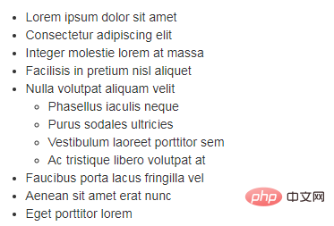
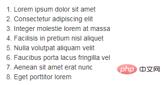
bootstrap supports several list styles
bootstrap supports 6 list styles: 1. ul unordered list; 2. ol ordered list; 3. Removed list; 4. Inline list, which refers to changing the vertical list into a horizontal list, and Remove the bullets and keep the list displayed horizontally; 5. dl definition list; 6. Horizontal definition list.

The operating environment of this tutorial: Windows7 system, bootsrap3.3.7 version, DELL G3 computer
List--Introduction
In HTML documents, there are three main types of list structures: ordered lists, unordered lists, and definition lists. The specific tags used are described as follows: Unordered list
<ul>
    <li>…</li>
</ul>Ordered list
<ol>
    <li>…</li>
</ol>Definition list
<dl>
    <dt>…</dt>
    <dd>…</dd>
</dl>Bootstrap provides six forms of lists based on usual usage:
☑ Unordered list
☑ Ordered list
☑ Go to point list
☑ Inline list
☑ Definition list
☑ Horizontal definition list
Next, let’s learn this provided by Bootstrap Six ways to use lists
<!DOCTYPE HTML>
< html>
	<head>
		<meta charset="utf-8">
		<title>列表--简介</title>
		<link rel="stylesheet" href="//netdna.bootstrapcdn.com/bootstrap/3.1.1/css/bootstrap.min.css">
	</head>
	<body>
		<ul>
			<li>无序列表信息1</li>
			<li>无序列表信息2</li>
			<li>无序列表信息3</li>
		</ul>
		<ol>
			<li>有序列表信息1</li>
			<li>有序列表信息2</li>
			<li>有序列表信息3</li>
		</ol>
		<dl>
			<dt>定义列表标题</dt>
			<dd>定义列表信息1</dd>
			<dd>定义列表信息2</dd>
		</dl>
	</body>
	</html>
Lists--unordered lists, ordered lists


Unordered lists The usage of ordered lists is the same as what we usually use (unordered lists use ul, ordered lists use ol tags). In terms of style, Bootstrap has only made some subtle optimizations on this basis. Please view bootstrap.css for the source code. Lines 569 to 579 of the file:
ul,
ol {
  margin-top: 0;
  margin-bottom: 10px;
}
ul ul,
ol ul,
ul ol,
ol ol {
  margin-bottom: 0;
}From the source code, we can know that Bootstrap only made some adjustments to the margin for the list.
List nesting
Lists can also be nested in Bootstrap.
List--Go to the list
You can see that by default in Bootstrap, unordered list and ordered list It has bullet points, but in many cases in actual work, our lists do not need this number, such as when using unordered lists for navigation. Bootstrap has been very considerate for many developers. By adding a class name ".list-unstyled" to the unordered list, the default list style can be removed. /*For the source code, please view lines 580~583 of the bootstrap.css file*/
.list-unstyled {
padding-left: 0;
list-style: none;
}As can be seen from the example, in addition to the item number, the default left padding# of the list will also be included. ##Alsocleared0.
List--inline listBootstrap implements an inline list by adding the class name ".list-inline" just like a list. To put it simply, That is replace the vertical list with a horizontal list, and remove the bullets (numbers) , keep the horizontal display. It can also be said that inline lists are born for creating horizontal navigation. /*View the source code for lines 584~593 of the bootstrap.css file*/
.list-inline {
padding-left: 0;
margin-left: -5px;
list-style: none;
}
.list-inline > li {
display: inline-block;
padding-right: 5px;
padding-left: 5px;
}<ul class="list-inline">
<li>W3cplus</li>
<li>Blog</li>
<li>CSS3</li>
<li>jQuery</li>
<li>PHP</li>
</ul>
line spacing, margin and font bold Effect. /*For the source code, please view lines 594~607 of the bootstrap.css file*/
dl {
margin-top: 0;
margin-bottom: 20px;
}
dt,
dd {
line-height: 1.42857143;
}
dt {
font-weight: bold;
}
dd {
margin-left: 0;
}
<dl>
    <dt>W3cplus</dt>
    <dd>一个致力于推广国内前端行业的技术博客</dd>
    <dt>seashen.cn</dt>
    <dd>一个真心在做HTML5教育的网站</dd>
</dl>
. dl-horizontal" implements horizontal display effects for definition lists. /*For the source code, please view lines 608~621 of the bootstrap.css file*/
@media (min-width: 768px) {
.dl-horizontal dt {
float: left;
width: 160px;
overflow: hidden;
clear: left;
text-align: right;
text-overflow: ellipsis;
white-space: nowrap;
  }
.dl-horizontal dd {
margin-left: 180px;
  }
}is larger than 768px, adding the class name ".dl-horizontal" will have the horizontal definition list effect. The main methods of implementation: 1. Set dt to a left float and set a width of 160px 2. Set dd to a margin-left value of 180px to achieve a horizontal effect 3. When the title width exceeds 160px , three ellipses
will be displayed and their usage is as follows:<dl class="dl-horizontal">
<dt>W3cplus</dt>
<dd>一个致力于推广国内前端行业的技术博客。它以探索为己任,不断活跃在行业技术最前沿,努力提供高质量前端技术博文</dd>
<dt>seashen.cn</dt>
<dd>一个专业的HTML5网站</dd>
<dt>我来测试一个标题,我来测试一个标题</dt>
<dd>我在写一个水平定义列表的效果,我在写一个水平定义列表的效果</dd>
</dl>bootstrap usage tutorial"
The above is the detailed content of bootstrap supports several list styles. For more information, please follow other related articles on the PHP Chinese website!

Hot AI Tools

Undresser.AI Undress
AI-powered app for creating realistic nude photos

AI Clothes Remover
Online AI tool for removing clothes from photos.

Undress AI Tool
Undress images for free

Clothoff.io
AI clothes remover

Video Face Swap
Swap faces in any video effortlessly with our completely free AI face swap tool!

Hot Article

Hot Tools

Notepad++7.3.1
Easy-to-use and free code editor

SublimeText3 Chinese version
Chinese version, very easy to use

Zend Studio 13.0.1
Powerful PHP integrated development environment

Dreamweaver CS6
Visual web development tools

SublimeText3 Mac version
God-level code editing software (SublimeText3)

Hot Topics
 1386
1386
 52
52
 How to get the bootstrap search bar
Apr 07, 2025 pm 03:33 PM
How to use Bootstrap to get the value of the search bar: Determines the ID or name of the search bar. Use JavaScript to get DOM elements. Gets the value of the element. Perform the required actions.
 How to use bootstrap in vue
Apr 07, 2025 pm 11:33 PM
Using Bootstrap in Vue.js is divided into five steps: Install Bootstrap. Import Bootstrap in main.js. Use the Bootstrap component directly in the template. Optional: Custom style. Optional: Use plug-ins.
 How to do vertical centering of bootstrap
Apr 07, 2025 pm 03:21 PM
Use Bootstrap to implement vertical centering: flexbox method: Use the d-flex, justify-content-center, and align-items-center classes to place elements in the flexbox container. align-items-center class method: For browsers that do not support flexbox, use the align-items-center class, provided that the parent element has a defined height.
 How to write split lines on bootstrap
Apr 07, 2025 pm 03:12 PM
There are two ways to create a Bootstrap split line: using the tag, which creates a horizontal split line. Use the CSS border property to create custom style split lines.
 How to insert pictures on bootstrap
Apr 07, 2025 pm 03:30 PM
There are several ways to insert images in Bootstrap: insert images directly, using the HTML img tag. With the Bootstrap image component, you can provide responsive images and more styles. Set the image size, use the img-fluid class to make the image adaptable. Set the border, using the img-bordered class. Set the rounded corners and use the img-rounded class. Set the shadow, use the shadow class. Resize and position the image, using CSS style. Using the background image, use the background-image CSS property.
 How to set up the framework for bootstrap
Apr 07, 2025 pm 03:27 PM
To set up the Bootstrap framework, you need to follow these steps: 1. Reference the Bootstrap file via CDN; 2. Download and host the file on your own server; 3. Include the Bootstrap file in HTML; 4. Compile Sass/Less as needed; 5. Import a custom file (optional). Once setup is complete, you can use Bootstrap's grid systems, components, and styles to create responsive websites and applications.
 How to resize bootstrap
Apr 07, 2025 pm 03:18 PM
To adjust the size of elements in Bootstrap, you can use the dimension class, which includes: adjusting width: .col-, .w-, .mw-adjust height: .h-, .min-h-, .max-h-
 How to use bootstrap button
Apr 07, 2025 pm 03:09 PM
How to use the Bootstrap button? Introduce Bootstrap CSS to create button elements and add Bootstrap button class to add button text


