How to pop up the warning box (Alerts) in
Bootstrap? The following article will explain the usage of Bootstrap5 warning box component through code examples. I hope it will be helpful to you!

When you see the word Alerts, don’t confuse it with the Alert warning window in js. The two have nothing to do with each other. The official definition of Bootstrap5 warning box is to provide contextual feedback messages for typical user operations and provide a small number of available and flexible alert messages. The official definition is a bit confusing. Generally speaking, the warning box is actually more appropriately named a message reminder. It usually reminds "you have several unread messages" in the lower right corner or upper right corner of the window. [Related recommendations: "bootstrap tutorial"]
<!doctype html>
<html>
  <head>
    <meta charset="utf-8">
    <meta name="viewport" content="width=device-width, initial-scale=1">
    <meta name="keywords" content="">
    <meta name="description" content="">
    <link href="../bootstrap5/bootstrap.min.css" rel="stylesheet">
    <title>警告窗口组件</title>
  </head>
  <body>
    <div>
      <br><br><br>
      <div class="alert alert-warning alert-dismissible fade show" role="alert">
        <strong>老刘!</strong> 你收到一条站内短信,<a href="#">点此查看</a>
        <button type="button" data-bs-dismiss="alert" aria-label="Close"></button>
        </div>

      </div>
     <script src="../bootstrap5/bootstrap.bundle.min.js" ></script>
  </body>
</html>The alert box is relatively simple, consisting of a container and It consists of a close button, which can be omitted and can be closed regularly through js. For example, it can be set to close after 30 seconds of display. Below is the simplest example of a message box.
<!doctype html>
<html>
  <head>
    <meta charset="utf-8">
    <meta name="viewport" content="width=device-width, initial-scale=1">
    <meta name="keywords" content="">
    <meta name="description" content="">
    <link href="../bootstrap5/bootstrap.min.css" rel="stylesheet">
    <title>警告窗口组件</title>
  </head>
  <body>
      <div class="alert alert-primary">
        老刘!你收到一条站内短信。
        </div>

     <script src="../bootstrap5/bootstrap.bundle.min.js" ></script>
  </body>
</html>In the above example, in addition to using alert in the container to mark this as a warning box, there is also an alert-primary class , set the background color of the warning box. All common colors for alert boxes are listed below.
<!doctype html>
<html>
  <head>
    <meta charset="utf-8">
    <meta name="viewport" content="width=device-width, initial-scale=1">
    <meta name="keywords" content="">
    <meta name="description" content="">
    <link href="../bootstrap5/bootstrap.min.css" rel="stylesheet">
    <title>警告窗口组件</title>
  </head>
  <body>
    <div>
      <br><br><br>
      <div class="alert alert-primary" role="alert">
        alert-primary
        </div>
        <div class="alert alert-secondary" role="alert">
        alert-secondary
        </div>
        <div class="alert alert-success" role="alert">
        alert-success
        </div>
        <div class="alert alert-danger" role="alert">
            alert-danger
        </div>
        <div class="alert alert-warning" role="alert">
            alert-warning
        </div>
        <div class="alert alert-info" role="alert">
            alert-info
        </div>
        <div class="alert alert-light" role="alert">
            alert-light
        </div>
        <div class="alert alert-dark" role="alert">
            alert-dark
        </div>

      </div>
     <script src="../bootstrap5/bootstrap.bundle.min.js" ></script>
  </body>
</html>Using the .alert-link utility class can be used in any alert Quickly provide matching color links, below I only give a comparison of the three colors.
<!doctype html>
<html>
  <head>
    <meta charset="utf-8">
    <meta name="viewport" content="width=device-width, initial-scale=1">
    <meta name="keywords" content="">
    <meta name="description" content="">
    <link href="../bootstrap5/bootstrap.min.css" rel="stylesheet">
    <title>彩色链接</title>
  </head>
  <body>
    <div>
      <br><br><br>
      <div class="alert alert-primary" role="alert">
        A simple primary alert with <a href="#">an example link</a>. Give it a click if you like.
        </div>
        <div class="alert alert-secondary" role="alert">
        A simple secondary alert with <a href="#">an example link</a>. Give it a click if you like.
        </div>
        <div class="alert alert-success" role="alert">
        A simple success alert with <a href="#">an example link</a>. Give it a click if you like.
        </div>

        <br><br>
        <div class="alert alert-primary" role="alert">
            A simple primary alert with <a href="#">an example link</a>. Give it a click if you like.
            </div>
            <div class="alert alert-secondary" role="alert">
            A simple secondary alert with <a href="#">an example link</a>. Give it a click if you like.
            </div>
            <div class="alert alert-success" role="alert">
            A simple success alert with <a href="#">an example link</a>. Give it a click if you like.
            </div>
      </div>
     <script src="../bootstrap5/bootstrap.bundle.min.js" ></script>
  </body>
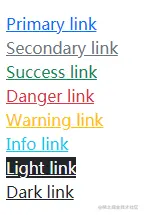
</html>In the colored links in the assistant category of "Bootstrap5 Chinese Manual", you can use link-* Class colors links. Unlike the text-* classes, these classes have :hover and :focus states. Colored links are not unique to warning boxes and are valid for all links, so the warning box colors are not used below. The following are various colors:
<!doctype html>
<html>
  <head>
    <meta charset="utf-8">
    <meta name="viewport" content="width=device-width, initial-scale=1">
    <meta name="keywords" content="">
    <meta name="description" content="">
    <link href="../bootstrap5/bootstrap.min.css" rel="stylesheet">
    <title>彩色链接</title>
  </head>
  <body>
    <div>
      <br><br><br>
        <div><a href="#">Primary link</a></div>
        <div><a href="#">Secondary link</a></div>
        <div><a href="#">Success link</a></div>
        <div><a href="#">Danger link</a></div>
        <div><a href="#">Warning link</a></div>
        <div><a href="#">Info link</a></div>
        <div><a href="#" class="bg-dark link-light">Light link</a></div>
        <div><a href="#">Dark link</a></div>

      </div>
     <script src="../bootstrap5/bootstrap.bundle.min.js" ></script>
  </body>
</html>
I put the background on the second to last one Set it to black, otherwise it will be difficult to distinguish.
Alerts can also contain other HTML elements such as titles, paragraphs, and separators.
<div class="alert alert-success" role="alert">
<h4 class="alert-heading">Well done!</h4>
<p>Aww yeah, you successfully read this important alert message.
This example text is going to run a bit longer so that you can see
how spacing within an alert works with this kind of content.</p>
<hr>
<p class="mb-0">Whenever you need to, be sure to use margin utilities to keep things nice and tidy.</p>
</div>
Although it looks good, it is not recommended to use it as a component for layout and typesetting. Grids and the more powerful cards introduced later are more suitable for typesetting.
In the first example, we have used the close button. Let’s talk about its principle again. If you don’t want to study this section in depth, just copy the example directly. Can.
Using the alert JavaScript plugin, any inline alert (i.e. warning box) can be turned off. The method is as follows:
When the alert is cleared, the element is completely removed from the page structure. If a keyboard user dismisses the alert using the "Close" button, their focus will suddenly be lost and, depending on the browser, reset to the beginning of the page/document. Therefore, we recommend including additional JavaScript to listen to the closed.bs.alert event and programmatically set focus() to the most appropriate position in the page. If you plan to move focus to a non-interactive element that does not normally receive focus, be sure to add tabindex="-1" to that element.
For more knowledge about bootstrap, please visit: bootstrap basic tutorial! !
The above is the detailed content of In-depth explanation of how to use the warning box component in Bootstrap. For more information, please follow other related articles on the PHP Chinese website!