In CSS, you can use the "box-shadow" attribute to set the shadow on the right and bottom sides of the element's border. The function of this attribute is to set the border shadow style of the element. The syntax is "element {box-shadow: to Right shadow value down shadow value blur spread color ;}".

The operating environment of this tutorial: Windows 10 system, CSS3&&HTML5 version, Dell G3 computer.
How to set the shadow on the right and bottom of the border in css
In css, you can use the box-shadow attribute to set the shadow on the right and bottom of the border Shadow, the function of the box-shadow attribute is to set one or more drop-down shadow borders for the element. Its syntax format is as follows:
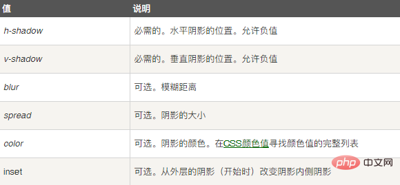
box-shadow: h-shadow v-shadow blur spread color inset;
The attribute value represents the following:

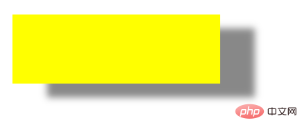
The example is as follows:
<!DOCTYPE html>
<html>
<head>
<meta charset="utf-8">
<title>123</title>
<style>
div{
width:300px;
height:100px;
background-color:yellow;
box-shadow: 50px 20px 10px #888888;
}
</style>
</head>
<body>
<div></div>
</body>
</html>Output result:

(Learning video sharing: css video tutorial)
The above is the detailed content of How to set the shadow on the right and bottom of the border in css. For more information, please follow other related articles on the PHP Chinese website!