 Web Front-end
 Bootstrap Tutorial
 How to use tooltips in Bootstrap? A brief analysis of the usage of prompt components
How to use tooltips in Bootstrap? A brief analysis of the usage of prompt components
How to use the prompt tool in
Bootstrap? The following article will introduce to you the usage of pop-up prompts and tooltip components in Bootstrap5. I hope it will be helpful to you!

Let’s talk about two controls: Popovers and Tooltips. These two components have a single function and are very simple to use. Lots of similarities. [Related recommendations: "bootstrap Tutorial"]
Popovers
1 Example
1.1 Notes
Things to note when using the popover plug-in:
- It must rely on bootstrap.bundle.min.js to work!
- For performance reasons, popovers are optional, so you must initialize them yourself.
1.2 Enable popovers everywhere
One way to initialize all popovers on the page is to select them via their data-bs-toggle attribute:
<!doctype html>
<html>
<head>
<meta charset="utf-8">
<meta name="viewport" content="width=device-width, initial-scale=1">
<meta name="keywords" content="">
<meta name="description" content="">
<link href="../bootstrap5/bootstrap.min.css" rel="stylesheet">
<title>Popovers</title>
</head>
<body>
<div>
<br><br><br><br>
<button type="button"
class="btn btn-lg btn-danger"
data-bs-toggle="popover"
title="提示标题"
data-bs-content="你想告诉别人些什么提示?你可以写在这里!">
点此按钮弹出提示
</button>
</div>
<script src="../bootstrap5/bootstrap.bundle.min.js" ></script>
<script>
var popoverTriggerList = [].slice.call(document.querySelectorAll('[data-bs-toggle="popover"]'))
var popoverList = popoverTriggerList.map(function (popoverTriggerEl) {
return new bootstrap.Popover(popoverTriggerEl)
})
</script>
</body>
</html>
1.3 Using container options
When certain styles on the parent element interfere with the popover, you need to specify a custom container , so that the popover's HTML is displayed in that element. There is no difference in display between this one and the above one, except that an example-popover is added to the button class.
<!doctype html>
<html>
<head>
<meta charset="utf-8">
<meta name="viewport" content="width=device-width, initial-scale=1">
<meta name="keywords" content="">
<meta name="description" content="">
<link href="../bootstrap5/bootstrap.min.css" rel="stylesheet">
<title>Popovers</title>
</head>
<body>
<div>
<br><br><br><br>
<button type="button"
class="btn btn-lg btn-danger example-popover"
data-bs-toggle="popover"
title="提示标题"
data-bs-content="你想告诉别人些什么提示?你可以写在这里!">
点此按钮弹出提示
</button>
</div>
<script ></script>
<script>
var popover = new bootstrap.Popover(document.querySelector('.example-popover'), {
container: 'body'
})
</script>
</body>
</html>You can also use id, which seems more understandable
<!doctype html>
<html>
<head>
<meta charset="utf-8">
<meta name="viewport" content="width=device-width, initial-scale=1">
<meta name="keywords" content="">
<meta name="description" content="">
<link href="../bootstrap5/bootstrap.min.css" rel="stylesheet">
<title>Popovers</title>
</head>
<body>
<div>
<br><br><br><br>
<button type="button"
id="example-popover"
class="btn btn-lg btn-danger"
data-bs-toggle="popover"
title="提示标题"
data-bs-content="你想告诉别人些什么提示?你可以写在这里!">
点此按钮弹出提示
</button>
</div>
<script src="../bootstrap5/bootstrap.bundle.min.js" ></script>
<script>
var popover = new bootstrap.Popover(document.querySelector('#example-popover'), {
container: 'body'
})
</script>
</body>
</html>2 Change the pop-up direction
us You can make the pop-up prompt information in four directions: top, right, bottom, left. It is also very simple to use. You only need to add data-bs-placement="position" to the button attribute, where the position can be top, bottom, left, or right.
It should be noted that the position to be displayed must have enough space, otherwise, it will automatically find a suitable position. If you set it to be displayed at the top, but it is already at the top of the browser, it will Shown below.
<!doctype html>
<html>
<head>
<meta charset="utf-8">
<meta name="viewport" content="width=device-width, initial-scale=1">
<meta name="keywords" content="">
<meta name="description" content="">
<link href="../bootstrap5/bootstrap.min.css" rel="stylesheet">
<title>Popovers</title>
</head>
<body>
<div>
<br><br><br><br>
<button type="button"
class="btn btn-lg btn-danger"
data-bs-toggle="popover"
title="提示标题"
data-bs-content="你想告诉别人些什么提示?你可以写在这里!">
默认
</button>
<button type="button"
class="btn btn-lg btn-danger"
data-bs-toggle="popover"
data-bs-placement="top"
title="提示标题"
data-bs-content="你想告诉别人些什么提示?你可以写在这里!">
上部
</button>
<button type="button"
class="btn btn-lg btn-danger"
data-bs-toggle="popover"
data-bs-placement="bottom"
title="提示标题"
data-bs-content="你想告诉别人些什么提示?你可以写在这里!">
下部
</button>
<button type="button"
class="btn btn-lg btn-danger"
data-bs-toggle="popover"
data-bs-placement="left"
title="提示标题"
data-bs-content="你想告诉别人些什么提示?你可以写在这里!">
左侧
</button>
<button type="button"
class="btn btn-lg btn-danger"
data-bs-toggle="popover"
data-bs-placement="right"
title="提示标题"
data-bs-content="你想告诉别人些什么提示?你可以写在这里!">
右侧
</button>
</div>
<script src="../bootstrap5/bootstrap.bundle.min.js" ></script>
<script>
var popoverTriggerList = [].slice.call(document.querySelectorAll('[data-bs-toggle="popover"]'))
var popoverList = popoverTriggerList.map(function (popoverTriggerEl) {
return new bootstrap.Popover(popoverTriggerEl)
})
</script>
</body>
</html>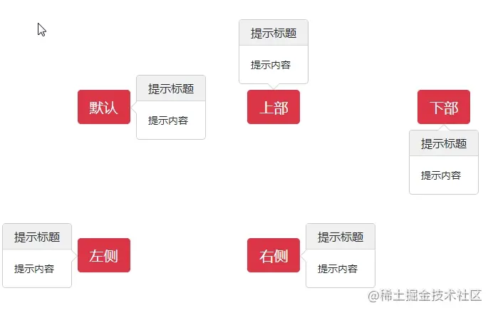
3 Close again anywhere
By default, click the button to display the prompt message , click this button again to hide the message, otherwise the message will always be displayed.
If we want to click anywhere again to close the previously displayed prompt information, we need to add a data-bs-trigger="focus" attribute to the button, and add trigger: 'focus to the js file '.
To achieve correct cross-browser and cross-platform behavior, the a tag must be used instead of the button tag, and the tabindex attribute must also be included.
<!doctype html>
<html>
<head>
<meta charset="utf-8">
<meta name="viewport" content="width=device-width, initial-scale=1">
<meta name="keywords" content="">
<meta name="description" content="">
<link href="../bootstrap5/bootstrap.min.css" rel="stylesheet">
<title>Popovers</title>
</head>
<body>
<div>
<br><br><br><br>
<a tabindex="0"
class="btn btn-lg btn-danger"
role="button" data-bs-toggle="popover"
data-bs-trigger="focus"
title="提示标题"
data-bs-content="你想告诉别人些什么提示?你可以写在这里!" >
点此按钮弹出提示,点击空白处提示消失
</a>
</div>
<script src="../bootstrap5/bootstrap.bundle.min.js" ></script>
<script>
var popoverTriggerList = [].slice.call(document.querySelectorAll('[data-bs-toggle="popover"]'))
var popoverList = popoverTriggerList.map(function (popoverTriggerEl) {
return new bootstrap.Popover(popoverTriggerEl)
trigger: 'focus'
})
</script>
</body>
</html>
Tooltips
Tooltips are very similar to Popovers and can also be If you choose to load it, you must initialize it yourself. Its display will also be Automatically adjust according to reserved space. Different from pop-up tips, tool tips will be displayed when the mouse hovers over the button, and will automatically hide when the mouse is moved away, without the need to click.
1 The tool tip validation code
is basically similar to the pop-up prompt. This code must be included in the page for the tool tip to take effect.
var tooltipTriggerList = [].slice.call(document.querySelectorAll('[data-bs-toggle="tooltip"]'))
var tooltipList = tooltipTriggerList.map(function (tooltipTriggerEl) {
return new bootstrap.Tooltip(tooltipTriggerEl)
})2 Tool tip example
Tool tips are generally used on buttons and links to explain their functions. Of course, they can also be used on on the picture. The value of title is the content displayed when the mouse is hovering, and you can use html elements.
The link has a default title attribute, and its prompt text is displayed in the browser status bar. This display is more intuitive.
<!doctype html>
<html>
<head>
<meta charset="utf-8">
<meta name="viewport" content="width=device-width, initial-scale=1">
<meta name="keywords" content="">
<meta name="description" content="">
<link href="../bootstrap5/bootstrap.min.css" rel="stylesheet">
<title>工具提示</title>
</head>
<body>
<div>
<br><br><br><br>
<button type="button" class="btn btn-secondary" data-bs-toggle="tooltip" title="这个是按钮提示">
按钮提示
</button>
<a href="#" data-bs-toggle="tooltip" title="这个是链接提示">链接提示</a>
</div>
<script ></script>
<script>
var tooltipTriggerList = [].slice.call(document.querySelectorAll('[data-bs-toggle="tooltip"]'))
var tooltipList = tooltipTriggerList.map(function (tooltipTriggerEl) {
return new bootstrap.Tooltip(tooltipTriggerEl)
})
</script>
</body>
</html>
3 Tooltip display position
Supports four tooltip directions just like pop-up tips , respectively top, bottom, left, right.
<!doctype html>
<html>
<head>
<meta charset="utf-8">
<meta name="viewport" content="width=device-width, initial-scale=1">
<meta name="keywords" content="">
<meta name="description" content="">
<link href="../bootstrap5/bootstrap.min.css" rel="stylesheet">
<title>吐司消息</title>
</head>
<body>
<div>
<br><br><br><br>
<button type="button" class="btn btn-secondary" data-bs-toggle="tooltip" data-bs-placement="top" title="顶部提示">
顶部提示
</button>
<button type="button" class="btn btn-secondary" data-bs-toggle="tooltip" data-bs-placement="right" title="右侧提示">
右侧提示
</button>
<button type="button" class="btn btn-secondary" data-bs-toggle="tooltip" data-bs-placement="bottom" title="底部提示">
底部提示
</button>
<button type="button" class="btn btn-secondary" data-bs-toggle="tooltip" data-bs-placement="left" title="左侧提示">
左侧提示
</button>
</div>
<script ></script>
<script>
var tooltipTriggerList = [].slice.call(document.querySelectorAll('[data-bs-toggle="tooltip"]'))
var tooltipList = tooltipTriggerList.map(function (tooltipTriggerEl) {
return new bootstrap.Tooltip(tooltipTriggerEl)
})
</script>
</body>
</html>
4 Used for tips in articles
<!doctype html>
<html>
<head>
<meta charset="utf-8">
<meta name="viewport" content="width=device-width, initial-scale=1">
<meta name="keywords" content="">
<meta name="description" content="">
<link href="../bootstrap5/bootstrap.min.css" rel="stylesheet">
<title>吐司消息</title>
</head>
<body>
<div>
<br><br><br><br>
<div class="bd-example tooltip-demo">
<p>
最近<a href="#" data-bs-toggle="tooltip" title="哔哩哔哩">B站</a> 是迎来了自己12周年的纪念日,
之前吧,B站做过好些<a href="#" data-bs-toggle="tooltip" title="点此查看流行语盘点内容">流行语盘点</a>,
比如“awsl”一类的词,不少朋友都刷过,甚至有的<a href="#" data-bs-toggle="tooltip" title="相当于现代典故">梗</a>还出圈了,
像是后那个什么浪一类的,我留意到B站官方很多时候还会做一些相关的科普盘点啥的,时不时有推送。
</p>
</div>
</div>
<script ></script>
<script>
var tooltipTriggerList = [].slice.call(document.querySelectorAll('[data-bs-toggle="tooltip"]'))
var tooltipList = tooltipTriggerList.map(function (tooltipTriggerEl) {
return new bootstrap.Tooltip(tooltipTriggerEl)
})
</script>
</body>
</html>You can combine it with general classes to create more effects
The text part of both prompts can use the general classes of html and bootstrap to set the spacing, layout, fonts, colors, etc. You can try it yourself to create more Cool effect.
For more knowledge about bootstrap, please visit: bootstrap basic tutorial! !
The above is the detailed content of How to use tooltips in Bootstrap? A brief analysis of the usage of prompt components. For more information, please follow other related articles on the PHP Chinese website!

Hot AI Tools

Undresser.AI Undress
AI-powered app for creating realistic nude photos

AI Clothes Remover
Online AI tool for removing clothes from photos.

Undress AI Tool
Undress images for free

Clothoff.io
AI clothes remover

AI Hentai Generator
Generate AI Hentai for free.

Hot Article

Hot Tools

Notepad++7.3.1
Easy-to-use and free code editor

SublimeText3 Chinese version
Chinese version, very easy to use

Zend Studio 13.0.1
Powerful PHP integrated development environment

Dreamweaver CS6
Visual web development tools

SublimeText3 Mac version
God-level code editing software (SublimeText3)

Hot Topics
 1359
1359
 52
52
 How to resize bootstrap
Apr 07, 2025 pm 03:18 PM
To adjust the size of elements in Bootstrap, you can use the dimension class, which includes: adjusting width: .col-, .w-, .mw-adjust height: .h-, .min-h-, .max-h-
 How to use bootstrap button
Apr 07, 2025 pm 03:09 PM
How to use the Bootstrap button? Introduce Bootstrap CSS to create button elements and add Bootstrap button class to add button text
 How to do vertical centering of bootstrap
Apr 07, 2025 pm 03:21 PM
Use Bootstrap to implement vertical centering: flexbox method: Use the d-flex, justify-content-center, and align-items-center classes to place elements in the flexbox container. align-items-center class method: For browsers that do not support flexbox, use the align-items-center class, provided that the parent element has a defined height.
 How to upload files on bootstrap
Apr 07, 2025 pm 01:09 PM
The file upload function can be implemented through Bootstrap. The steps are as follows: introduce Bootstrap CSS and JavaScript files; create file input fields; create file upload buttons; handle file uploads (using FormData to collect data and then send to the server); custom style (optional).
 How to change the size of a Bootstrap list?
Apr 07, 2025 am 10:45 AM
The size of a Bootstrap list depends on the size of the container that contains the list, not the list itself. Using Bootstrap's grid system or Flexbox can control the size of the container, thereby indirectly resizing the list items.
 What is the reason why Bootstrap Table displays garbled code
Apr 07, 2025 am 11:30 AM
The main reasons for displaying garbled code on Bootstrap Table are character set mismatch, encoding problems and poor browser compatibility. Solutions include: 1. Confirm character set consistency; 2. Check data transmission encoding; 3. Replace a browser with better compatibility; 4. Update the Bootstrap Table version; 5. Confirm the data format is correct; 6. Clear the browser cache.
 How to write a carousel picture on bootstrap
Apr 07, 2025 pm 12:54 PM
Creating a carousel chart using Bootstrap requires the following steps: Create a container containing a carousel chart, using the carousel class. Add a carousel image to the container, using the carousel-item class and the active class (only for the first image). Add control buttons, using the carousel-control-prev and carousel-control-next classes. Add a carousel-indicators metric (small dots), using the carousel-indicators class (optional). Set up automatic playback and add data-bs-ride="carousel&"on the carousel" container.
 How to layout bootstrap
Apr 07, 2025 pm 02:24 PM
To use Bootstrap to layout a website, you need to use a grid system to divide the page into containers, rows, and columns. First add the container, then add the rows in it, add the columns within the row, and finally add the content in the column. Bootstrap's responsive layout function automatically adjusts the layout according to breakpoints (xs, sm, md, lg, xl). Different layouts under different screen sizes can be achieved by using responsive classes.


