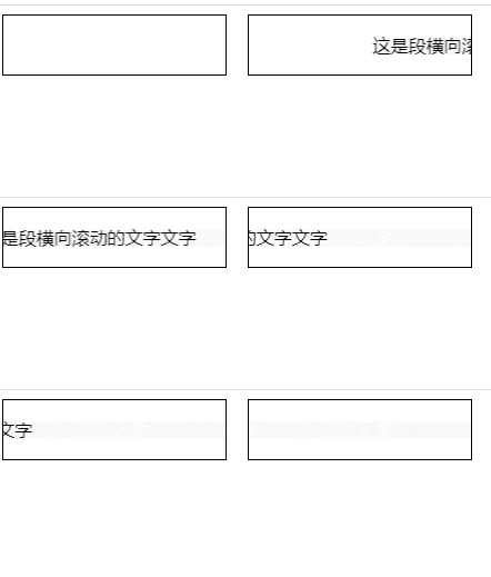
In css, keyframes rules, animation and transform attributes can be used to scroll text horizontally. The syntax is "element {animation: name time}@keyframes name {100%{transform: translateX (scroll distance)}}".

The operating environment of this tutorial: Windows 10 system, CSS3&&HTML5 version, Dell G3 computer.
How to do horizontal scrolling text in css
In css, if you want to achieve horizontal scrolling text, you need to use the animation attribute and @keyframes rules To achieve the animation effect of element scaling, animation can be created through the @keyframes rule.
The principle of creating animation is to gradually change one set of CSS styles into another set of styles. You can change this set of CSS styles multiple times during the animation.
Specify the time when the change occurs as a percentage, or through the keywords "from" and "to", which are equivalent to 0% and 100%. 0% is the start time of the animation, 100% is the end time of the animation. For best browser support, you should always define 0% and 100% selectors.
There is also a transform attribute used to set the effect of text scrolling. The transform property applies a 2D or 3D transformation to an element. This property allows us to rotate, scale, move or tilt the element.
The example is as follows:
1 2 3 4 5 6 7 8 9 10 11 12 13 14 15 16 17 18 19 20 21 22 23 24 25 26 |
|
Output result:

(Learning video sharing: css video tutorial)
The above is the detailed content of How to make horizontal scrolling text in css. For more information, please follow other related articles on the PHP Chinese website!