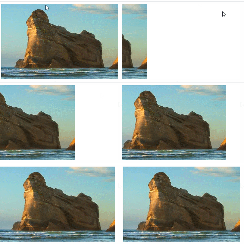
Method: 1. Use the "picture element {animation: name time}" statement to bind the sliding animation to the picture element; 2. Use "@keyframes name {0%{transform:translateX(-sliding distance)} }" statement sets the action of the sliding animation, just let the picture slowly slide in and appear.

The operating environment of this tutorial: Windows 10 system, CSS3&&HTML5 version, Dell G3 computer.
How to make pictures slide and appear in css
In css, you can use animation attributes and @keyframes rules to achieve the effect of pictures sliding. Through the @keyframes rule, animations can be created.
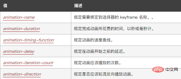
The animation attribute syntax is as follows:
animation: name duration timing-function delay iteration-count direction;
Among them:

The principle of creating animation is to gradually change one set of CSS styles into another A set of styles. You can change this set of CSS styles multiple times during the animation.
Specify the time when the change occurs as a percentage, or through the keywords "from" and "to", which are equivalent to 0% and 100%. 0% is the start time of the animation, 100% is the end time of the animation. For best browser support, you should always define 0% and 100% selectors.
There is also a transform attribute used to set the image sliding action. The transform property applies a 2D or 3D transformation to an element. This property allows us to rotate, scale, move or tilt the element.
The example is as follows:
<!DOCTYPE html>
<html lang="en">
<head>
    <meta charset="UTF-8">
    <meta name="viewport" content="width=device-width, initial-scale=1.0">
    <meta http-equiv="X-UA-Compatible" content="ie=edge">
    <title>Document</title>
    <style>
img{
animation:fadenum 5s;
}
@keyframes fadenum{
  0%{transform:translateX(-420px);}
}
</style>
</head>
<body>
<img src="/static/imghw/default1.png"  data-src="1118.02.png"  class="lazy"   alt="">
</body>
</html>Output result:

css video tutorial)
The above is the detailed content of How to make images slide and appear with css. For more information, please follow other related articles on the PHP Chinese website!