 Web Front-end
 Front-end Q&A
 What is the CSS property used to set the absolute positioning of an element?
What is the CSS property used to set the absolute positioning of an element?
The CSS attribute used to set the absolute positioning of an element is "position". You only need to set the value of the position attribute to "absolute". The syntax is "element {position:absolute;}"; set to absolute positioning The element is completely removed from the document flow and positioned relative to its containing block.

The operating environment of this tutorial: Windows 7 system, CSS3&&HTML5 version, Dell G3 computer.
The CSS property used to set the absolute positioning of an element is "positon".
The position attribute specifies the positioning type of the element. You only need to set the value of the positon attribute to "absolute" to achieve absolute positioning.
An element set to absolute positioning is completely removed from the document flow and positioned relative to its containing block, which may be another element in the document or the initial containing block. The space previously occupied by the element in normal document flow is closed, as if the element did not exist. The element generates a block-level box after positioning, regardless of what type of box it originally generated in the normal flow.
Basic features of absolute positioning
The first feature of absolute positioning is that it will start from It is separated from the document flow and is not affected by other elements. The positioning is "absolute", so it is called absolute positioning. If it is relative positioning, it will be affected by other elements, then the positioning is "relative";
Positioning is not used: that is, the element is in the normal document flow
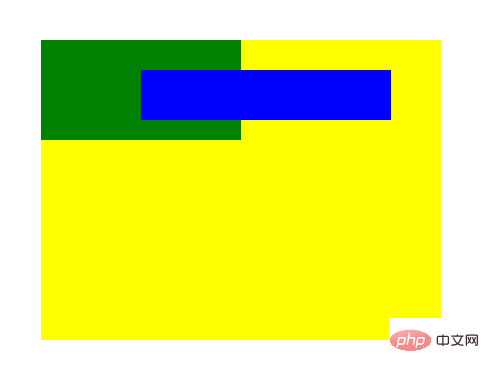
        <div class="frame">
            <div id="div1"></div>
            <div id="div2"></div>
</div>.frame {
margin: 0 auto;
margin-top: 50px;
width: 400px;
height: 300px;
background-color: yellow;
}
#div1 {
width: 100px;
height: 50px;
background-color: blue;
}
#div2 {
width: 200px;
height: 100px;
background-color: green;
}When we add absolute positioning to the element, The element will break away from the current document flow;
#div1 {
	position: absolute;
}
That is to say, the absolutely positioned element has no position in the document flow, it is separated from the document flow out, the subsequent elements will fill in its original position;
The second feature of absolute positioning is that the positioning position has a positioning attribute relative to the first one (that is, position is relative or absolute );
#div1 {
	top: 30px;
}
#When setting a positioning value for an absolutely positioned element, the element will search upwards along the DOM tree until it finds an element with If the ancestor element of the positioning attribute is positioned relative to the element, in this example, since its ancestor elements have no positioning attribute, the absolutely positioned element will be positioned relative to the body; if a positioning attribute is added to its parent element , the absolutely positioned element will be relative to the parent element;
.frame {
	position: relative;
	/* 或者 position: absolute; */
}
##Advanced features of absolute positioning
The first advanced feature of an absolutely positioned element is its automatic scaling function. When we set the width to auto (or not set it, the default is auto), the absolutely positioned element will be based on its left and right automatically scales its size ( Note: Please remember that the positioning value of an absolutely positioned element is relative to the first ancestor element with a positioning attribute );
#div1 {
	width: auto;
	left: 100;
	right: 50px;
}
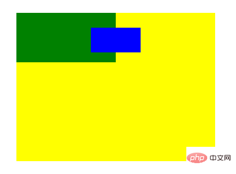
According to the first advanced feature, we can derive the second advanced feature. Since the absolute behavior element has the function of automatic scaling, if the width value is auto, at this time, if we set both left and right If it is 0, the element will fill up with its relative element. If we set the width to a fixed value at this time, this is an absolutely positioned element, which will give priority to the left value as the positioning mark ( This standard applies from left to right In the document stream that is read from right to left, and in a small number of document streams that are read from right to left, right is given priority). If we set margin to auto at this time, the absolutely positioned element will be centered;
#div1 {
	margin: auto;
	width: 100px;
	left: 0;
	right: 0;
}
其实并不一定非要设置成0,在 margin: auto 下,只要 left 和 right 的值相等,且不超过其 相对元素减去该绝对定位元素 width 的一半,就可以实现居中;如果其 left 超出了范围,那么会取 left 的值作为定位( 从左向右的文档流); /* 至于在范围能的值不等情况,大家可以自行测试一下 */
以上例子均在水平方向实现,那么垂直方向是怎么样的呢?其实垂直方向的作用效果是一样,垂直方向同样可以自动拉伸,同理我们也可以实现垂直方向上的自动居中;
#div1 {
	top: 0;
	bottom: 0;
}
和水平居中有一点不同的是,无论 top 和 bottom 的值设置为多少,只要相等,就可以垂直居中。
(学习视频分享:css视频教程)
The above is the detailed content of What is the CSS property used to set the absolute positioning of an element?. For more information, please follow other related articles on the PHP Chinese website!

Hot AI Tools

Undresser.AI Undress
AI-powered app for creating realistic nude photos

AI Clothes Remover
Online AI tool for removing clothes from photos.

Undress AI Tool
Undress images for free

Clothoff.io
AI clothes remover

Video Face Swap
Swap faces in any video effortlessly with our completely free AI face swap tool!

Hot Article

Hot Tools

Notepad++7.3.1
Easy-to-use and free code editor

SublimeText3 Chinese version
Chinese version, very easy to use

Zend Studio 13.0.1
Powerful PHP integrated development environment

Dreamweaver CS6
Visual web development tools

SublimeText3 Mac version
God-level code editing software (SublimeText3)

Hot Topics
 1387
1387
 52
52
 How to use bootstrap in vue
Apr 07, 2025 pm 11:33 PM
Using Bootstrap in Vue.js is divided into five steps: Install Bootstrap. Import Bootstrap in main.js. Use the Bootstrap component directly in the template. Optional: Custom style. Optional: Use plug-ins.
 The Roles of HTML, CSS, and JavaScript: Core Responsibilities
Apr 08, 2025 pm 07:05 PM
HTML defines the web structure, CSS is responsible for style and layout, and JavaScript gives dynamic interaction. The three perform their duties in web development and jointly build a colorful website.
 How to write split lines on bootstrap
Apr 07, 2025 pm 03:12 PM
There are two ways to create a Bootstrap split line: using the tag, which creates a horizontal split line. Use the CSS border property to create custom style split lines.
 Understanding HTML, CSS, and JavaScript: A Beginner's Guide
Apr 12, 2025 am 12:02 AM
WebdevelopmentreliesonHTML,CSS,andJavaScript:1)HTMLstructurescontent,2)CSSstylesit,and3)JavaScriptaddsinteractivity,formingthebasisofmodernwebexperiences.
 How to resize bootstrap
Apr 07, 2025 pm 03:18 PM
To adjust the size of elements in Bootstrap, you can use the dimension class, which includes: adjusting width: .col-, .w-, .mw-adjust height: .h-, .min-h-, .max-h-
 How to use bootstrap button
Apr 07, 2025 pm 03:09 PM
How to use the Bootstrap button? Introduce Bootstrap CSS to create button elements and add Bootstrap button class to add button text
 How to set up the framework for bootstrap
Apr 07, 2025 pm 03:27 PM
To set up the Bootstrap framework, you need to follow these steps: 1. Reference the Bootstrap file via CDN; 2. Download and host the file on your own server; 3. Include the Bootstrap file in HTML; 4. Compile Sass/Less as needed; 5. Import a custom file (optional). Once setup is complete, you can use Bootstrap's grid systems, components, and styles to create responsive websites and applications.
 How to insert pictures on bootstrap
Apr 07, 2025 pm 03:30 PM
There are several ways to insert images in Bootstrap: insert images directly, using the HTML img tag. With the Bootstrap image component, you can provide responsive images and more styles. Set the image size, use the img-fluid class to make the image adaptable. Set the border, using the img-bordered class. Set the rounded corners and use the img-rounded class. Set the shadow, use the shadow class. Resize and position the image, using CSS style. Using the background image, use the background-image CSS property.


