

Are gradients new to css3?

Gradient is a new image type in css3, used to replace images. CSS3 defines two types of gradients: 1. Linear gradient, defined using the "linear-gradient()" function; 2. Radial gradient, defined using the "radial-gradient()" function.

The operating environment of this tutorial: Windows 7 system, CSS3&&HTML5 version, Dell G3 computer.
As a new attribute of CSS3, gradients also have endless potential.
1. Introduction
Gradient is a new image type in CSS3, which is used to replace images. Its benefits are:
- Speed up page loading Speed, reducing bandwidth usage;
More flexible.
CSS3 defines two types of gradients:
Linear Gradients - Down/Up/Left /Right/Diagonal direction
Radial Gradient (Radial Gradient) - defined by their center
2. Linear Gradient
In fact, the use of gradients is quite common, such as navigation bars:
background-image: linear-gradient(90deg,#0af,#0085ff)
Obviously, this looks much better than a solid color background.
Of course, sometimes we don’t need transition effects:
background-image: linear-gradient(90deg,blue 100px,#FFF 100px,#FFF 200px,red 200px);
    $c1: #fff;
    $c2: #DF5646;
    $c3: #1C78A4;
    background-image: repeating-linear-gradient(45deg, $c1, $c1 10px, $c2 10px, $c2 40px, $c1 40px, $c1 50px, $c3 50px, $c3 80px);
    $color: #122556;
    background-image: linear-gradient(45deg, $color 25%, transparent 25%, transparent 75%, $color 75%),
                      linear-gradient(-45deg, $color 25%, transparent 25%, transparent 75%, $color 75%);
    background-size: 30px 30px;
- When you declare multiple gradients, the one declared first is closer to the user. (Here we need to consider the issue of covering, generally using transparent);
    @mixin menuaction($color) {
        background: linear-gradient($color 100%, transparent 100%) no-repeat center bottom / 100% 10%;
        &:hover {
            background-size: 100% 100%;
            color: #fff;
        }
}background-image: radial-gradient(shape size at position, start-color, ..., last-color);
| Description | |
|---|---|
| Determine the type of circle: |
|
| Define the size of the gradient, possible values: |
|
| defines the position of the gradient. Possible values: |
|
| is used to specify the starting and ending colors of the gradient. |
<!DOCTYPE html>
<html>
<head>
<meta charset="utf-8">
<style>
#grad1 {
    height: 150px;
    width: 200px;
    background-color: red; /* 浏览器不支持的时候显示 */
    background-image: radial-gradient(red, yellow, green); /* 标准的语法(必须放在最后) */
}

#grad2 {
    height: 150px;
    width: 200px;
    background-color: red; /* 浏览器不支持的时候显示 */
    background-image: radial-gradient(circle, red, yellow, green); /* 标准的语法(必须放在最后) */
}
</style>
</head>
<body>

<h3 id="径向渐变-nbsp-nbsp-形状">径向渐变 - 形状</h3>

<p><strong>椭圆形 Ellipse(默认):</strong></p>
<div id="grad1"></div>

<p><strong>圆形 Circle:</strong></p>
<div id="grad2"></div>

<p><strong>注意:</strong> Internet Explorer 9 及之前的版本不支持渐变。</p>

</body>
</html>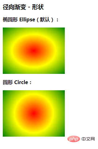
<!DOCTYPE html>
<html>
	<head>
		<meta charset="utf-8">
		<style>
			div {
				width: 300px;
				height: 120px;
				background: radial-gradient(transparent 0, transparent 5px, rgb(247, 245, 201) 5px) no-repeat,
					radial-gradient(transparent 0, transparent 5px, rgb(247, 245, 201) 5px) no-repeat,
					radial-gradient(transparent 0, transparent 5px, rgb(247, 245, 201) 5px) no-repeat,
					radial-gradient(transparent 0, transparent 5px, rgb(247, 245, 201) 5px) no-repeat,
					radial-gradient(transparent 0, transparent 5px, rgb(247, 245, 201) 5px) no-repeat,
					radial-gradient(transparent 0, transparent 5px, rgb(247, 245, 201) 5px) no-repeat,
					radial-gradient(#fff 0, #fff 10px, rgb(247, 245, 201) 10px) no-repeat,
					radial-gradient(#fff 0, #fff 10px, rgb(247, 245, 201) 10px) no-repeat,
					linear-gradient(90deg, transparent 10px, rgb(247, 245, 201) 10px);
				background-size: 20px 20px, 20px 20px, 20px 20px, 20px 20px, 20px 20px, 20px 20px, 60px 60px, 60px 60px, 100% 100%;
				background-position: -10px 0, -10px 20px, -10px 40px, -10px 60px, -10px 80px, -10px 100px, 60px -30px, 60px 90px, left center;
			}
		</style>
	</head>
	<body>
		<div></div>
	</body>
</html>
css video tutorial)
The above is the detailed content of Are gradients new to css3?. For more information, please follow other related articles on the PHP Chinese website!

Hot AI Tools

Undresser.AI Undress
AI-powered app for creating realistic nude photos

AI Clothes Remover
Online AI tool for removing clothes from photos.

Undress AI Tool
Undress images for free

Clothoff.io
AI clothes remover

AI Hentai Generator
Generate AI Hentai for free.

Hot Article
Hot Tools

Notepad++7.3.1
Easy-to-use and free code editor

SublimeText3 Chinese version
Chinese version, very easy to use

Zend Studio 13.0.1
Powerful PHP integrated development environment

Dreamweaver CS6
Visual web development tools

SublimeText3 Mac version
God-level code editing software (SublimeText3)
Hot Topics
 1385
1385
 52
52

 How to achieve wave effect with pure CSS3? (code example)
Jun 28, 2022 pm 01:39 PM
How to achieve wave effect with pure CSS3? (code example)
Jun 28, 2022 pm 01:39 PM
How to achieve wave effect with pure CSS3? This article will introduce to you how to use SVG and CSS animation to create wave effects. I hope it will be helpful to you!
 Use CSS skillfully to realize various strange-shaped buttons (with code)
Jul 19, 2022 am 11:28 AM
Use CSS skillfully to realize various strange-shaped buttons (with code)
Jul 19, 2022 am 11:28 AM
This article will show you how to use CSS to easily realize various weird-shaped buttons that appear frequently. I hope it will be helpful to you!
 How to hide elements in css without taking up space
Jun 01, 2022 pm 07:15 PM
How to hide elements in css without taking up space
Jun 01, 2022 pm 07:15 PM
Two methods: 1. Using the display attribute, just add the "display:none;" style to the element. 2. Use the position and top attributes to set the absolute positioning of the element to hide the element. Just add the "position:absolute;top:-9999px;" style to the element.
 Detailed example of how to solve the problem of CSS gradient aliasing!
Nov 25, 2022 pm 04:43 PM
Detailed example of how to solve the problem of CSS gradient aliasing!
Nov 25, 2022 pm 04:43 PM
This article will introduce to you how to solve the aliasing problem caused by using gradient graphics. The so-called CSS gradient aliasing disappearing technique can be done once you know it. Let's take a look at how to achieve it~ I hope it will be helpful to everyone. !
 How to implement lace borders in css3
Sep 16, 2022 pm 07:11 PM
How to implement lace borders in css3
Sep 16, 2022 pm 07:11 PM
In CSS, you can use the border-image attribute to achieve a lace border. The border-image attribute can use images to create borders, that is, add a background image to the border. You only need to specify the background image as a lace style; the syntax "border-image: url (image path) offsets the image border width inward. Whether outset is repeated;".
 It turns out that text carousel and image carousel can also be realized using pure CSS!
Jun 10, 2022 pm 01:00 PM
It turns out that text carousel and image carousel can also be realized using pure CSS!
Jun 10, 2022 pm 01:00 PM
How to create text carousel and image carousel? The first thing everyone thinks of is whether to use js. In fact, text carousel and image carousel can also be realized using pure CSS. Let’s take a look at the implementation method. I hope it will be helpful to everyone!
 How to enlarge the image by clicking the mouse in css3
Apr 25, 2022 pm 04:52 PM
How to enlarge the image by clicking the mouse in css3
Apr 25, 2022 pm 04:52 PM
Implementation method: 1. Use the ":active" selector to select the state of the mouse click on the picture; 2. Use the transform attribute and scale() function to achieve the picture magnification effect, the syntax "img:active {transform: scale(x-axis magnification, y Axis magnification);}".
 How to achieve transparency gradient effect using CSS properties
Nov 18, 2023 pm 05:28 PM
How to achieve transparency gradient effect using CSS properties
Nov 18, 2023 pm 05:28 PM
The method of implementing the transparency gradient effect using CSS properties requires specific code examples. In web design, the transparency gradient effect can add a soft and beautiful transition effect to the page. Through the setting of CSS properties, we can easily achieve the transition effect on transparency of different elements. Today we will introduce some common methods and specific code examples. Use the opacity attribute. The Opacity attribute can set the transparency of an element. The value ranges from 0 to 1. 0 means completely transparent and 1 means completely opaque. we can pass
