

What are the new features of css3 borders?

The newly added features of css3 border include: border-radius, border-image, border-image-outset, border-image-repeat, border-image-slice, border-image-width, etc.
The operating environment of this tutorial: Windows 7 system, CSS3&&HTML5 version, Dell G3 computer.
Newly added features (properties) of css3 borders
| Properties | Description | CSS |
|---|---|---|
| border-radius | Sets or retrieves the rounded border of an object. | |
| border-bottom-left-radius | Sets or retrieves the lower left corner rounded border of the object. Provide 2 parameters, separated by spaces. Each parameter is allowed to set 1 parameter value. The first parameter represents the horizontal radius, and the second parameter represents the vertical radius. If the second parameter is omitted, it defaults to the 1st parameter. Parameters | 3 |
| border-bottom-right-radius | Set or retrieve the rounded border of the lower right corner of the object. | 3 |
| border-top-left-radius | Define the shape of the upper left border. | 3 |
| border-top-right-radius | Define the shape of the upper right border. | 3 |
| border-image | Sets or retrieves the object's border style to fill with an image. | 3 |
| border-image-outset | Specifies the amount by which the border image exceeds the border. | 3 |
| border-image-repeat | Specifies whether the image border should be repeated, stretched, or covered ( rounded). | 3 |
| border-image-slice | Specifies the inward offset of the image border. | 3 |
| border-image-source | Specifies the image to be used in place of the border style set in the border-style property. | 3 |
| border-image-width | Specifies the width of the image border. | 3 |
| box-decoration-break | Specifies that inline elements are broken | 3 |
| box-shadow | Add one or more shadows to the box. | 3 |
| box-reflect | Sets or retrieves the reflection of an object | 3 |
border-image
The new border attribute in CSS3 expands the functionality of the original box model and enables the border to have background image attributes. Previously, border only had width, color and style attributes.
To implement border background image attributes, padding and background attributes are usually used for simulation, but this increases the difficulty of setting the background of the box
Grammar format: The syntax is CSS Abbreviation style
#
Description: Set or retrieve the border style of an object using an image path.
Specify an image to be used to replace the border-style border style attribute. When border-image is none or the image is invisible, the border style effect defined by border-style will be displayed. The corresponding script feature is borderImageSource. Value:
none: No background image.
None: No background image.
Description:
This attribute specifies to separate the image from the top, right, bottom, and left directions. The image is divided into 4 corners, 4 sides and a middle area, a total of 9 parts. The middle area is always transparent (that is, there is no image filling) ), unless the keyword fill is added. The corresponding script feature is borderImageSlice.
Value: :Specify the width with a floating point number. Negative values are not allowed.
<%>: Specify the width as a percentage. Negative values are not allowed.
[
/ [ border-image-width border width]? |
Description:
Set or retrieve the border thickness of the object. This attribute is used to specify how thick the border is to be used to carry the cropped image.
This attribute can be omitted and is defined by the external border-width. The corresponding script feature is borderImageWidth. Value:
Auto: If the auto value is set, border-image-width takes the same value as border-image-slice.
should will need to be added to the box model. Chrome will have a size of 3 pixels, and the border size of other browsers will still be 0 |
/ [border-image-outset extension method]
Description:
Set or retrieve the background diagram of the object of the object.This attribute is used to specify the value defined by the outward expansion of the border image. That is, if the value is 10px, the image will be extended 10px outward on the original basis before displaying.
The corresponding script feature is borderImageOutset.Value:
]
[border-image-repeat repeat mode]
Description:
This attribute is used to specify the filling method of the border background image. 0-2 parameter values can be defined, namely horizontal and vertical directions. If the two values are the same, they can be merged into one, indicating that the border background image is filled in the same way in both horizontal and vertical directions; if both values are stretch, they can be omitted.
The corresponding script feature is borderImageOutset.
Stretch: Specify the background diagram of the frame with stretching method.
Repeat: Specify the tiling method to fill the border background image. When the image hits the boundary, it will be truncated if it exceeds it.
Round: Specify a tiling method to fill the border background image. The image will dynamically adjust its size according to the size of the border until it just fits the entire border. At the time of writing this document, this effect can only be seen in Firefox
Space: Specifies a tiling method to fill the border background image. The picture will dynamically adjust the spacing between the pictures according to the size of the border until it can exactly cover the entire border. At the time of writing this document, no browser can see this effect
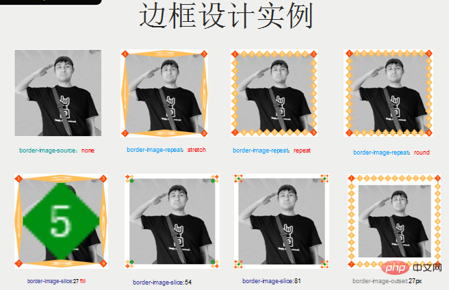
CSS3 New Property Example

 ##1、
##1、
<style>
    div{
        width:300px;
        height:300px;
        background:url(./shuaige.jpg) no-repeat center  ;
        border-image-source:none;
    }
</style>
</head>
<body>
    <div></div>
</body><style>
div{
width:300px;
height:300px;
background:url(./shuaige.jpg) center no-repeat ;
border-image-source:url(./border.png);/*边框图片属性*/
border-image-width:27px;/*边框图片宽度属性*/
border-image-slice:27;/*边框图片切割属性*/
border-image-outset:0px;/*边框图片扩展属性*/
border-image-repeat:stretch;/*边框图片重复属性*/
}
</style>
</head>
<body>
<div>
</div>
</body><style>
div{
width:300px;
height:300px;
background:url(shuaige.jpg) no-repeat center;
border-image-source:url(border.png);
border-image-width:27px;
border-image-slice:27;
border-image-outset:0px;
border-image-repeat:repeat;/*设定重复方式为重复*/
}
</style>
</head>
<body>
<div>
</div>
</body><style>
div{
width:300px;
height:300px;
background:url(shuaige.jpg) no-repeat center;
border-image-source:url(border.png);
border-image-width:27px;
border-image-slice:27;
border-image-outset:0px;
border-image-repeat:round;/*设定重复方式为round 会看情况进行缩放或缩小*/
}
</style>
</head>
<body>
<div>
</div>
</body><style>
div{
width:300px;
height:300px;
background:url(./shuaige.jpg) center no-repeat ;
border-image-source:url(./border.png);/*边框图片属性*/
border-image-width:27px;/*边框图片宽度属性*/
border-image-slice:27 fill;
/*设定边框图片背景填充内容部分,会显示第5块切割的内容*/
border-image-outset:0px;/*边框图片扩展属性*/
border-image-repeat:stretch;/*边框图片重复属性*/
}
</style>
</head>
<body>
<div>
</div>
</body><style>
div{
width:300px;
height:300px;
background:url(./shuaige.jpg) center no-repeat ;
border-image-source:url(./border.png);
border-image-width:27px;
border-image-slice:54;/*切割为宽度的2倍 会自动缩放*/
border-image-outset:0px;
border-image-repeat:stretch;
}
</style>
</head>
<body>
<div>
</div>
</body><style>
div{
width:300px;
height:300px;
background:url(./shuaige.jpg) center no-repeat ;
border-image-source:url(./border.png);
border-image-width:27px;
border-image-slice:81;/*切割为宽度的3倍*/
border-image-outset:0px;
border-image-repeat:stretch;
}
</style>
</head>
<body>
<div>
</div>
</body><style>
div{
width:300px;
height:300px;
background:url(./shuaige.jpg) center no-repeat ;
border-image-source:url(./border.png);
border-image-width:27px;
border-image-slice:27;
border-image-outset:154px;/*向外扩展的大小*/
border-image-repeat:repeat;
}
</style>
</head>
<body>
<div>
</div>
</body>The above is the detailed content of What are the new features of css3 borders?. For more information, please follow other related articles on the PHP Chinese website!

Hot AI Tools

Undresser.AI Undress
AI-powered app for creating realistic nude photos

AI Clothes Remover
Online AI tool for removing clothes from photos.

Undress AI Tool
Undress images for free

Clothoff.io
AI clothes remover

Video Face Swap
Swap faces in any video effortlessly with our completely free AI face swap tool!

Hot Article
Hot Tools

Notepad++7.3.1
Easy-to-use and free code editor

SublimeText3 Chinese version
Chinese version, very easy to use

Zend Studio 13.0.1
Powerful PHP integrated development environment

Dreamweaver CS6
Visual web development tools

SublimeText3 Mac version
God-level code editing software (SublimeText3)
Hot Topics
 1387
1387
 52
52

 How to achieve wave effect with pure CSS3? (code example)
Jun 28, 2022 pm 01:39 PM
How to achieve wave effect with pure CSS3? (code example)
Jun 28, 2022 pm 01:39 PM
How to achieve wave effect with pure CSS3? This article will introduce to you how to use SVG and CSS animation to create wave effects. I hope it will be helpful to you!
 Use CSS skillfully to realize various strange-shaped buttons (with code)
Jul 19, 2022 am 11:28 AM
Use CSS skillfully to realize various strange-shaped buttons (with code)
Jul 19, 2022 am 11:28 AM
This article will show you how to use CSS to easily realize various weird-shaped buttons that appear frequently. I hope it will be helpful to you!
 How to hide elements in css without taking up space
Jun 01, 2022 pm 07:15 PM
How to hide elements in css without taking up space
Jun 01, 2022 pm 07:15 PM
Two methods: 1. Using the display attribute, just add the "display:none;" style to the element. 2. Use the position and top attributes to set the absolute positioning of the element to hide the element. Just add the "position:absolute;top:-9999px;" style to the element.
 How to implement lace borders in css3
Sep 16, 2022 pm 07:11 PM
How to implement lace borders in css3
Sep 16, 2022 pm 07:11 PM
In CSS, you can use the border-image attribute to achieve a lace border. The border-image attribute can use images to create borders, that is, add a background image to the border. You only need to specify the background image as a lace style; the syntax "border-image: url (image path) offsets the image border width inward. Whether outset is repeated;".
 How to enlarge the image by clicking the mouse in css3
Apr 25, 2022 pm 04:52 PM
How to enlarge the image by clicking the mouse in css3
Apr 25, 2022 pm 04:52 PM
Implementation method: 1. Use the ":active" selector to select the state of the mouse click on the picture; 2. Use the transform attribute and scale() function to achieve the picture magnification effect, the syntax "img:active {transform: scale(x-axis magnification, y Axis magnification);}".
 It turns out that text carousel and image carousel can also be realized using pure CSS!
Jun 10, 2022 pm 01:00 PM
It turns out that text carousel and image carousel can also be realized using pure CSS!
Jun 10, 2022 pm 01:00 PM
How to create text carousel and image carousel? The first thing everyone thinks of is whether to use js. In fact, text carousel and image carousel can also be realized using pure CSS. Let’s take a look at the implementation method. I hope it will be helpful to everyone!
 How to set animation rotation speed in css3
Apr 28, 2022 pm 04:32 PM
How to set animation rotation speed in css3
Apr 28, 2022 pm 04:32 PM
In CSS3, you can use the "animation-timing-function" attribute to set the animation rotation speed. This attribute is used to specify how the animation will complete a cycle and set the speed curve of the animation. The syntax is "element {animation-timing-function: speed attribute value;}".
 Does css3 animation effect have deformation?
Apr 28, 2022 pm 02:20 PM
Does css3 animation effect have deformation?
Apr 28, 2022 pm 02:20 PM
The animation effect in css3 has deformation; you can use "animation: animation attribute @keyframes ..{..{transform: transformation attribute}}" to achieve deformation animation effect. The animation attribute is used to set the animation style, and the transform attribute is used to set the deformation style. .
