How does the mini program implement the tab card switching function? This article will introduce to you how to implement tab card switching in WeChat applet. I hope it will be helpful to you!

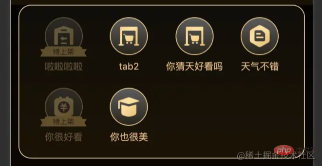
First of all, let’s take a look at the UI appearance and interaction effect to be achieved. The picture below is One of our entrances. Clicking on each icon area below will display the corresponding card display.

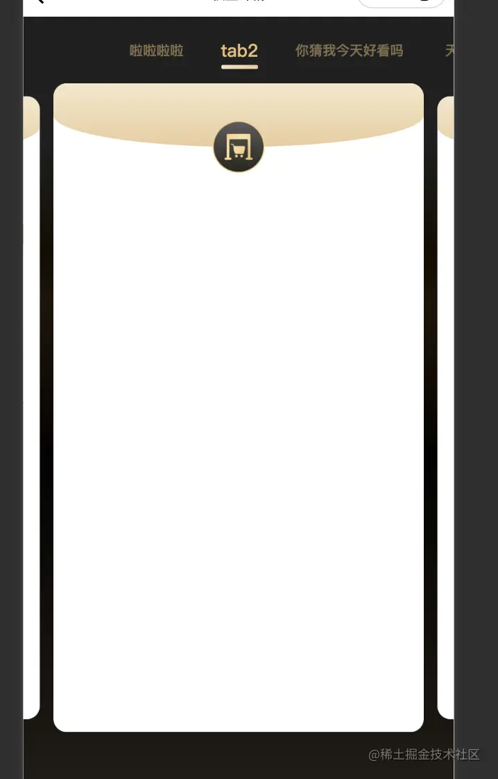
For example, when I click on the icon of tab2, the corresponding jump will be as shown in the figure below.
The page is displayed as a long tab bar at the head, which can be slid left and right. Blank areas need to be left on both sides to achieve the centering effect of the tabs at both ends., click the corresponding tab The corresponding card can be displayed, , and the text of the tab will be displayed in the center. Similar to the effect of switching left and right carousels, I think as a user it should be easy to think of this kind of interaction.
The currently activated card will have an effect that feels slightly larger than other cards, and the edges of the front and back cards can be seen. And the card area can also be slid left and right to achieve the same interactive effect as the head tab bar.
This is probably such an interactive effect!

1. First of all, we need to know that all the tabs displayed on the front end are always displayed like this. Is it more than one, or is it possible that it will be expanded in the future, or that it is possible to iterate on it. I personally think we can discuss this with the back-end to unify the content we need to display into a set of constant configuration, and then we can make our dynamic rendering. Here I roughly maintain such a constant.
data: [
  {
    title: 'tab2', // 标题
    logoUrl: 'xxx', // 图标地址
    isNeed: false, // 是否需要该tab
    id: '', // 每个tab对应的一个id,与后端交互使用
    content: '' // 每个tab对应的一些内容,用于扩展
    ...
  }
]is roughly the above data structure.
2. When clicking the corresponding icon at the entrance, you can bring the corresponding array index or id into the details page to display the corresponding card And the corresponding ui
3. In the design of the details page, I divided the page into two components for display.
<view>
    <scroll-tab data="{{data}}" current="{{current}}" bind:chooseDetail="handleChooseDetail" />
    <swiper-card data="{{data}}" current="{{current}}" bind:swiperChange="handleSwiperChange" />
</view>wx.getSystemInfo({
success: res => {
this.marginWidth = res.windowWidth / 2 // 两边空白距离
}
})
const computedPosition = (margin, textArr, preWidthArr) => {
// margin每个tab之间的间距
// textArr为所有tab的文字宽度的数组
// preWidthArr为每一个tab与前一个tab的距离数组,第一个默认为0
let distanceArr = []
let len = textArr?.length
for (let i = 0; i < textArr?.length; i++) {
distanceArr.unshift(preWidthArr[len - 1] + (len - 1) * margin + textArr[len - 1] / 2)
len--
}
// distanceArr为每个tab居中展示时应该设置的scroll-left值
return distanceArr
}
// textArr[n] = 第 n - 1元素的宽度
// const widthArr = [78, 78, 78, 52, 52, 52]
// preWidthArr[n] = 第n - 1个tab距离前面tab的距离 = 元素宽 + margin
// 第一个tab没有前面的元素
// const arr = [0, 78, 156, 234, 286, 338]
// 获取元素信息
getElementAttr() {
wx.createSelectorQuery()
.in(this)
.selectAll('.swiper-text__item')
.boundingClientRect(res => {
const textWidth = res?.map(item => item.width)
const preWidth = this.getPreWidth(textWidth)
this.distanceArr = computedPosition(MARGIN, textWidth, preWidth)
})
.exec()
},
getPreWidth(textWidth) {
const arr = [0]
for (let i = 0; i < textWidth.length - 1; i++) {
arr.push(textWidth[i] + arr[i])
}
return arr
}前段时间接了这个需求的时候我作为owner,和一个同事为该需求评估排期时间时评的是10人日,我自然而然的也想尝试一下所以选择了ui与交互更为复杂的内容,当然以上要实现的内容只是其中一个部分,说实话在实现过程中我真的挺痛苦的,还有一个半圆弧状的进度条展示,首尾都要有弧度的那一种,作为一个应届小白,还是有太多不会的东西了,即使是这些在他们眼里看作为很简单的内容,一下就能实现的内容,在我这里可要经历太多了,我知道我菜,但我会继续努力,作为一个前端开发,高还原度实现ui设计稿一直作为我的初衷。但希望你们不要以这个我xxx(多久时间)就能做出来的口吻来pua我,至少我认为在几年后我会比你们更加优秀,但一定不会用这样的口吻来对待我的应届同事们。
【相关学习推荐:小程序开发教程】
The above is the detailed content of A brief discussion on how to implement the tab card switching function in mini programs. For more information, please follow other related articles on the PHP Chinese website!
 Mini program path acquisition
 How to solve an error in the script of the current page
 Why webstorm cannot run the file
 What does add mean in java?
 git undo submitted commit
 What are the main technologies of firewalls?
 Bitcoin inscription dragon coin
 How to use insert statement in mysql
 Usage of fixed in c language