In CSS3, em is a relative length unit, relative to the font size of the text in the current object, which is the size set by font-size; if the current font size of the inline text has not been manually set, then Relative to the browser's default font size.

The operating environment of this tutorial: Windows 7 system, CSS3&&HTML5 version, Dell G3 computer.
em is a relative length unit, relative to the font size of the text in the current object, which is the size set by font-size. Its unit length is determined based on the vertical length of the element's text.
If the current font size of the inline text has not been manually set, look for the parent's font-size. If there is no parent or the parent does not set font-size, it will be relative to the browser's default font size. (16px).
For example 1: By default, the width and height of the internal p are directly given to 10em
<!DOCTYPE html>
<html>
<head>
    <meta charset="UTF-8">
    <meta name="viewport" content="width=device-width, initial-scale=1.0">
    <title>Example 01</title>
    <style>
        #app{
            width: 10em;
            height: 10em;
            background-color: bisque;
        }
    </style>
</head>
<body>
    <div id="app"></div>
</body>
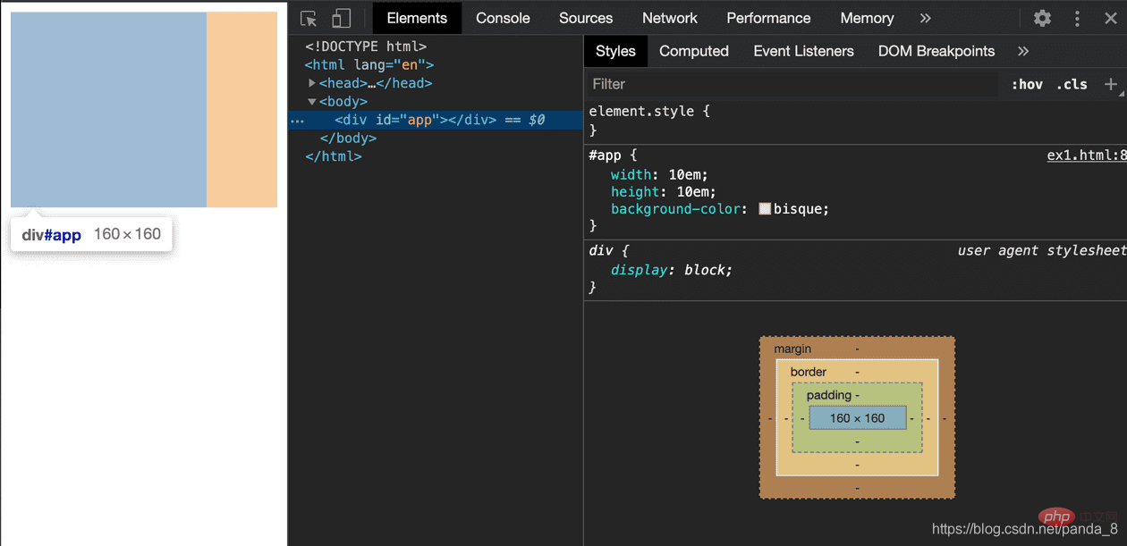
</html>Inspect screenshot is as follows:

As you can see, the width and height we gave #app p are 10em. After the browser renders, their width and height are 160px. This size is exactly 10 times larger than 16px.
This size is exactly the browser’s default font-size of 16px.
<!DOCTYPE html>
<html>
<head>
    <meta charset="UTF-8">
    <meta name="viewport" content="width=device-width, initial-scale=1.0">
    <title>Example 01</title>
    <style>
        #app{
            font-size: 12px;
            width: 10em;
            height: 10em;
            background-color: bisque;
        }
    </style>
</head>
<body>
    <div id="app"></div>
</body>
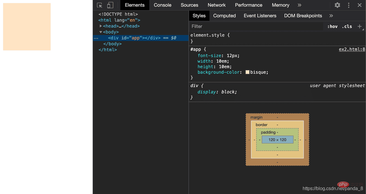
</html>Inspect screenshot:

css video tutorial)
The above is the detailed content of What is the unit of em in css3. For more information, please follow other related articles on the PHP Chinese website!