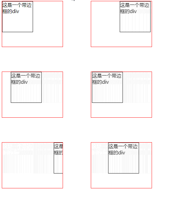
Method: 1. Use the "div{animation:name time}" statement to bind the sliding animation to the div element; 2. Use "@keyframes name{0%{transform:translateX(sliding distance)}} " statement sets the action of the sliding animation to achieve the sliding effect on the right side of the div.

The operating environment of this tutorial: Windows 10 system, CSS3&&HTML5 version, Dell G3 computer.
css3How to realize the slide-in effect on the right side of a div
In css, if you want to realize the slide-in effect on the right side of a div, you can use the animation attribute and @keyframes rules.
The principle of creating animation is to gradually change one set of CSS styles into another set of styles. You can change this set of CSS styles multiple times during the animation.
Specify the time when the change occurs as a percentage, or through the keywords "from" and "to", which are equivalent to 0% and 100%. 0% is the start time of the animation, 100% is the end time of the animation. For best browser support, you should always define 0% and 100% selectors.
There is also a transform attribute used to set the image sliding action. The transform property applies a 2D or 3D transformation to an element. This property allows us to rotate, scale, move or tilt the element.
The example is as follows:
<!DOCTYPE html>
<html lang="en">
<head>
    <meta charset="UTF-8">
    <meta name="viewport" content="width=device-width, initial-scale=1.0">
    <meta http-equiv="X-UA-Compatible" content="ie=edge">
    <title>Document</title>
    <style>
.div1{
  width:100px;
  height:100px;
  border:1px solid #000;
animation:fadenum 5s;
}
@keyframes fadenum{
  0%{transform:translateX(250px);}
}
.div2{
  width:200px;
  height:150px;
  border:1px solid red;
  overflow:hidden;
}
</style>
</head>
<body>
<div class="div2"><div class="div1">这是一个带边框的div</div></div>
</body>
</html>Output result:

(Learning video sharing: css video tutorial)
The above is the detailed content of How to slide in the right side of div in css3. For more information, please follow other related articles on the PHP Chinese website!