css3 can add strokes. Method: 1. Use the text-shadow attribute to achieve the stroke effect by adding text shadow around the text; 2. Use the text-stroke attribute. The syntax "text-stroke: stroke" Edge width color;"; 3. Use SVG to add strokes to the text.

The operating environment of this tutorial: Windows 7 system, CSS3&&HTML5 version, Dell G3 computer.
text-shadow: Sets a shadow to the text.
text-shadow:color||length||length||opacity
color: Specify the color.
length: The first length specifies the extension distance of the shadow in the horizontal direction, and the second length specifies the extension distance of the shadow in the vertical direction, which can be a negative value.
opacity: Specifies the distance of the shadow blur effect.
The direction order represented by the four attribute values separated by commas is lower right, upper left.
<!DOCTYPE html>
<html>

	<head>
		<meta charset="UTF-8">
		<title>text-shadow-文字描边</title>
		<style>
			.demo {
				height: 200px;
				text-align: center;
				font-family: Verdana;
				font-size: 30px;
				font-weight: bold;
				background: peru;
				color: #000;
			}

			.stroke {
				text-shadow: #fff 1px 0 0, #fff 0 1px 0, #fff -1px 0 0, #fff 0 -1px 0;
			}
		</style>
	</head>

	<body>
		<div class="demo">
			<p>没有添加描边</p>
			<p class="stroke">添加了字体描边</p>
		</div>
	</body>

</html>
There is a property specifically used for text stroke in CSS-webkit-text-stroke, you can control the width and color of the stroke, for example
.text{
  -webkit-text-stroke: 2px #333;
}The effect is as follows


-webkit-text-stroke is actually The stroke is centered and covers the text, and the stroke method cannot be changed. In fact, many design tools allow you to choose the stroke method, such as figma

<p class="text" data-title="为你定制 发现精彩">为你定制 发现精彩</p>
::beforeSet the gradient, located above , set the stroke of the original text, located below, pay attention to remove the -webkit-text-stroke of ::before
.text::before{
    content: attr(data-title);
    position: absolute;
    background-image: linear-gradient(#FFCF02, #FF7352);
    background-clip: text;
    -webkit-background-clip: text;
    -webkit-text-fill-color: transparent;
    -webkit-text-stroke: 0;
}
.text{
    -webkit-text-stroke: 6px #333;
}

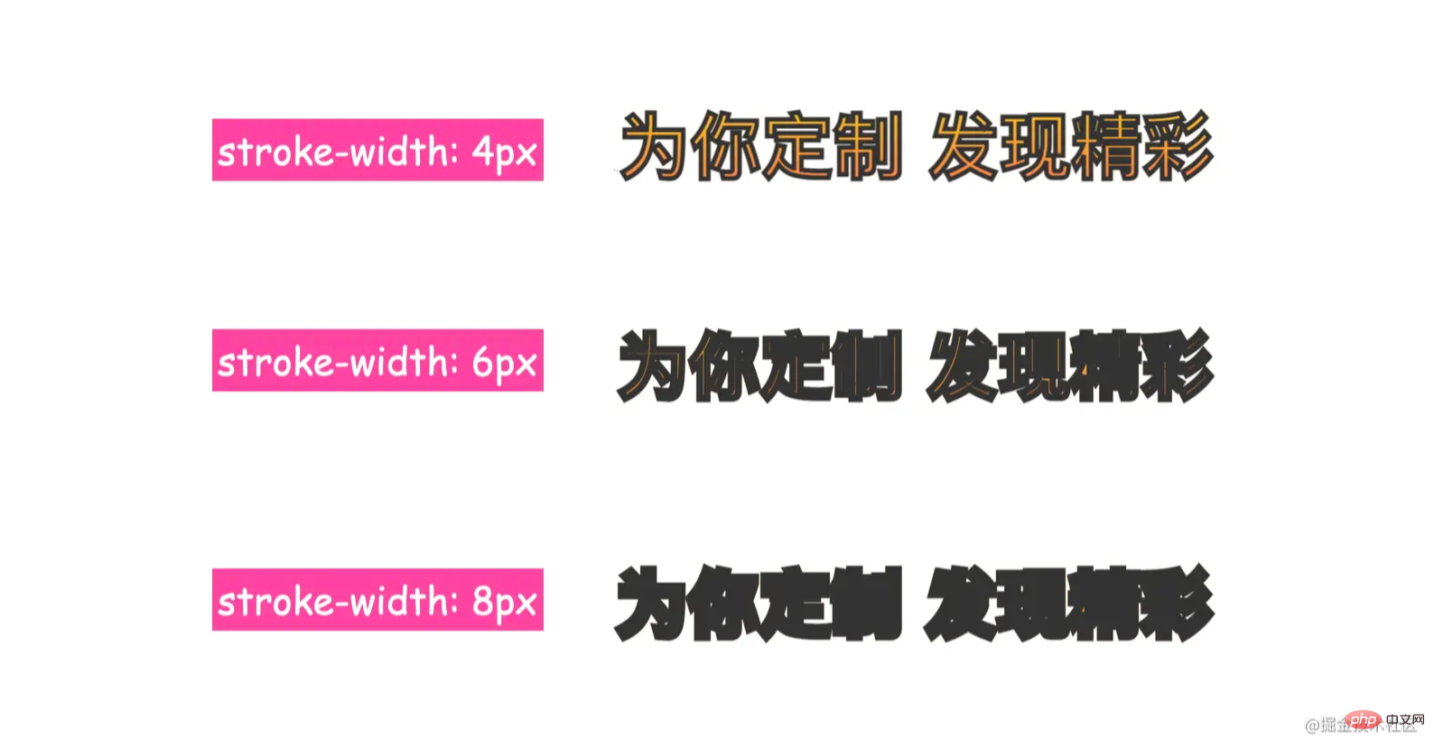
stroke and stroke-width, such as
.text{
  /*其他*/
  stroke-width: 4px;
  stroke: #333;
}
The default is to fill first and then stroke, so it looks like the stroke is above the fill, but we can change this According to this rule, if you set the stroke first and then the fill, then the fill color will cover the stroke. Changing this rule in SVG can be set by paint-order.
.text{
  /*其他*/
  stroke-width: 4px;
  stroke: #333;
  paint-order: stroke; /*先描边*/
}
css video tutorial)
The above is the detailed content of Can you add text strokes in css3?. For more information, please follow other related articles on the PHP Chinese website!
 css3 tutorial
 What are the css3 gradient properties?
 How to write triangle in css
 How to use the month function
 What does the rm-rf command mean in linux?
 oracle add trigger method
 Which platform is better for virtual currency trading?
 What are the new features of Hongmeng 3.0?
 How to use videos in java