There are three types of css3 layout models: 1. Flow model (Flow), which is the default web page layout mode; 2. Float model (Float), which is controlled by the float attribute; 3. Layer model (Layer), which has There are three forms: "relative positioning", "absolute positioning" and "fixed positioning".

The operating environment of this tutorial: Windows 7 system, CSS3&&HTML5 version, Dell G3 computer.
CSS3 contains 3 basic layout models, summarized in English as: Flow, Layer and Float.
In web pages, elements have three layout models:
Flow model (Flow)
Float model (Float)
Layer model(Layer)
1. Flow model(Flow)
Flow model is the default web page layout mode. That is to say, the HTML web elements of the web page in the default state distribute the web page content according to the flow model.
The fluid layout model has two typical characteristics:
First, the block elements will be vertically extended and distributed in order from top to bottom within the containing element, because in By default, the width of block elements is 100%. In fact, block elements will occupy their position in the form of rows.
(Each sticky note displays its original default width and height)
Second point, under the flow model, inline elements will move from left to right within the containing element. Horizontal distribution display. (Inline elements are not as domineering as block elements and occupy one line)
2. Float model (Float)
Any element is by default The bottom cannot float, but it can be defined as floating using CSS
div{float:left;}
div{float:right;}You can set different floating methods for different divs to lay out.
3. Layer model (Layer)
The layer model has three forms:
1. Relative positioning (position: relative)
2. Absolute positioning (position: absolute)
3. Fixed positioning (position: fixed)
Relative positioning
If you want to set the relative positioning in the layer model for an element, you need to set position:relative (indicating relative positioning), which Determine the offset position of the element in the normal document flow through the left, right, top, and bottom attributes.
Move relative to the previous position, and the position before the offset remains unchanged. When using relative positioning, even if the element is offset, it still occupies the space before it was offset.
 .div1 {
            width: 100px;
            height: 100px;
            border: 1px solid red;
        }

        .div2 {
            width: 100px;
            height: 100px;
            border: 1px dashed blue;
            position: relative;
            top: 100px;
            left: 100px;
        }
    <div class="div1"></div>
    <div class="div2"></div>
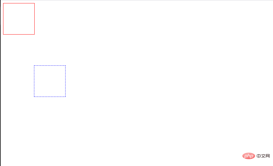
The blue dotted box here indicates the use of relativ. Setting top and left to 100px respectively means moving 100 pixels downward and to the right relative to the original position. That is, the original position of the element is 100 pixels above and left of its current position.
Absolute positioning
If you want to set the absolute positioning in the layer model for an element, you need to set position:absolute (indicating absolute positioning) to remove the element from the document Drag it out of the flow, and then use the left, right, top, and bottom attributes to perform absolute positioning relative to its closest parent containing block with a positioning attribute.
If there is no such containing block (that is, the div in front of it does not have a positioning attribute set), it will be relative to the body element, that is, relative to the browser window.
Elements that are set to absolute positioning do not occupy space in the document flow. If an element is set to absolute positioning, its position in the document flow will be deleted;
We can set their stacking order through z-index.
Absolute positioning makes the element out of the document flow, so it does not occupy space. The layout of the element in the ordinary document flow is the same as when the absolutely positioned element does not exist. Other elements still in the document flow will ignore the element and Fill his former space. Because absolutely positioned boxes are independent of document flow, they can cover other elements on the page.
        .div1 {
            width: 300px;
            height: 300px;
            background: red;
            position: absolute;
            top: 100px;
            left: 100px;
        }
            <div class="div1"></div>
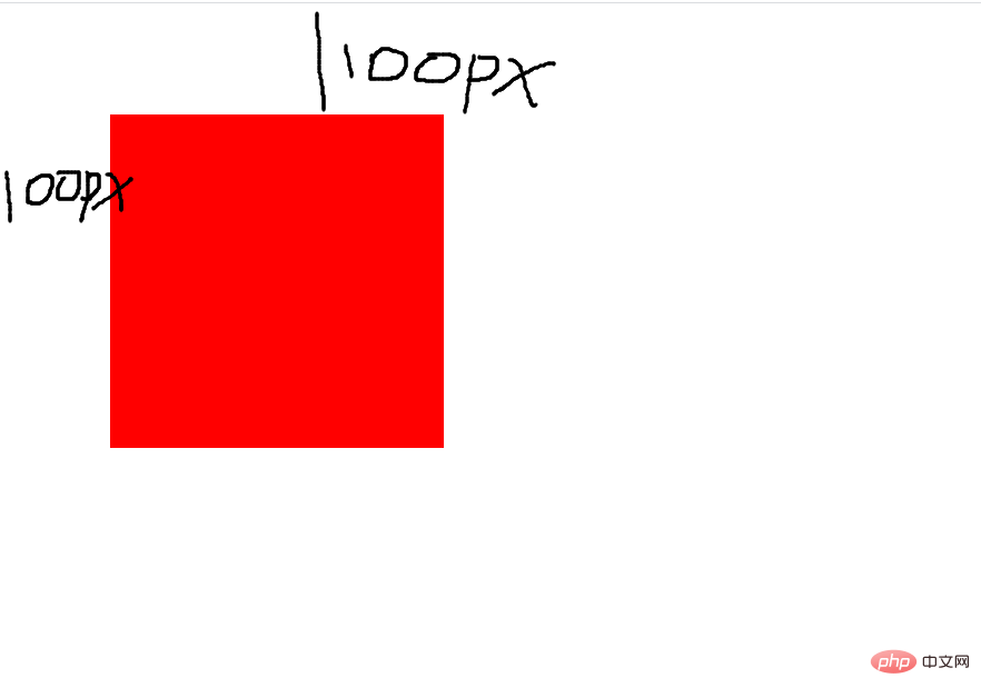
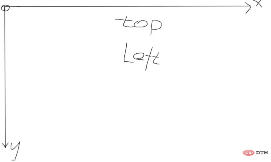
 What I set here is top and left, so the positioning attribute at this time takes the upper left corner of the browser as the origin. Similarly, if you set top and left Right means taking the upper right corner of the browser as the origin, and the same applies to everything else.
Fixed positioning
fixed: Indicates fixed positioning, similar to the absolute positioning type, but its relative movement coordinates are the view (web page window within the screen) itself. Since the view itself is fixed, it does not change as the browser window's scrollbar scrolls.
        .div1 {
            width: 100%;
            height: 10000px;
            border: 1px solid red;
        }

        .div2 {
            width: 100px;
            height: 100px;
            border: 1px dashed blue;
            position: fixed;
            top: 100px;
            left: 100px;
        }
     <div class="div1">
        <div class="div2"></div>
</div>The fixed position means that it will not change as the scroll bar changes.
Using RELATIVE and ABSOLUTE in combination
Rules:
1. The reference-positioned element must be the predecessor element of the relatively positioned element
2. Reference positioning elements must be added with position: relative;
3. Positioning elements must be added with position: absolute; use top, left, right, bottom to offset.
(Learning video sharing: css video tutorial)
The above is the detailed content of What are the types of css3 layout models?. For more information, please follow other related articles on the PHP Chinese website!