

Why set the style of rounded border in css3

The style is: 1. "border-radius: radius value;"; 2. "border-radius: radius value radius value;"; 3. "border-radius: radius value radius value radius value;" ;4. "border-radius: radius value radius value radius value radius value;".
The operating environment of this tutorial: Windows 7 system, CSS3&&HTML5 version, Dell G3 computer.
Rounded border
##1. Introduction to border-radius attribute
Add a rounded border to an element, you can add a rounded border to the element The four corners are rounded (the properties are not inherited)2. Border-radius definition method
border-radius attribute There are two definition methods: border-radius can set the same value (abbreviated attribute) for the four corners at once, or it can set the rounded style for the four corners separately (separate attribute settings).(1) Individual attribute settings
border-radius: Set the rounded corner styles of four borders at the same time;- border-top -left-radius: Set the rounded corner style of the upper left corner border;
- border-top-right-radius: Set the rounded corner style of the upper right corner border;
- border-bottom-left-radius : Set the rounded corner style of the lower left corner border;
- border-bottom-right-radius: Set the rounded corner style of the lower right corner border;
(2) Abbreviation attribute
Set four parameters for border-radius, Pay attention to the order relationship
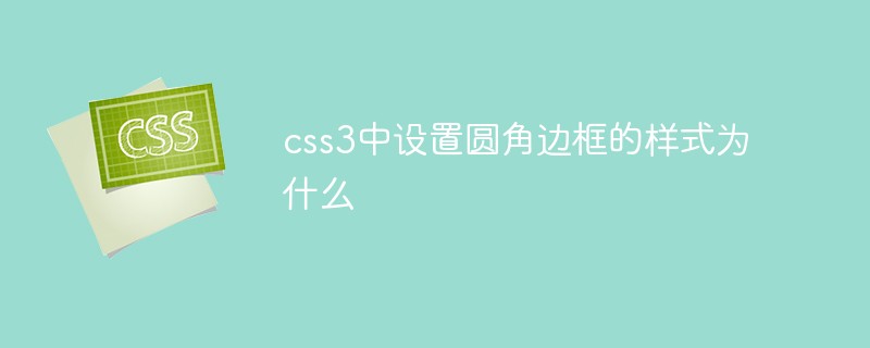
1. Set only one value for the attribute, and the rounded corners of the four borders use the same valueborder-radius:20px //四个边框圆角为20px
##2 , set two values for the attribute, the first value sets the upper left corner and lower right corner, the second value sets the upper right corner and lower left corner
border-radius: 20px 50px //左上角和右下角20px,右上角和左下角50px
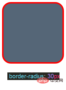
3. Set the attribute Three values, the first value is set to the upper left corner, the second value is set to the upper right corner and lower left corner, and the third value is set to the lower right corner
border-radius: 20px 50px 5px //左上角20px,右上角和左下角50px,右下角5px
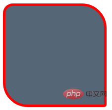
##4 , set four values for the attribute, the first value is set to the upper left corner, the second value is set to the upper right corner, the third value is set to the lower right corner, and the fourth value is the lower left corner (clockwise)
border-radius: 20px 50px 5px 100px //左上角20px,右下角50px,右下角5px ,左下角100px
The syntax of border-radius
border-radius: {1-4} length /% / {1-4} length /%;
border-radius: 20px 10px 40px / 25px 30px
length defines rounded corners The shape of value. If bottom-left is omitted, it is the same as top-right. If bottom-right is omitted, it is the same as top-left. If top-right is omitted, it is the same as top-left. The number of parameters of border-radius ranges from 1 to 4. Here you should pay attention to the use of horizontal radius and vertical radius respectively: first set the horizontal radius of 4 corners in border-radius and then set 4 The vertical radius of the corners. 】Example:
div{border-radius: 20px 5px 100px/15px 30px;}div{ border-top-left-radius: 20px 15px;
border-top-right-radius: 5px 30px;
border-bottom-right-radius: 100px 15px;
border-bottom-left-radius: 5px 30px;
} 4. Application
Use border-radius to create a circleInput border-radius: r, the radius size of the r element here (with length units), to create a circle set r to half the height and width of the element.
When the height and width of the element are equal, this value method is circular. Code<!DOCTYPE html>
<html>
<head>
<meta charset="UTF-8">
<title>css3圆角边框</title>
<style>
#box1{
width: 200px;
height: 200px;
background-color: #567;
border:5px solid red;
border-radius: 50%;
margin: auto;
box-shadow:10px 10px 5px #a2a2a3 ;}
</style>
</head>
<body>
<div>
<div id="box1"></div>
</div>
</body>
</html>
border-radius achieves circular and semi-circular effects
border-radius has such a feature:
给任何正方形设置一个足够大的border-radius,就可以把它变成一个圆形。
注意:当任意两个相邻的圆角的半径之和超过 borderbox 的尺寸之后,用户代理必须按照比例缩小各个边框半径所示用的值,直到它们不会相互重叠为止。
为什么叫border-radius ?
可能有些人会奇怪,border-radius到底由何得名。这个属性并不需要边框来参与工作,似乎叫做内容圆角更合适一些。
实际原因是 border-radius 是对元素borderbox 进行切圆角处理的。当元素没有边框时,可能还看不出差异;当它有边框时,则以边框外侧的拐角作为切圆角的基准。边框内侧的圆角会稍小一些(严格来说内角半径将是 max(0,border-radius-border-width))。
实例:
(一)、border-radius画圆形
div{
        width:200px;
        height:200px;
        border-radius:50%;
        background: #f775a9;
}表现效果:
- 要想实现一个圆形,首先要设置出一个正方形。
- 给border-radius设置任何大于或等于50%的百分数,都可以实现圆形效果。
例如:设置border-radius:70%,同样可以得到一个圆形。

(二)、border-radius实现四个方向的半圆
圆角相当是边框对内容的切割,圆角值设置的越大相当对元素切割越圆。
<!DOCTYPE html>
<html>
<head>
    <meta charset="UTF-8">
    <title>border-radius</title>
    <style type="text/css">
    .box1{
        width:200px;height:100px;
        border-radius:400px 400px 0 0;
        background: #f775a9;
        float:left;
    }
    .box2{
        width:100px;height:200px;
        border-radius:300px 0 0 300px;
        background: #fabab8;
        float:left;
    }
    .box3{
        width:200px;
        height:100px;
        border-radius:0 0 200px 200px ;
        background: #aadfe6;
        float:left;
    }
    .box4{
        width:100px;height:200px;
        border-radius:0 100px 100px 0;
        background: #79e0c3;
        float:left;
    }
    .box5{
        width:100px;height:200px;
        border-radius:0 50px 50px 0;
        background: #acbfea;
        float:left;
    }
    </style>
</head>
<body>
<div>1</div>
<div>2</div>
<div>3</div>
<div>4</div>
<div>5</div>
</body>
</html>
(学习视频分享:css视频教程)
The above is the detailed content of Why set the style of rounded border in css3. For more information, please follow other related articles on the PHP Chinese website!

Hot AI Tools

Undresser.AI Undress
AI-powered app for creating realistic nude photos

AI Clothes Remover
Online AI tool for removing clothes from photos.

Undress AI Tool
Undress images for free

Clothoff.io
AI clothes remover

Video Face Swap
Swap faces in any video effortlessly with our completely free AI face swap tool!

Hot Article
Hot Tools

Notepad++7.3.1
Easy-to-use and free code editor

SublimeText3 Chinese version
Chinese version, very easy to use

Zend Studio 13.0.1
Powerful PHP integrated development environment

Dreamweaver CS6
Visual web development tools

SublimeText3 Mac version
God-level code editing software (SublimeText3)
Hot Topics
 1389
1389
 52
52

 How to achieve wave effect with pure CSS3? (code example)
Jun 28, 2022 pm 01:39 PM
How to achieve wave effect with pure CSS3? (code example)
Jun 28, 2022 pm 01:39 PM
How to achieve wave effect with pure CSS3? This article will introduce to you how to use SVG and CSS animation to create wave effects. I hope it will be helpful to you!
 Use CSS skillfully to realize various strange-shaped buttons (with code)
Jul 19, 2022 am 11:28 AM
Use CSS skillfully to realize various strange-shaped buttons (with code)
Jul 19, 2022 am 11:28 AM
This article will show you how to use CSS to easily realize various weird-shaped buttons that appear frequently. I hope it will be helpful to you!
 How to hide elements in css without taking up space
Jun 01, 2022 pm 07:15 PM
How to hide elements in css without taking up space
Jun 01, 2022 pm 07:15 PM
Two methods: 1. Using the display attribute, just add the "display:none;" style to the element. 2. Use the position and top attributes to set the absolute positioning of the element to hide the element. Just add the "position:absolute;top:-9999px;" style to the element.
 How to implement lace borders in css3
Sep 16, 2022 pm 07:11 PM
How to implement lace borders in css3
Sep 16, 2022 pm 07:11 PM
In CSS, you can use the border-image attribute to achieve a lace border. The border-image attribute can use images to create borders, that is, add a background image to the border. You only need to specify the background image as a lace style; the syntax "border-image: url (image path) offsets the image border width inward. Whether outset is repeated;".
 How to enlarge the image by clicking the mouse in css3
Apr 25, 2022 pm 04:52 PM
How to enlarge the image by clicking the mouse in css3
Apr 25, 2022 pm 04:52 PM
Implementation method: 1. Use the ":active" selector to select the state of the mouse click on the picture; 2. Use the transform attribute and scale() function to achieve the picture magnification effect, the syntax "img:active {transform: scale(x-axis magnification, y Axis magnification);}".
 It turns out that text carousel and image carousel can also be realized using pure CSS!
Jun 10, 2022 pm 01:00 PM
It turns out that text carousel and image carousel can also be realized using pure CSS!
Jun 10, 2022 pm 01:00 PM
How to create text carousel and image carousel? The first thing everyone thinks of is whether to use js. In fact, text carousel and image carousel can also be realized using pure CSS. Let’s take a look at the implementation method. I hope it will be helpful to everyone!
 How to set animation rotation speed in css3
Apr 28, 2022 pm 04:32 PM
How to set animation rotation speed in css3
Apr 28, 2022 pm 04:32 PM
In CSS3, you can use the "animation-timing-function" attribute to set the animation rotation speed. This attribute is used to specify how the animation will complete a cycle and set the speed curve of the animation. The syntax is "element {animation-timing-function: speed attribute value;}".
 Does css3 animation effect have deformation?
Apr 28, 2022 pm 02:20 PM
Does css3 animation effect have deformation?
Apr 28, 2022 pm 02:20 PM
The animation effect in css3 has deformation; you can use "animation: animation attribute @keyframes ..{..{transform: transformation attribute}}" to achieve deformation animation effect. The animation attribute is used to set the animation style, and the transform attribute is used to set the deformation style. .
