How to achieve background linear gradient in css3
In CSS, you can use the "background-image" attribute and the "linear-gradient()" function to achieve a linear gradient of the element background. The syntax is "element {background-image:linear-gradient(gradient direction, color) 1, color 2..)”.

The operating environment of this tutorial: Windows 10 system, CSS3&&HTML5 version, Dell G3 computer.
How to realize linear gradient of background in css3
If you want to realize linear gradient of element background in css, you need to use the background-image attribute.
The background-image attribute is used to set the background style of the element. When this attribute is used in conjunction with the linear-gradient() function, the background of the element can be set to a linear gradient style.
The linear-gradient() function is used to create an image that represents a linear gradient of two or more colors.
To create a linear gradient, you need to specify two colors. You can also achieve gradient effects in different directions (specified as an angle). If the direction is not specified, the gradient will default from top to bottom.
The example is as follows:
<html>
<head>
<meta charset="utf-8">
<title>123</title>
<style>
#grad1 {
  height: 300px;
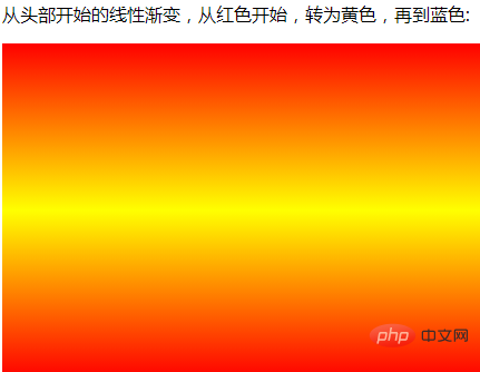
  background-image: linear-gradient(red, yellow ,red);
}
</style>
</head>
<body>
<p>从头部开始的线性渐变,从红色开始,转为黄色,再到蓝色:</p>
<div id="grad1"></div>
</body>
</html>Output result:

(Learning video sharing: css video tutorial)
The above is the detailed content of How to achieve background linear gradient in css3. For more information, please follow other related articles on the PHP Chinese website!

Hot AI Tools

Undresser.AI Undress
AI-powered app for creating realistic nude photos

AI Clothes Remover
Online AI tool for removing clothes from photos.

Undress AI Tool
Undress images for free

Clothoff.io
AI clothes remover

AI Hentai Generator
Generate AI Hentai for free.

Hot Article

Hot Tools

Notepad++7.3.1
Easy-to-use and free code editor

SublimeText3 Chinese version
Chinese version, very easy to use

Zend Studio 13.0.1
Powerful PHP integrated development environment

Dreamweaver CS6
Visual web development tools

SublimeText3 Mac version
God-level code editing software (SublimeText3)

Hot Topics
 Dynamic web page elements XPath and Class names change frequently. How to stably crawl the target a tag?
Apr 01, 2025 pm 04:12 PM
Dynamic web element crawling problem: dealing with XPath and Class name changes, many crawler developers will encounter a difficult problem when crawling dynamic web pages: the goal...
 How to share the same page on the PC and mobile side and handle cache issues?
Apr 01, 2025 pm 01:57 PM
How to share the same page on the PC and mobile side and handle cache issues? In the nginx php mysql environment built using the Baota background, how to make the PC side and...
 From PHP to Go or Front-end? The suggestions and confusions of reality from experienced people
Apr 01, 2025 pm 02:12 PM
Confusion and the cause of choosing from PHP to Go Recently, I accidentally learned about the salary of colleagues in other positions such as Android and Embedded C in the company, and found that they are more...
 Is Debian Strings compatible with multiple browsers
Apr 02, 2025 am 08:30 AM
"DebianStrings" is not a standard term, and its specific meaning is still unclear. This article cannot directly comment on its browser compatibility. However, if "DebianStrings" refers to a web application running on a Debian system, its browser compatibility depends on the technical architecture of the application itself. Most modern web applications are committed to cross-browser compatibility. This relies on following web standards and using well-compatible front-end technologies (such as HTML, CSS, JavaScript) and back-end technologies (such as PHP, Python, Node.js, etc.). To ensure that the application is compatible with multiple browsers, developers often need to conduct cross-browser testing and use responsiveness
 How to convert XML to PDF on Android phone?
Apr 02, 2025 pm 09:51 PM
Converting XML to PDF directly on Android phones cannot be achieved through the built-in features. You need to save the country through the following steps: convert XML data to formats recognized by the PDF generator (such as text or HTML); convert HTML to PDF using HTML generation libraries such as Flying Saucer.
 How to solve the problem of style loss after Django project is deployed to Pagoda panel?
Apr 01, 2025 pm 09:09 PM
Detailed explanation of style loss after Django project is deployed to pagoda panel. After deploying Django project to pagoda panel, you may encounter style loss problem. This...
 How to display hidden lines in xml
Apr 02, 2025 pm 11:45 PM
There are two common ways to hide rows in XML: Use the display property in CSS to set to none Use XSLT to skip hidden rows via conditional copying
 How to display the content of the interface with xml
Apr 02, 2025 pm 11:48 PM
XML is widely used to build and manage user interfaces. It defines and displays the interface content through the following steps: Define interface elements: XML uses tags to define interface elements and their properties. Building a hierarchy: XML organizes interface elements according to hierarchical relationships to form a tree structure. Using Stylesheets: Developers use stylesheet languages such as CSS or XSL to specify the visual appearance and behavior of elements. Rendering process: A browser or application uses an XML parser and stylesheet to parse an XML file and render interface elements to make it visible on the screen.


